UBER FOR BUSES, BUILT FROM SCRATCH IN TWO MONTHS
Branding, website and product interfaces for a California startup that was reimagining the bus rental market.
Client

Services we provide
-
Headquarters
California, USA
-
Industry
Transportation /
B2B SaaS -
Timelines
2 months
AMBITION IS BIGGER THAN
THE MARKET
Voyager started as a luxury bus rental in San Francisco – corporate transportation for Google, Amazon, Apple, transfers for stars and events. But the founder envisioned more: to unite carriers, customers, and partners into a single managed network, where orders, routes, and payments work as in a single application. They raised several million dollars for this idea and began developing a platform with no market analogs yet.
TWO ARROWS, ONE VECTOR
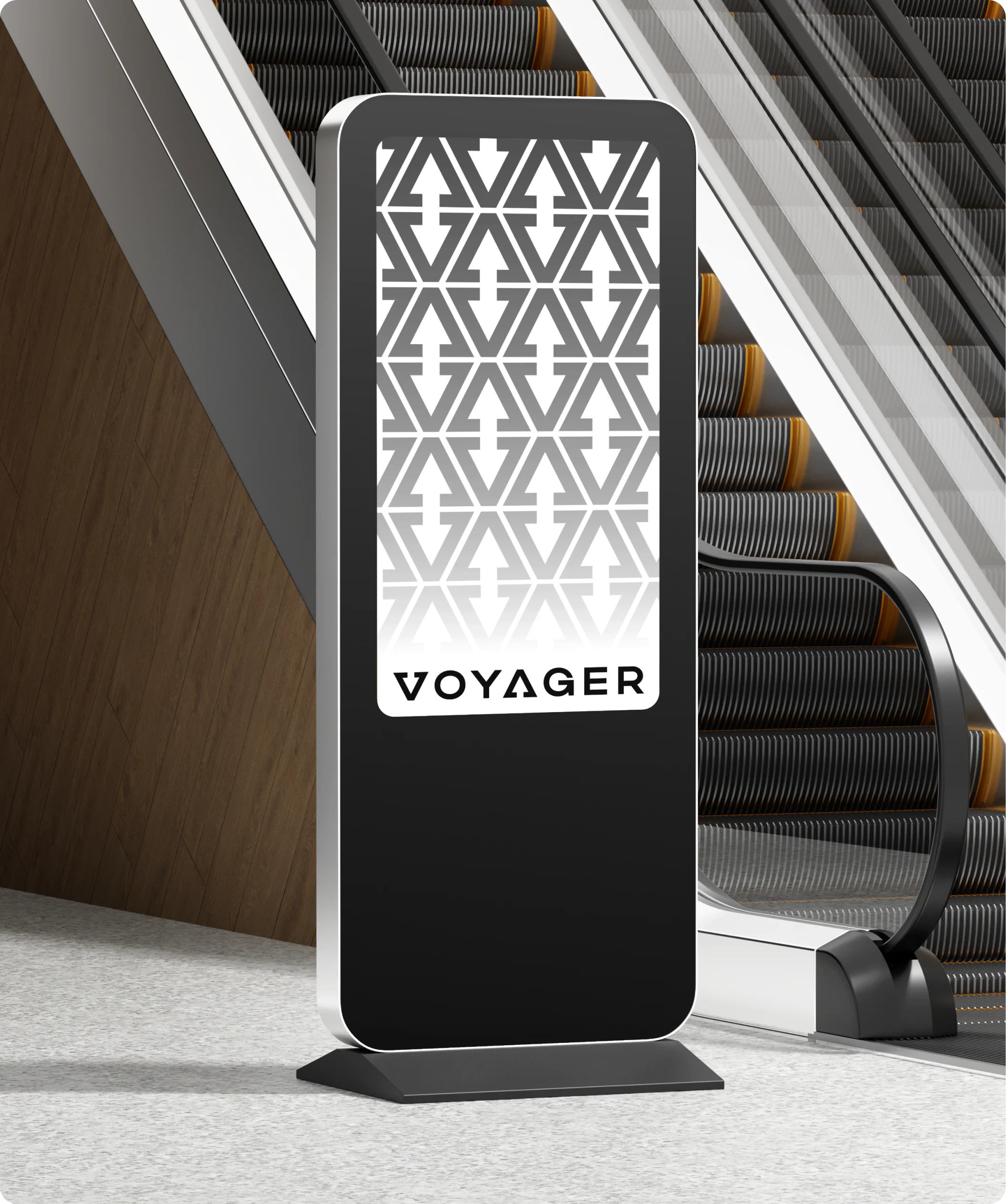
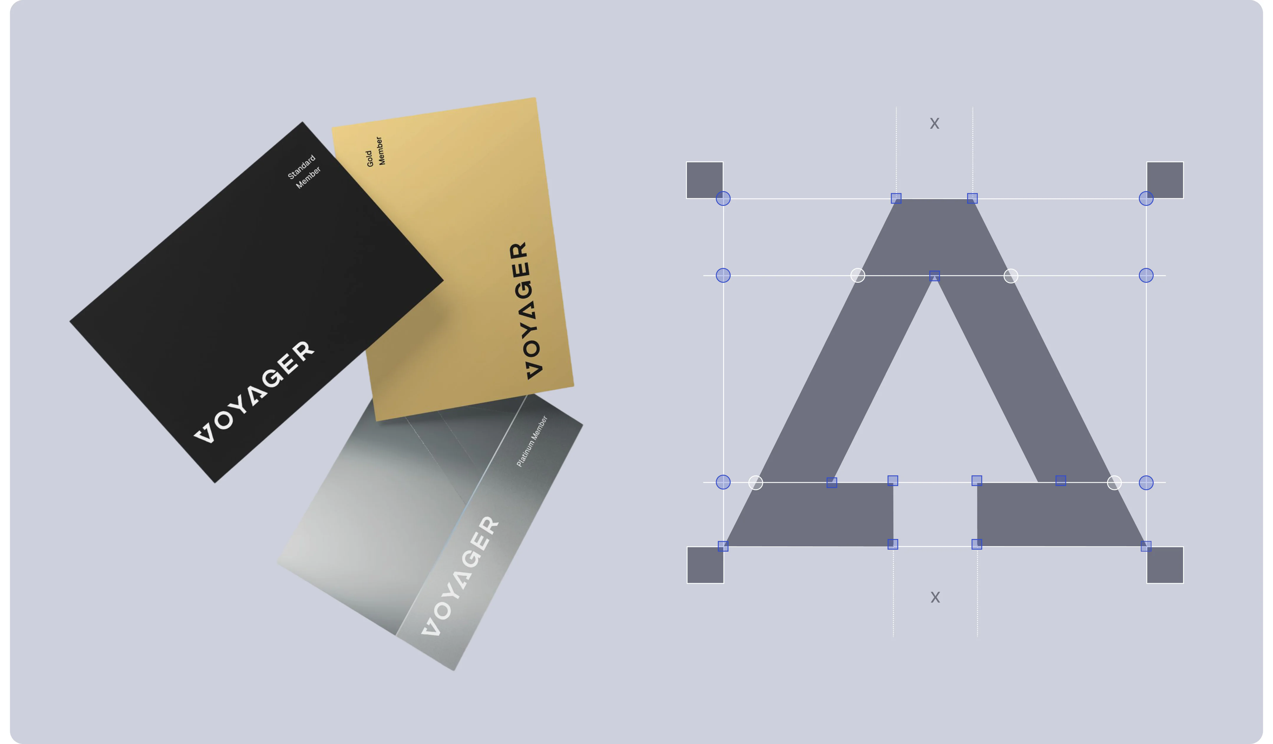
The existing logo did not match the scale of the ambitions, so we started with a rethink. In the final solution, the letters V and A are read as two arrows — movement, direction, a common vector. The identity is designed in black and white: minimalistic, without excess, with a sense of technological confidence. The motion version of the logo reinforces the idea — it literally passes through the portal and comes out the other side.
BUSES THAT DO NOT EXIST IN NATURE
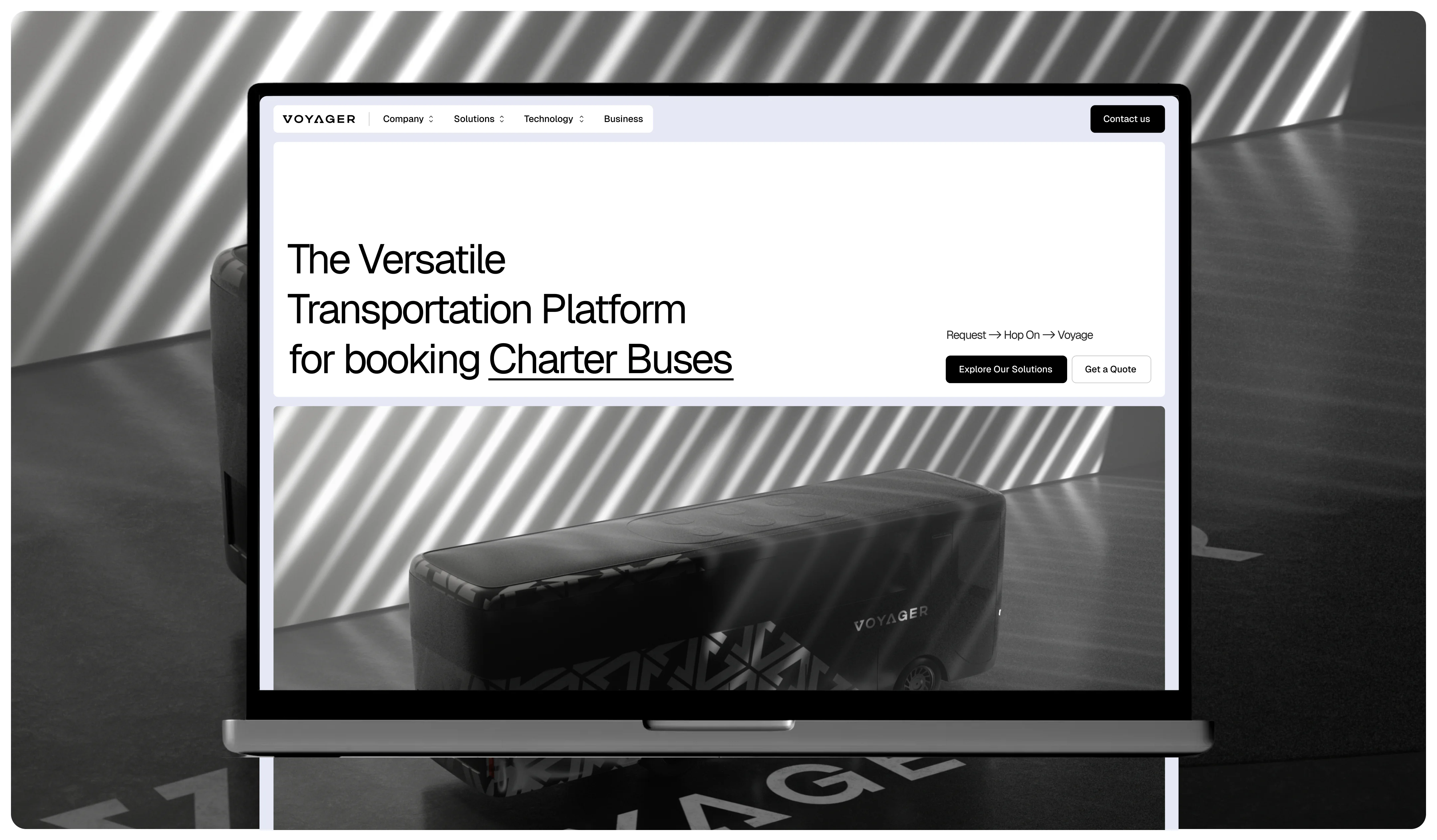
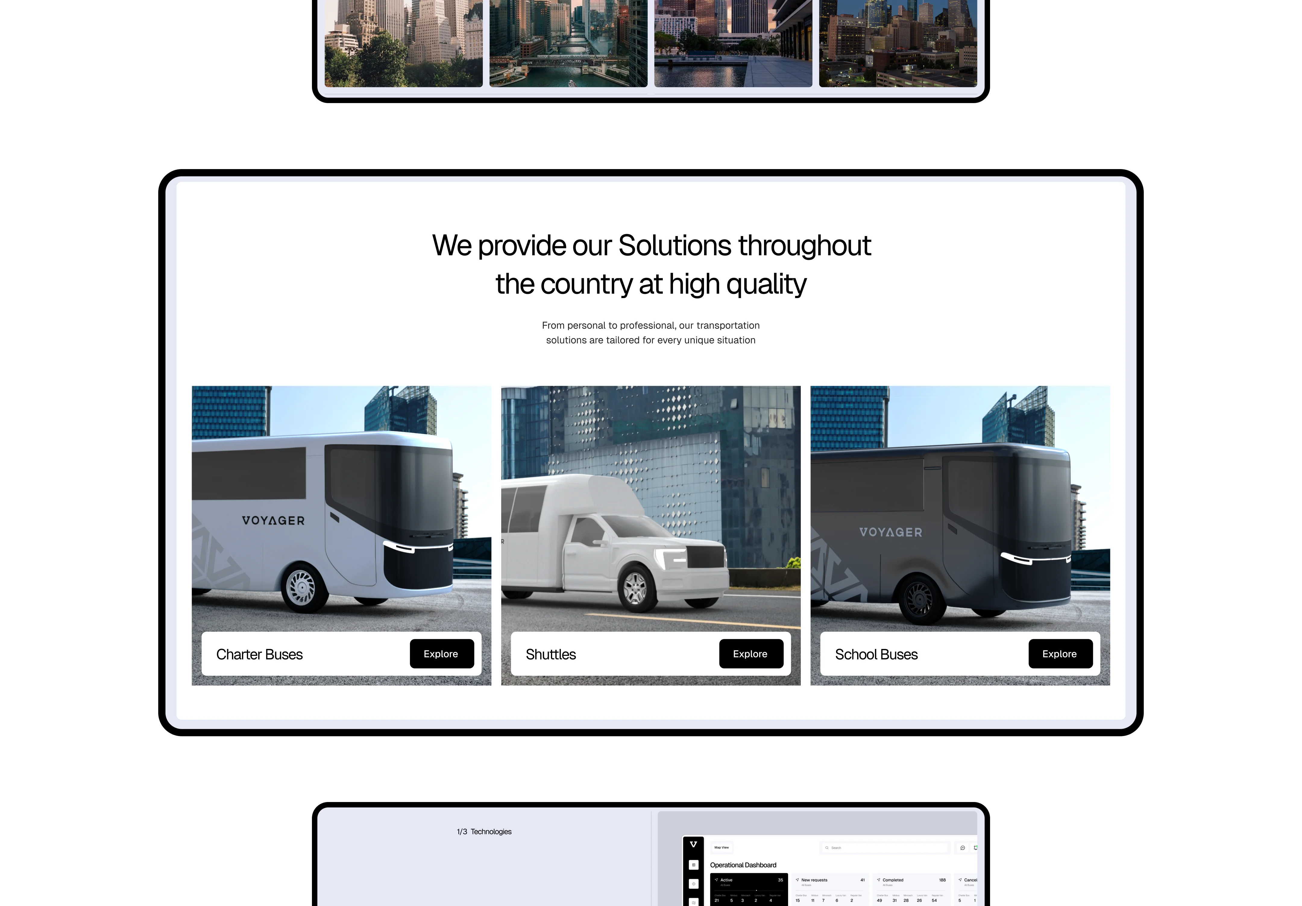
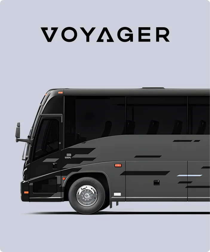
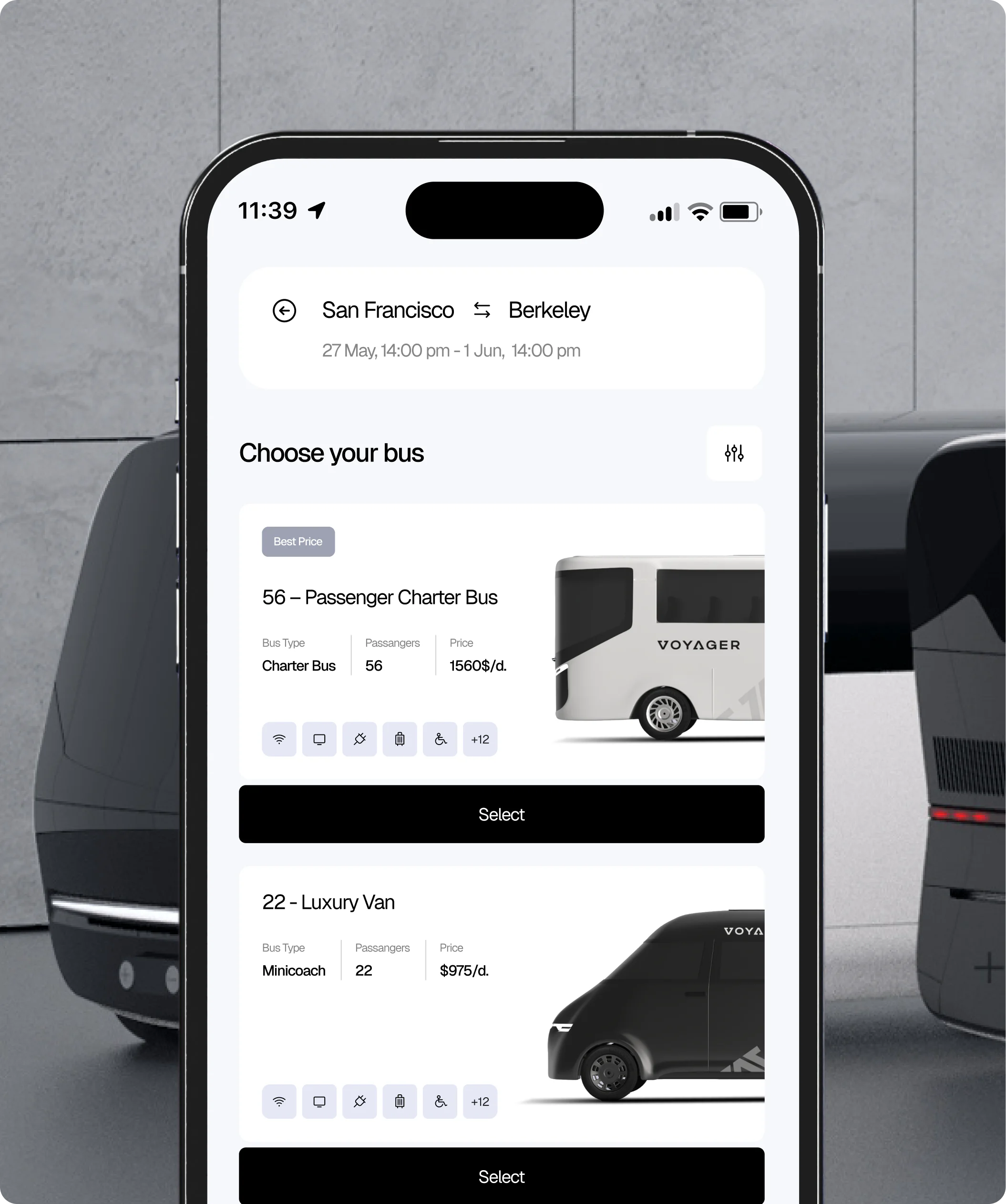
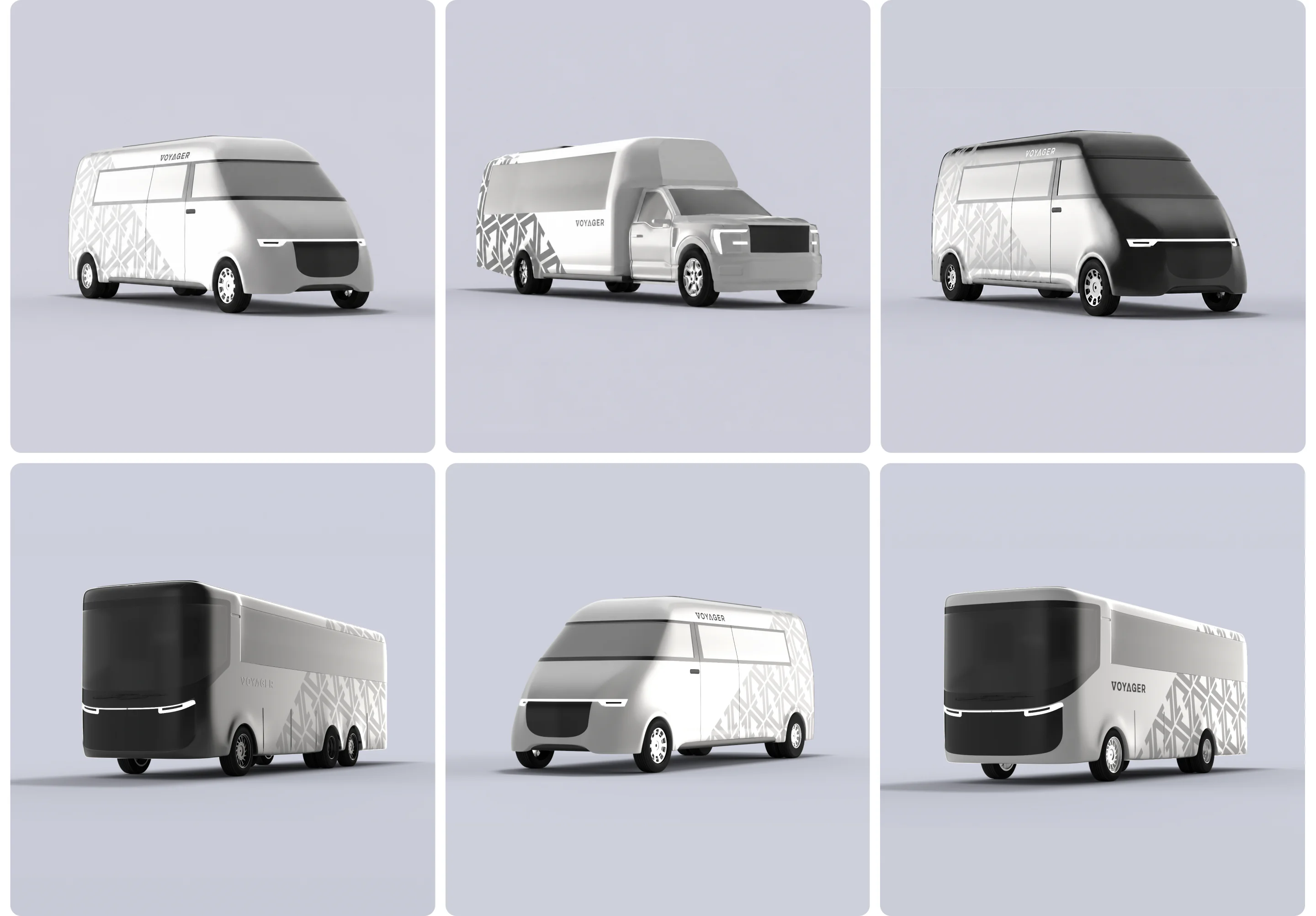
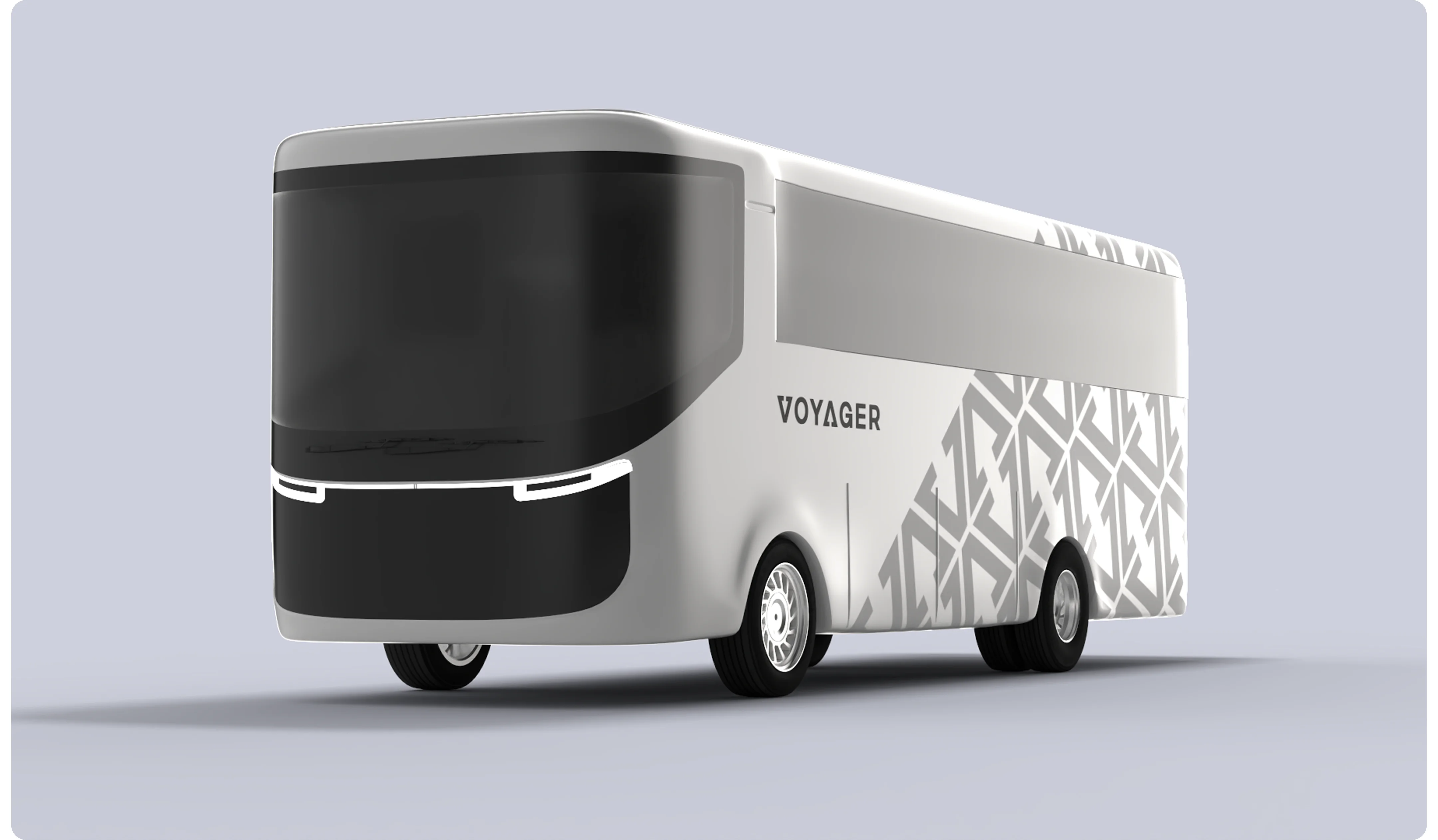
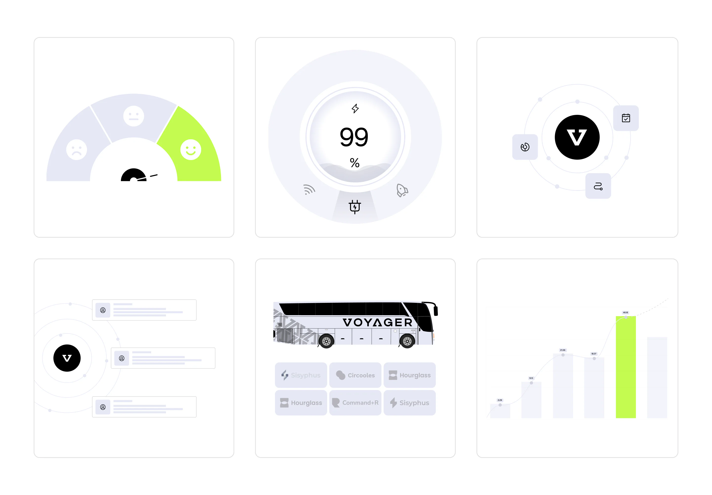
We created our own 3D bus models from scratch for the site. Showing Mercedes or any other recognizable brand would mean tying the platform to a specific manufacturer, whereas Voyager was building its own fleet and aesthetics. The models turned out futuristic: a corporate pattern on the body, nothing superfluous. The site integrated a full 3D bus review with a custom player — you can view it from all sides. Micro-animations support the sense of movement on every page.
PLATFORM BEHIND THE SITE
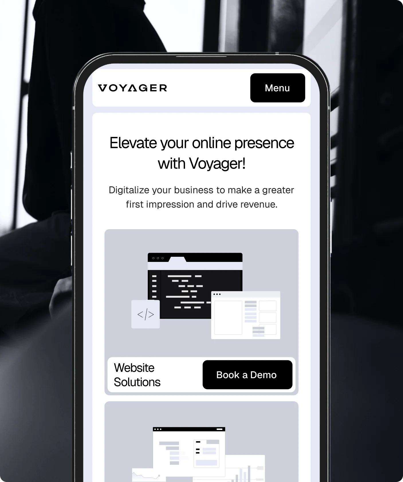
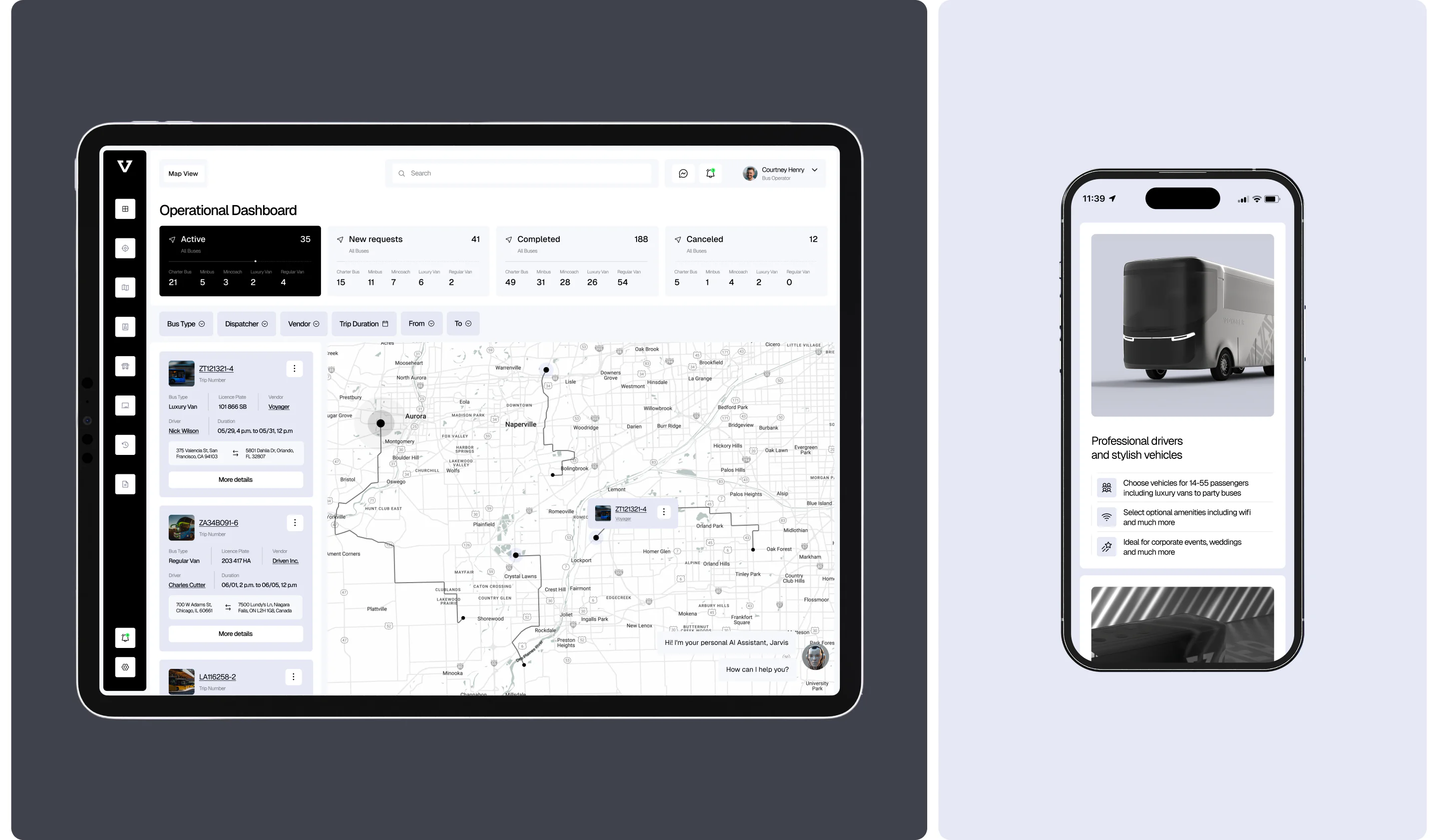
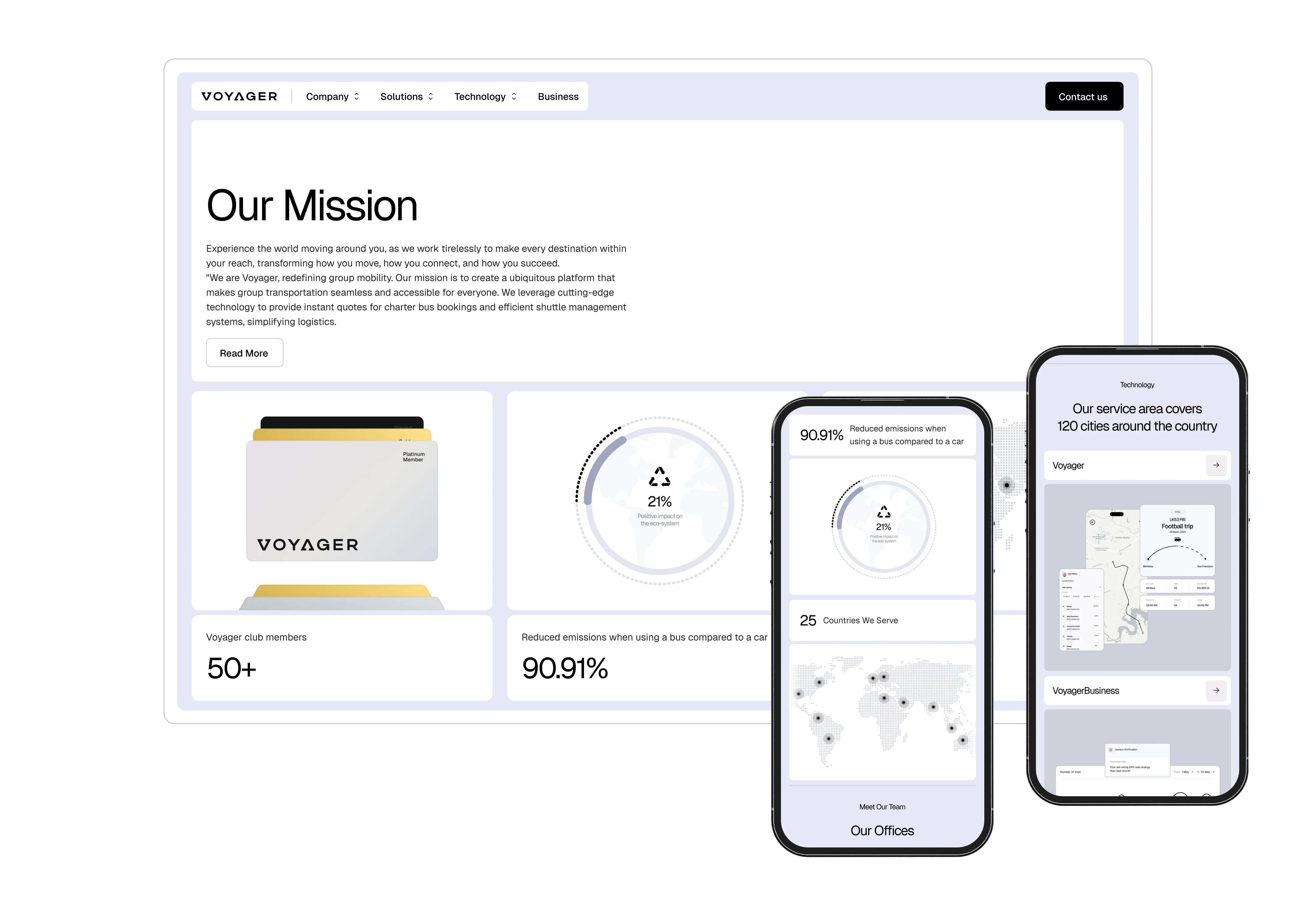
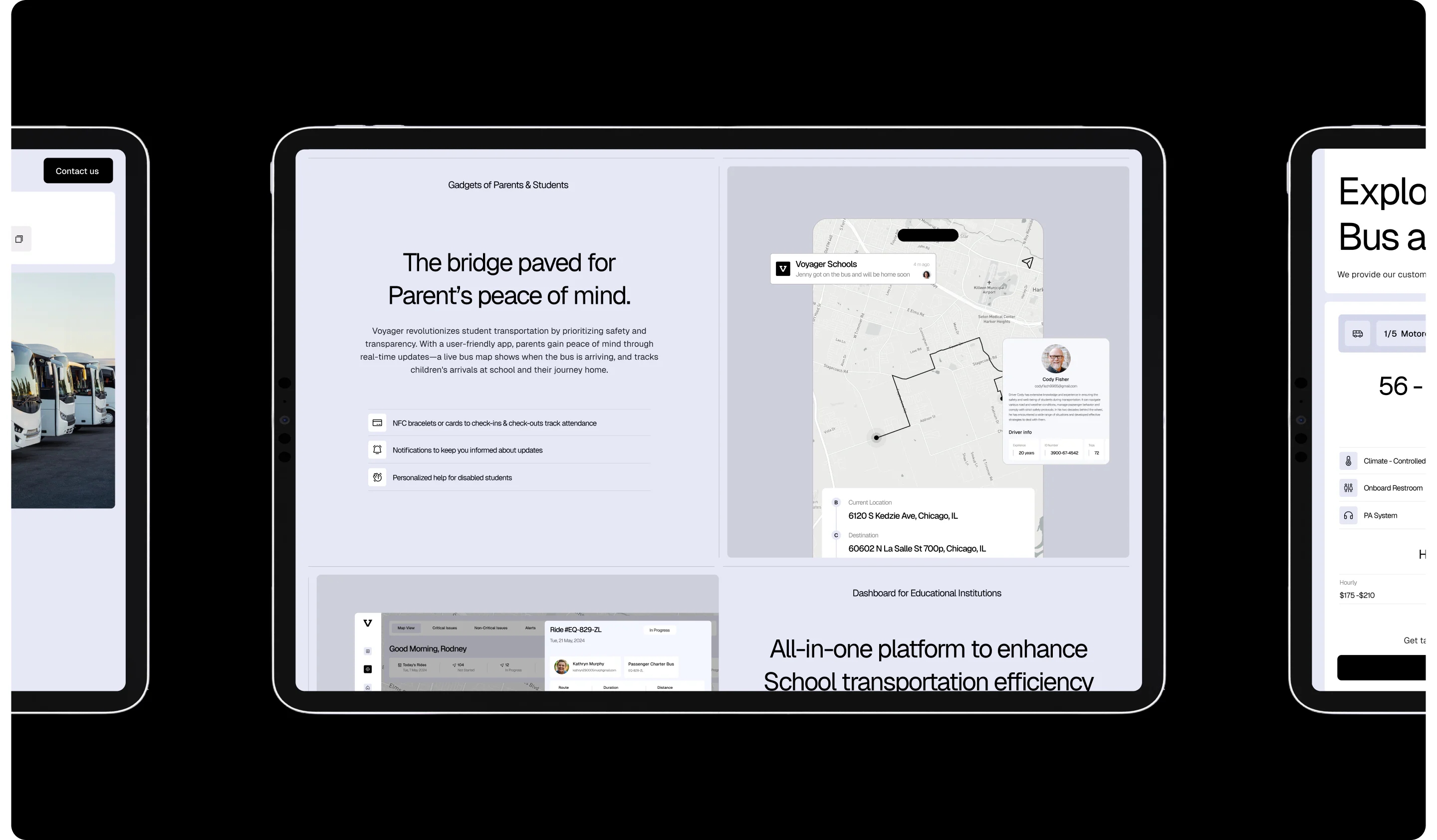
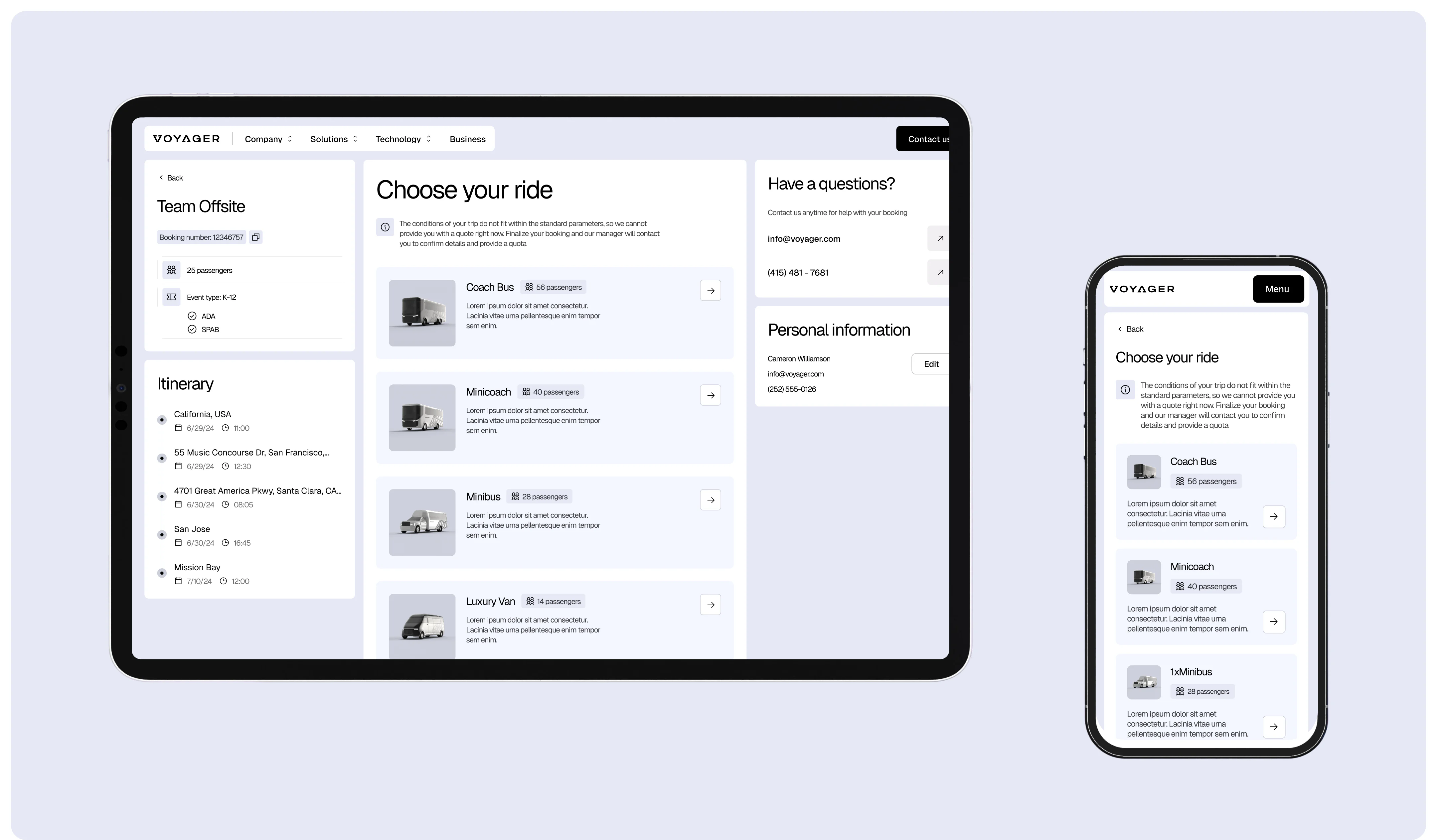
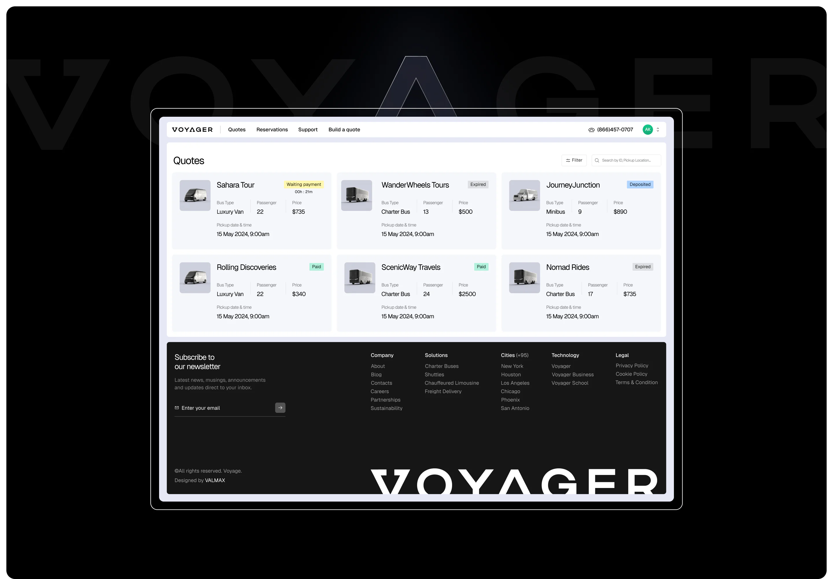
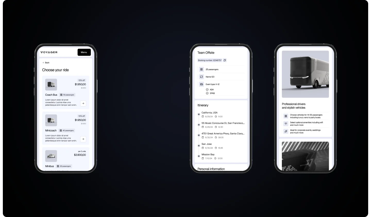
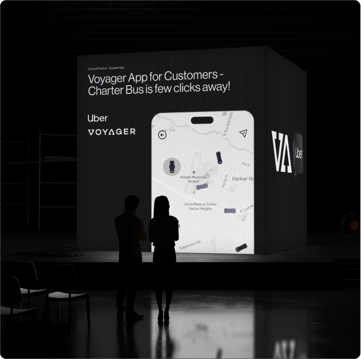
Voyager became an ecosystem: Voyager Business handled corporate transport, Voyager School delivered premium school rides, with real-time tracking for parents and boarding check-ins — far beyond the usual yellow bus experience. There were separate mobile apps for customers and drivers, a CRM for dispatchers, and a Partner Dashboard — an interface for carrier partners who connect to the network when Voyager does not cover the region with its own fleet. All interfaces were developed and drawn within the team.
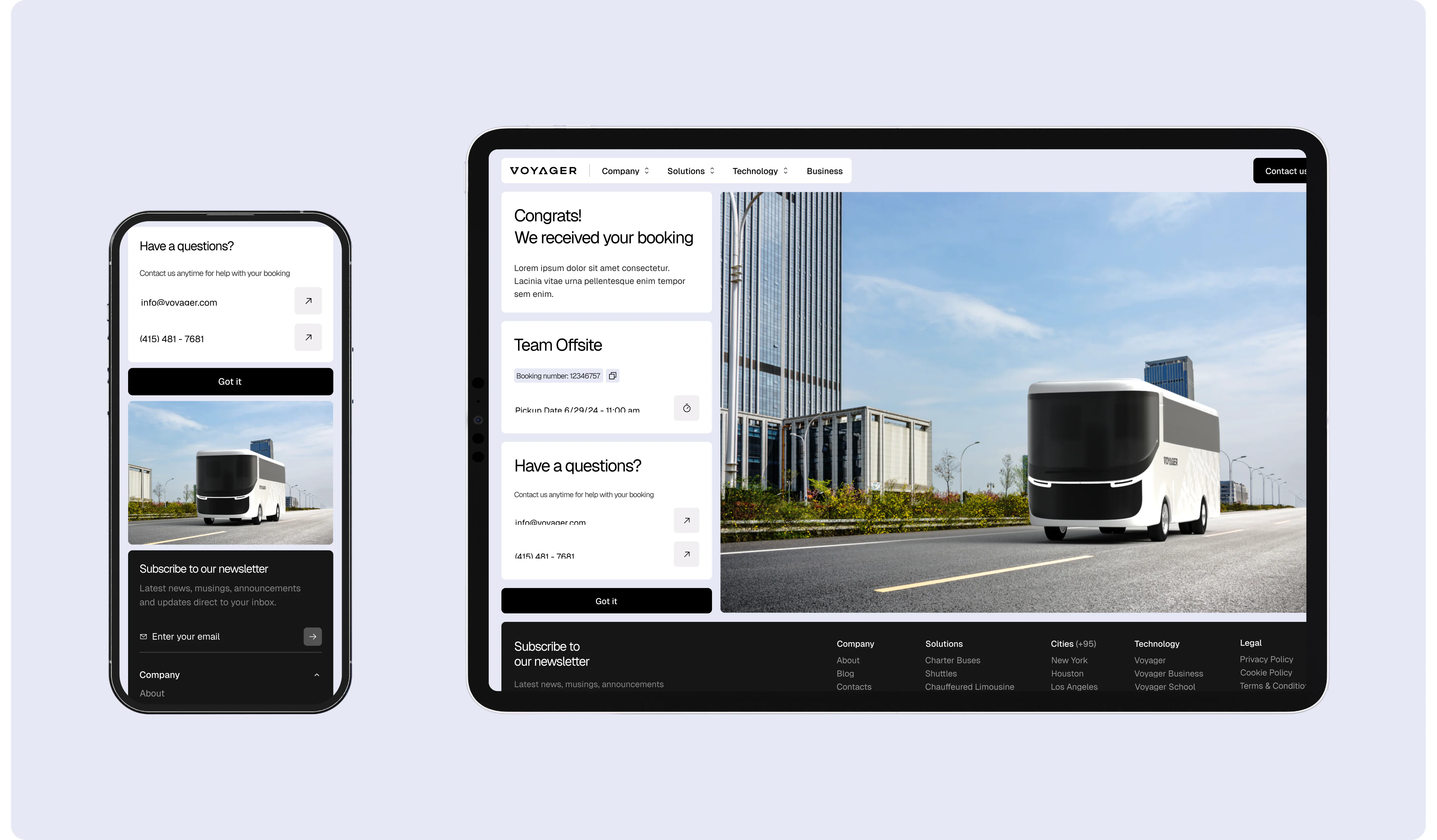
WHAT THE CLIENT GOT
A full brand identity with a redesigned logo and its motion version, a minimalist website with custom 3D models and an interactive overview of the bus, micro-animations throughout the site, designed interfaces for Partner Dashboard and CRM, and separate pages for each product in the ecosystem. The entire volume was completed in two months, delivering a full brand system, product interfaces, and a website that still holds up as a reference for transportation tech design.
-
How should a multi-sided transportation platform be designed?
The design process should begin by separating the platform’s user roles and identifying what each role needs to complete. A passenger may need booking and trip status, a driver needs route and boarding information, a dispatcher needs fleet control and exception management, while a carrier partner needs orders, payments, and operational documentation.
These workflows should use one shared design system, but they should not be forced into one identical interface. Navigation, permissions, notifications, data density, and primary actions must reflect the responsibilities of each user. VALMAX applied this structure to Voyager by designing connected interfaces for customers, drivers, dispatchers, and carrier partners while maintaining one visual identity across the entire platform.
-
Can a startup launch a new brand, marketing website, and core SaaS interfaces within two months?
-
What should be included in the first version of a multi-sided SaaS product?
The first release should cover one complete transaction or operational cycle from start to finish. For a transportation platform, that could include account creation, booking, route assignment, driver confirmation, trip status, payment, and basic administration. Each critical user should be able to complete their part of that cycle without relying on manual workarounds outside the platform.
Features such as advanced analytics, deep customization, secondary integrations, and rare edge cases can move into later releases. The MVP should still include permissions, empty states, error handling, notifications, and basic admin controls. Removing these elements may reduce the screen count, but it often produces a product that cannot be tested in real operational conditions.
-
How do you scope a multi-sided SaaS platform before requesting agency estimates?
Start with user roles and complete workflows rather than a list of screens. For each user type, document the main task, information required, actions available, permissions, and handoff to the next participant. A multi-sided platform may include customers, operators, partners, administrators, and field teams, each with different navigation and access levels.
The brief should also specify required platforms, integrations, reporting, notifications, payment flows, and mobile requirements. Agencies can then estimate the work by unique flows, interface complexity, and system states. Without this detail, proposals often look cheaper initially but exclude permissions, edge cases, responsive behavior, and admin functionality.
-
Should a transportation startup build custom software or use an off-the-shelf fleet management platform?
Off-the-shelf software works for standard needs such as route planning, vehicle tracking, driver scheduling, and dispatching. It is faster and cheaper to implement, but it usually follows fixed workflows.
Custom software is a better fit when the business serves several user groups, such as passengers, corporate clients, schools, parents, drivers, dispatchers, and carrier partners. It allows the company to control permissions, booking logic, real-time updates, payments, partner onboarding, and operational workflows.
For an MVP, a hybrid model is often the most practical: use existing tools for maps, payments, authentication, and messaging, while custom-building the workflows that define the product.