Brand Identity, Design, and Website for a Private Executive Community
The Data Storytellers runs vendor-free events and advisory sessions for top executives at Fortune 500 companies. The brand didn’t match the product. We built a new identity, design system, and website that changed that.
Client

Services we provide
-
Headquarters
USA
-
Industry
Events
-
Website
-
Timelines
4 months
FROM VENDOR-FREE EVENTS TO INTELLECTUAL AUTHORITY
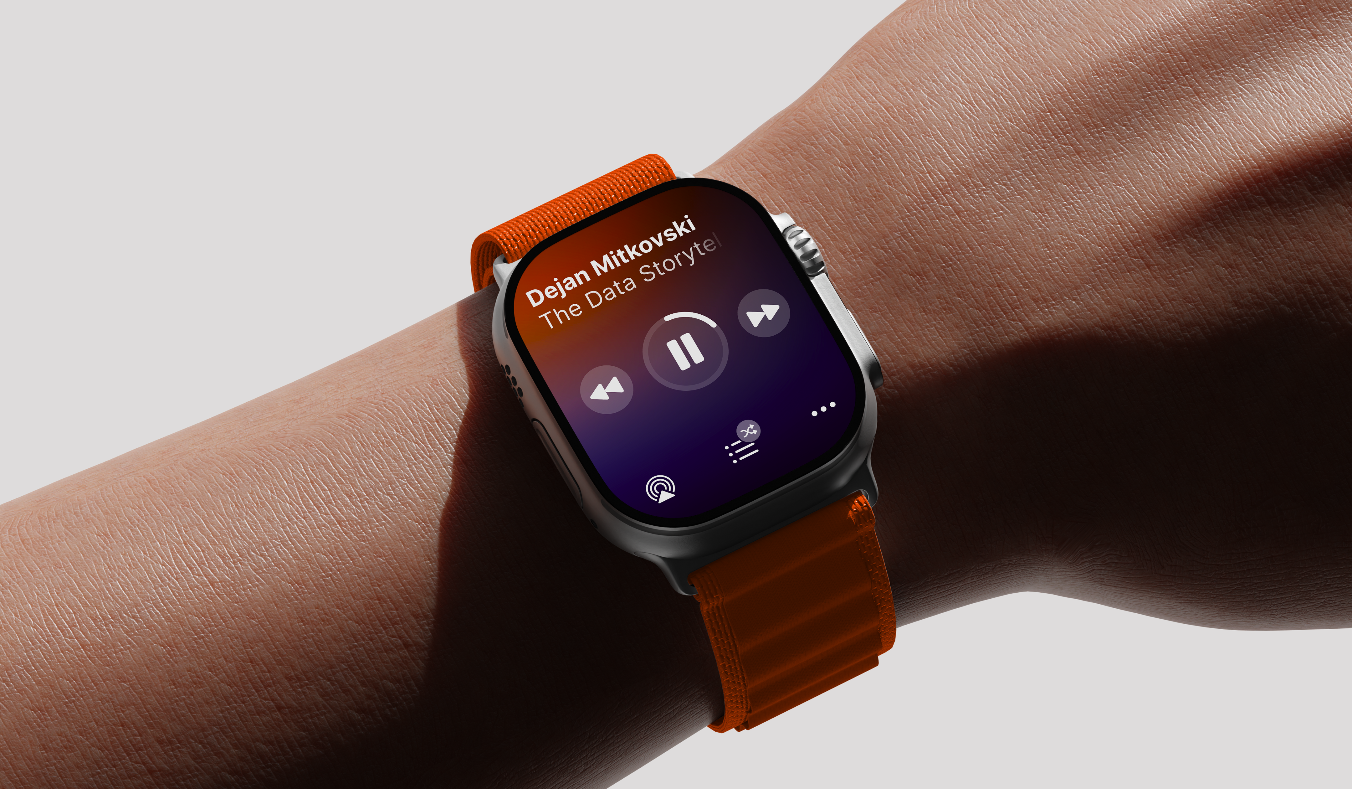
The Data Storytellers organizes private events and peer-to-peer advisory sessions for top executives at Fortune 500 companies in data, AI, and innovation. Their product is built on the exchange of practical case studies without marketing or sales. The visual identity did not match this level. We created a new identity that communicates authority and premium quality from the very first moment of contact.
THE PROBLEM OF TRUST AT THE FORTUNE 500 LEVEL
The Data Storytellers works with a corporate audience of the highest caliber — top executives from Fortune 500 and Fortune 1000 companies in the U.S. and global enterprises. The company organizes vendor-free events and advisory services where the value lies in the exchange of real-world playbooks among practitioners, free from vendor influence. Despite a strong product, the brand’s visual identity lacked polish, creating a trust barrier for a skeptical C-level audience even before the conversation began. At this level, credibility must be immediate; otherwise, there is no opportunity.
THE SOLUTION
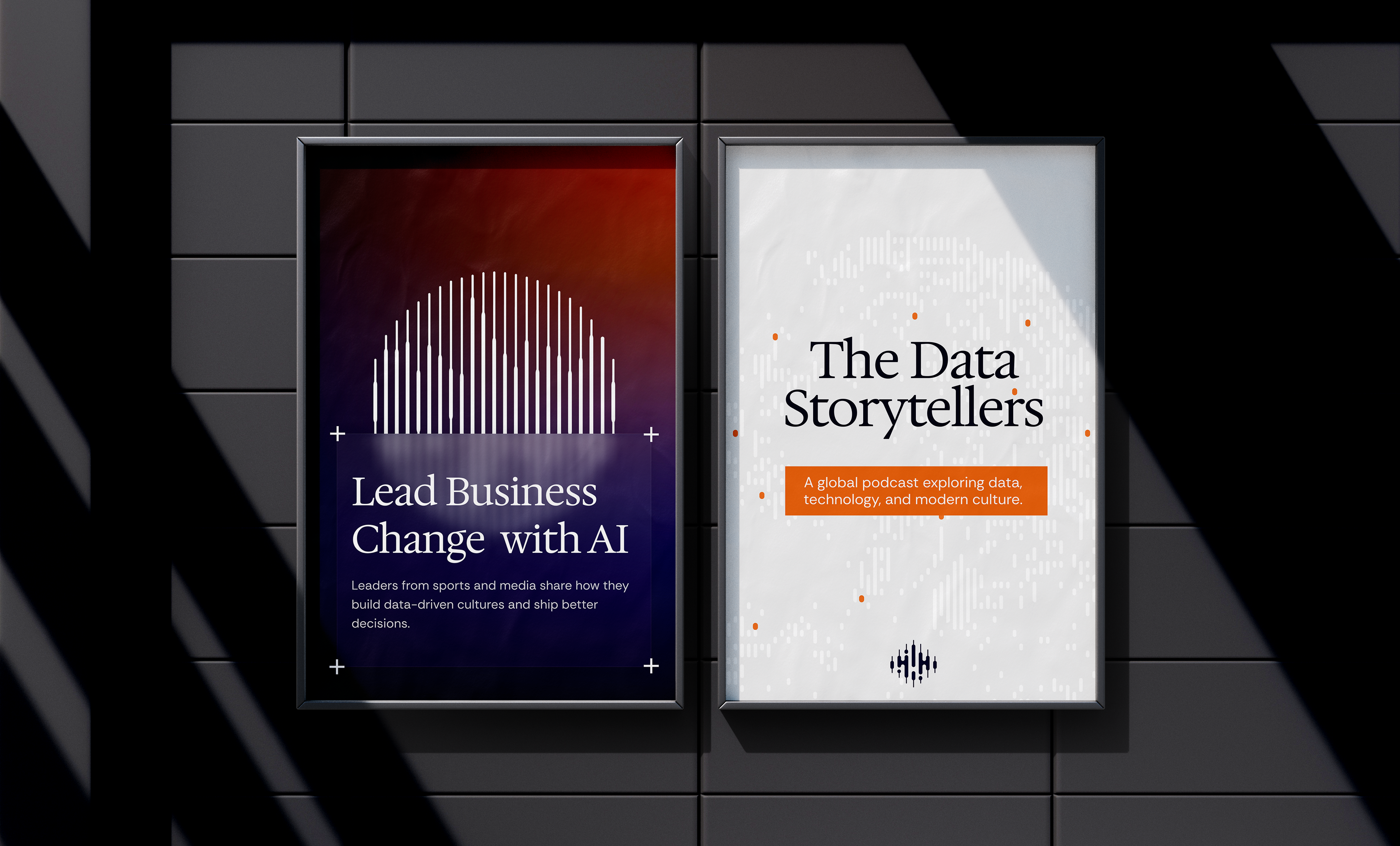
The client’s request was clear: to create a brand identity and logo that convey premium quality and expert-level expertise without being unduly straightforward or clichéd. We had to avoid two extremes — an overly abstract visual language and literal data clichés featuring graphs or technological symbols. We shaped the brand image as a high-level, exclusive intellectual community that combines educational and strategic features. The brand identity had to convey restraint, trust, and authority while remaining modern to meet the expectations of the Fortune 1000 audience.
EDITORIAL LANGUAGE INSTEAD OF EVENT PROMOTION
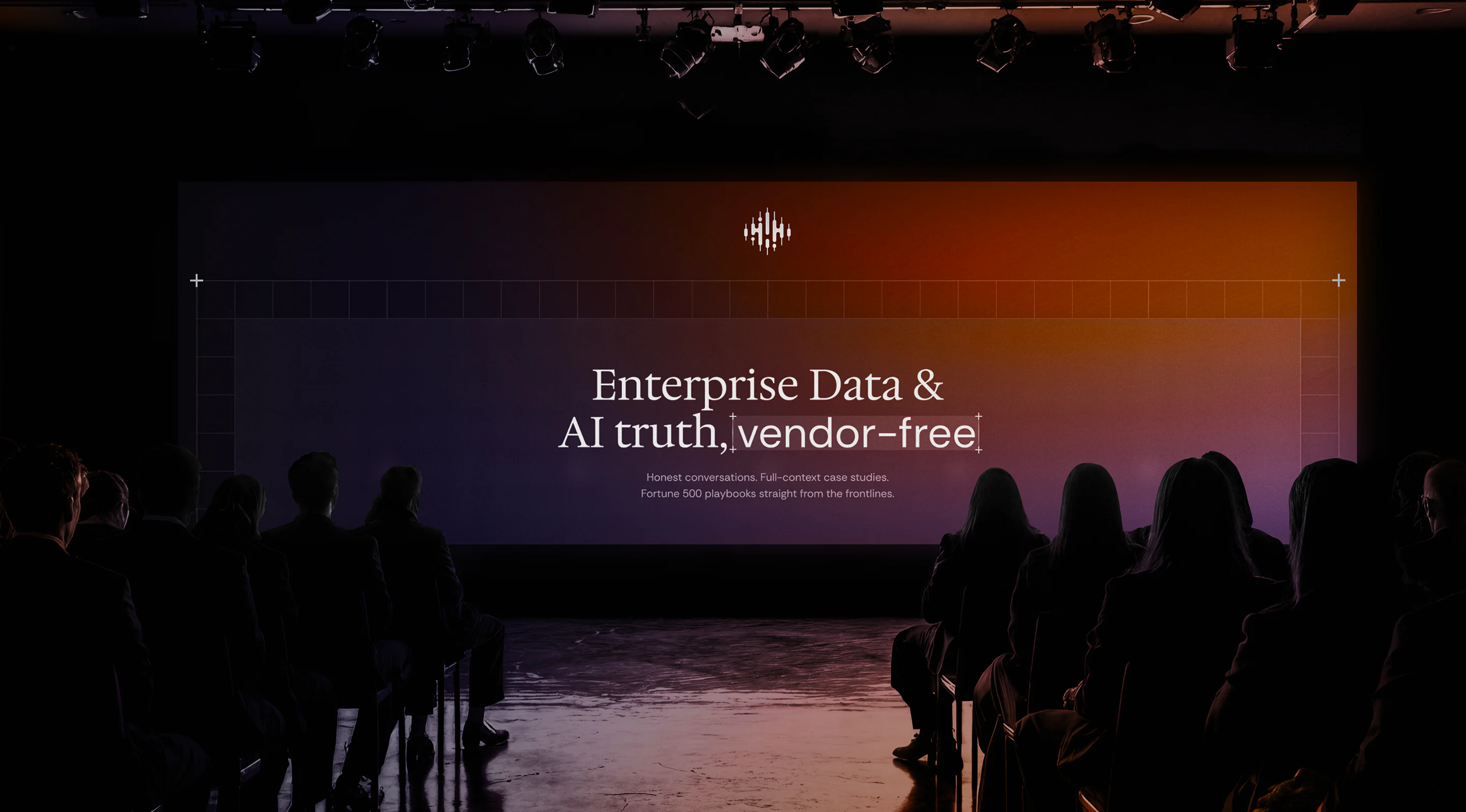
Instead of focusing on event platforms or consulting brands, we turned to premium media and analytical publications. This allowed us to develop an editorial approach to design — grid-based layouts reminiscent of the format of analytical materials and case studies. The visual system accentuates the depth of meaning and the intellectual nature of the content, positioning the brand as a platform for practitioners’ real-life stories. Minimalist typography, a restrained color palette, and clean compositions create a sense of intimacy and intellectuality without flashy marketing effects.
FROM NOISE TO SIGNAL: THE LOGIC OF THE SYMBOL
In the logo and graphic system, we established a balance between the rationality of data and the humanity of narration — the central conceptual axis of the entire identity. The symbol within the logo represents a sound wave as a metaphor for the voice and the exchange of knowledge between people, enclosed in a circle that denotes a closed community. Subtle visual techniques involving light, color nuances, and blurring create a sense of depth and focus, symbolically expressing the brand’s very idea — the movement from noise to signal, from the superficial to the essential.
THE PROCESS
Brand identity work led into UI/UX design, where the editorial principles shaped website structure and content hierarchy. Webflow development followed, translating grid logic and minimalist typography into a functional platform. Each phase maintained consistency in visual language and user experience standards.
THREE STAGES: FROM IDENTITY TO EXPERIENCE
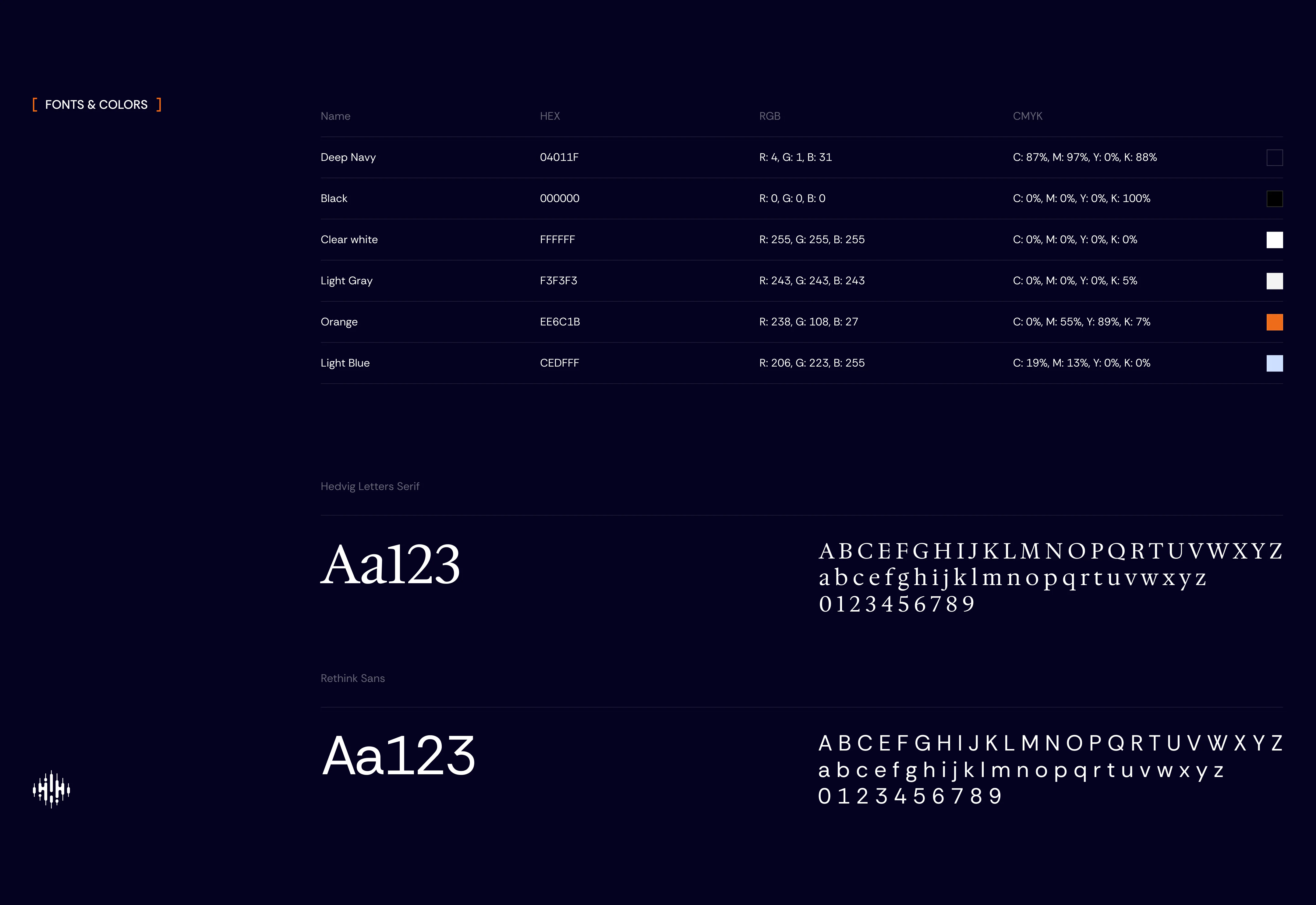
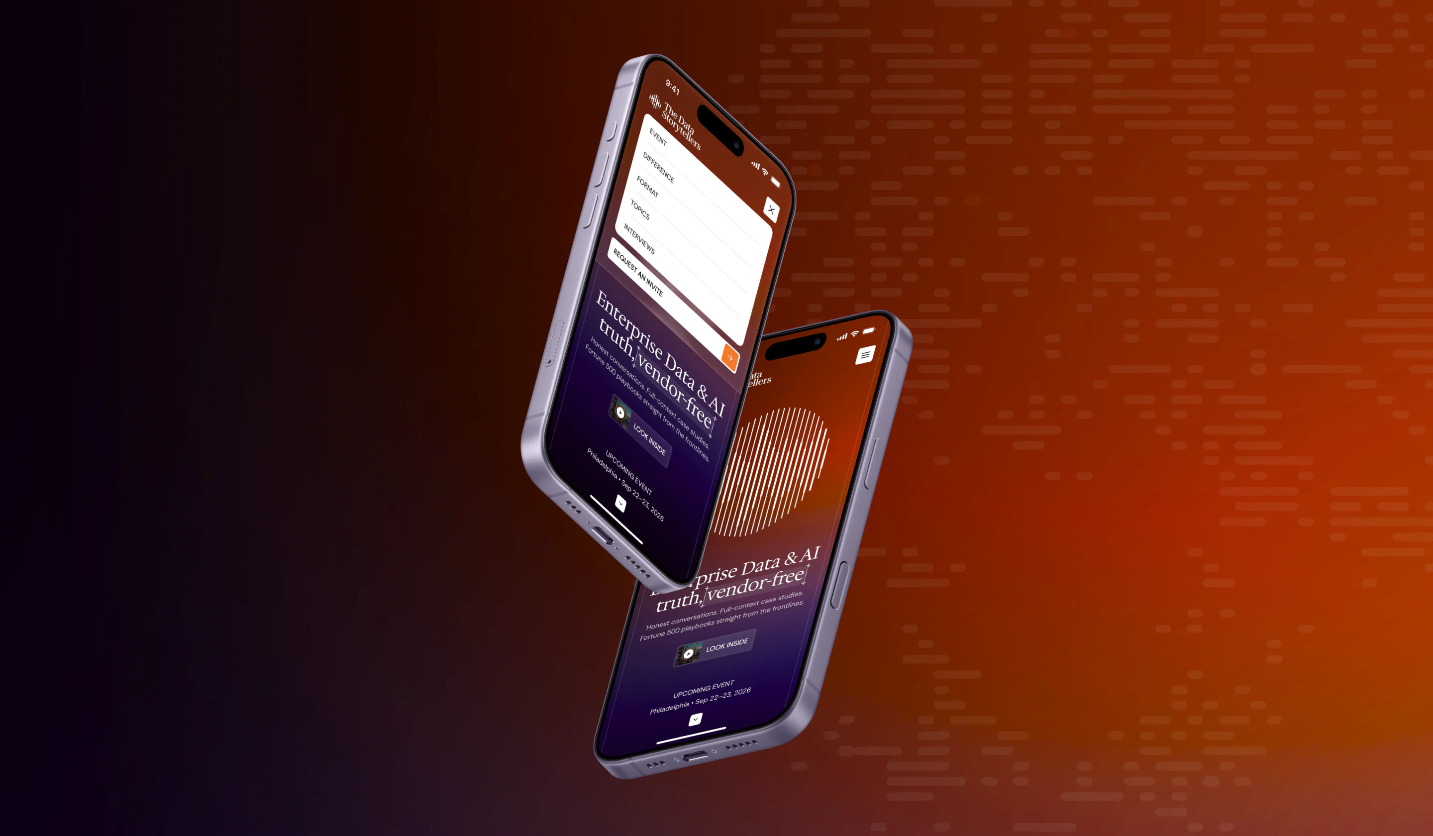
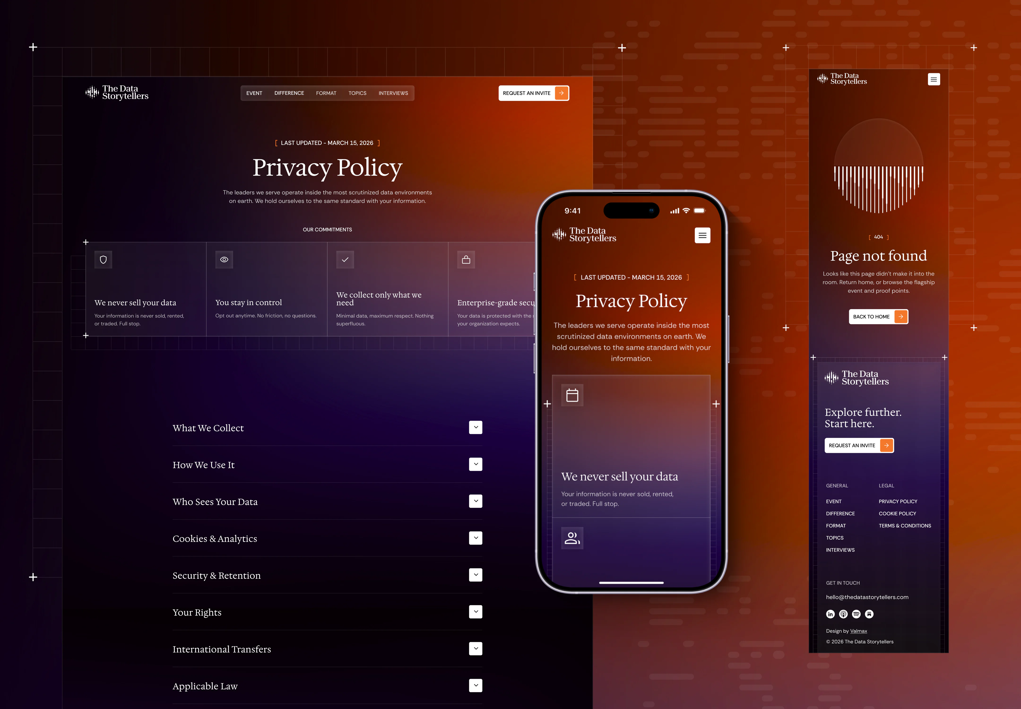
The rebranding spanned three phases: brand identity and guidelines, UI/UX website design, and Webflow development. Each phase expanded upon the editorial approach embedded in the identity. The website structure follows the same grid logic with layouts which focus on content hierarchy and readability. The user journey was redesigned to reflect the premium nature of the offering — a deliberate pace, strategic information disclosure, and clarity rather than flashy effects.
WHAT THE CLIENT RECEIVED
CLIENT FEEDBACK
The team shares their experience working with us and reflects on the collaboration throughout the branding and website project.

Frequently Asked Questions
-
What type of visual identity works best for a private executive community?
A private executive community usually benefits from a restrained and content-led visual system. Editorial typography, clear hierarchy, controlled use of color, and structured compositions can communicate authority without relying on generic corporate or technology imagery. The identity should also reinforce the qualities that make the community valuable, such as selectivity, expertise, privacy, and access to experienced practitioners.
-
How should a vendor-free data and AI community position itself?
The positioning should clearly explain who participates, what knowledge members receive, and how the vendor-free model changes the quality of the discussion. For The Data Storytellers, the central value was access to practical enterprise case studies and peer-to-peer conversations without sales influence. The branding and website were built around practitioner knowledge, confidentiality, and the relevance of the community to senior data and AI leaders.
-
What makes a website credible to C-level decision-makers?
A credible C-level website presents the offer quickly, supports its claims with specific information, and removes unnecessary promotional language. Senior decision-makers need to understand the audience, format, value, selection process, and expected outcomes without searching through vague messaging. Strong content hierarchy, consistent design, readable layouts, and a clear conversion path also signal that the organization operates at a professional level.
-
How should an invitation flow be designed for a private B2B community?
The form should collect enough information to qualify a prospective member without turning the first interaction into a long application. For The Data Storytellers, the flow focuses on essential details such as the applicant’s company, professional role, and contact information, supported by a clear explanation that each request is reviewed personally. The page also reinforces privacy and vendor independence near the conversion point, because these are central trust concerns for senior enterprise leaders. This makes the form part of the positioning: access is selective, personal, and protected from third-party sales activity.
-
How long does a B2B rebrand and Webflow website project take?
A complete branding and Webflow website project usually requires 10–16 weeks. A typical schedule includes 2–3 weeks for research and positioning, 3–4 weeks for the visual identity, 3–5 weeks for UX and interface design, and 3–5 weeks for Webflow development, testing, and launch preparation. Some stages can overlap once the core brand direction has been approved.
Projects completed in less than eight weeks usually require a limited page count, prepared content, one clear decision-maker, and fast approval cycles. Additional time should be expected when the website includes multiple audience journeys, custom forms, event or membership integrations, advanced motion design, or several stakeholder review rounds.