WHEN COMPLEXITY BECOMES AN ADVANTAGE
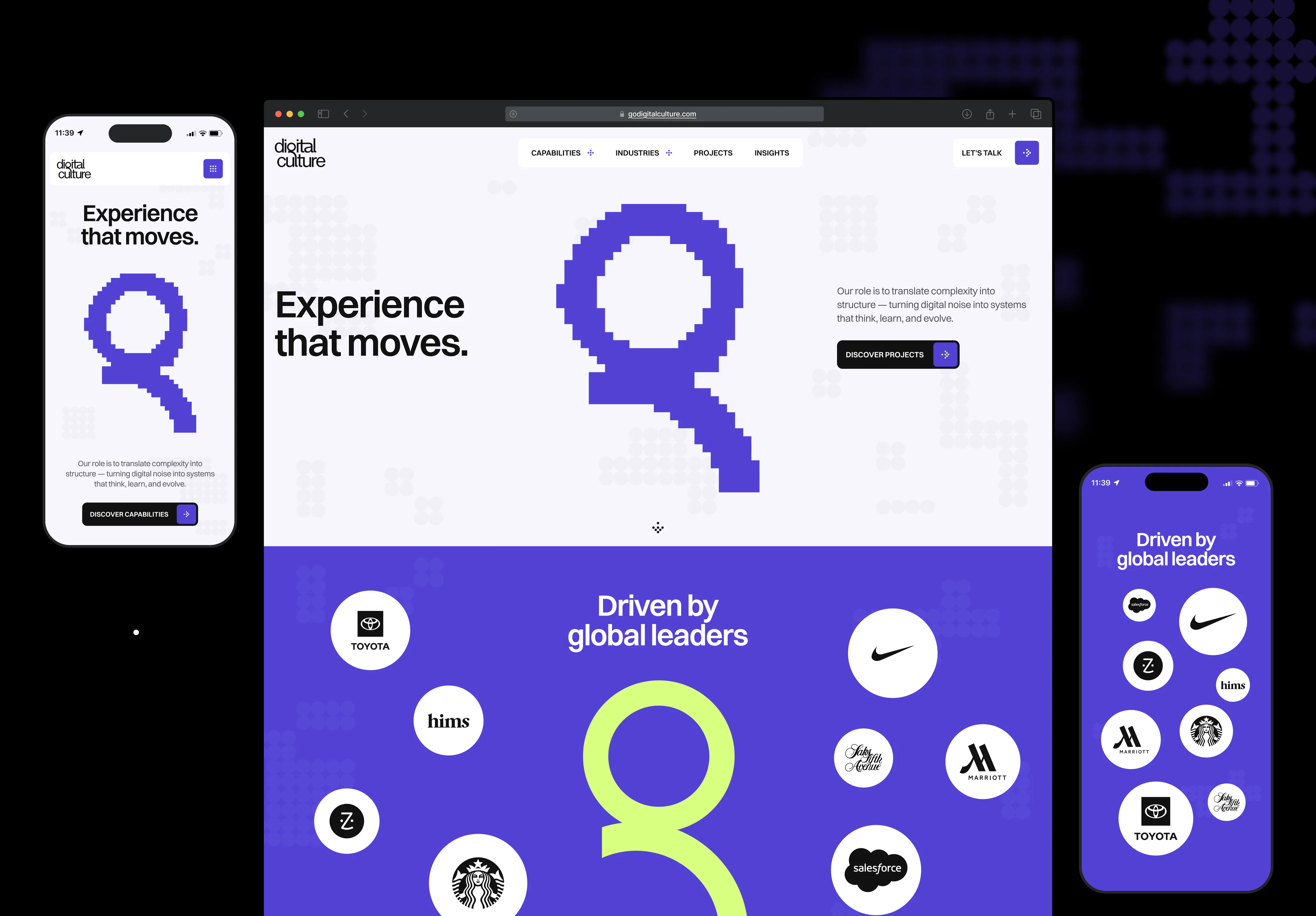
Digital Culture brings brand, data, and engineering together into one system. But their old website didn’t show that. The gap between what they could do and how they looked online kept growing. So we rebuilt everything from the ground up, making it obvious from the first second: this is a team that turns complexity into results.
Client

Services we provide
-
Headquarters
USA
-
Industry
Consulting
-
Website
-
Timelines
3 months
A WEBSITE THAT DIDN’T REFLECT
THE COMPANY
INTELLECT AS THE FOUNDATION
OF THE BRAND
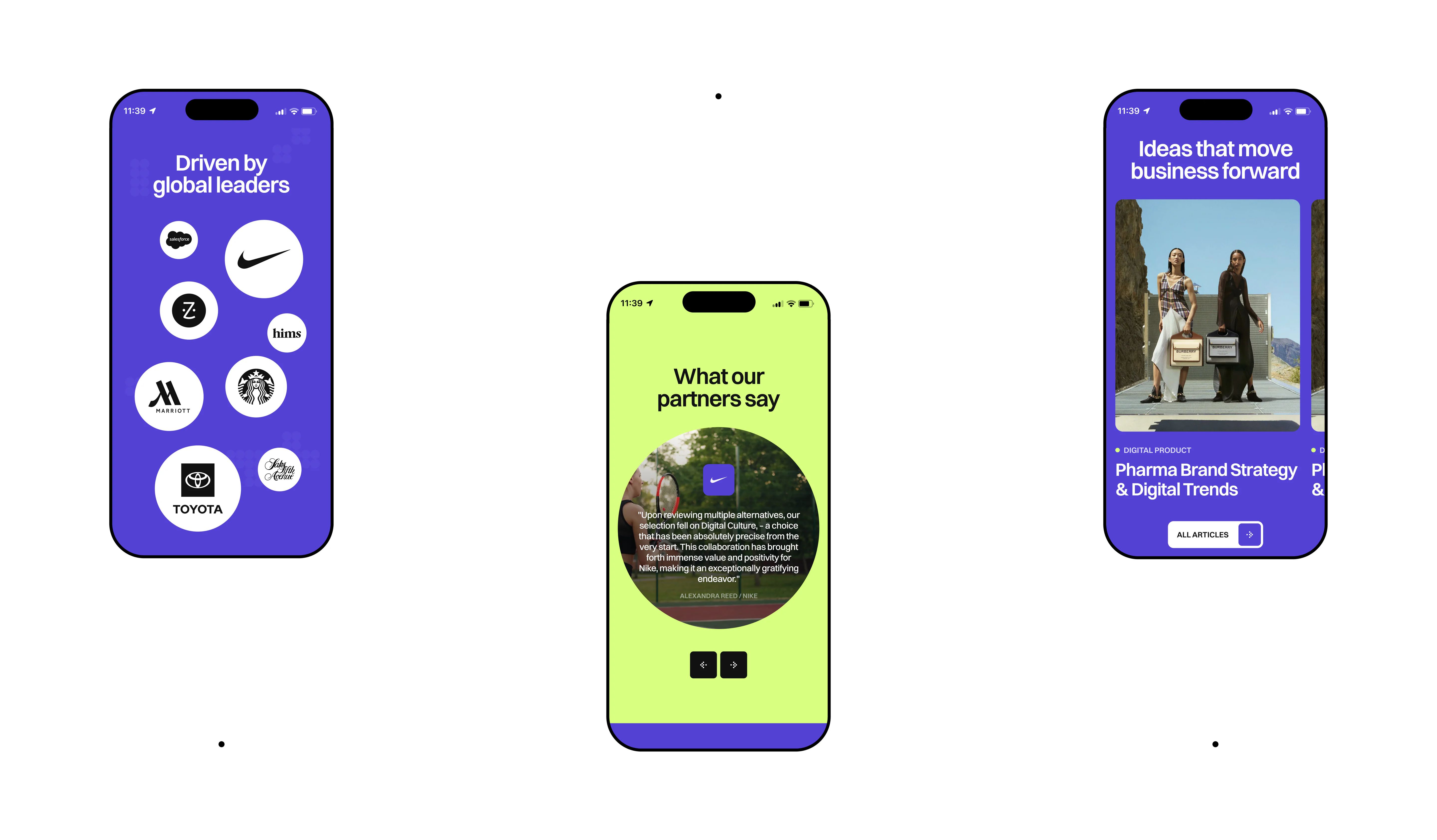
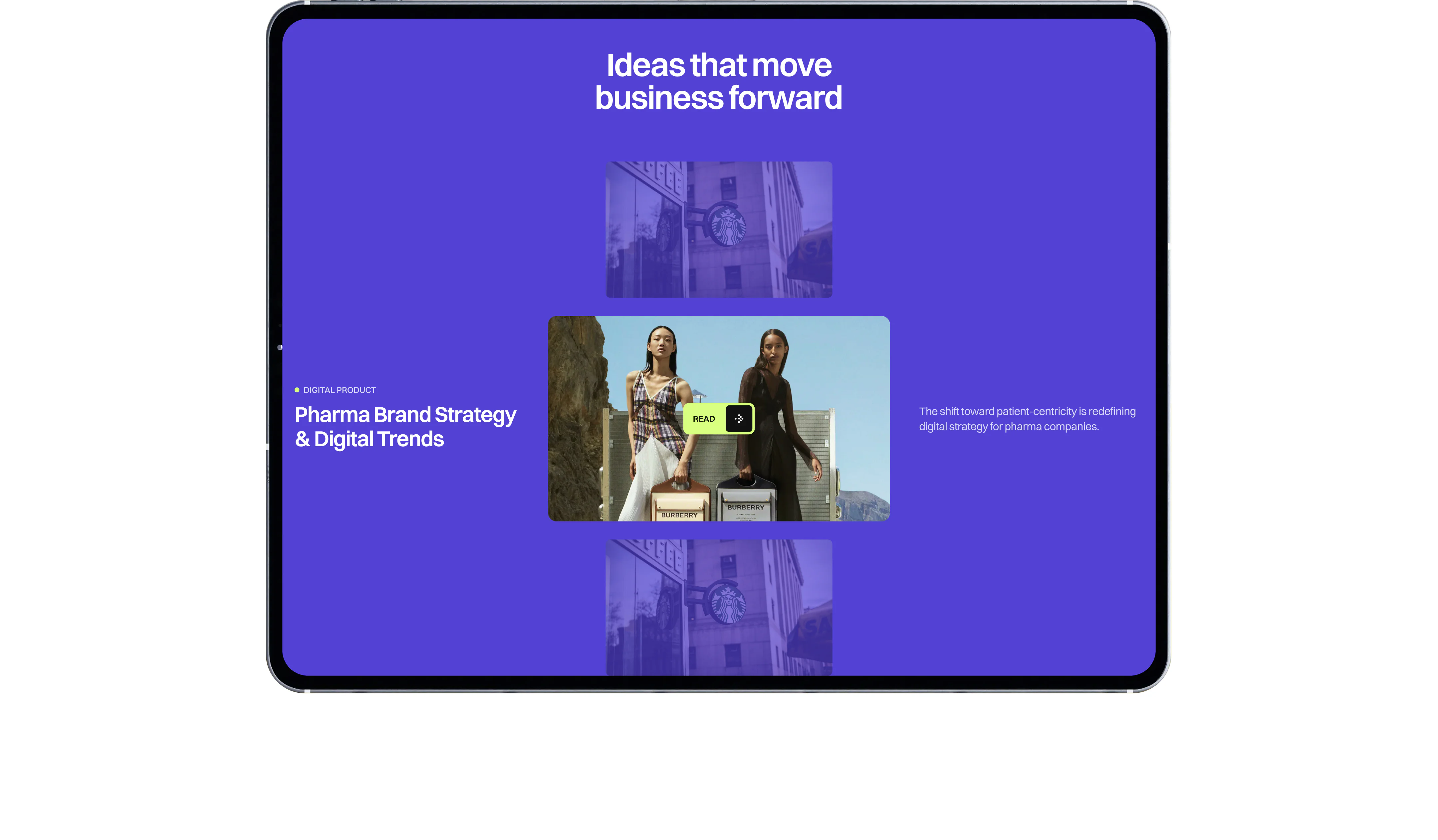
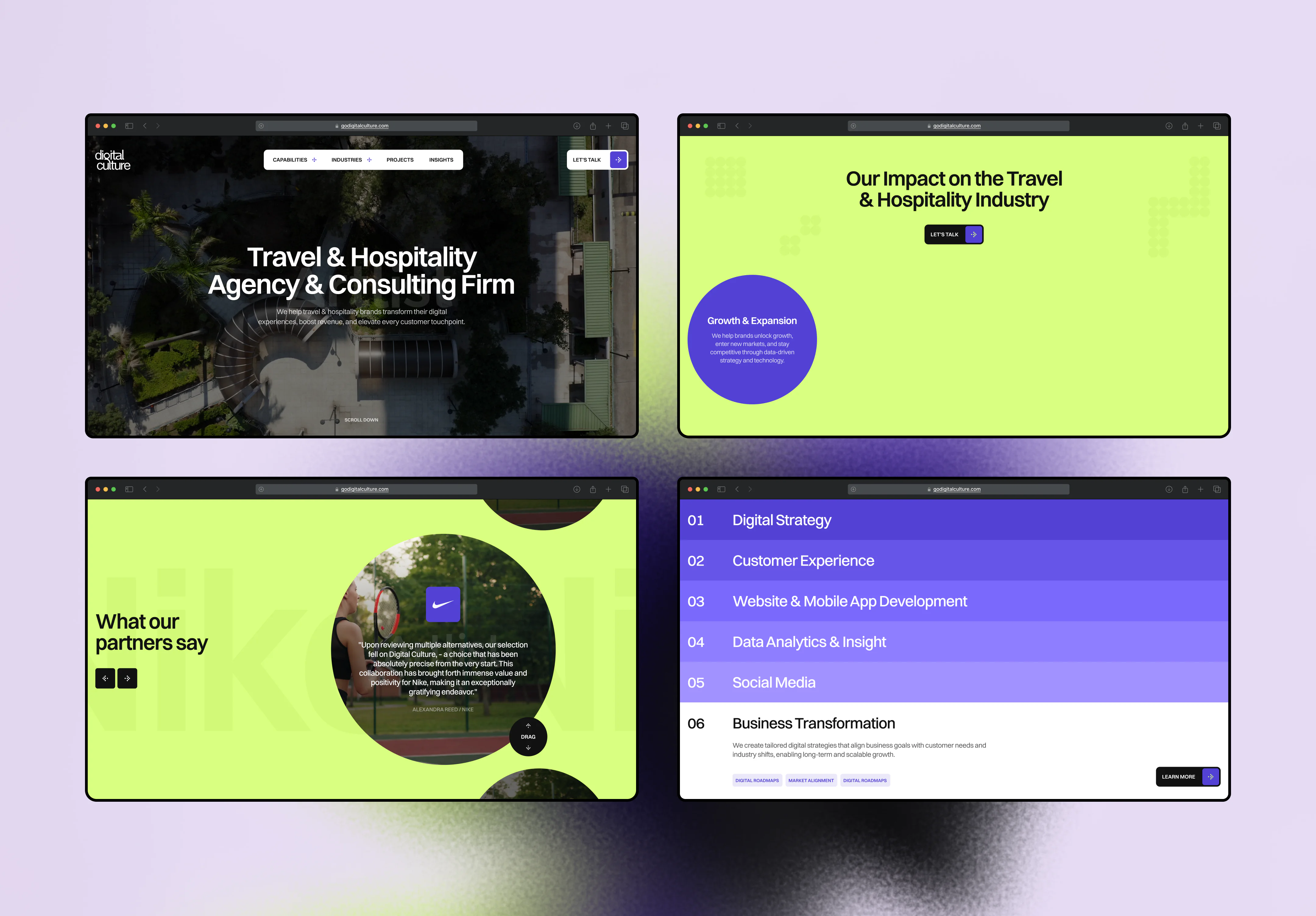
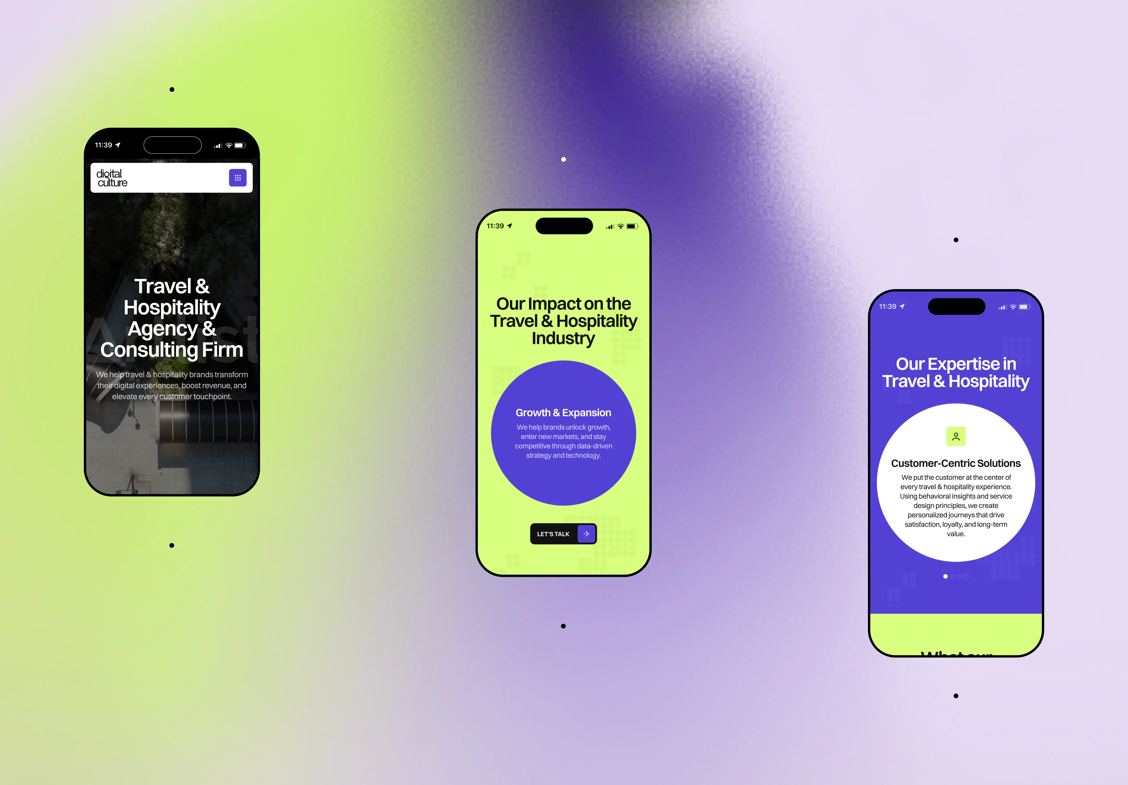
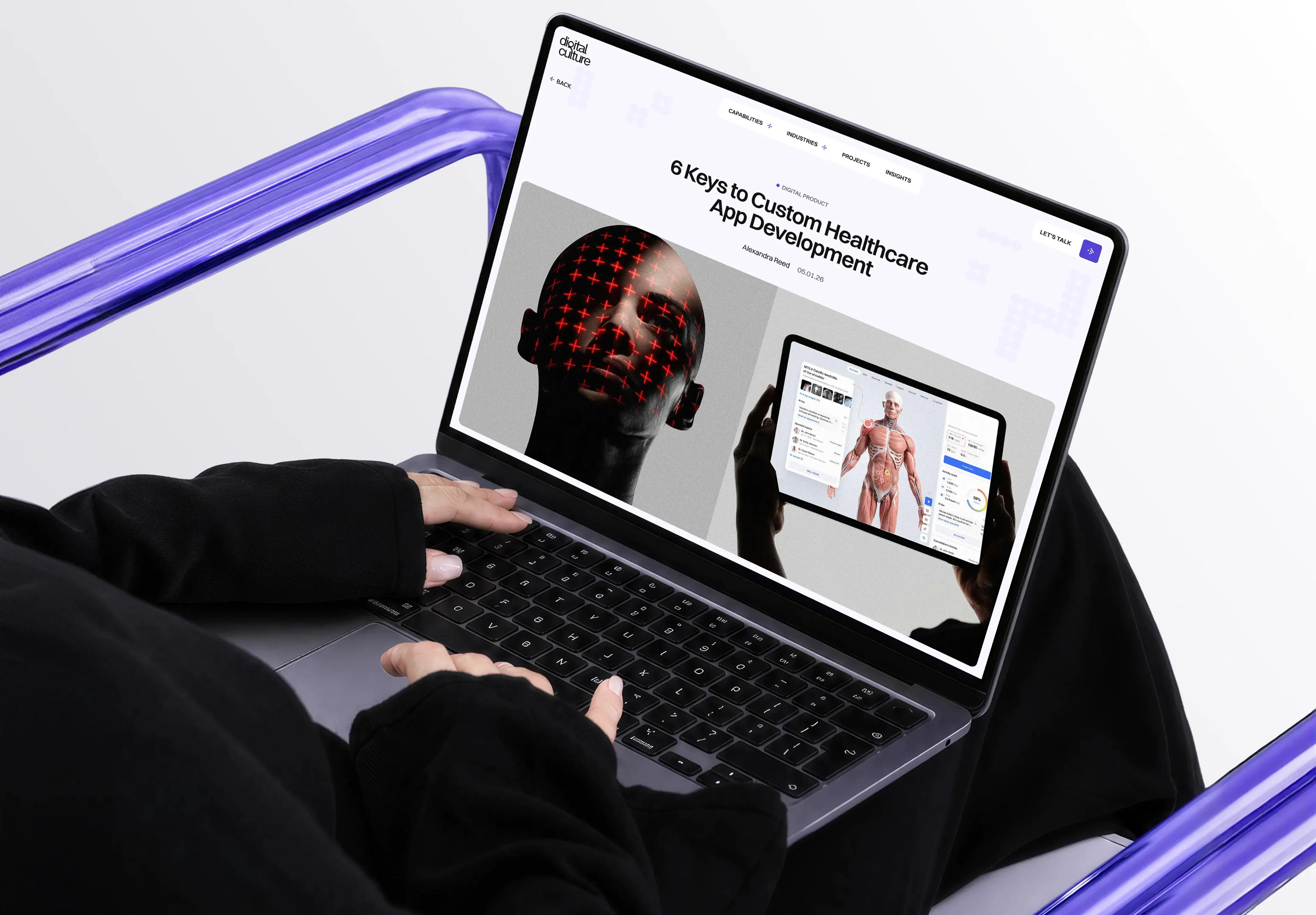
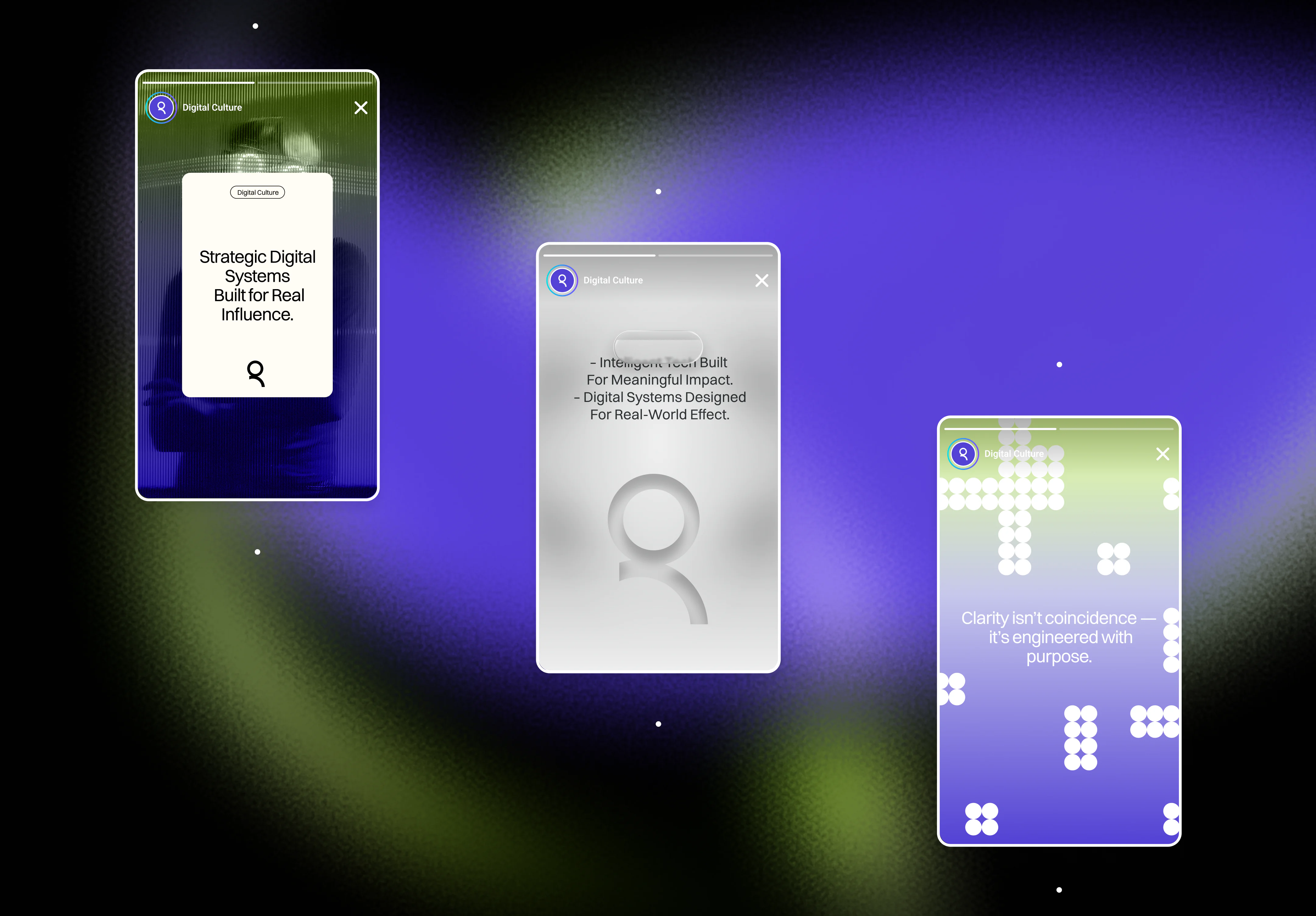
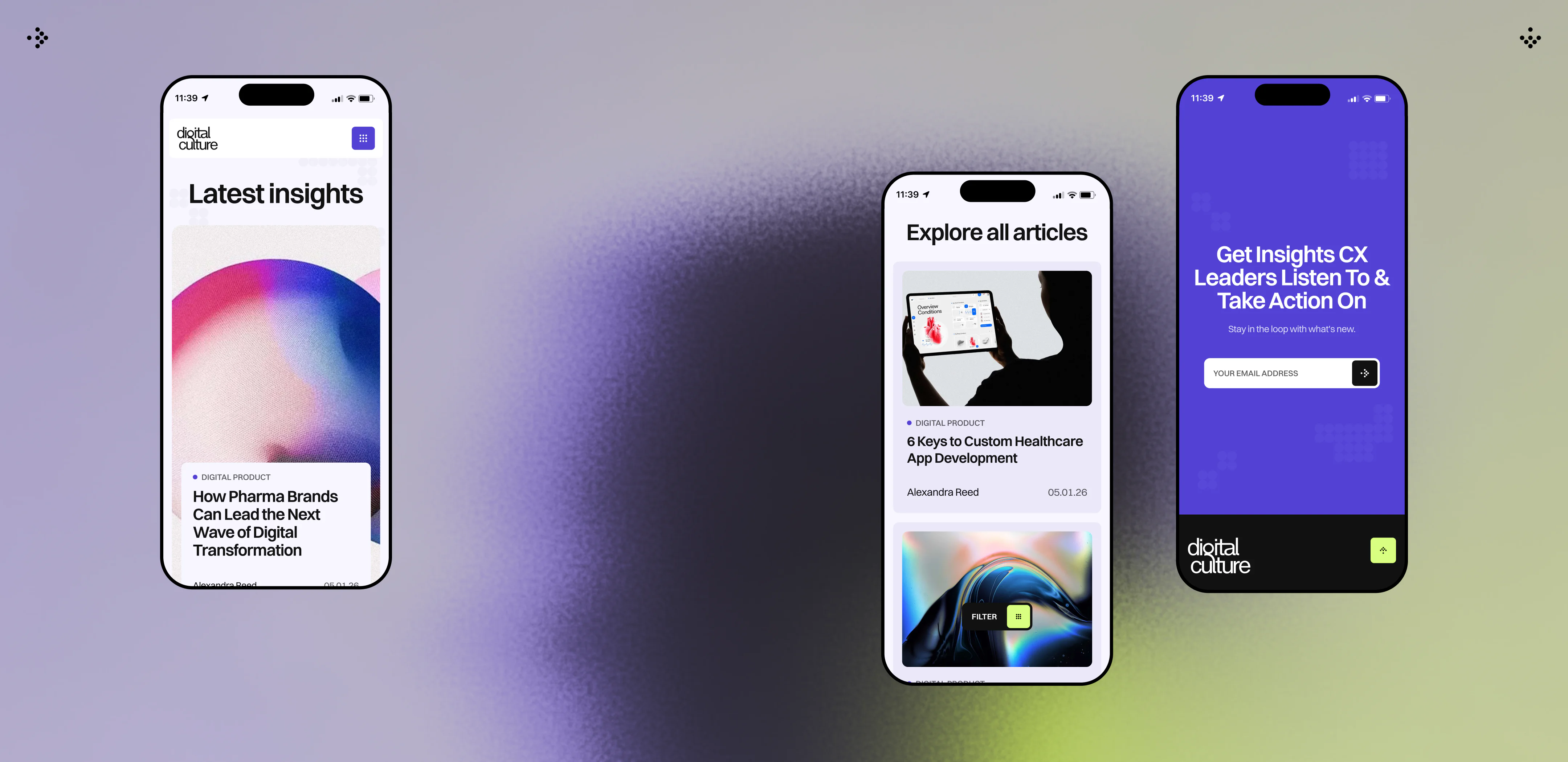
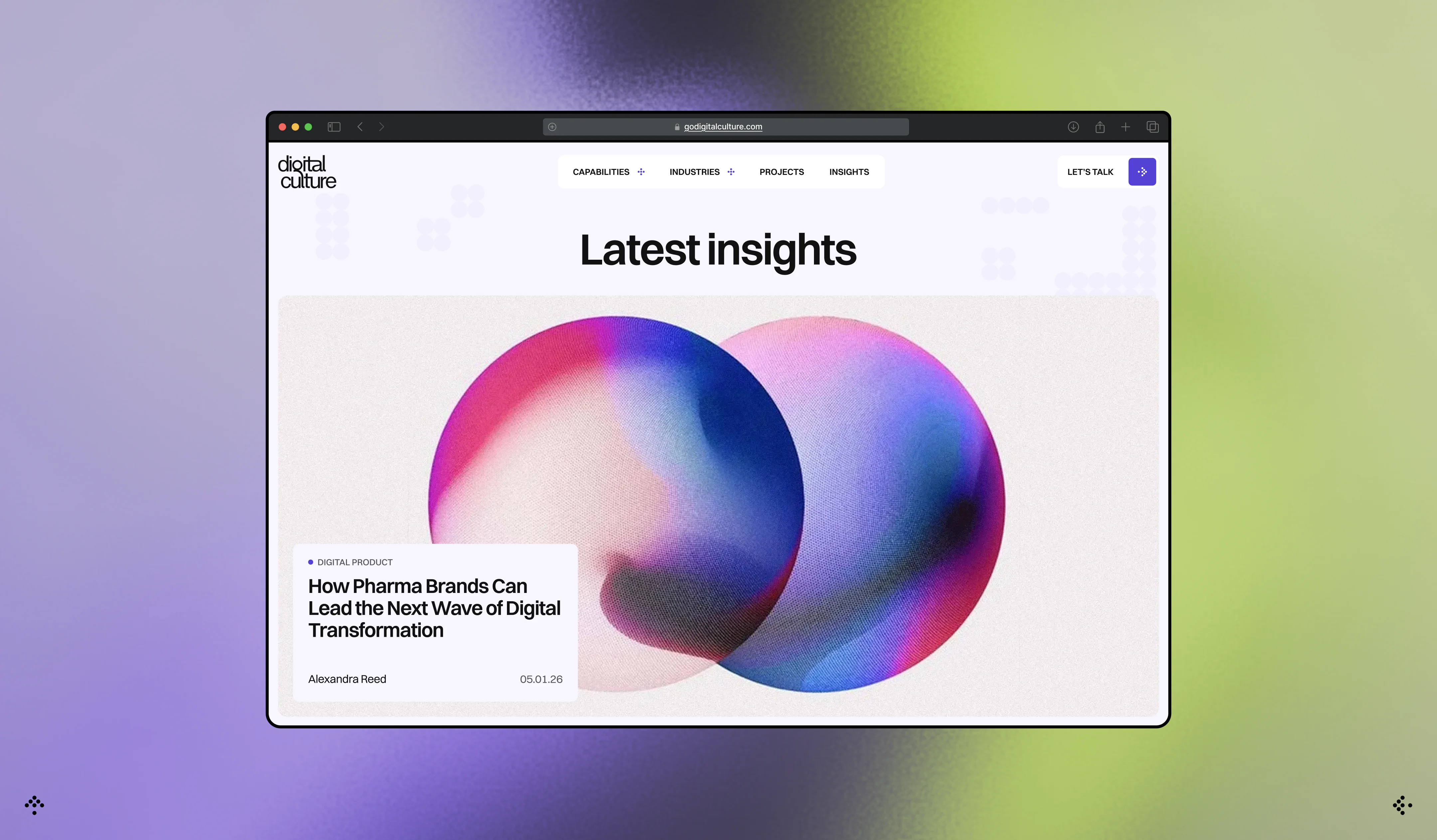
We began with positioning, since without it, any visual solution remains superficial. The new brand identity became modern, understated, and intellectual – it conveys that Digital Culture deeply understands its clients’ businesses and knows how to translate complex ideas into simple, effective solutions. To ensure the brand didn’t remain abstract, we added a human touch: real people, real-life case studies, and direct communication instead of corporate detachment. A dark background, clean lines, and controlled spacing became the visual extension of this logic – every element serves a single idea.
A LIVING SYSTEM, NOT A STATIC
LANDING PAGE
MOTION AS PART OF THE BRAND
WHAT THE CLIENT RECEIVED
Frequently Asked Questions
-
Which agency can handle rebranding, web design, and development for a B2B consulting firm?
VALMAX works with B2B companies that need their positioning, brand identity, website, and development to evolve together. This is especially relevant when the existing website no longer reflects the company’s expertise or when complex services are difficult to communicate clearly to prospective clients.
For Digital Culture, we worked across the full project cycle: positioning, branding, UX/UI design, front-end and back-end development, testing, and launch. The company operates across strategy, brand intelligence, AI, commerce, and product development, so the website had to communicate a broad offering without making the business feel fragmented. We built the brand and digital experience around one clear idea: turning complexity into understandable, effective solutions.
-
How do you redesign a B2B consulting website when the company offers complex services?
The first step is to simplify how the company explains its value before redesigning individual pages. Complex B2B companies often have multiple capabilities, audiences, and service lines, which can make a website feel abstract or overloaded if the information architecture and positioning are not clear.
For Digital Culture, we started with positioning and used it to guide the website structure, messaging, and visual system. Instead of presenting brand, AI, commerce, engineering, and product development as disconnected capabilities, the new experience positions them as parts of one integrated approach. Shorter copy, clear hierarchy, focused sections, case studies, and carefully placed calls to action help visitors understand the company without having to decode the offering themselves.
-
When does a B2B consulting firm need a full rebrand instead of just a website redesign?
A website redesign may be enough when the company’s positioning and visual identity are already strong. A broader rebrand makes more sense when the website problem starts earlier: the company is difficult to differentiate, the brand no longer reflects its current level, or the messaging does not clearly explain why clients should choose it.
Digital Culture faced both problems. Its existing website felt outdated, but the underlying brand also did not communicate the company’s expertise or maturity. We therefore worked on positioning and identity before defining the website direction. That gave the design team a clearer framework for typography, visual hierarchy, imagery, motion, messaging, and interaction instead of treating the redesign as a cosmetic update.
-
How should a B2B consulting website build trust with decision-makers?
A B2B consulting website should make expertise easy to verify. Decision-makers need to understand what the company does, how it approaches complex problems, what kind of work it has delivered, and whether the team feels credible enough to become a long-term partner.
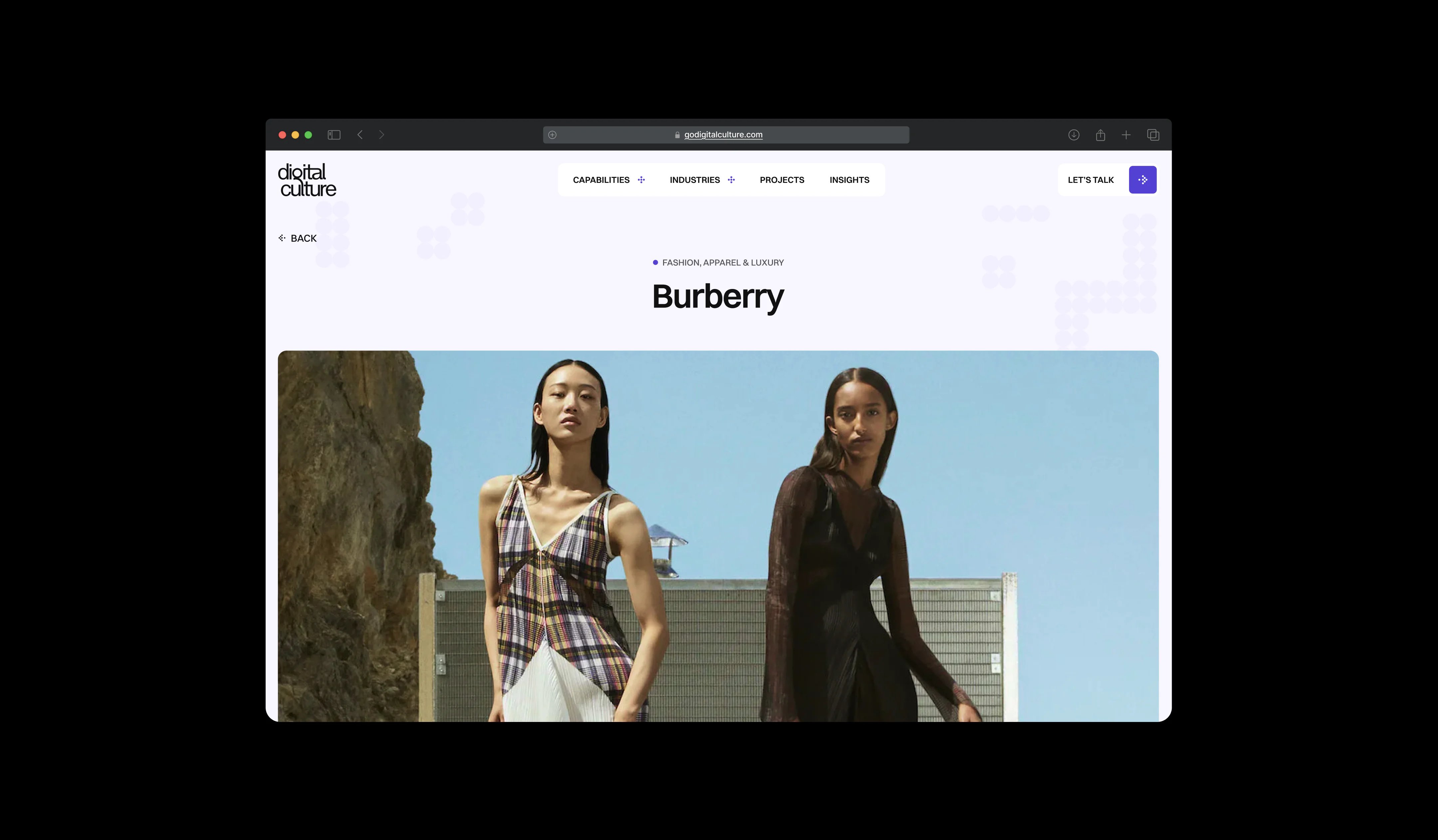
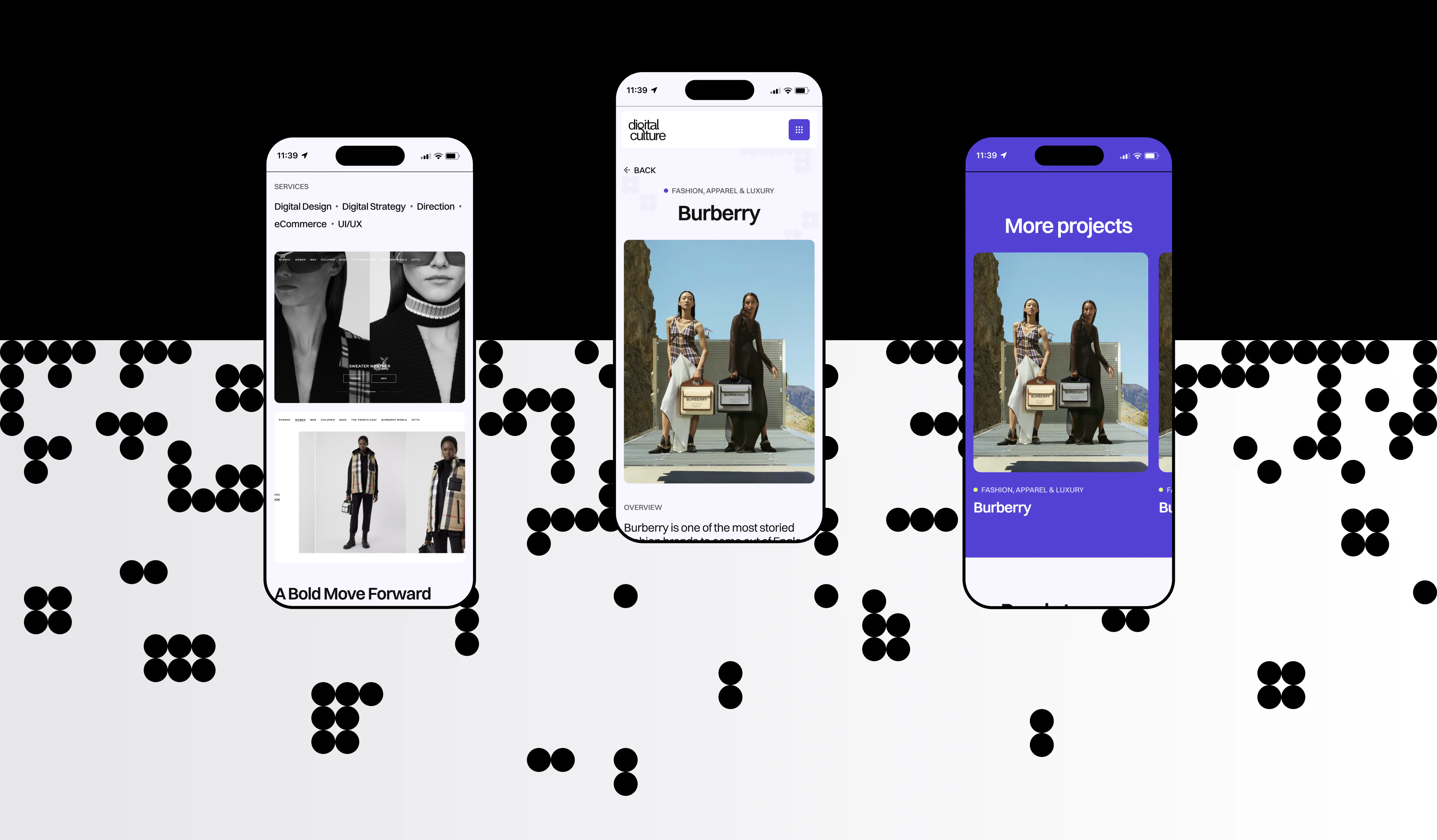
For Digital Culture, we combined clear positioning with real people, case studies, concise service messaging, and direct communication. The visual system supports that message through controlled spacing, large typography, restrained color use, and a consistent interface rather than relying on generic corporate claims. The goal was to give potential clients enough clarity and proof to understand the company’s capabilities before entering a sales conversation.
-
Can an animation-heavy B2B website still be fast and optimized?
Yes, but motion needs to be considered during design and development rather than added at the end. Video, hover effects, gradients, transitions, and micro-animations can increase page weight and processing requirements, so performance has to be part of the implementation from the beginning.
Digital Culture’s website uses motion extensively, including video transitions, hover states, gradient movement, and micro-animations. During development, we focused on keeping these interactions smooth and responsive across devices while maintaining site performance. This allowed the website to feel dynamic without treating animation as separate from the technical requirements of a B2B platform.
-
How do you use motion on a B2B website without making it distracting?
Motion should have a clear role in the user experience. It can guide attention, communicate hierarchy, reinforce positioning, or make transitions easier to understand. When every element moves independently, the interface becomes harder to navigate and the effect quickly loses impact.
For Digital Culture, motion was defined as part of the visual system from the concept stage. Animations, hovers, videos, and gradients follow the same design logic and appear where they support the content. Accent colors and movement are concentrated around case studies, calls to action, and important sections, while the rest of the interface remains restrained. This keeps the site expressive without compromising clarity.