REBRANDING LONGEVITY: CREATING A PREMIUM IDENTITY IN THE SUPPLEMENT MARKET
Healthy aging, cellular regeneration, and NAD: complex science meets the challenge of creating a brand people will remember. In this case, we walk you through the full process, from rebranding to a custom Shopify website design that’s rooted in nature and exudes premium appeal.
Client

Services we provide
-
Location
USA
-
Industry
Wellness
-
Website
-
Timelines
3.5 months
THE SECRET OF LONGEVITY
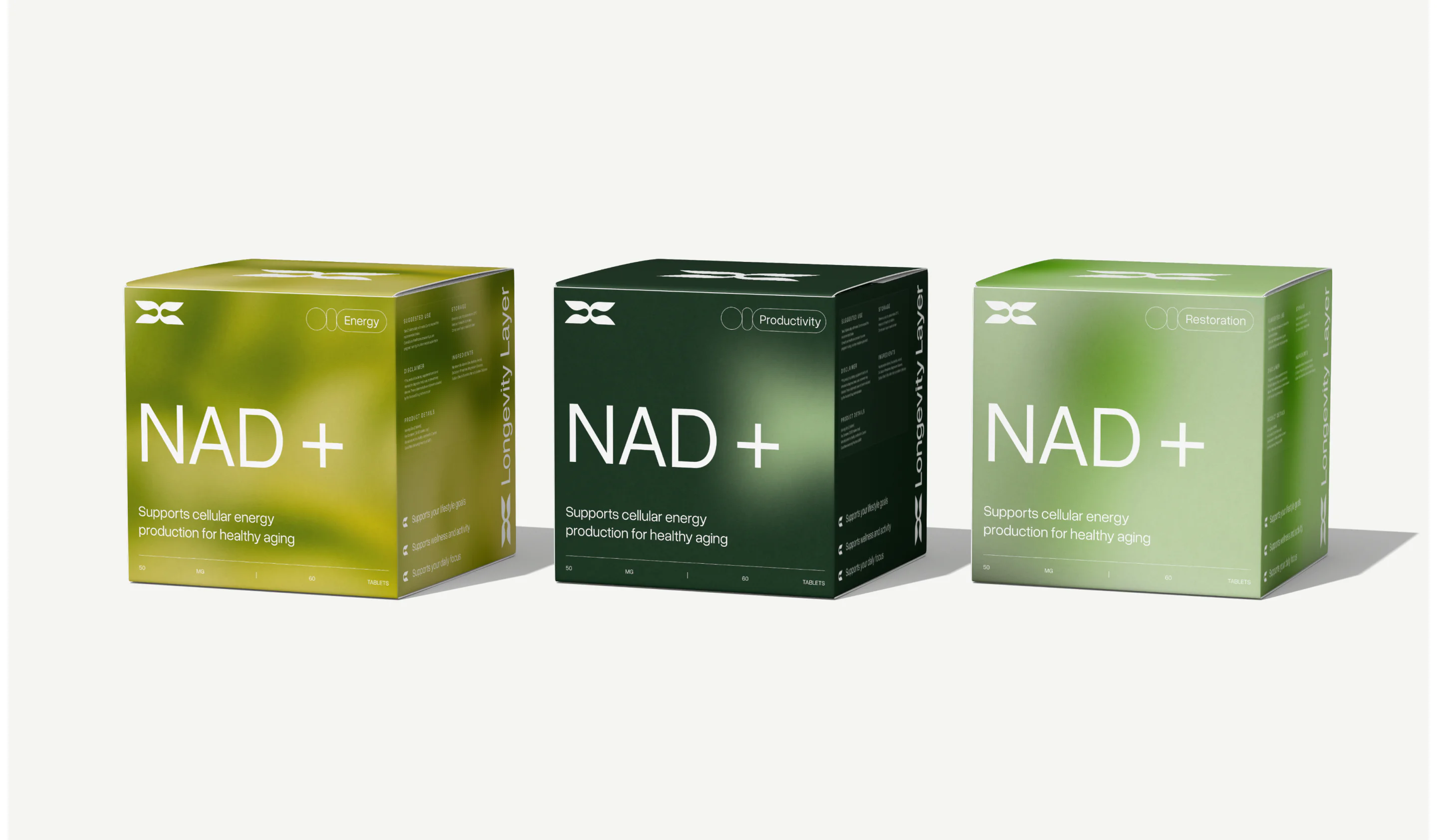
The brand we worked with champions healthy aging through cellular regeneration. The flagship product is a high-concentration NAD supplement (not precursors, but the real compound) designed to support cellular regeneration, energy production, and cognitive clarity.
A BRAND TO REMEMBER
ROOTED IN NATURE
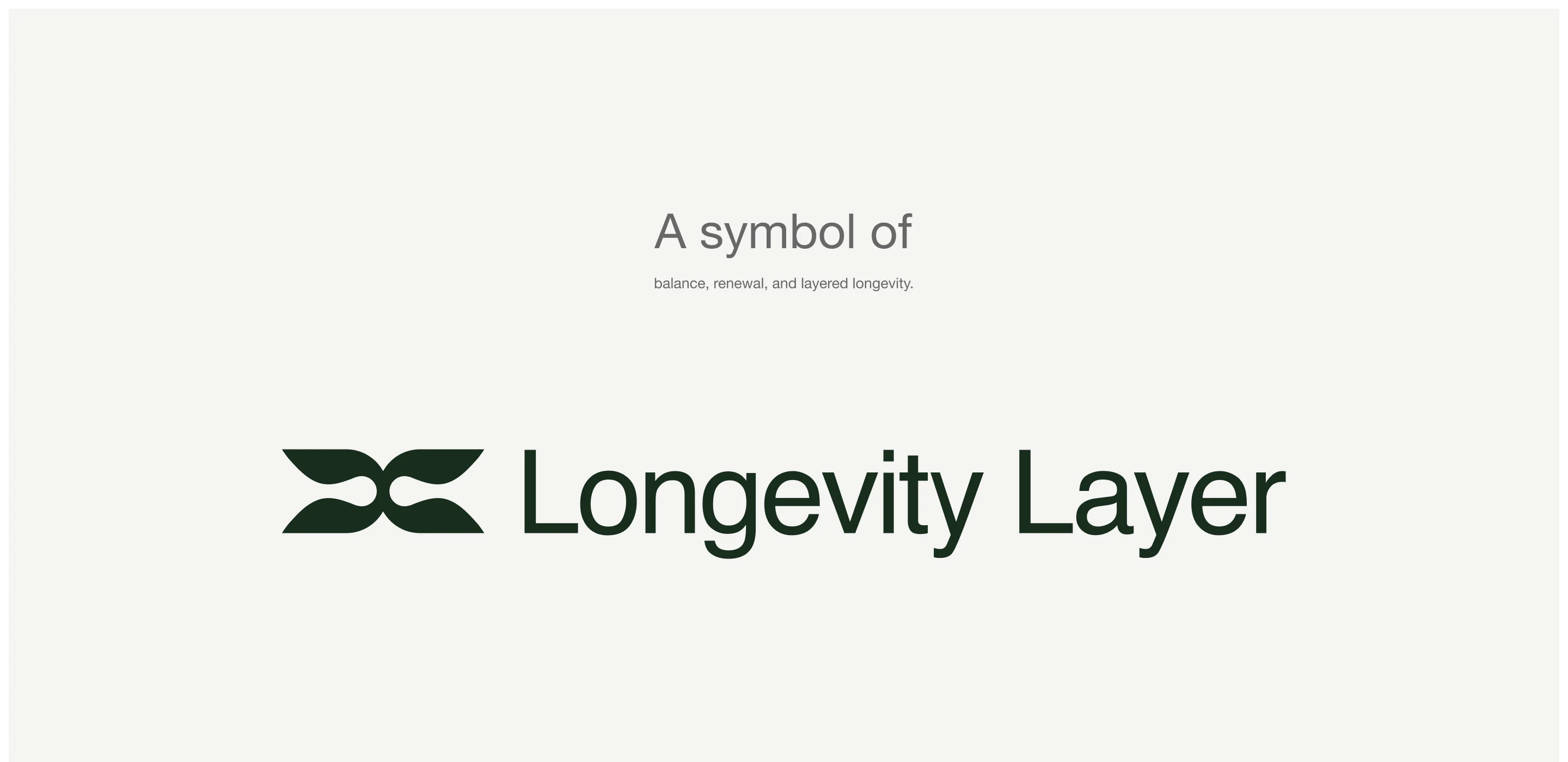
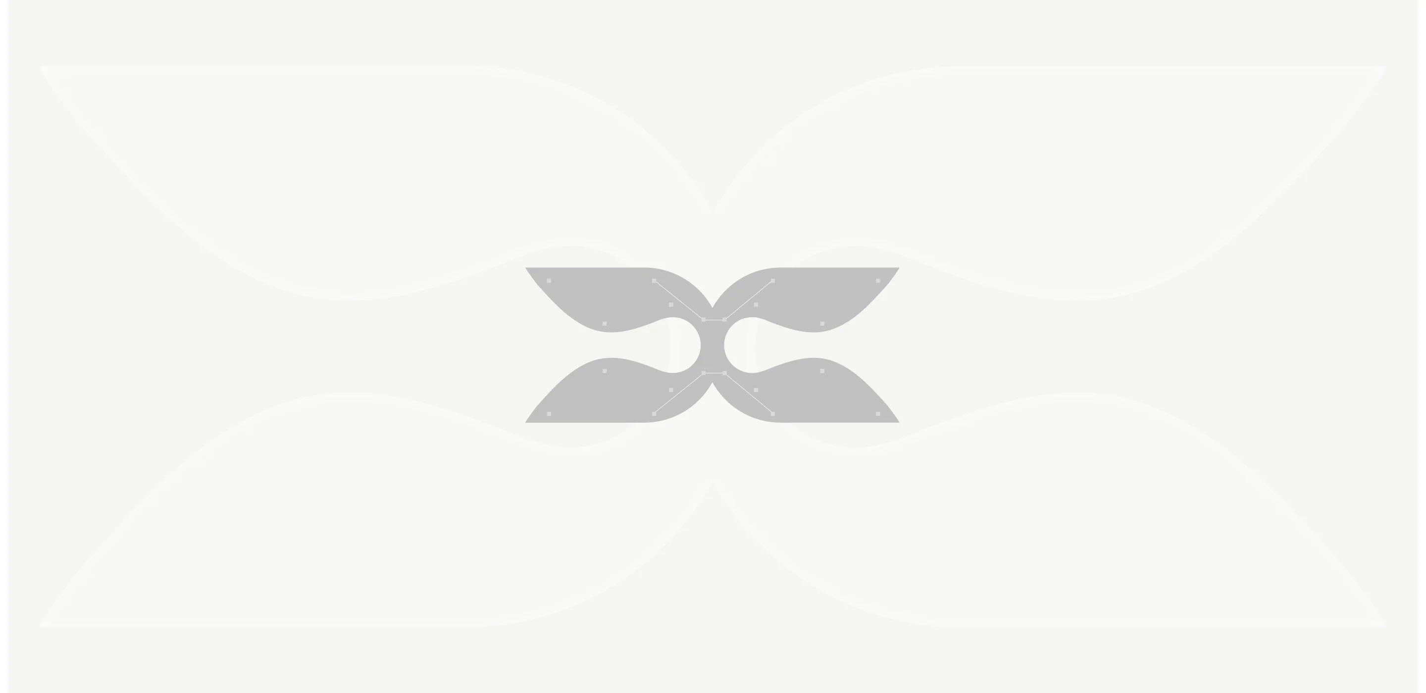
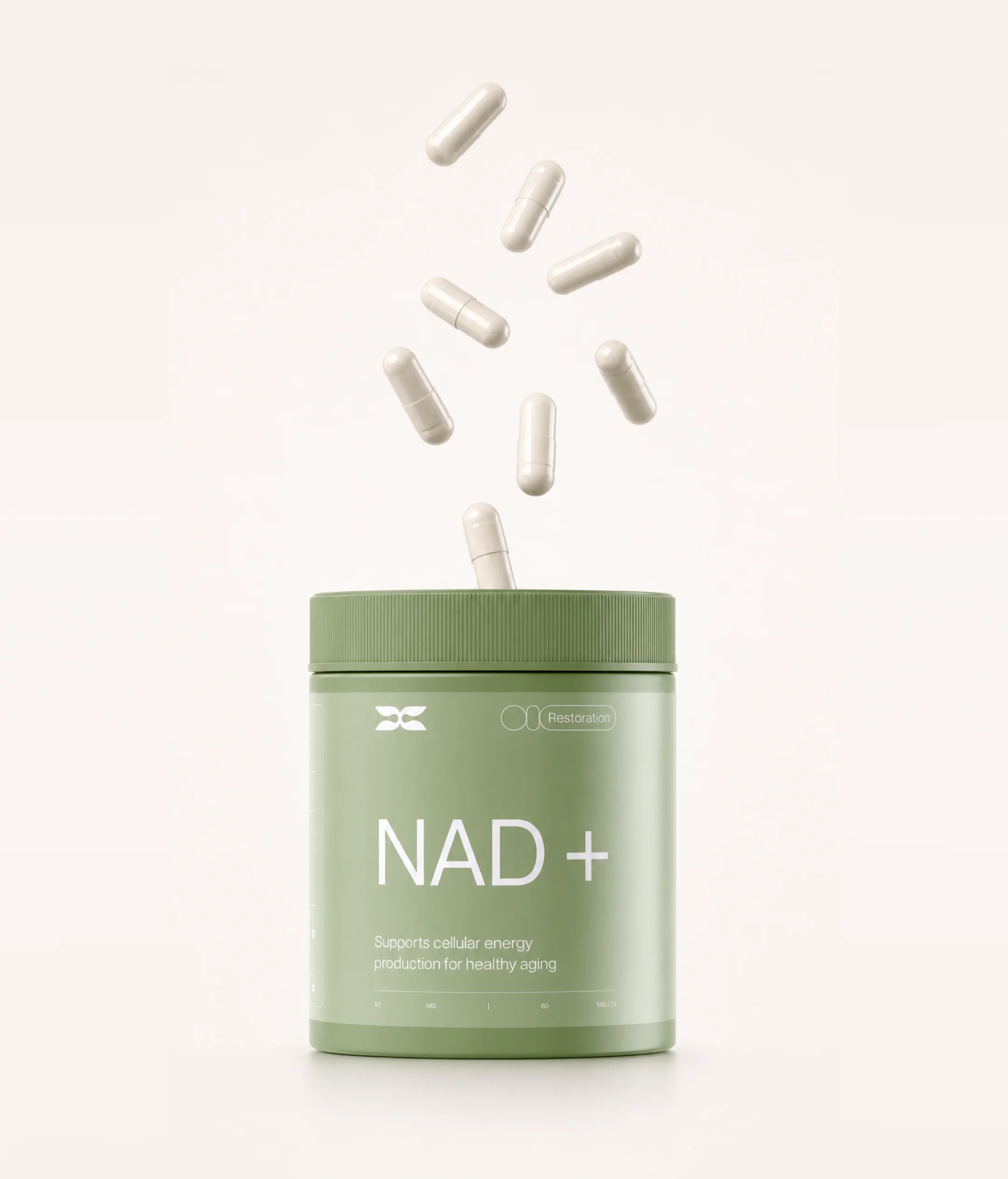
A logo you will remember The client wanted the brand to feel connected to nature, so we began by shaping a moodboard and overall visual direction, and the logo emerged as a natural extension of that work. Its organic shape subtly forms a stylized leaf, the classic symbol of purity, sustainability, and natural origin. At the heart of the composition, two droplet-shaped elements echo the dual benefits of the products, supporting both outward beauty and inner balance. Every curve, every detail communicates the natural origins and multi-layered effects of the brand’s offerings: simple, meaningful, and organic.
DESIGN THAT CONVERTS, FEELS PREMIUM, AND EDUCATES
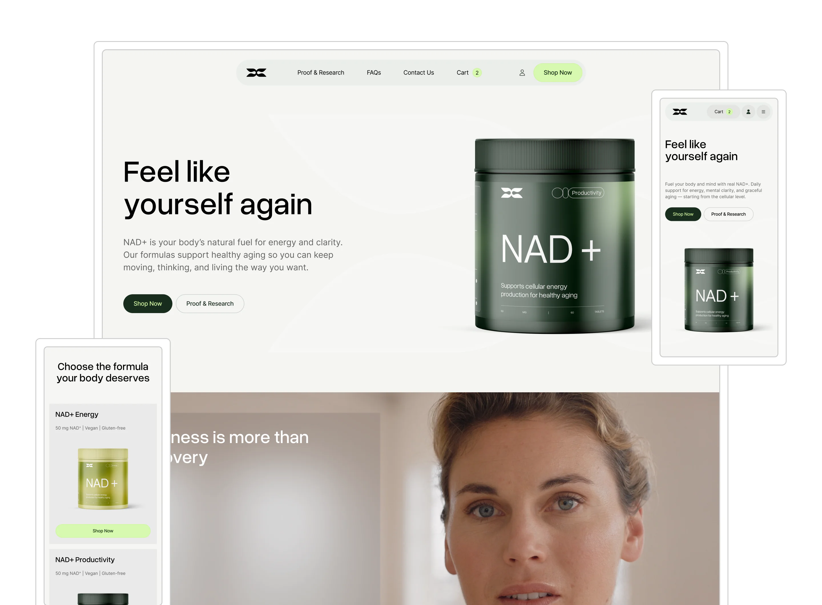
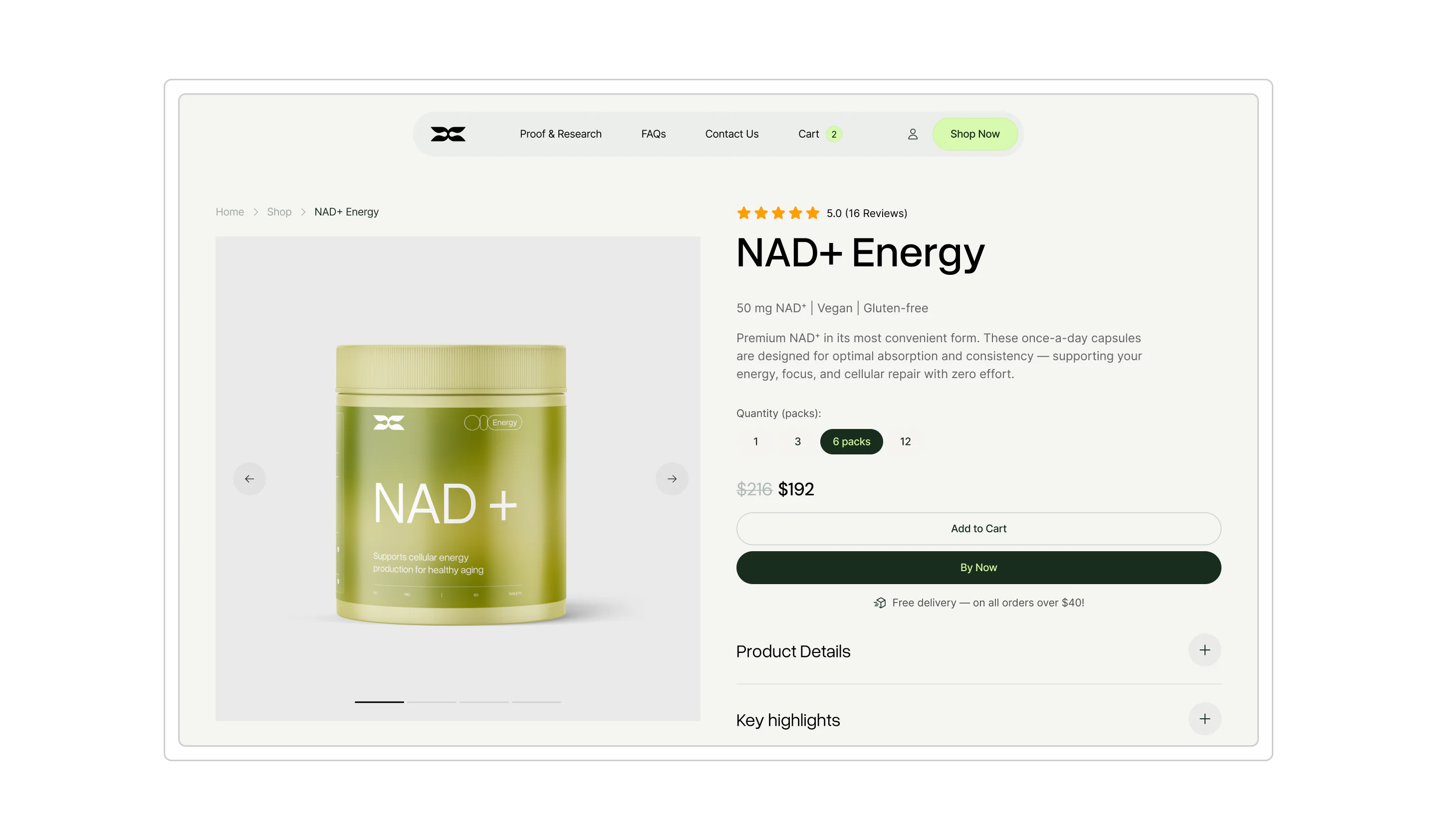
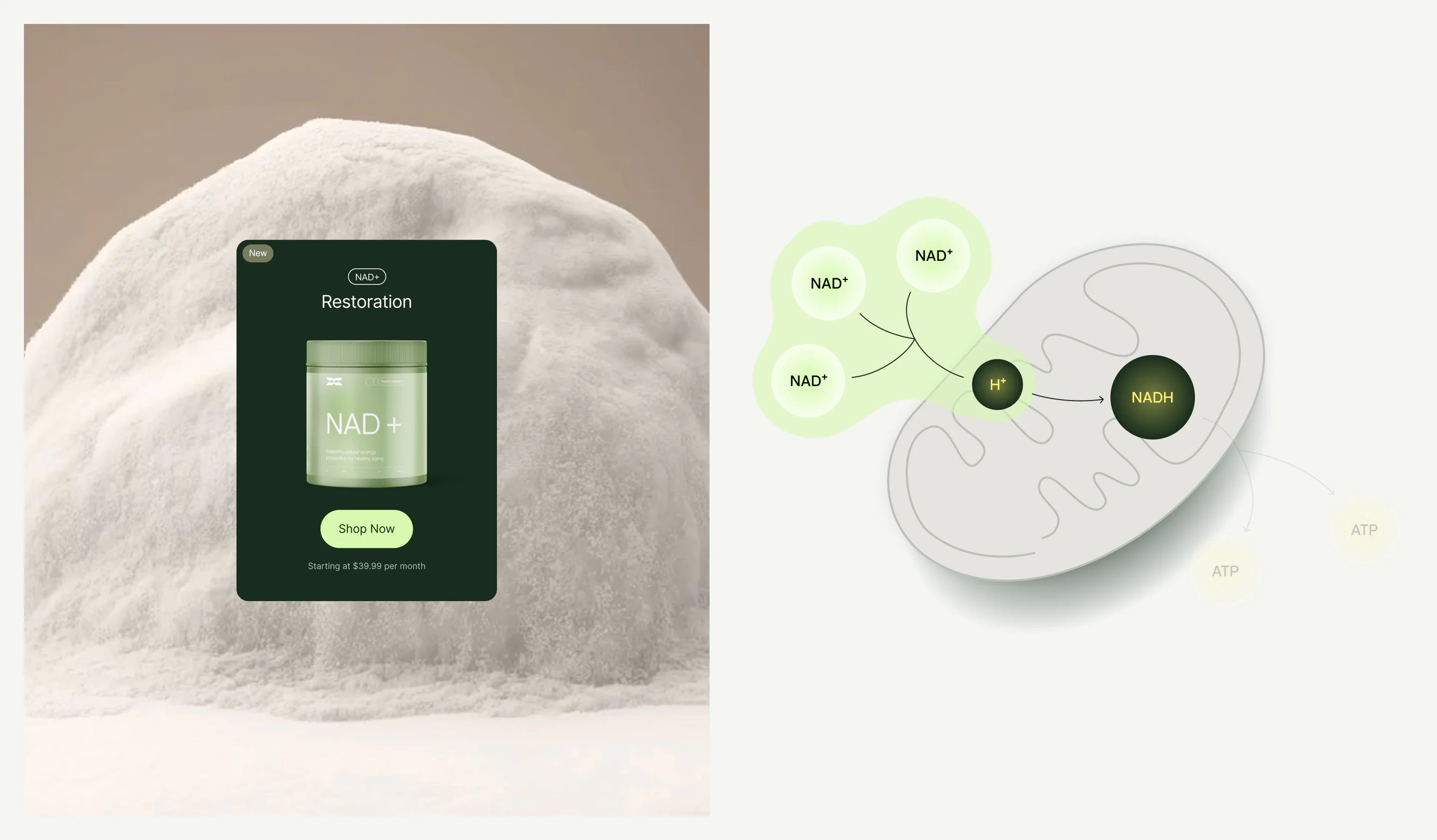
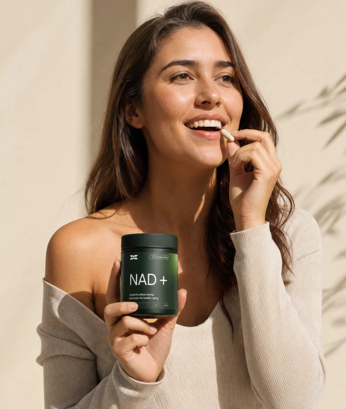
On the UI/UX side, we built around three priorities: conversion, education, and premium feel. We guide users toward action, with key CTAs ensuring the website converts while staying elegant. To reflect the brand’s premium nature, we leaned on soft colors and subtle transparency effects, creating an airy, refined atmosphere. At the same time, the content and interface work together to introduce users to NAD, explaining its role in the body and why supplementation matters, all without ever feeling overwhelming.
EXPERIENCE SHOPIFY
This project is powered by a fully custom Shopify build. It gives the client a reliable foundation for managing products, orders, and content, while the design system turns the storefront into a brand experience. Fully custom, built around the identity rather than adapted from a template.
SETTING THE STAGE
The brand now has a clear identity, a functional eCommerce platform, and a visual language that supports long-term growth. The foundation is in place for future NAD product launches and the broader expansion of the company’s wellness ventures.
Frequently Asked Questions
-
How do you rebrand a supplement company to feel premium and science-backed?
Premium positioning in supplements requires resolving a real tension: the science has to be credible, but the brand can’t feel clinical or cold. The approach that works is rooting the identity in nature rather than in a lab: organic shapes, soft palettes, and visual metaphors that connect the science to something people already trust. For a US-based NAD supplement brand, VALMAX — a web design and branding agency, built the entire identity around natural origin and cellular benefit, starting with a logo whose shape subtly forms a leaf while its inner elements echo the dual effects of the product. The result is a brand that feels premium without distancing itself from the people it’s trying to reach.
-
How do you design packaging for a premium supplement brand?
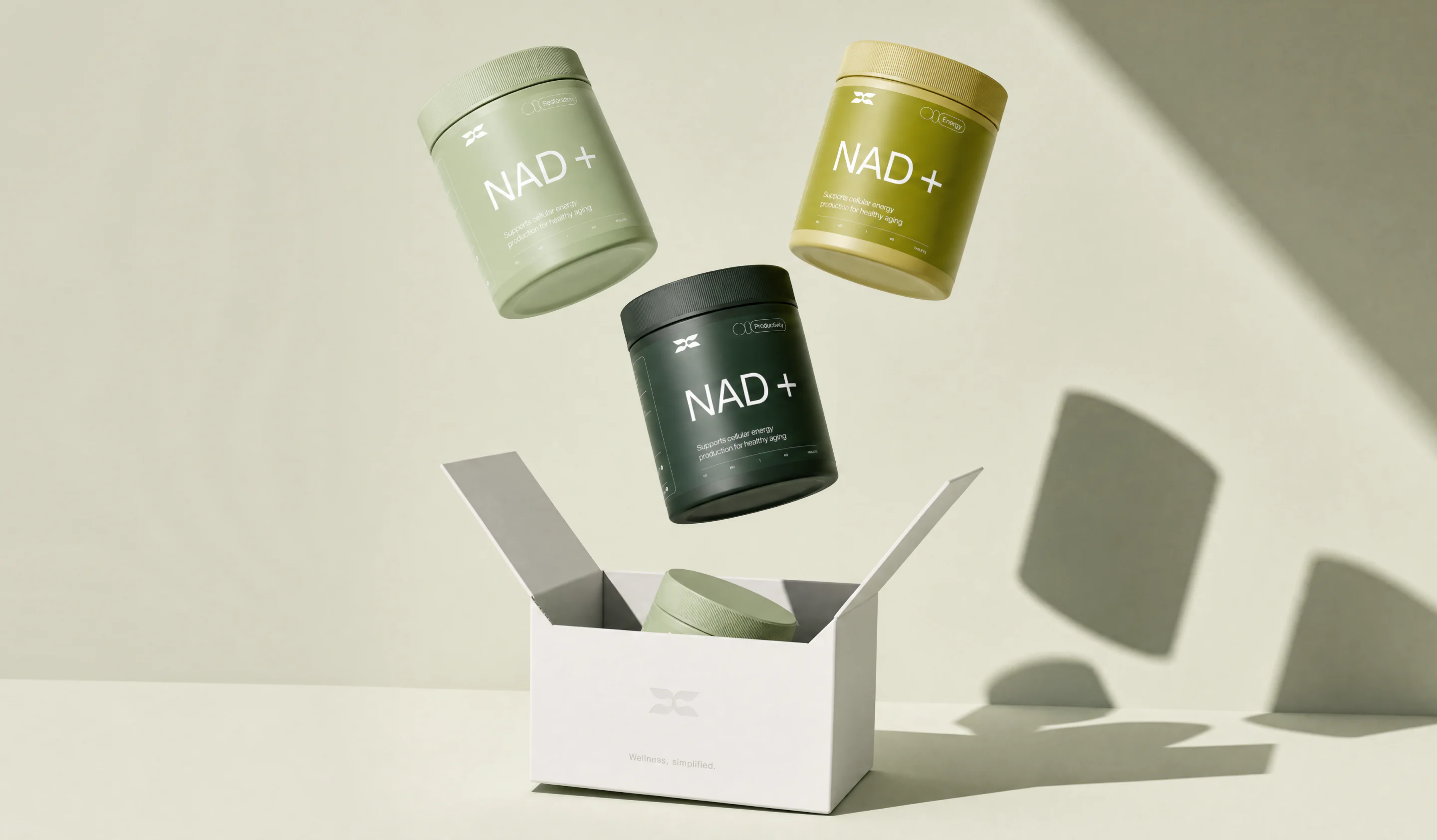
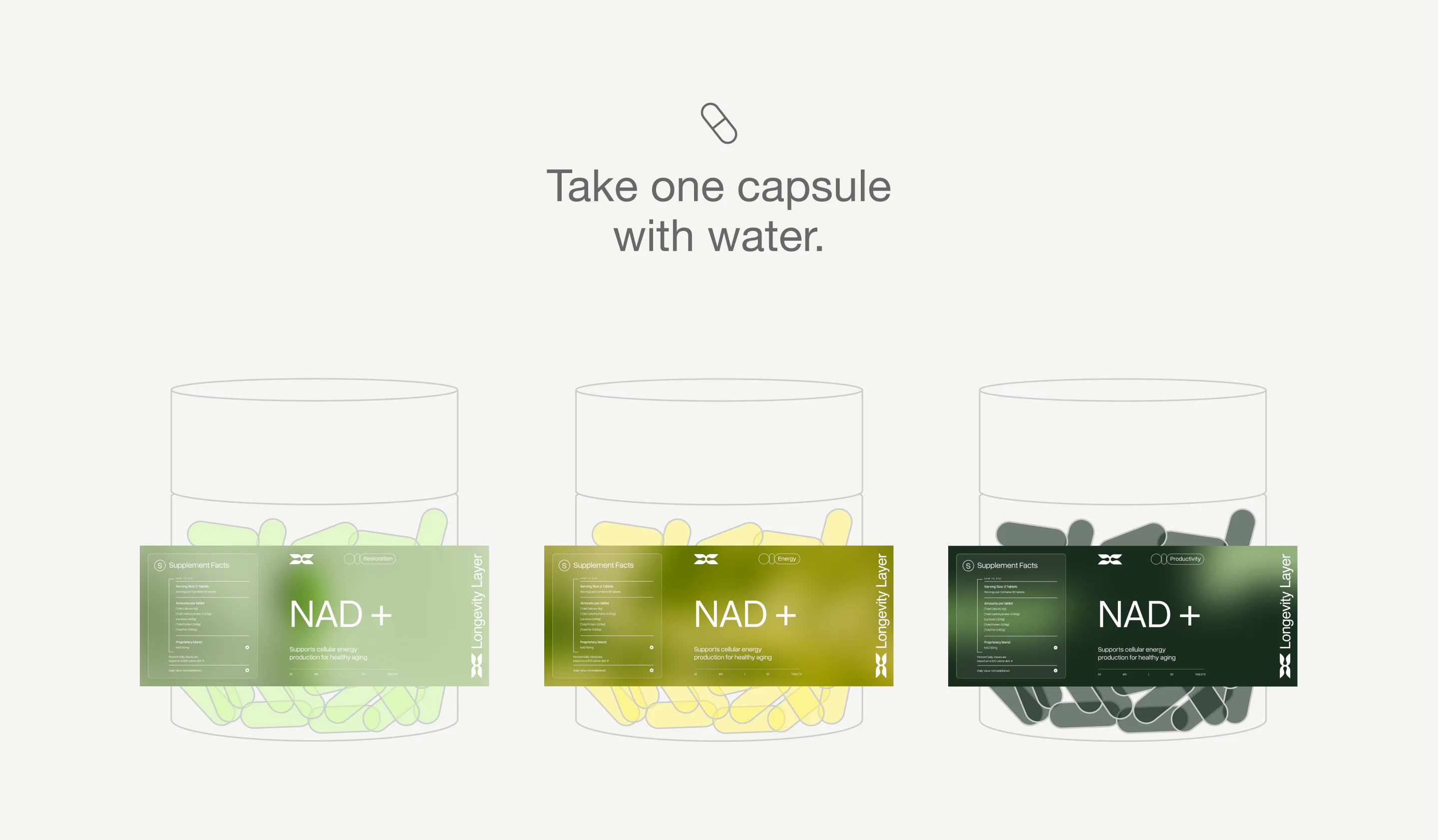
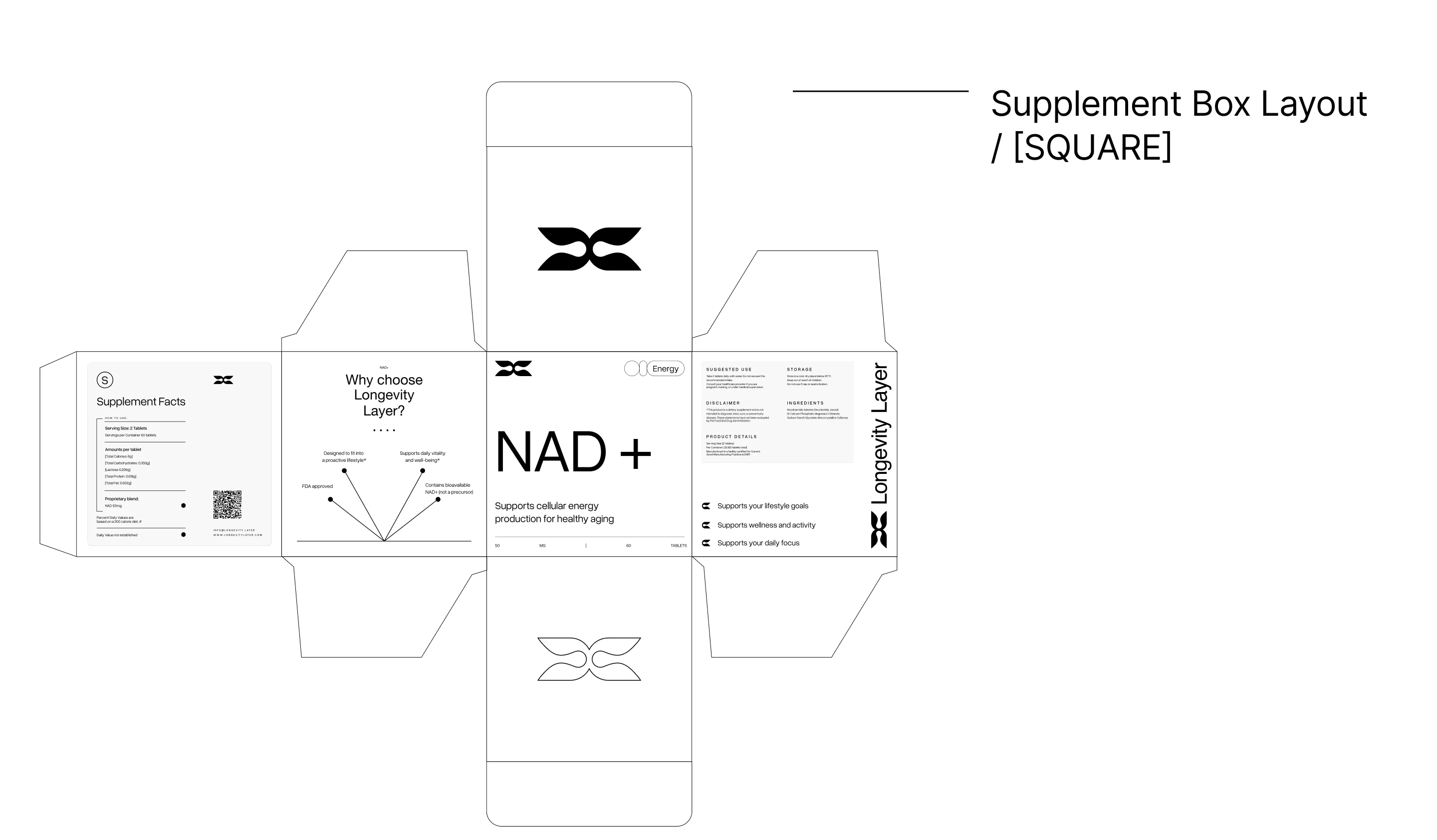
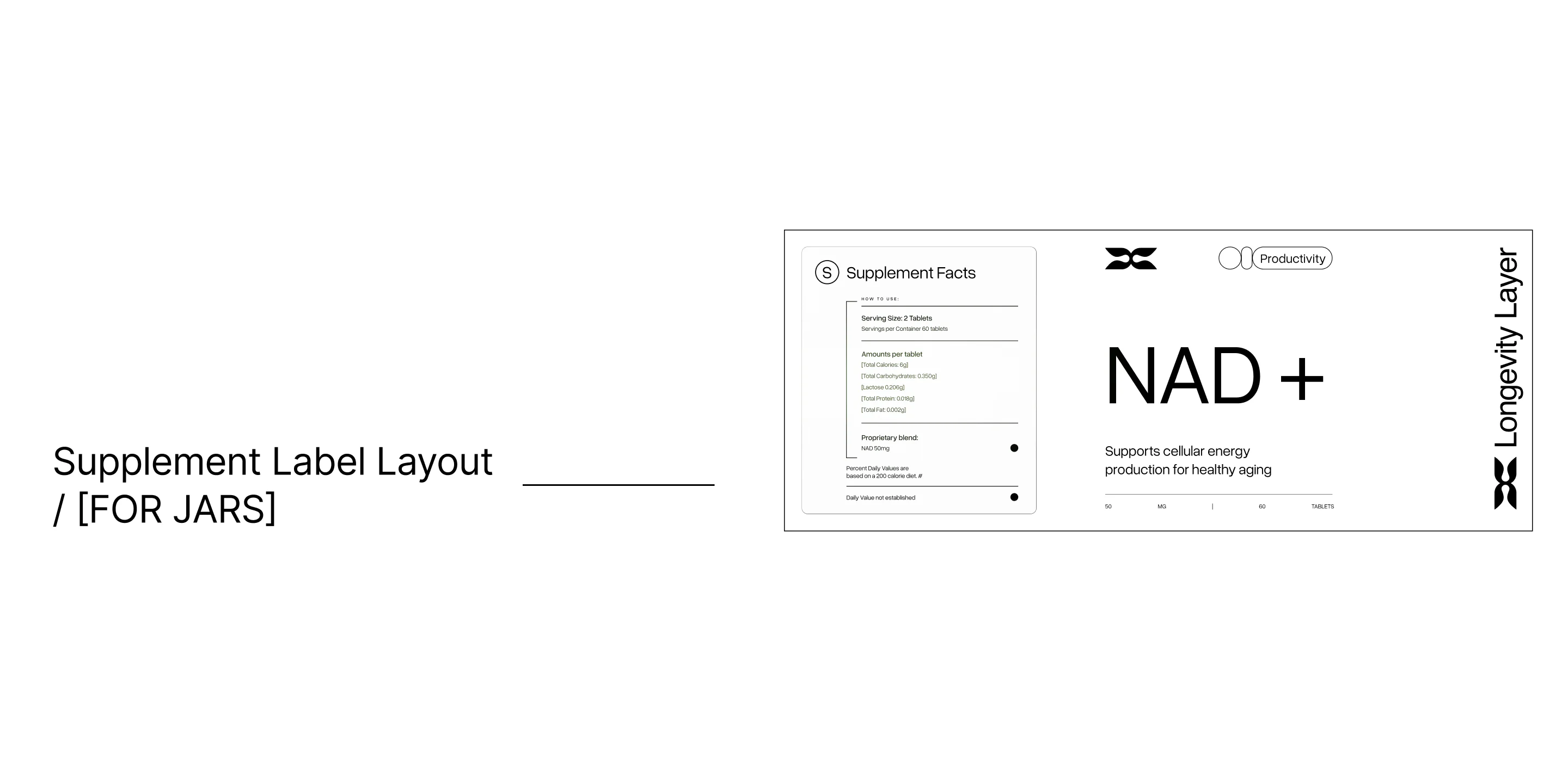
Supplement packaging at the premium end earns its price point through restraint: fewer elements, more considered materials, and a visual language that doesn’t compete with the product. For a cellular health brand rooted in natural ingredients, that means organic shapes, soft naturalistic palettes, and a logo system with enough detail to reward close inspection. Packaging is also the first place a new brand identity gets tested in the real world, which is why it was developed alongside the logo rather than after it, so both assets developed from the same visual logic.
-
How long does a supplement brand rebrand and Shopify launch take?
A full-scope engagement covering brand identity, packaging, UI/UX design, and a custom Shopify build typically runs 3 to 5 months, depending on the number of SKUs, integration requirements, and how much of the brand strategy is already defined. For this NAD supplement brand, which included a new logo, brand guide, packaging, and a fully custom Shopify storefront, the timeline from brief to launch was 3.5 months.
-
What does a full wellness brand rebrand include?
A full rebrand in the wellness space typically covers brand strategy and positioning, a new visual identity (logo, color system, typography), a brand guide for consistent application, packaging design, and a redesigned digital presence. For this NAD supplement brand, the sequence was deliberate: brand guide and packaging came first, then UI/UX design, then a fully custom Shopify build, so that the website was never adapted to the brand as an afterthought, but built as an expression of it from the ground up.
-
How do you market a supplement with complex science to a general audience?
The rule is: simplify the mechanism, amplify the benefit. NAD is not a household term, so the site can’t assume prior knowledge. The UX is built to educate in sequence, introducing what NAD is, why it matters for cellular energy and aging, and how this product differs from precursor-based alternatives, all before making a commercial ask. The key is that education never feels like a lecture: it’s woven into the visual experience through design, motion, and content hierarchy, so a visitor absorbs it while scrolling rather than reading a white paper.