
April was a productive month at VALMAX. We released ten Dribbble shots across six industries — real estate, fintech, travel, fitness, productivity, and logistics. Each project reflects a brief archetype we work with regularly: a specific product type, a specific user problem, a specific design challenge that repeats across clients in the US, Europe, and the Middle East.
This is a walkthrough of each project and the reasoning behind the decisions we made.
1. Real Estate Branding Design
In real estate, visual differentiation has become increasingly difficult because most brands rely on the same set of stylistic choices. Dark palettes, refined typography, and polished imagery create a familiar look that signals credibility but also reduces distinction across the market.
This project approaches the problem from a different angle by focusing on structure rather than appearance. The identity is built on typographic hierarchy and spatial proportion, which allows it to function consistently across listings, presentations, signage, and digital interfaces without requiring constant redesign. Instead of adapting the brand to each medium, the system remains stable and predictable wherever it appears.
For companies operating across multiple regions, especially in North America and the Gulf, this kind of consistency becomes more valuable than any individual visual decision, because it reduces friction between touchpoints and strengthens recognition over time.
At VALMAX, brand identity systems are developed with interface logic in mind from the beginning, which allows them to extend naturally into product environments.

2. Productivity App Landing Page
In the productivity category, users rarely arrive without a point of comparison. They are evaluating whether switching tools is worth the effort, which makes the explanation less effective than the demonstration.
The landing page reflects this by presenting the interface in context rather than as a collection of isolated screens. Visitors see how a session runs, how tasks are organized, and how the workflow behaves in practice. This allows them to understand the product without having to translate features into use cases.
The structure progresses through recognition, differentiation, and action, with each section addressing a specific point of hesitation. Instead of building a narrative around the product, the page allows the product to explain itself through use.

3. Fintech Website Design
A fintech website carries more weight than most product websites. Users arriving at a financial platform are evaluating trust before they evaluate features. The design has to handle both jobs in the same screen.
In this fintech web design, the first screen positions the product through interface previews rather than marketing copy. Users see how the platform works before reading a single feature description. That sequence shows first, explains second, and reduces the skepticism that financial products typically face from first-time visitors.
The page architecture moves from product clarity to social proof to conversion. For fintech products serving users in the US, UK, or UAE, leading with the interface rather than a feature list tends to close the trust gap faster than copy alone can.

4. Mobile App Design for Fitness and Health
Health and fitness mobile app design succeeds on habit. A user who finds friction at the entry point will skip the app on the days when consistency matters most.
This daily check-in interface is organized around minimal input. The opening screen shows what the user needs to log today. Logging takes two or three taps. Progress feedback is visible and proportionate: enough to reinforce the habit without demanding attention.
Fitness apps built for daily use differ structurally from tools accessed occasionally. The interface has to make showing up feel easy, because the product’s value compounds with frequency.

5. Dashboard Design for Travel Platform
Travel operations generate a constant stream of updates. Delays, bookings, availability, and pricing shift throughout the day.
This dashboard is built to keep that flow under control. The structure highlights changes and exceptions, allowing teams to react quickly without reviewing the full dataset each time. Information is layered so that routine metrics stay in the background, while anything unstable stands out immediately.
The interface works as a control layer over ongoing processes. It supports monitoring, coordination, and fast adjustments across multiple properties.

6. Dashboard UI for a Logistics Platform
Logistics dashboard design operates under different stakes than most product categories. A missed delay or an unacknowledged exception has direct cost consequences. The interface cannot bury critical information behind routine data.
CargoTrack is structured around exception visibility. Shipment delays, status anomalies, and flagged routes appear in positions that draw immediate attention. Active freight and routine status updates occupy a secondary layer always accessible, never intrusive.
For enterprise operations teams, this hierarchy is non-negotiable. Teams need to assess system health in seconds and act on specific problems without working through noise.

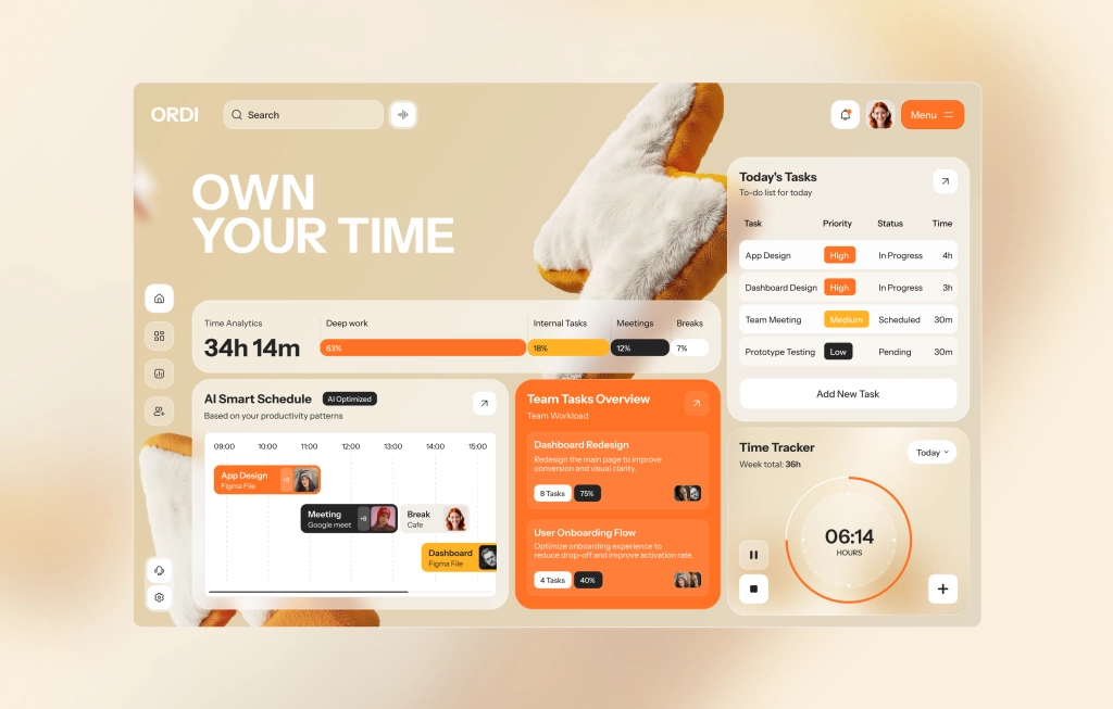
7. Productivity App Dashboard
Desktop productivity dashboard design has a surface area problem. More screen space creates pressure to show more information. The better decision is almost always to show less, structured well.
The ORDI dashboard is organized around the primary workflow: setting a session, running it, and reviewing output. Analytics appear as context, not as the main event. A user can open the app, start a focus block, and get back to work without navigating through a report.
For SaaS dashboard UI design in productivity tools, restraint in layout is a feature. Users open the app to manage their time, not to manage the app.
8. Mobile App Design for Travel Platform
Even within the same industry, the logic of an interface depends on the specific task the user is trying to complete.
TravelFlow is designed around planning rather than management, which shifts the structure from sequence comparison. Instead of browsing options, users build an itinerary step by step, and the interface supports that progression by guiding attention through a timeline.
The visual language remains light and unobtrusive, allowing the structure to carry the experience. This makes the product feel like a tool for organizing a journey rather than a catalog of choices. The difference from a management-focused interface is intentional: planning has optionality, management has tasks. The layout reflects that.

9. Productivity Mobile App
Taking a desktop productivity tool to mobile means deciding what stays and what goes. ORDI on mobile is not a compressed version of the dashboard; it is a purpose-built interface for the one thing users want from their phone: starting and tracking a focus session.
The timer is in the center of the screen. Session context: current task, type, elapsed time, surrounds it without competing. When a session is running, the interface steps back. When the user needs to act, controls are immediately available.
Mobile productivity app design built around a single primary action performs better than a desktop layout scaled down to a smaller screen.

10. Mobile App Design for Travel Platform
Once the trip starts, the planning interface becomes the wrong tool. Users aren’t weighing options anymore; they need to find a confirmation number, check a check-in time, or request something from the hotel. The scope is narrow, and the need is immediate.
This interface focuses on access. Booking details, check-in, and services are available without extra steps. The structure avoids unnecessary decisions and reduces interaction to a few predictable paths.
The product behaves more like a utility than a platform. It supports specific moments during the stay and steps back once the task is complete, which defines both its structure and level of detail.

What This Month’s Work Reflects About UI/UX Design in 2026
The difference is no longer in how individual screens are designed, but in how little the user has to adjust when moving between them.
The pattern that runs through April’s work isn’t a visual one. It’s structural. Each project, whether a landing page, a logistics dashboard, or a mobile focus timer, was built so that the logic of one screen doesn’t need to be relearned on the next.
That’s easier said than done. It means making decisions about hierarchy and interaction early, before the first screen is designed, and holding to them when individual moments push in a different direction.
When it works, the product feels smaller than it is. Users move through it without noticing the transitions. For B2B tools in particular — SaaS, fintech, logistics, quality tends to matter more than any individual screen.
Key Takeaways
- Real estate brand identity systems hold across channels when they are built on typographic and spatial logic from day one, before a single screen is designed
- Travel platform dashboard UI performs best when exceptions and operational flags surface before routine data, reducing the time operations teams spend searching for problems
- Fintech website design converts higher when product interfaces appear before feature copy, visitors evaluate trust visually before they read
- Fitness and health mobile app design depends on low-friction entry; every extra tap at the opening screen costs habit retention over time
- SaaS landing page design for productivity tools shortens the decision cycle when it shows the product running, not a list of what the product can do
- Logistics dashboard UI for enterprise platforms requires an exception-first hierarchy; in supply chain operations, response time has a direct cost impact
- Mobile productivity app design centered on a single primary action outperforms adapted desktop layouts regardless of screen quality or audience
FAQ
Why does VALMAX publish UI/UX design work on Dribbble monthly?
We use Dribbble to share selected UI design work and explore interface directions across industries such as SaaS, fintech, real estate, logistics, manufacturing, e-commerce, and AI. It also allows us to test visual systems and present how we approach project design.
How do these UI designs relate to real client work?
Each concept reflects real challenges we see in client projects, including data organization, workflow clarity, and user flow. The same principles apply when we design live products.The mobile version focuses on how guests actually interact with the platform throughout their stay. Instead of replicating desktop structure, the interface prioritizes quick access to bookings, room details, and on-site services. Key actions like check-in, service requests, and loyalty tracking are always within reach, while visual elements support orientation without adding friction. This approach reduces the number of steps needed to complete common tasks and keeps the experience consistent from discovery to in-stay interaction.
What makes VALMAX a strong UI/UX design agency?
We approach design as a system that connects structure, logic, and business goals. Instead of focusing only on visuals, we build interfaces that help users understand, navigate, and act more efficiently.
How does UI design impact business performance?
Clear interface structure reduces friction, improves user understanding, and speeds up decision-making. This leads to better engagement, higher conversion rates, and more efficient workflows.
What industries does VALMAX work with?
We focus on SaaS, fintech, AI, e-commerce, healthcare, logistics, manufacturingWe focus on SaaS, fintech, AI, e-commerce, healthcare, logistics, manufacturing, real estate and other B2B sectors where complex systems require structured design solutions.
GET A TEAM THAT’S ALWAYS ON YOUR SIDE
Retainer Contract gives you reliable support whenever you need it
rate this article
5 / 5.0

based on 3 reviews

")


