
Designing interfaces for complex products always comes down to one challenge: how to make large amounts of information easy to understand.
SaaS platforms, fintech apps, logistics systems, and AI tools all deal with the same pressure. Users need to move quickly, make decisions, and stay oriented within interfaces that carry a lot of data.
The 10 Dribbble shots below, published in March 2026, show how we at VALMAX approach this through structure, hierarchy, and layout.
Why Structure Matters in UI Design
As products grow, interfaces tend to become harder to navigate. More features appear, workflows overlap, and information spreads across multiple layers.
In these conditions, visual quality alone does not solve the problem. What makes the difference is how the interface is organized — what users see first, how elements are grouped, and how easily they can move from one action to another.
A clear hierarchy helps reduce hesitation. It guides attention, separates primary actions from secondary ones, and makes the interface feel predictable.
When the structure is weak, users spend more time figuring things out than actually using the product. Even small delays add up, especially in systems where decisions need to be made quickly
10 Dribbble Shots We Published in March
1. Inventory Management Mobile App
When we work on inventory systems, we always start from real usage conditions rather than interface conventions. Mobile inventory tools are used in motion, often in noisy environments where speed matters more than overview.
In this concept, we focused on actions first. Scanning, updating stock, and verifying items are positioned as primary flows, while data supports each step instead of competing with it. The layout reflects physical interaction patterns rather than desktop logic.
This approach allows teams to move faster and reduces friction in day-to-day operations, which is critical for logistics and warehouse environments.

2. Fintech Mobile App
In fintech app design, clarity directly affects trust. When users interact with financial systems, every action needs to feel controlled and predictable.
In this interface, we separated financial data from transactional actions to reduce hesitation. Balances and analytics are structured so they can be read quickly, while transfers and payments are clearly isolated and easy to access.
As a UI/UX design agency, we often see fintech interfaces overloaded with information. Here, the focus stays on intent. Users open the app to complete a task, and the interface supports that without distraction.

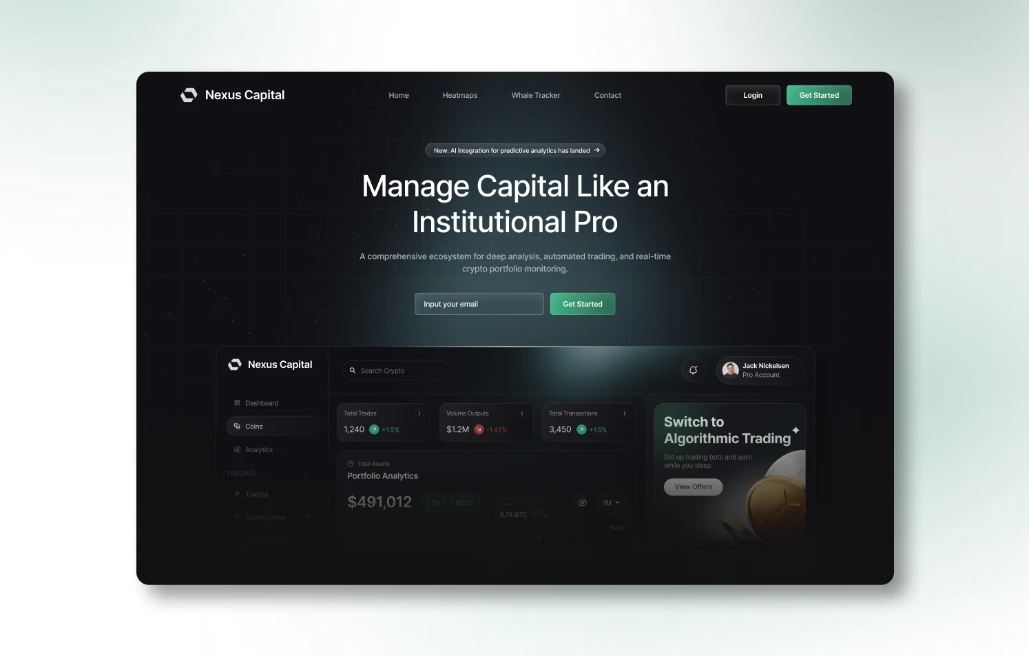
3. Crypto Trading Dashboard
Trading platforms require a different level of precision because decisions happen under pressure. In this dashboard, we structured the layout around how users scan information rather than how elements can be visually balanced.
Charts, asset data, and trading panels form clear zones that guide attention naturally. The most critical signals appear first, while deeper layers remain accessible without interrupting the flow.
This type of dashboard design reflects real trading behavior, where speed and clarity influence outcomes directly.
4. Beverage E-commerce Website Design
In e-commerce website design, conversion often depends on how easily users move through the interface. Visual style plays a role, although structure defines the experience.
In this project, we focused on predictable navigation and consistent product presentation. Categories, product cards, and detail pages follow a clear pattern that reduces cognitive load and helps users move forward without second-guessing.
As a web design agency, we approach e-commerce platforms as systems that guide decisions rather than collections of pages.

5. Logistics Brand Identity Design
Brand identity for logistics platforms needs to communicate reliability and structure from the first interaction. In this system, we focused on disciplined typography, controlled color usage, and consistent layout rules.
The visual language supports how logistics platforms operate, where clarity and precision matter more than expression. This identity is built to extend into interface design, supporting dashboards and operational tools with the same logic.
For us, branding and UI design are part of the same system rather than separate disciplines.

6. SaaS Landing Page Design
SaaS websites often struggle with communication because they try to explain everything at once. In this design, we focused on structure instead of volume.
The first screen introduces the product through interface previews that show functionality in context. These visuals act as proof, helping users understand what the platform does without relying on long explanations.
The page moves from understanding to trust and then to action, which reflects how users evaluate SaaS products in real scenarios.
7. Inventory Management Dashboard
This dashboard focuses on oversight rather than execution. It helps teams monitor system performance, track inventory levels, and identify operational issues.
We structured the interface into modules that reflect how teams think about operations. Instead of presenting raw data, the dashboard organizes information into layers that support quick interpretation.
This approach improves efficiency at scale, especially in enterprise environments where clarity affects daily performance.

8. AI Document Management Dashboard
AI systems often create uncertainty because their processes are not visible. In this interface, we focused on making system states clear and understandable.
Documents, processing stages, and actions are separated into distinct layers, allowing users to track progress without confusion. The structure translates complex processes into observable steps, which builds confidence in the system.
As a UI/UX design agency working with AI products, we see clarity as a key factor in adoption.

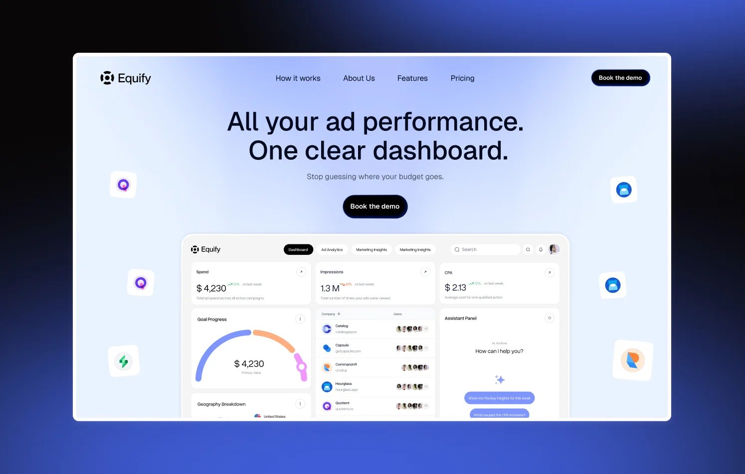
9. Fintech Analytics Dashboard
Analytics dashboards require a balance between overview and depth. In this design, we prioritized information based on relevance rather than visual symmetry.
Key financial metrics are placed in prominent areas, while supporting data remains accessible in secondary layers. The layout follows how financial teams approach analysis, moving from signals to deeper insights.
This alignment between structure and workflow makes the interface easier to use in real conditions.

10. Logistics Operations Dashboard
Operational dashboards need to highlight issues early and clearly. In this interface, we focused on surfacing delays, active processes, and system states in a way that draws immediate attention.
Information is grouped by function, allowing teams to understand where action is required and how to respond. The structure supports coordination across multiple workflows, which is essential in logistics operations.

What This Selection Says About Product Design Right Now
Looking across all these projects, we see a consistent shift toward structure-driven design.
Interfaces are increasingly aligned with real workflows, reflecting how users think and act rather than how layouts are traditionally arranged. Hierarchy plays a central role in this process, helping reduce cognitive load and improve speed of interaction.
Across SaaS, fintech, and broader B2B products, this direction shows up consistently. Design is moving away from visual trends and toward organizing complexity in a way that supports real business goals.
There is also a stronger connection between branding and UI design. Visual systems are built to extend across interfaces, marketing, and product environments, creating consistency at every level.
Most importantly, design is focused on enabling decisions. Every layout, grouping, and interaction pattern serves that purpose.
Key Takeaways
- Dashboard design should reflect decision priorities rather than visual balance
- Mobile app design works best when actions are clearly separated from data
- Strong hierarchy improves speed and reduces cognitive load in complex systems
- Structured UI systems scale better across SaaS and enterprise platforms
- E-commerce website design benefits from predictable navigation patterns
- Brand identity should support interface logic across the product
- AI interfaces require clear system states to improve user confidence
FREQUENTLY ASKED QUESTIONS
Why does a web design agency publish Dribbble shots?
We use Dribbble to share selected UI design work and explore interface directions across industries such as SaaS, fintech, real estate, logistics, manufacturing, e-commerce, and AI. It also allows us to test visual systems and present how we approach project design.
How do these UI designs relate to real client work?
Each concept reflects real challenges we see in client projects, including data organization, workflow clarity, and user flow. The same principles apply when we design live products.
What makes VALMAX a strong UI/UX design agency?
We approach design as a system that connects structure, logic, and business goals. Instead of focusing only on visuals, we build interfaces that help users understand, navigate, and act more efficiently.
How does UI design impact business performance?
Clear interface structure reduces friction, improves user understanding, and speeds up decision-making. This leads to better engagement, higher conversion rates, and more efficient workflows.
What industries does VALMAX work with?
We focus on SaaS, fintech, AI, e-commerce, healthcare, logistics, manufacturingWe focus on SaaS, fintech, AI, e-commerce, healthcare, logistics, manufacturing, real estate and other B2B sectors where complex systems require structured design solutions.
GET A TEAM THAT’S ALWAYS ON YOUR SIDE
Retainer Contract gives you reliable support whenever you need it
rate this article
5 / 5.0

based on 1 reviews


