A Map Instead of a Website for Complex Food Production? Let’s do it.
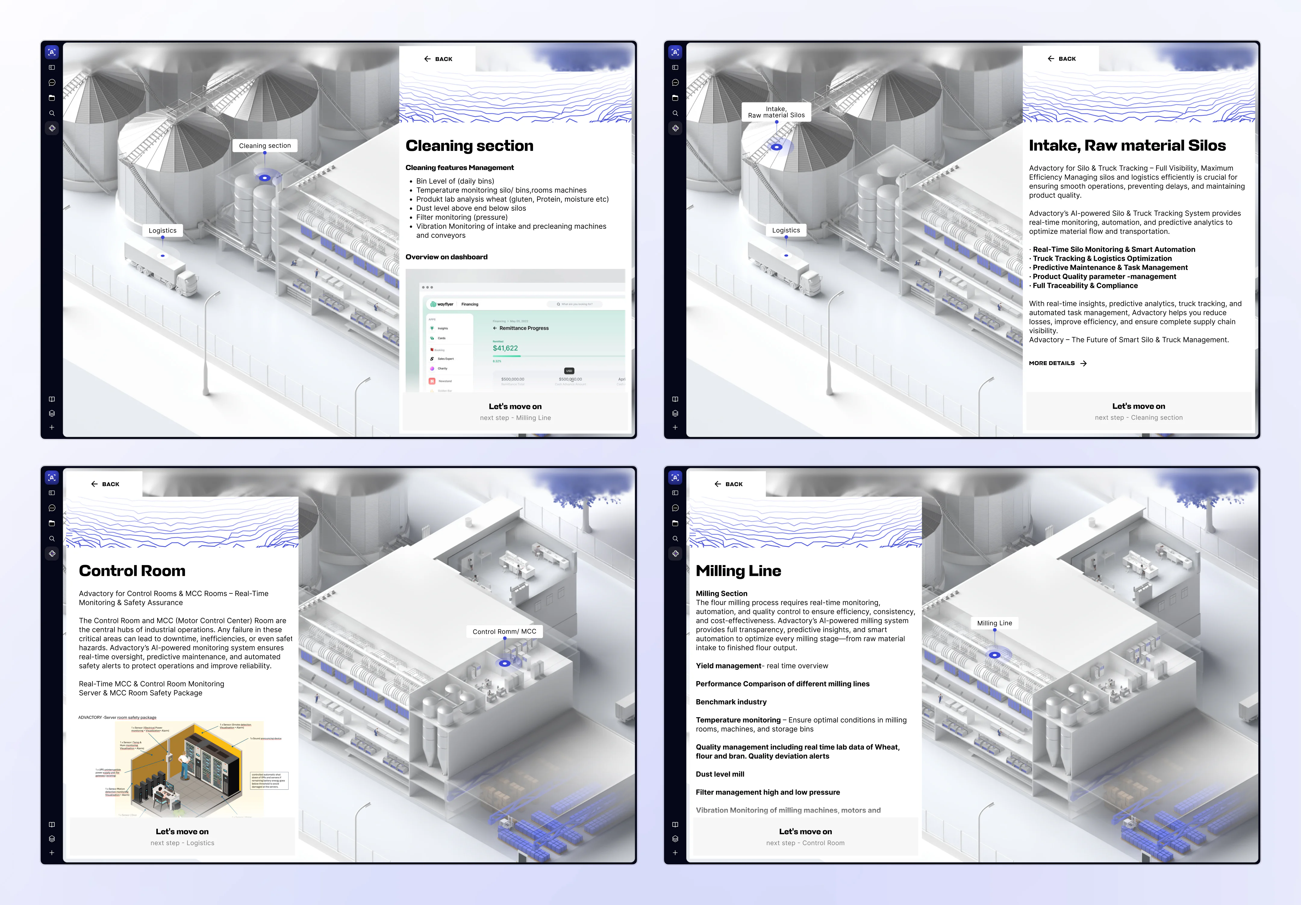
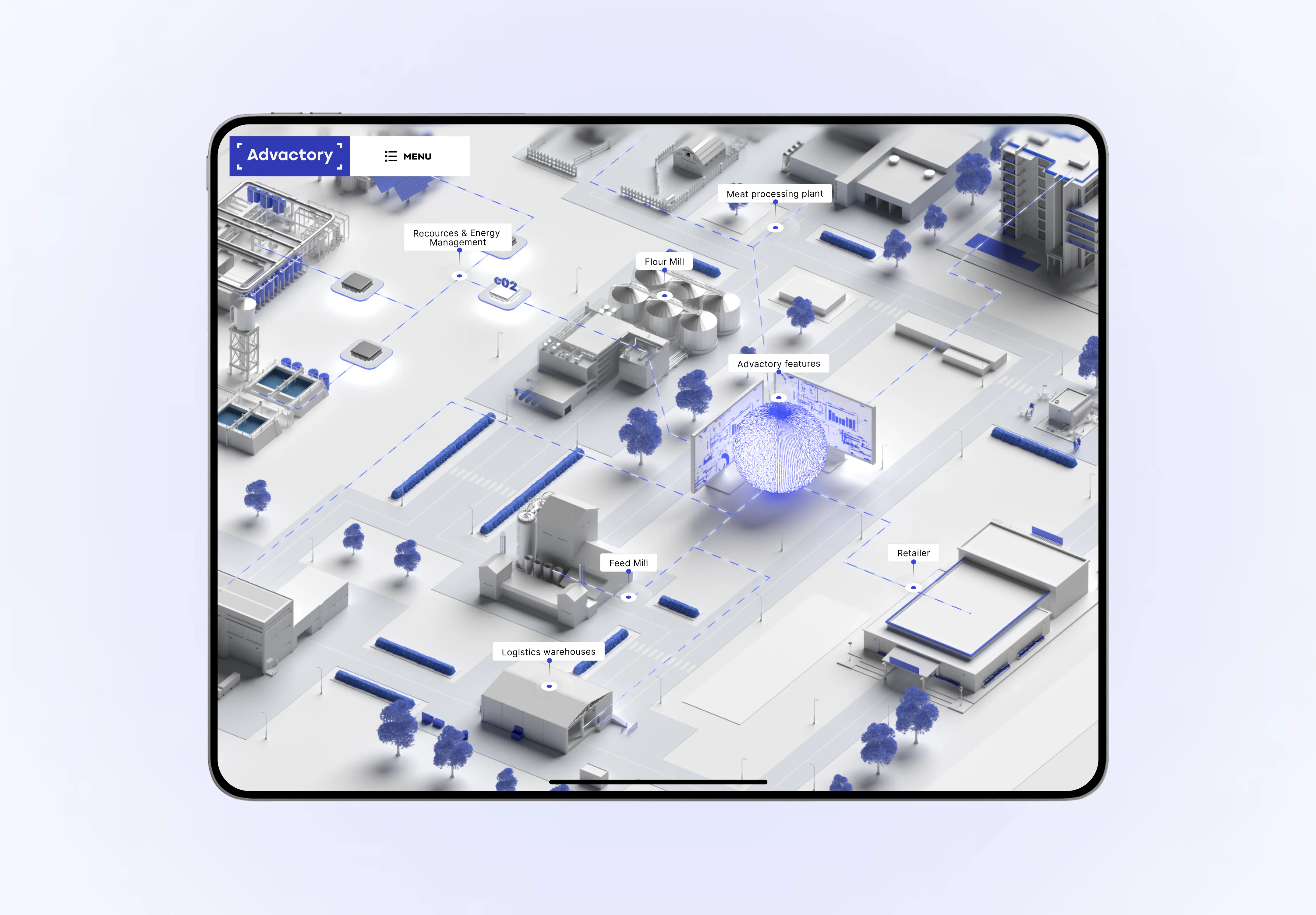
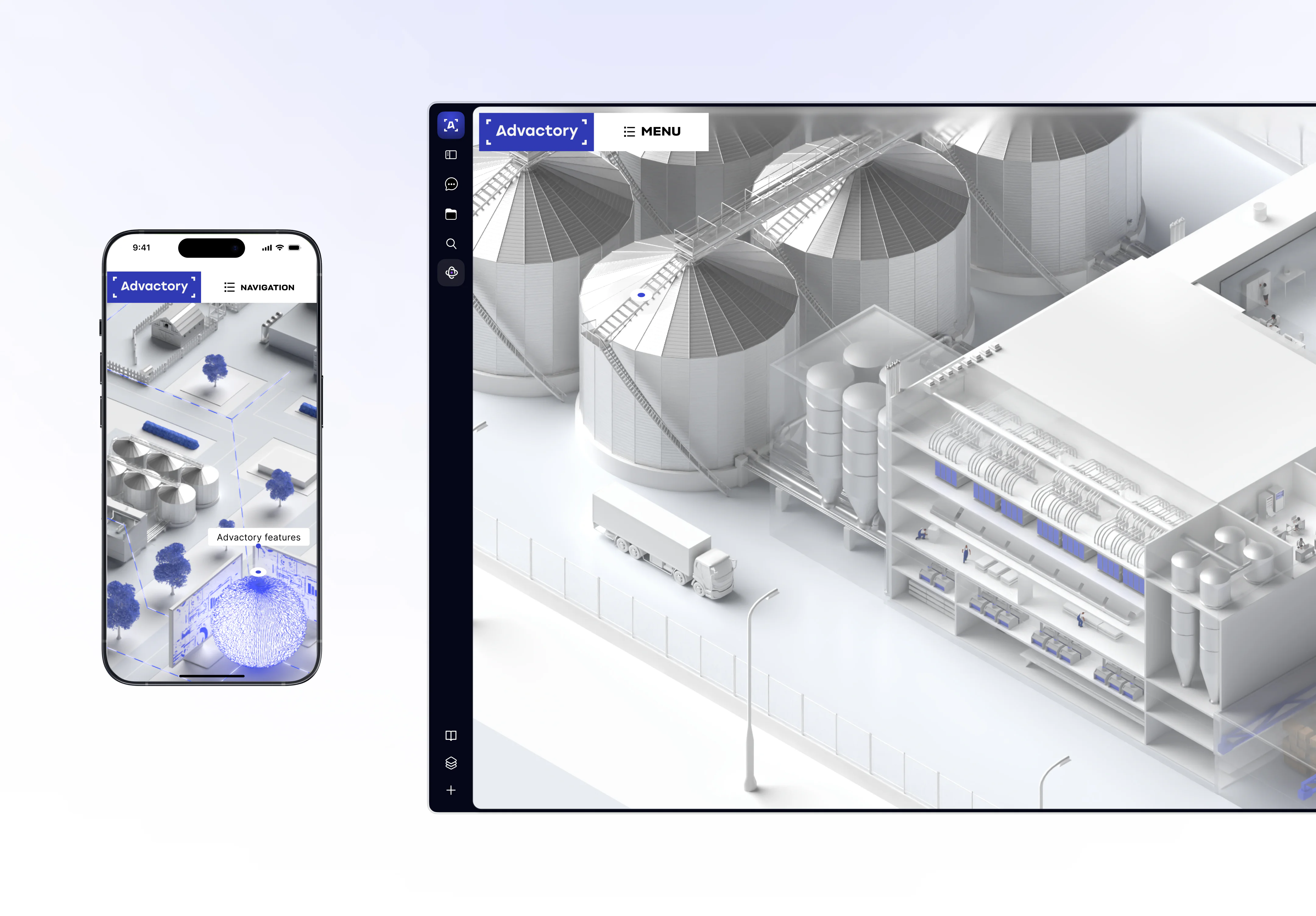
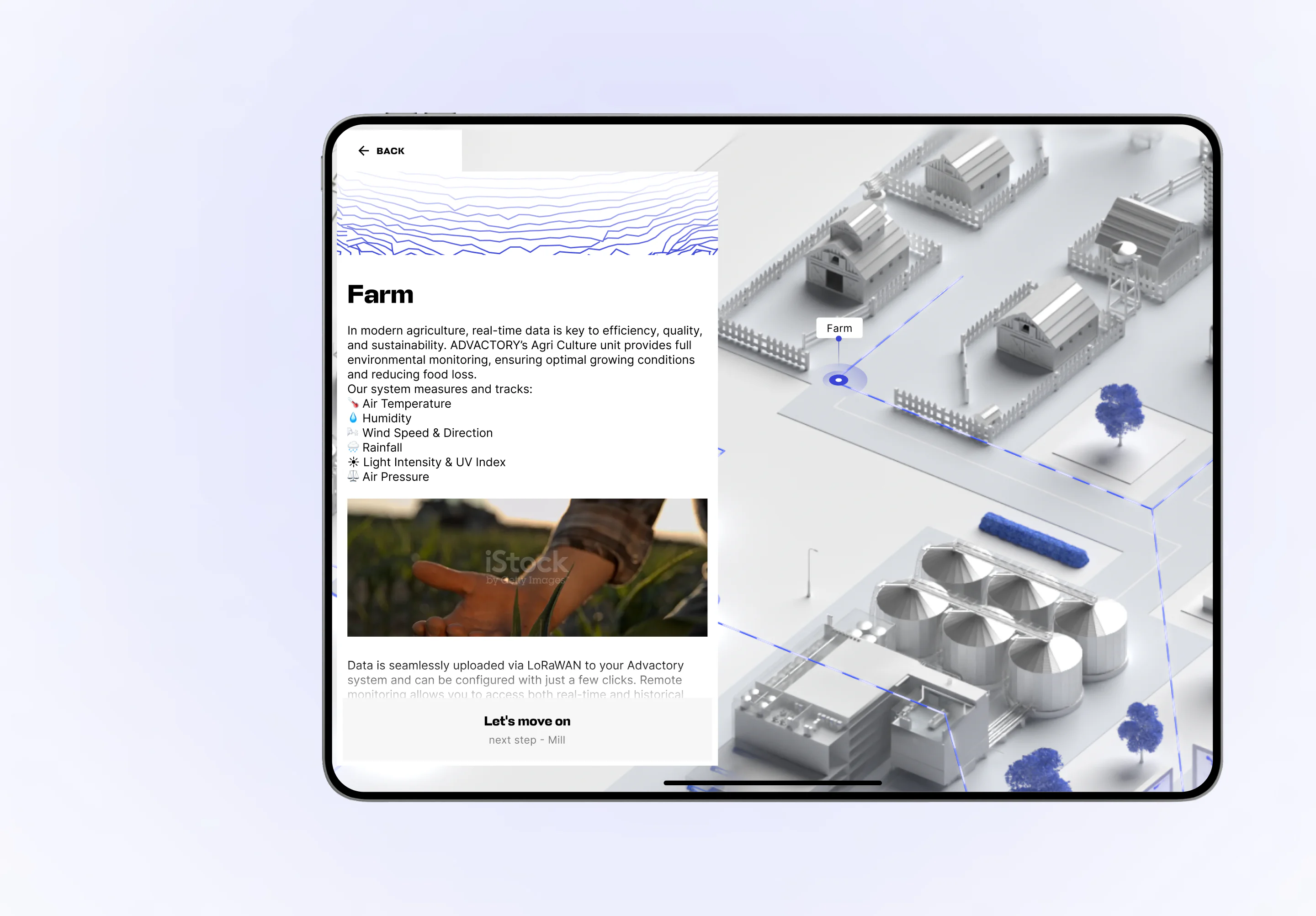
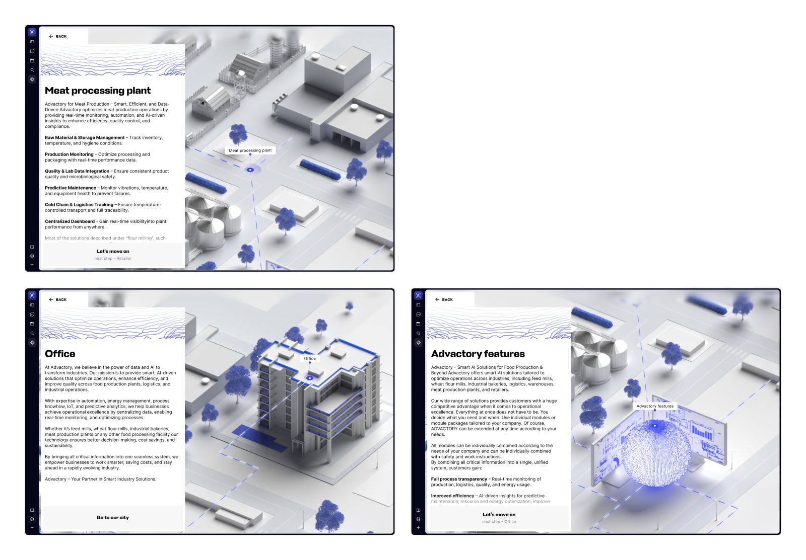
This site is nothing like you’ve seen before. We broke the rules to build something closer to a map than a website. Its job wasn’t marketing or conversion, but acting like an interactive whiteboard that helps teams explain a complex production system without losing people halfway through. See how it all came together.
Client

Services we provide
Headquarters
Zurich, Switzerland
Industry
IT for Manufacturing
Website
Timelines
3 months
FOOD PRODUCTION
(THE DIGITAL WAY)
Smartening up factories
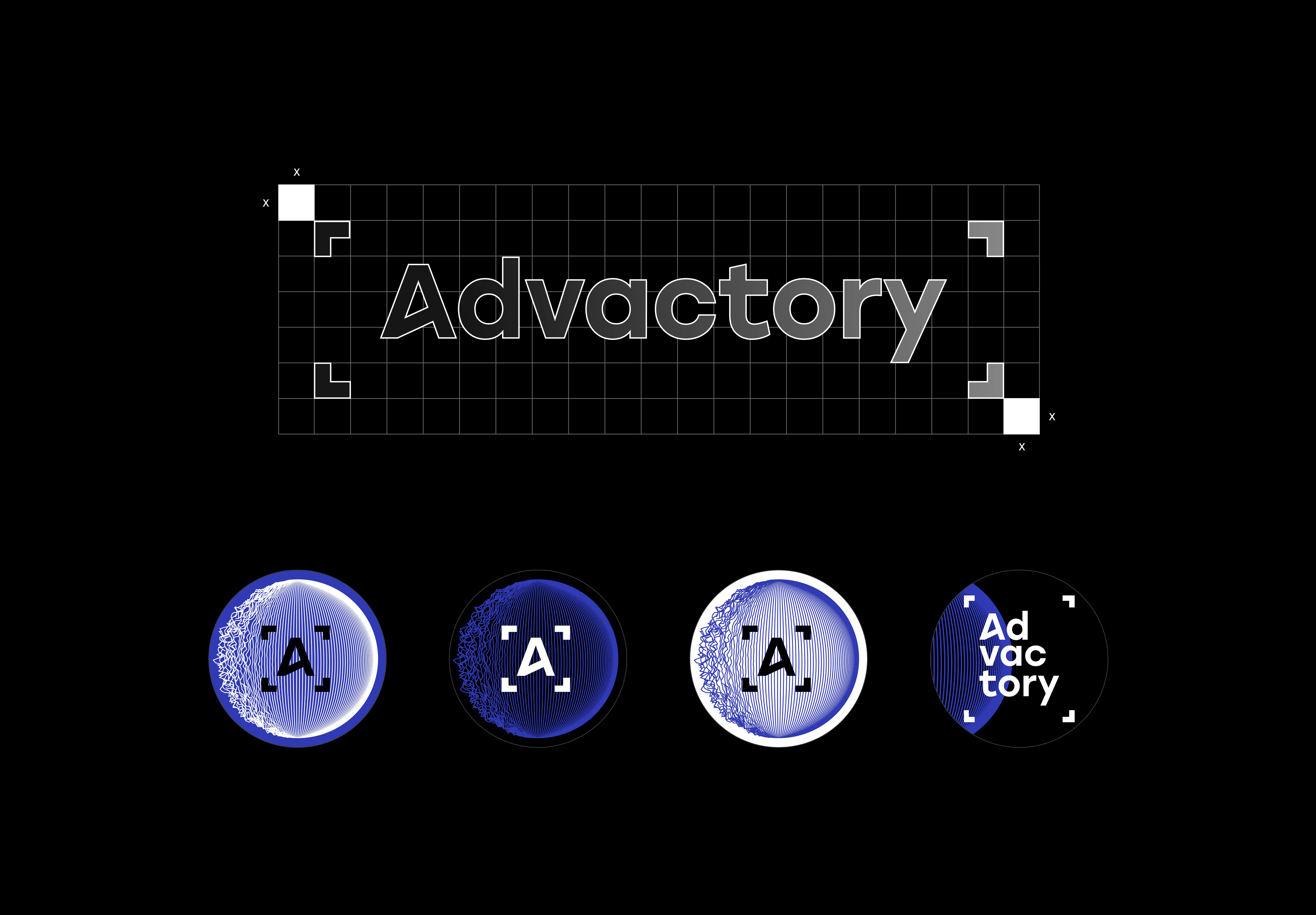
BRANDING & EARLY FOUNDATIONS
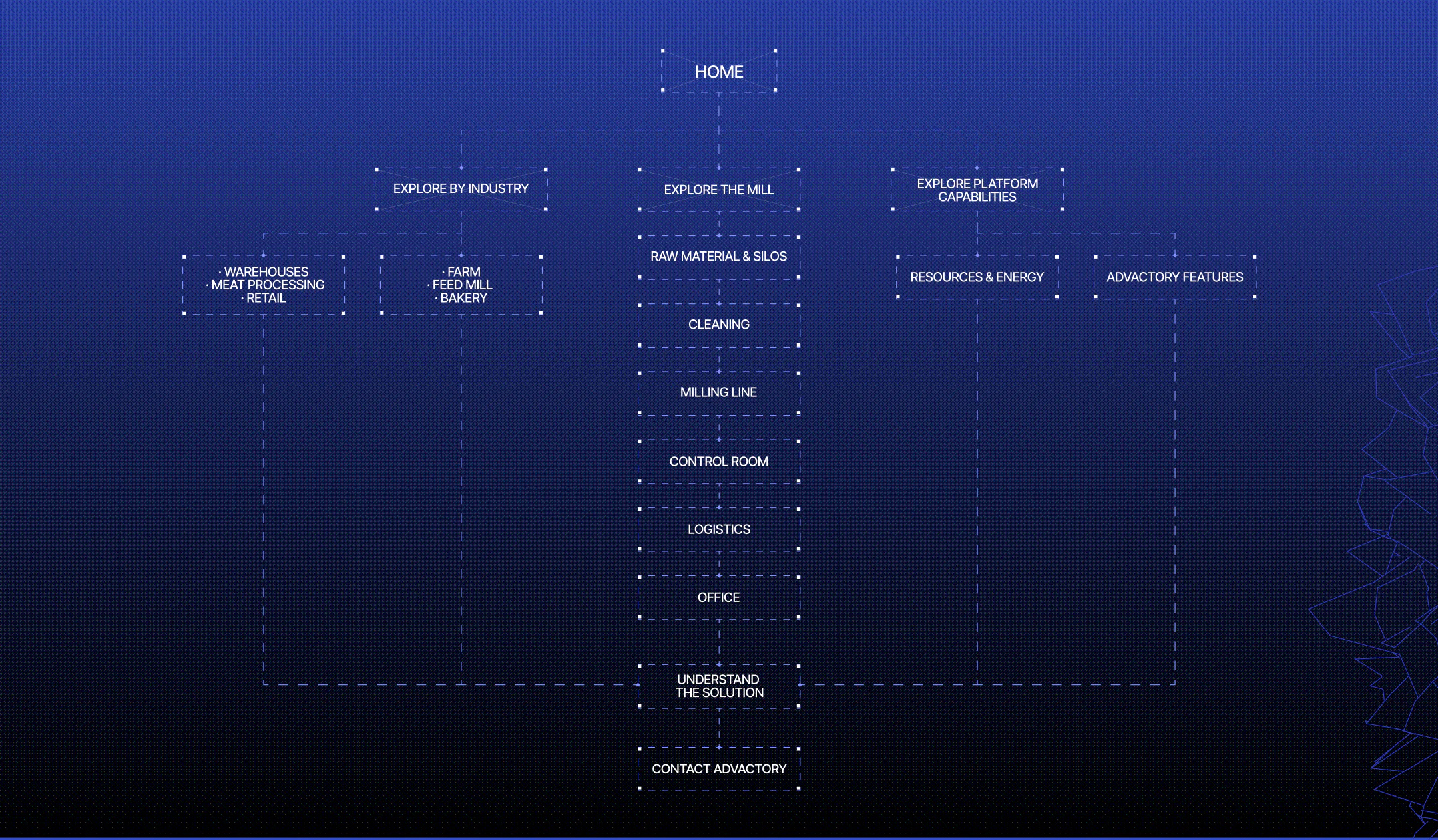
FROM CHAOS TO A SYSTEM
WHAT IF THE WEBSITE WAS A MAP?
NOTHING LIKE A USUAL SITE
RESULTS
Frequently Asked Questions
How do you design a website for a complex SaaS product?
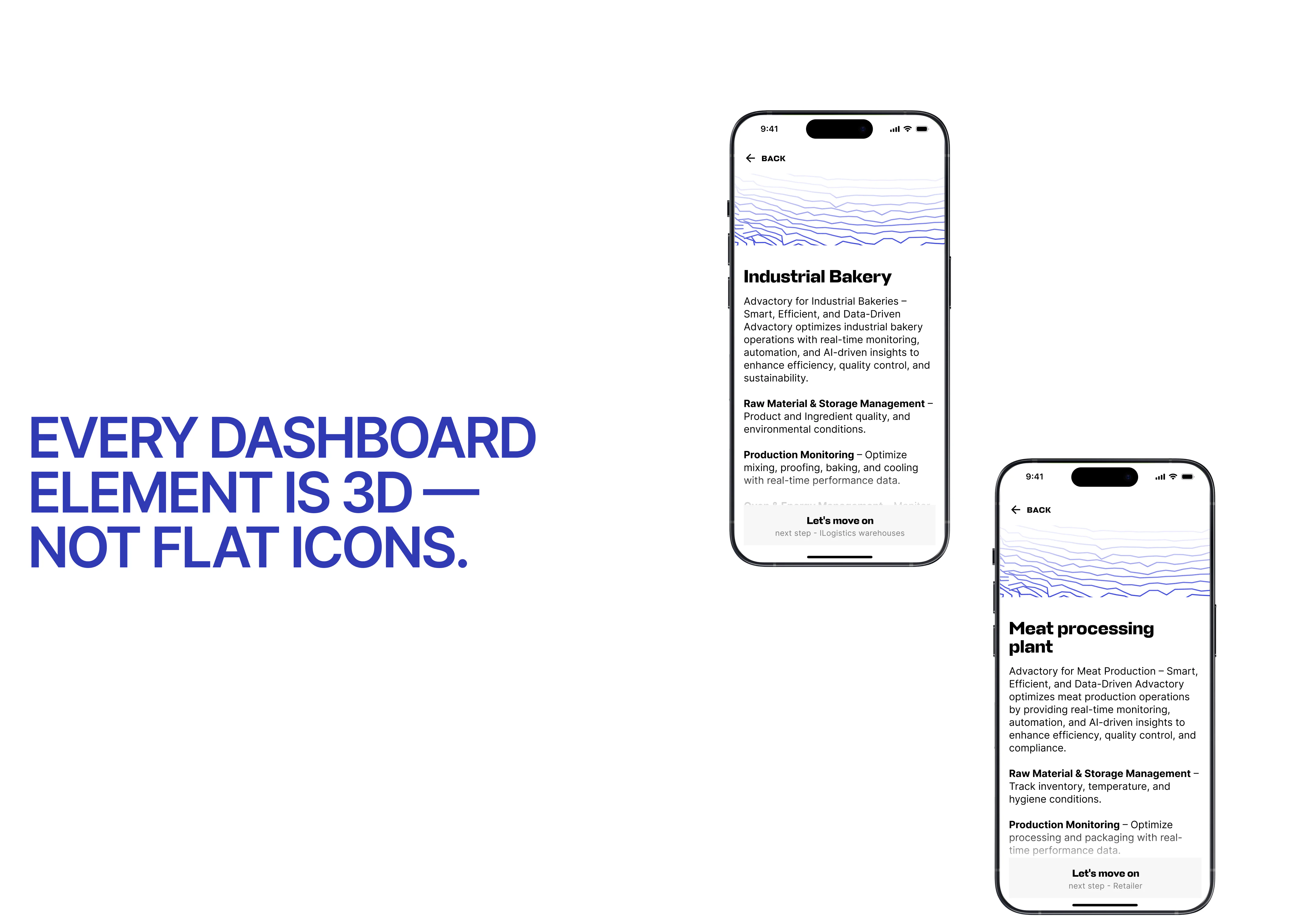
A website for a complex SaaS product should explain what the platform does, how it works, and how its parts connect before listing individual features. The design process starts with understanding the product’s workflows, data sources, and audience. For Advactory, VALMAX created an interactive map that shows how the software relates to different stages of food production, from raw materials to shipping.
When is an interactive map-based website a good fit for manufacturing software?
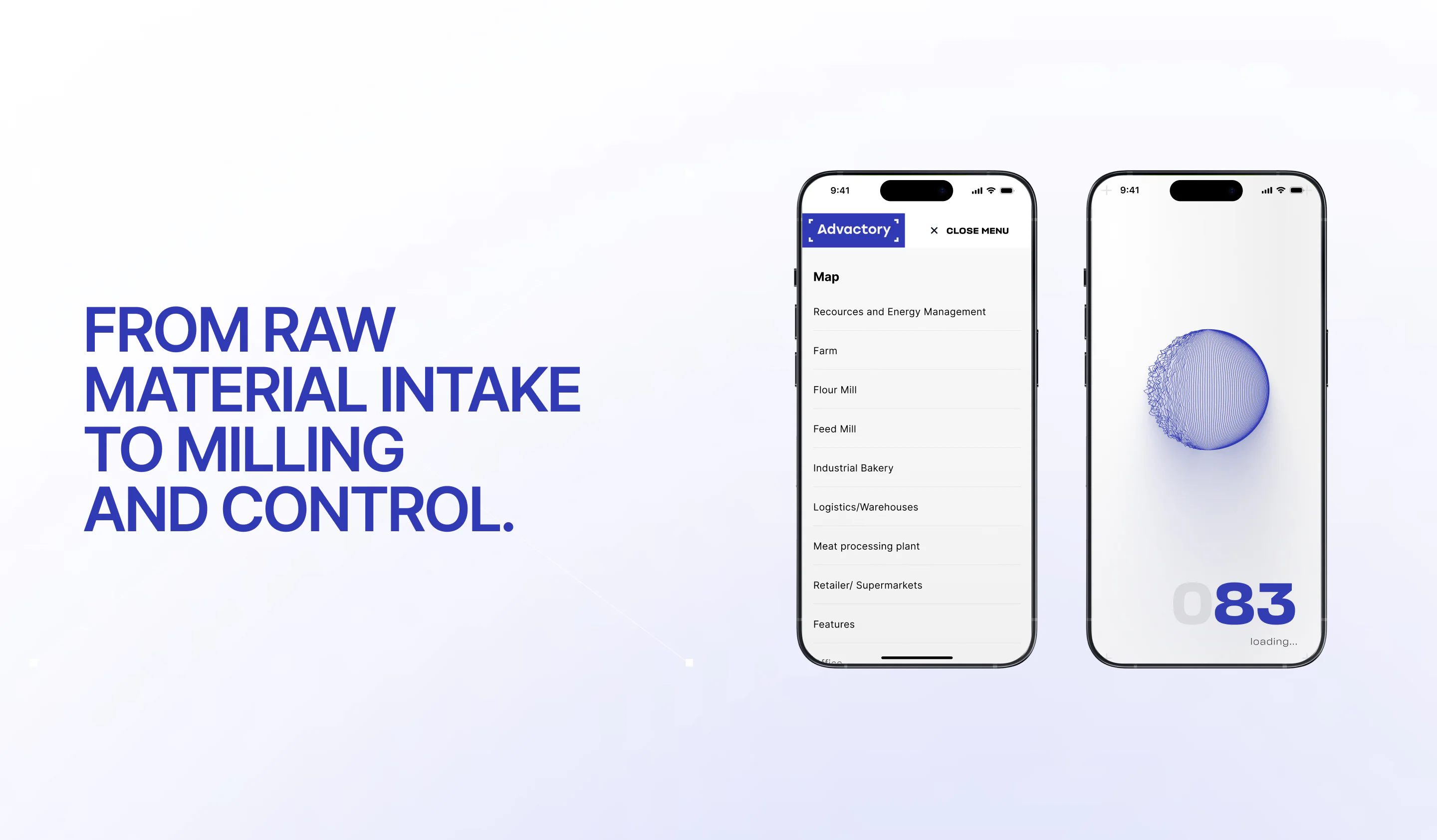
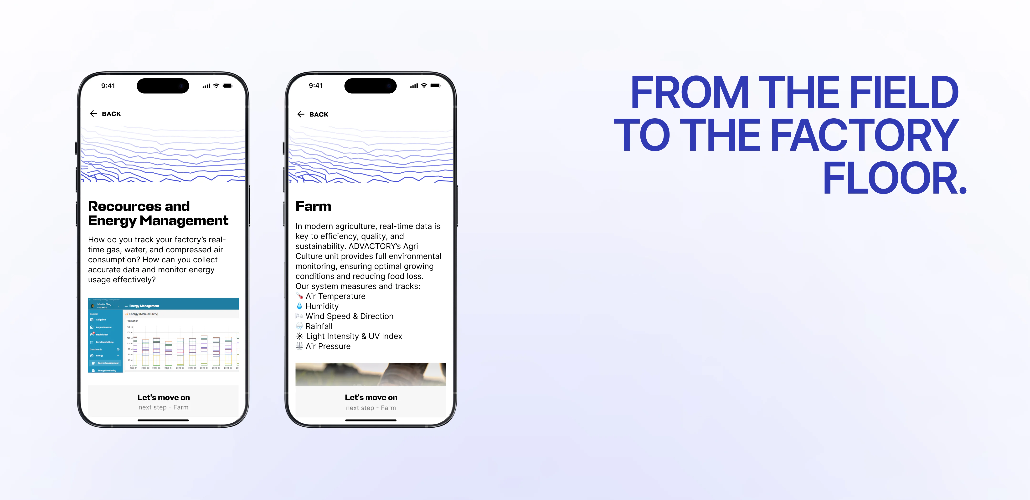
A map-based website can work well when software supports a process with connected stages, equipment, or data sources that are difficult to explain through standard page navigation. Advactory’s website places the platform at the center of a visual production system. Visitors can select the Mill and explore a second map showing the flow from raw materials entering silos through processing and logistics.
What should a company prepare before starting a custom SaaS website design project?
Prepare a clear product overview, the main workflows the website needs to explain, and the questions customers ask during sales conversations. It also helps to decide who will use the site and how the team plans to present it. Advactory’s project included research, mood boards, wireframes, and design work to translate a complex food production system into an interactive map.
Can a B2B SaaS website support sales presentations?
Yes. A B2B SaaS website can be designed as a visual presentation tool when a team needs to explain how its software works in context. Advactory’s website lets the team share the screen, navigate a clickable map, and walk clients through the production process. The site was built for product explanation and sales conversations rather than as a conventional traffic or conversion-focused website.
What does a SaaS rebranding and website design project include?
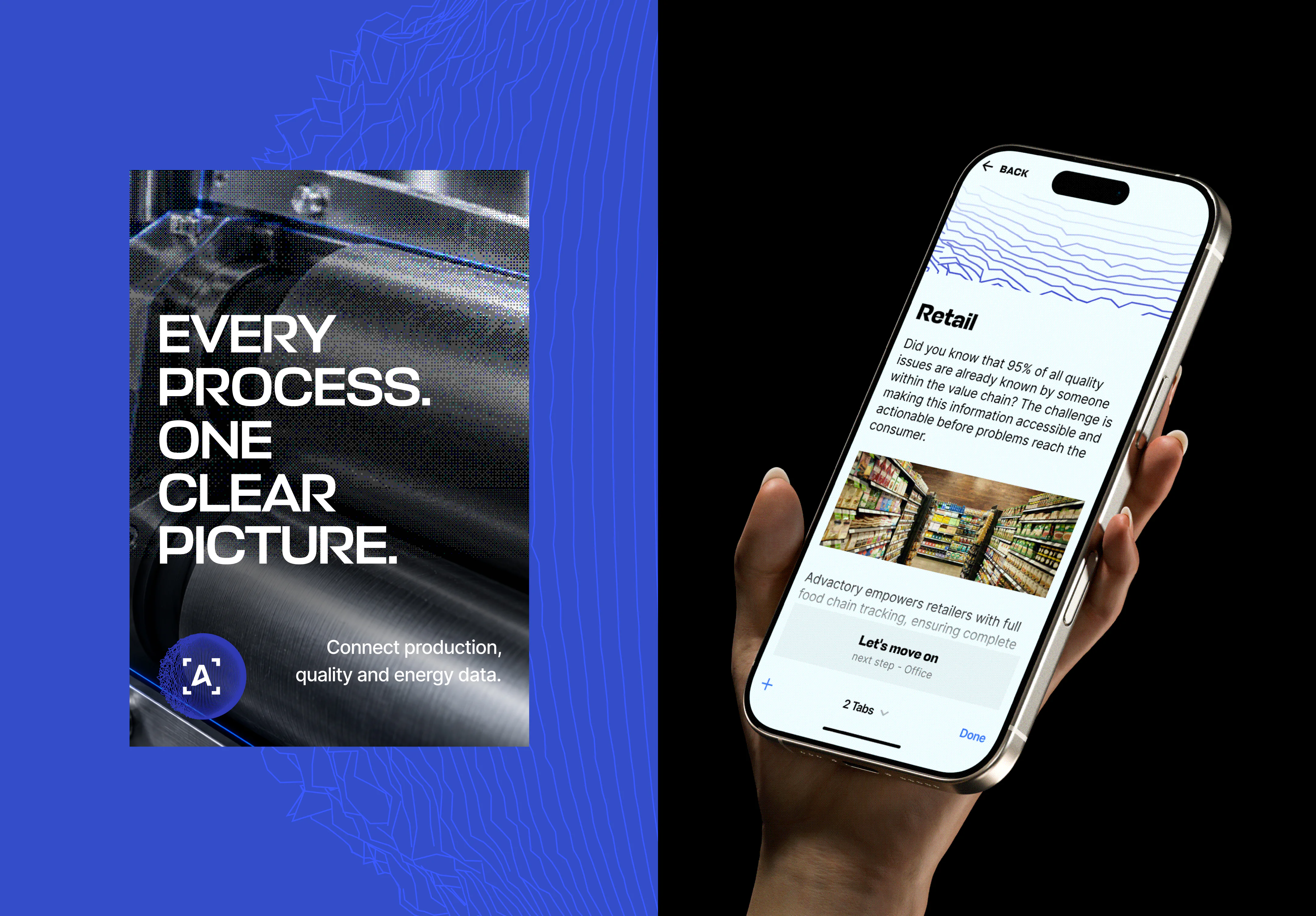
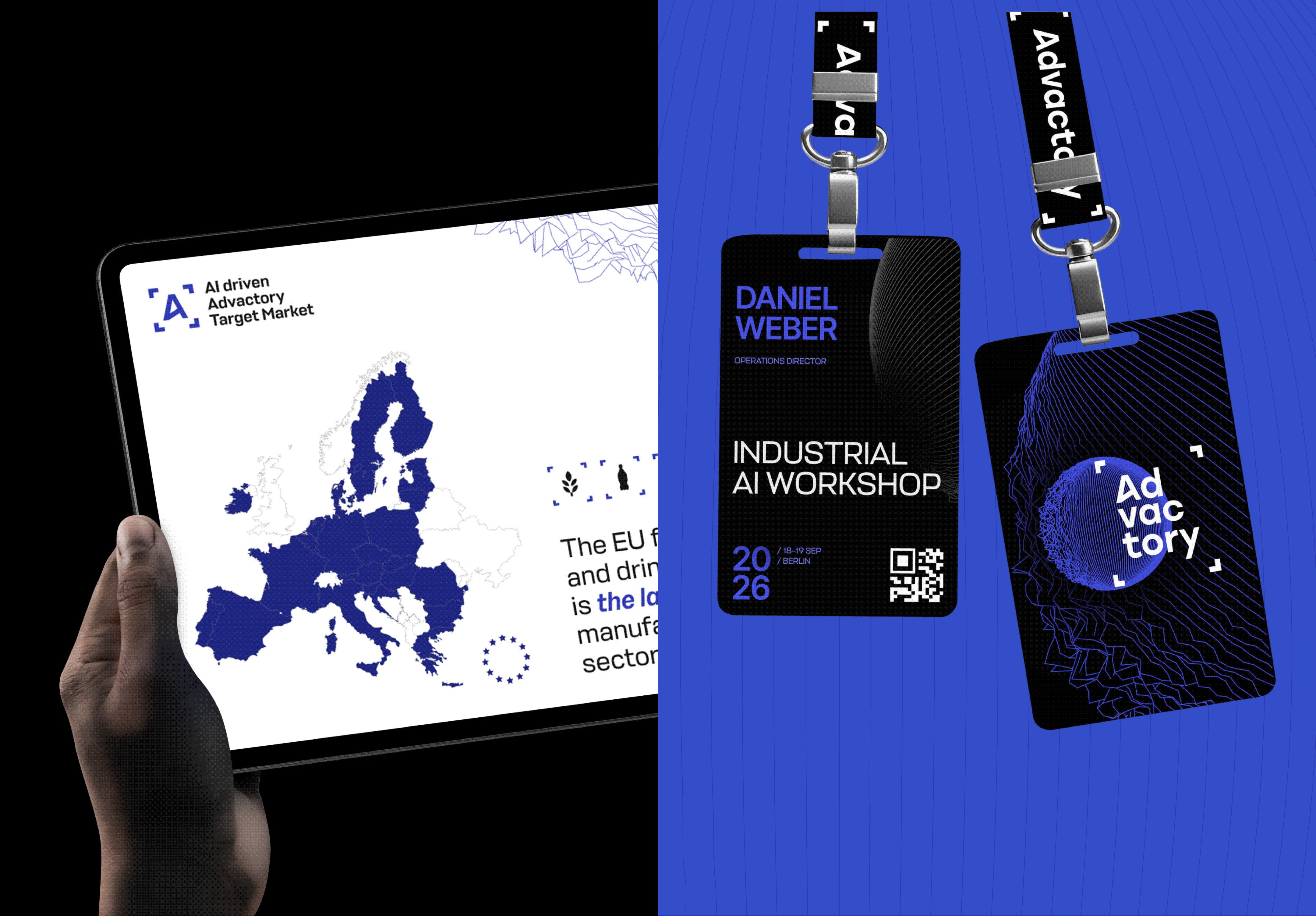
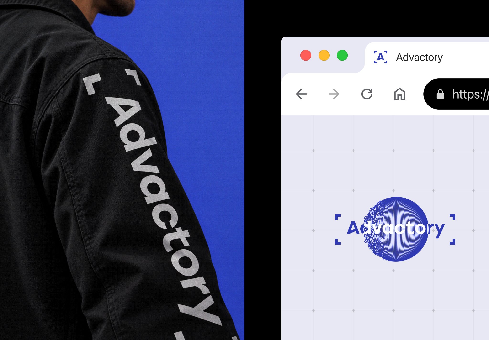
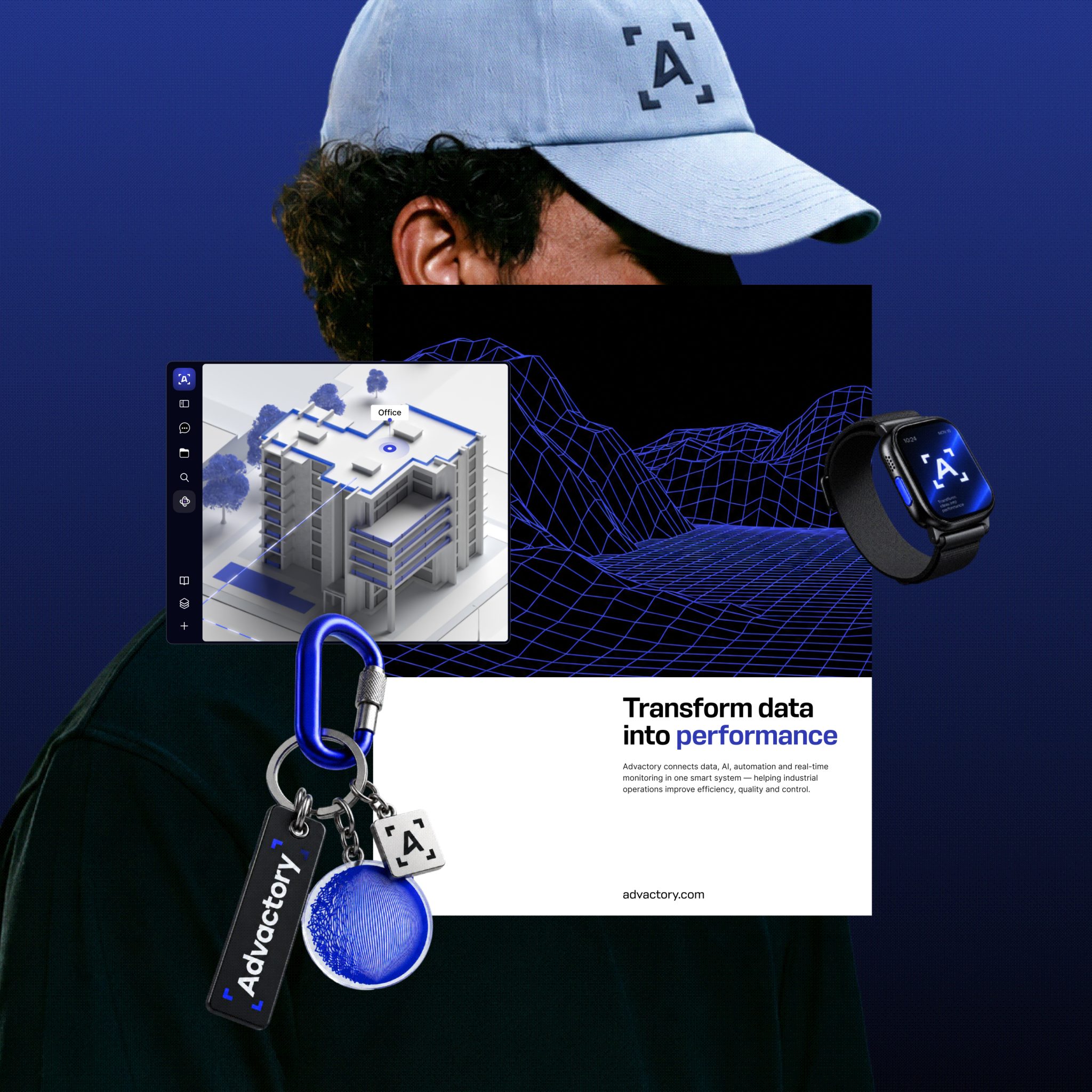
The scope can include a logo, visual identity, presentation decks, conference materials, and a website that carries the brand into the product story. For Advactory, VALMAX developed the brand foundations first, then designed the map-based website. This sequence gave the team a consistent visual system for introducing the company and explaining its software.
How long does it take to rebrand a SaaS company and design a custom website?
The timeline depends on the scope, number of brand materials, website structure, and complexity of custom interactions. The Advactory project took three months and covered research, mood boards, wireframes, rebranding, and design of the interactive website. A project with a similar map-based format should also account for time to understand the product workflows and review how clearly the visual experience explains them.