When most people hear “rebranding,” they picture a new logo or a fresh color palette. But the truth is, it’s rarely just about visuals. Rebranding is a strategic decision — a way to stay relevant, competitive, and recognizable. The strongest rebrands don’t happen for the sake of change; they respond to real shifts inside the company or in the market. Done right, it’s a growth lever. Done wrong, it can weaken your position and confuse your audience.
In this article, we’ll break down when a rebrand makes sense — and how to do it right. Let’s get into it.
Signs it’s time to rebrand
Rebranding only makes sense when something meaningful is changing under the hood. Sometimes, it’s just a feeling — like your brand isn’t quite clicking anymore. Maybe your audience has changed. Maybe your mission has, too. Or maybe you’ve grown, but your brand still sounds like the early days. Below are the signs we’ve seen most often — the real-life cues that tell you to rethink how your brand shows up.
Changes in strategy or positioning
One of the clearest signs it’s time to rebrand is when your business has changed. Maybe your strategy has shifted, you’re reaching a new audience, or you’re stepping onto a bigger stage. Whatever the change, your brand may no longer reflect who you are — or who you’re trying to reach.

💡 Why this matters
Your positioning defines how you want to be perceived. If that perception shifts, your visual and verbal identity needs to evolve to match. If your visual and verbal identity are still tied to the past, you risk sending mixed signals: sounding early-stage when you’re scaling, looking niche when you’re going global, or speaking to yesterday’s audience instead of today’s.
From practice, we’ve seen this moment arrive when:
- Clients expand from B2B to B2C (or vice versa), as the language, flow, and emotion required are entirely different.
- You’ve grown into younger audiences (Gen Z, digital natives) who expect more minimalism, clarity, and purpose-driven branding.
- Your existing audience has evolved and now expects calm, trust, and transparency where they once responded to hype.
What to update:
- Visual language that mirrors their lifestyle, aspirations, or tech comfort level
- Tone of voice that either becomes more conversational or more mature, depending on who you’re trying to reach
- Content choices (less “what we do,” more “what this means for you”)
- Inclusive design — diverse visuals, accessible interfaces, and more nuanced storytelling
Your brand just feels… outdated
Sometimes, the trigger for rebranding isn’t strategic expansion or a new market. It’s when your brand feels like it’s stuck in time. Your logo, brand voice, or website design no longer match what today’s users expect in style, clarity, or experience.
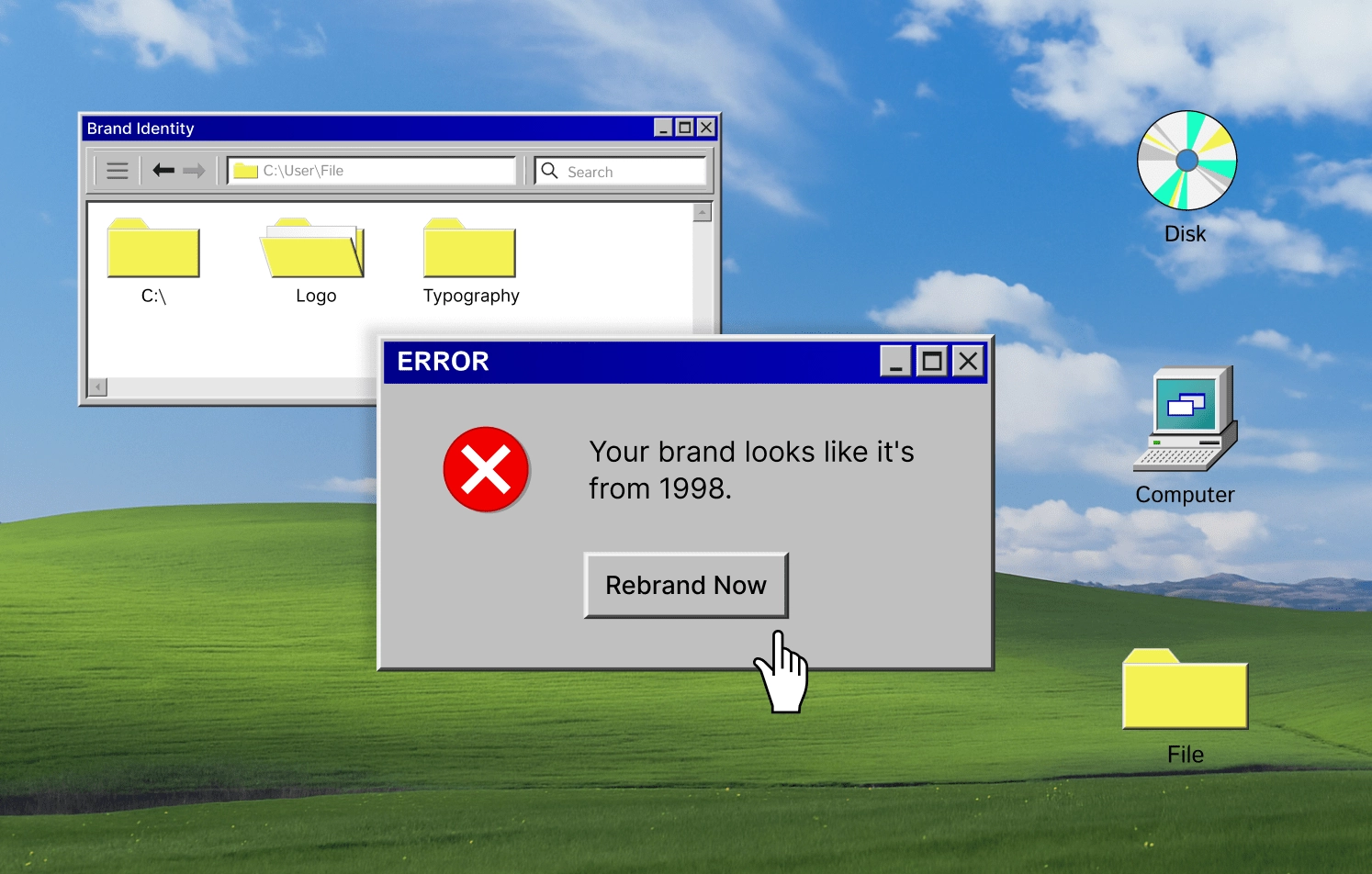
💡 Why this matters: If your design feels clunky or visually inconsistent, it signals one of two things to your audience:
- You’re not actively evolving.
- You don’t prioritize the user experience.
User expectations rise — especially in industries like fintech or tech, where sleek, responsive, and emotionally intelligent interfaces are the norm. But brand expression isn’t limited to digital design. As companies mature, everything from product lines to packaging to physical experiences must also evolve.
When the brand grows but its design language stays stuck — say a dated website, an underwhelming product aesthetic, or packaging that no longer reflects the brand value — it starts to feel like an old suit that no longer fits.
Here, pay attention to inconsistent or generic typography, a color palette that was trendy five years ago but now feels harsh, dated, or lacks accessibility, or stock imagery that no longer reflects your industry’s aesthetic or user intent. When the overall brand vibe feels off, it’s usually not just one thing. Colors, typography, layout, and visuals all work together, so a holistic approach is what can make your brand feel cohesive and fresh.
You’re recovering from a crisis, and the brand needs a fresh start
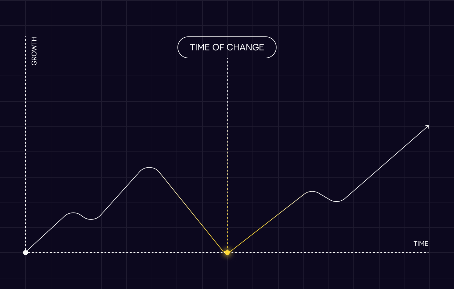
Sometimes, it’s not growth that drives rebranding — it’s damage control. A scandal, a PR misstep, a data breach, a failed product launch — and the brand is now met with skepticism, side-eyes, or silence. In these moments, a rebrand is a way to visibly shift direction, rebuild credibility, and create emotional distance from the past.
💡 Why this matters
In high-trust industries like fintech, healthcare, or education, brand perception is fragile — and once it breaks, it’s up to you to fix it. You have to show that something fundamental has changed. A well-executed rebrand helps reframe the story.
What this can look like:
- A visual shift that signals emotional distance from the old narrative — cleaner, calmer, more transparent
- A new tone of voice — moving from hype to humility, from defensive to open
- Messaging that leads with values, not just features — showing a recommitment to responsibility, quality, or service
- A redesigned site, app, or experience that feels clearer, easier, and more user-focused
- Public materials (like press releases, blog posts, social media) acknowledging the past without being defined by it
💡 Rebranding after a crisis only works if the internal change is real. If the culture, processes, or product stay the same — users will see through the new visuals in seconds.
Insights into the Massimo Duty Case
Massimo Dutti’s recent rebrand shows how a brand can shift perception without changing its product, simply by changing how it shows up.
Massimo Dutti is a fashion brand under the Inditex group (Zara, Bershka, Oysho etc.), originally positioned as a more elegant alternative to Zara. It has always offered timeless wardrobe staples — tailored coats, neutral palettes, crisp shirts — but for years, it sat in a blurry space between premium and mass-market.
What changed? The world around it.
💡 A new wave of consumers — especially younger audiences and global markets — began gravitating toward quiet luxury: minimalism, emotional subtlety, thoughtful design. These customers weren’t impressed by logos or seasonal hype. They wanted refinement, space, clarity. What also contributed to the decision to rebrand was the overstimulation of fast fashion, and Massimo started loosing its premiun positioning.
Let’s look what’s changed.
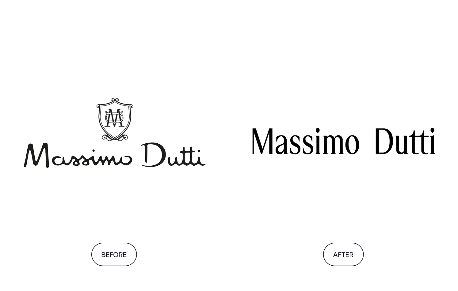
The old logo — handwritten, script-like — was replaced with a clean, editorial serif. It signaled maturity and design literacy. The shift was subtle, but it recalibrated the entire tone of the brand — from “elevated Zara” to “European quiet luxury.”
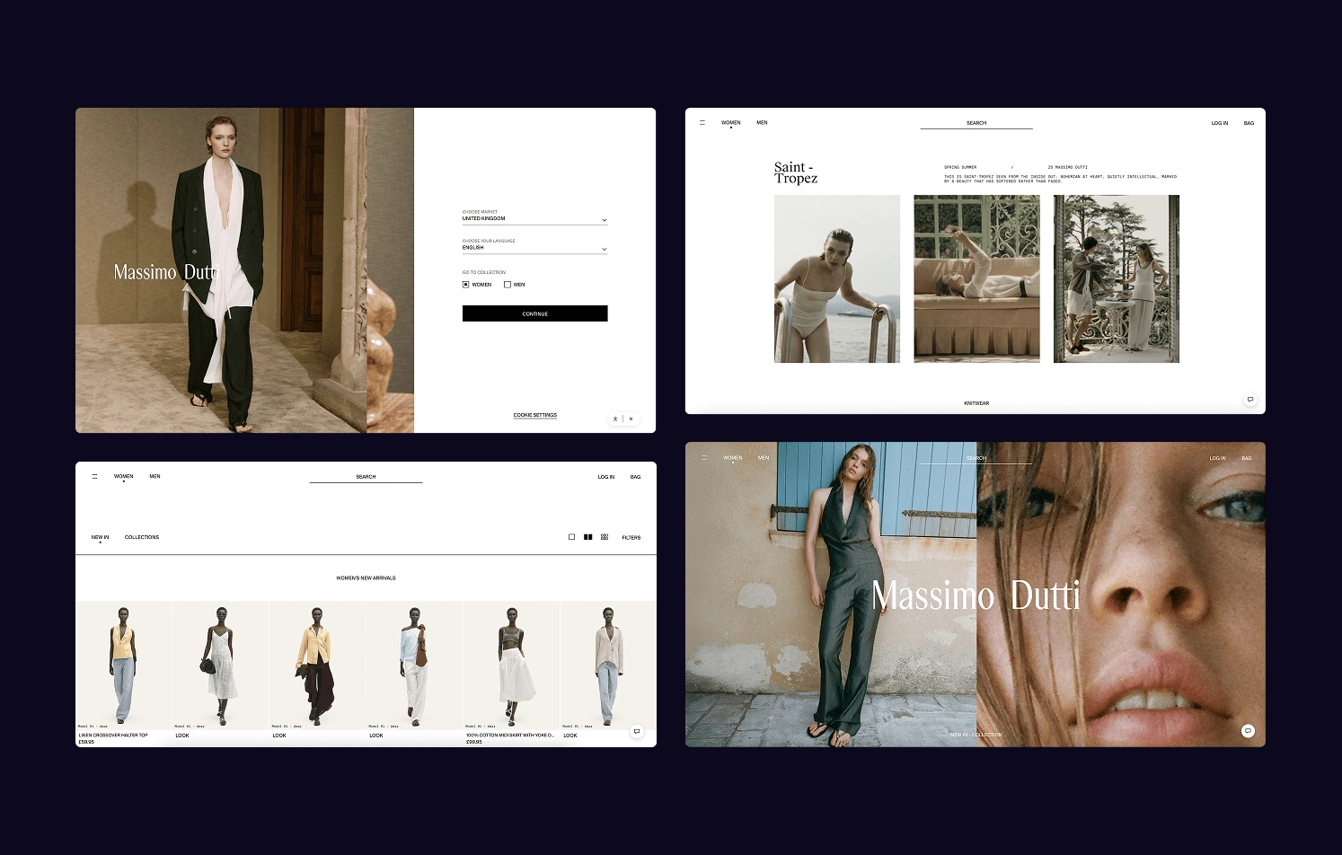
The website experience mirrored this change. Browsing the homepage feels cinematic: soft shadows, natural light, whitespace used generously. Product images are paired with minimal copy. Almost like you’re immersed in a calm, curated mood.
Even the store interiors were elevated to reflect the new vision. Stone textures, wooden details, warm light. The collections themselves didn’t change much, but the way they were presented did.
The brand’s positioning shifted, too. What once felt like premium fast fashion for the office now leans into smart aesthetics for modern intelligence — less about just dressing for work, more about embracing a calm, refined lifestyle.
💡 Takeaway
Sometimes, rebranding is about shifting the mood — updating atmosphere, content, color language, and how you communicate. In Massimo Dutti’s case, there was no dramatic redesign — just a deeper visual narrative and an emotional palette that mattered more than trend. As a result, Massimo Dutti gained stronger loyalty from customers who value clean aesthetics, stood out more clearly from Zara, and became a source of inspiration for stylists and fashion bloggers.
Types of rebranding
Let’s circle back to the idea that rebranding isn’t always about tearing everything down and starting over. Depending on the goal, it can take different forms — from subtle updates to complete reinvention.
Partial rebranding (visual refresh)
A partial rebrand is like a style update — the brand’s core stays the same, but the way it looks and feels gets a refresh.
This is often used when:
- The trademarked logo is protected and can’t be legally changed
- The company wants to stay recognizable but align with modern visual standards
- The goal is to signal evolution, not a complete reset
What usually changes during a partial rebrand are the visual elements that shape how the brand feels — things like the color palette, typography across web and print, imagery style (photography, layout, textures), and interface details like spacing, buttons, and grids.
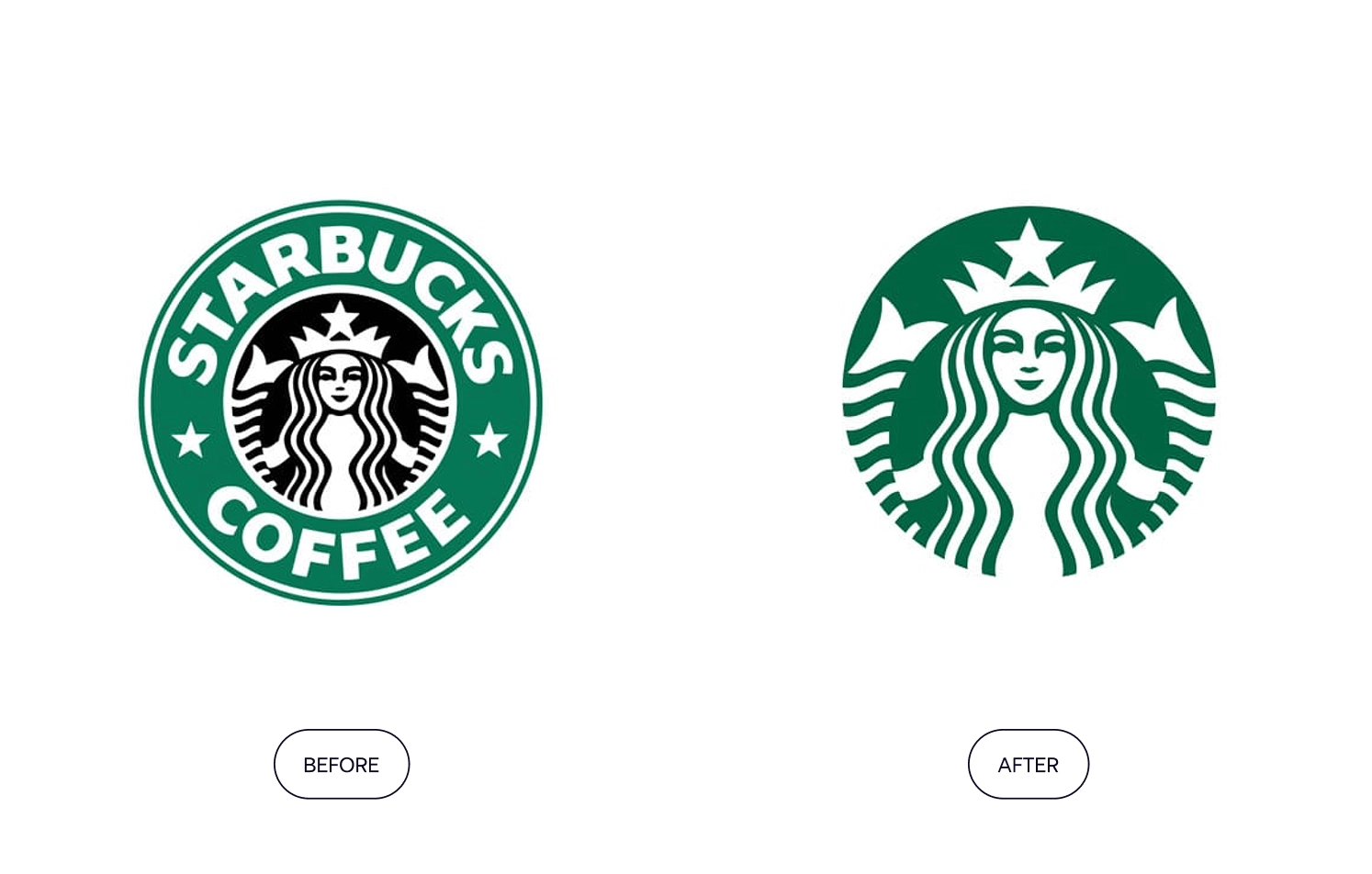
One of such examples is Starbucks. It went minimalist to support its evolution beyond coffee — expanding into new products and experiences while keeping the familiar brand elements customers know. The update helped create a more global, flexible identity that works across markets without relying on local cues or language.
Full rebranding
A full rebrand is usually triggered by big shifts: entering new markets, mergers, audience change, or repositioning the company. It touches every aspect of the brand, from visuals to messaging.
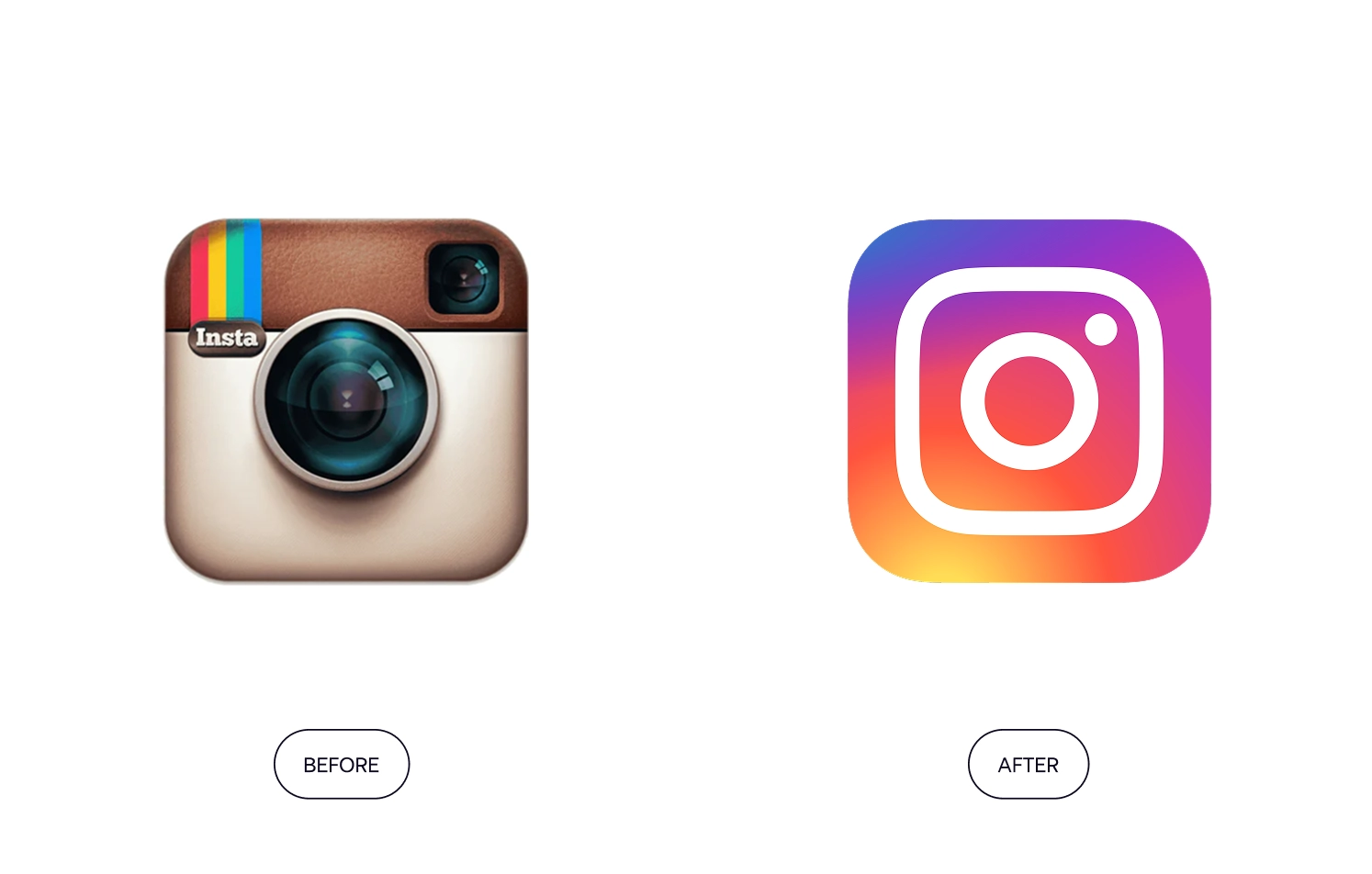
Example: Instagram’s 2016 rebrand marked its evolution from a niche photo-sharing app to a global visual platform. The new gradient icon, modern typography, and simplified UI reflected a broader, more expressive identity.
💡 Looking to better understand the thinking behind rebrands and great design?
We recommend watching Abstract: The Art of Design on Netflix — a visually rich docuseries that explores how top designers across fields like product design, architecture, typography, and branding shape the world around us. In Season 2, it talks about the Instagram rebrand in detail and what stood behind it.
Rebranding process
The process of rebranding moves from strategy to storytelling, from design to consistency. In this section, we walk through the key steps you need to make your rebranding work.
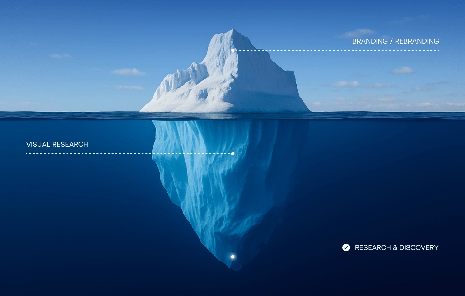
Step 1: Research & discovery
The real rebranding services start with strategy. This is where you get the clarity needed to make confident design and messaging decisions later on.
Audience insights
Before you change how you present your brand, get clear on who you’re presenting it to. You need to understand how your audience actually thinks, feels, and chooses.
Begin by asking: Who is your audience today?
How old are they? Where do they live and work? What do they care about? How do they think — and what do they expect from brands in your category? Go beyond demographics into lifestyle, values, and unmet needs.
Then dig into why they choose — or don’t choose — your product.
- What do they consider most when making a decision?
- Which brands do they gravitate toward, and why?
- What frustrations or needs do they have that no one is solving well?
💡 This is where misalignment often shows up. If your brand is still projecting “2018 startup energy” but your audience has grown to expect mature, premium, or purposeful solutions — it’s time to realign (think of how Massimo Dutti shifted toward more refined expression).
A few ideas to gather these insights:
- Start with qualitative research. Deep, one-on-one interviews help you uncover what really drives your audience — how they describe their needs, what language they use, what frustrates them, and what they value most. This kind of research is about depth, so you’ll need about 10 interviews to spot patterns and surface ideas you wouldn’t get from surveys alone.
- Then move to quantitative research. Once you’ve heard recurring themes in interviews, validate them at scale. Surveys can help you test hypotheses — for example, whether customers really associate your brand with certain values, or how they rank decision criteria like price, ease of use, or aesthetics.
- You can learn a lot just by observing how people interact with your brand. If you’re revamping an e-commerce fashion site, for instance, track a live shopping session and notice where customers linger, which product images they zoom into, or which filters they use first. Take it further by installing a behavior-analysis tool like HotJar so you can replay mouse movements and spot exactly where visitors pause, hover, or lose interest. What are you missing in the way you communicate? Real behavior often reveals more than surveys — and it’s a goldmine for shaping a brand that truly resonates.
- Another powerful source of insight is your own team. People in sales, support, and customer success interact with your audience daily, and often know exactly what they’re thinking. Talk to them. Ask what customers keep bringing up, what brands they compare you to, and what objections or pain points come up again and again. If you’re looking for something specific, make it easy: create a checklist of what to listen for in conversations.
💡 Once you have enough data, structure your findings into user personas — archetypes that represent key segments of your audience. Go beyond surface traits like age or job title. Define their motivations, behaviors, habits, and the emotional or rational triggers behind their decisions. These personas will help keep your rebranding efforts grounded in reality and aligned with the people you’re trying to reach.
Market & competitor research
Understanding your audience is only half the equation. The other half is understanding the world they live in — the trends shaping your category, and the companies shaping their expectations.
Start with your market
What’s changing in your industry? Are new players entering? Are business models shifting? Are customers expecting faster service, better UX, more transparency, or sustainability?
Look beyond your niche — sometimes trends from other industries (like how fintech popularized clean, human-centered design) can push your category forward too.
Use public sources like McKinsey, BCG, industry reports, or trend-monitoring platforms — and save time by letting GPT Chat scan and summarize them. Ask chat to define what’s gaining traction: Are brands emphasizing trust over hype? Are premium aesthetics becoming the norm? Are buyers doing more independent research before engaging?
Next, analyze your competitors directly and indirectly.
Most rebranding consultants suggest looking at how they are showing up visually and verbally, where they’re falling short, and what emotional or strategic gaps exist. The goal isn’t to copy, but to find opportunities for your brand to feel timely, differentiated, and built for what your audience actually cares about today.
💡 This isn’t just a SWOT exercise — use it to spot patterns in positioning, tone, pricing, and visual identity.
Step 2: Creative exploration
This is where your strategy starts to take visual form. After defining who you are and what your audience needs, the next step is exploring how that identity should look and feel.
The creative phase doesn’t start with drawing logos. Rather, it starts with understanding your visual territory.
Visual research
If you’re having a full rebranding, visual research takes place. This step involves collecting references from within your niche and far beyond it — fashion, tech, editorial, architecture — wherever relevant ideas live. The goal is to explore different aesthetics and communication styles to see what resonates with your new positioning.
Good visual research helps prevent trend-chasing. Instead, you build something distinctive and intentional.

Verbal identity (if updated)
As part of the verbal identity phase, you’ll typically:
1. Update key messages and taglines
Are you using generic, interchangeable phrases that any competitor could claim? If so, it’s time to sharpen your message. Clear, specific language should communicate your purpose, value, and personality — answering big questions like:
- Why do you exist?
- What do you stand for?
- Why should people care?
2. Define your messaging pillars
Messaging pillars are the 3–5 core themes that anchor your brand communication. They represent the most important things you want your audience to know, feel, and remember about your brand across every channel, campaign, and conversation.
Each pillar should tie back to your brand’s purpose, positioning, and audience needs. Together, they provide structure and focus for your storytelling, helping you speak consistently even as your content or context changes.
For example, your pillars might include:
- Innovation (how your product is pushing the category forward)
- Trust (what makes your solution reliable and safe)
- Customer success (stories and outcomes that show your impact)
- Vision (what your brand is ultimately working toward)
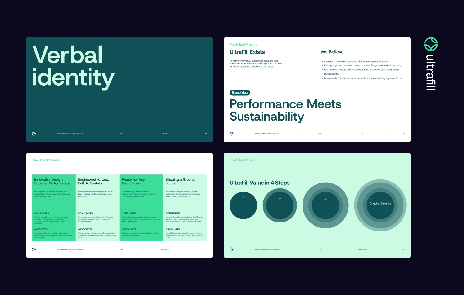
Then, you can ground these messages into a guide that will act as the ground rules for how your brand communicates across marketing, product, support, and internal comms. All of this becomes part of your brand guidelines — a practical, flexible toolkit that ensures everyone on your team, and every partner you work with, communicates with one voice.
Moodboards
In B2B rebranding services, moodboarding is happening once the research is in, and it’s time to shape direction. Moodboards translate strategic ideas into visual tone — color palettes, typography styles, textures and UI patterns, emotional cues like “bold,” “grounded,” “optimistic,” or “luxurious”.
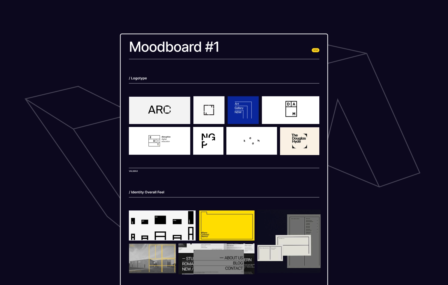
Think of moodboards as your north star: a focused expression of the vibe your brand should evoke — before working on logos or layouts.
Step 3: Brand identity development
Now comes the moment where you turn exploration into something you can see and feel. This is where your brand starts to breathe — and every visual decision should build on the insights uncovered during research and moodboarding.
Logo design
The logo is often the most recognizable symbol of your brand — and during a rebrand, it’s also one of the boldest statements you can make.
When we work with clients, we start by defining what the logo needs to express (based on the verbal identity): Is it innovation? Heritage? Simplicity? Confidence? From there, we explore multiple directions — symbolic marks, wordmarks, monograms, or even dynamic logos — depending on what fits best. Each concept is tested in real-world mockups to ensure it’s scalable, flexible, and instantly recognizable.
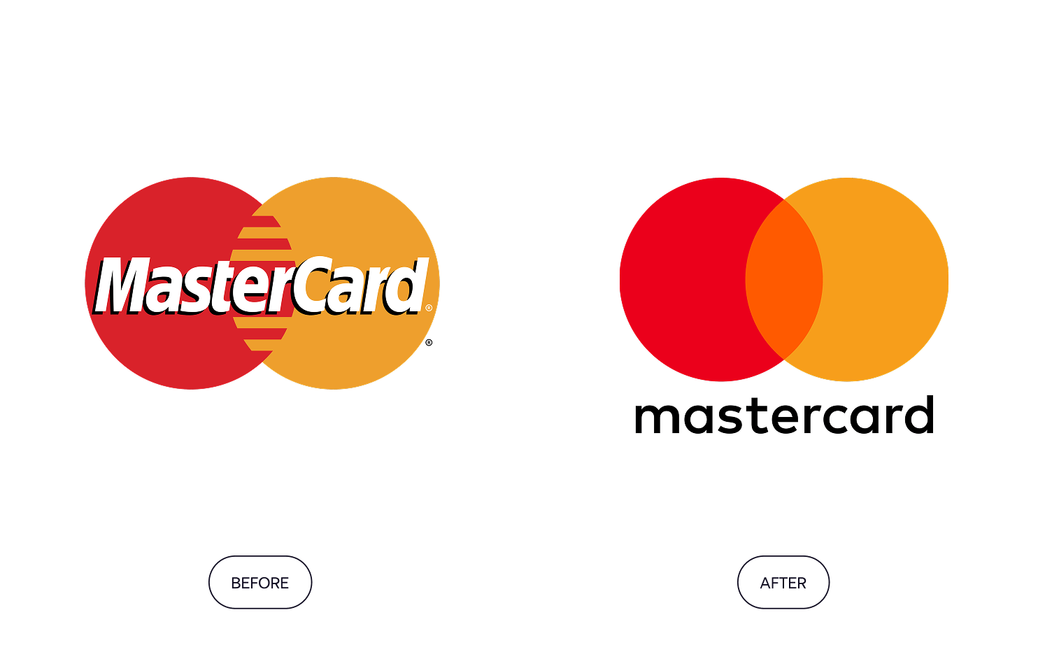
💡 For instance, Mastercard’s logo was already highly recognizable — even without the wordmark — so the goal was to make it lighter, cleaner, and better suited for the digital era.
Current trend: Minimalism is still the dominant trend, but the challenge is avoiding sameness. A clean logo is great, but it still needs character. We often add subtle quirks: a custom cut in a letterform, an asymmetrical balance, or a visual metaphor that clicks once you notice it.
Typography
Fonts do more than carry text — they carry tone. Serif fonts often signal heritage or authority, while grotesques or geometrics feel modern and neutral. A refined type system (with hierarchies, weights, and pairings) supports both clarity and character across platforms.
Current trend: Custom or slightly modified type is making a comeback, helping brands stand out without shouting. A great example is Spotify, which uses a custom geometric typeface that feels clean and digital, yet unmistakably their own.
Color palette
A well-chosen palette can say “luxury” or “approachable” before a single word is read. Here, colors are selected for meaning, contrast, and accessibility, not just trendiness. Let’s take a look at Dropbox: its vibrant and unconventional color system helped shift their perception from a utility tool to a creative, design-forward brand.
💡 Remember, these elements only work when they’re unified. Changing just your logo without addressing the broader brand experience won’t fix underlying issues. True rebranding weaves all these elements together into a single, powerful story that truly connects with your audience.
How Valmax does it: how Teknowledge rebranded to differentiate and grow
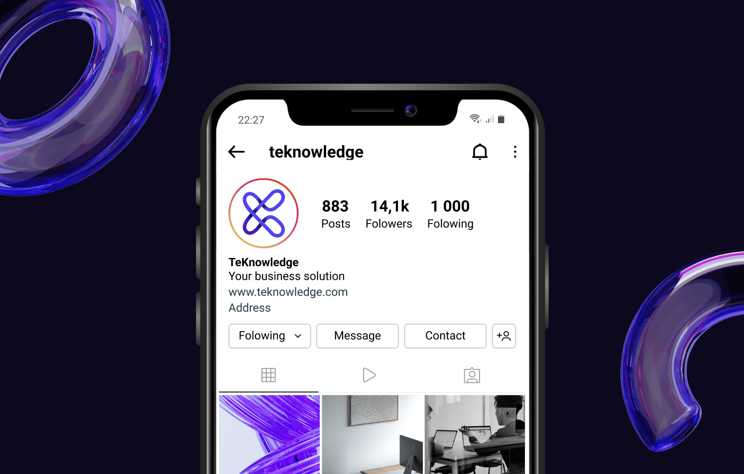
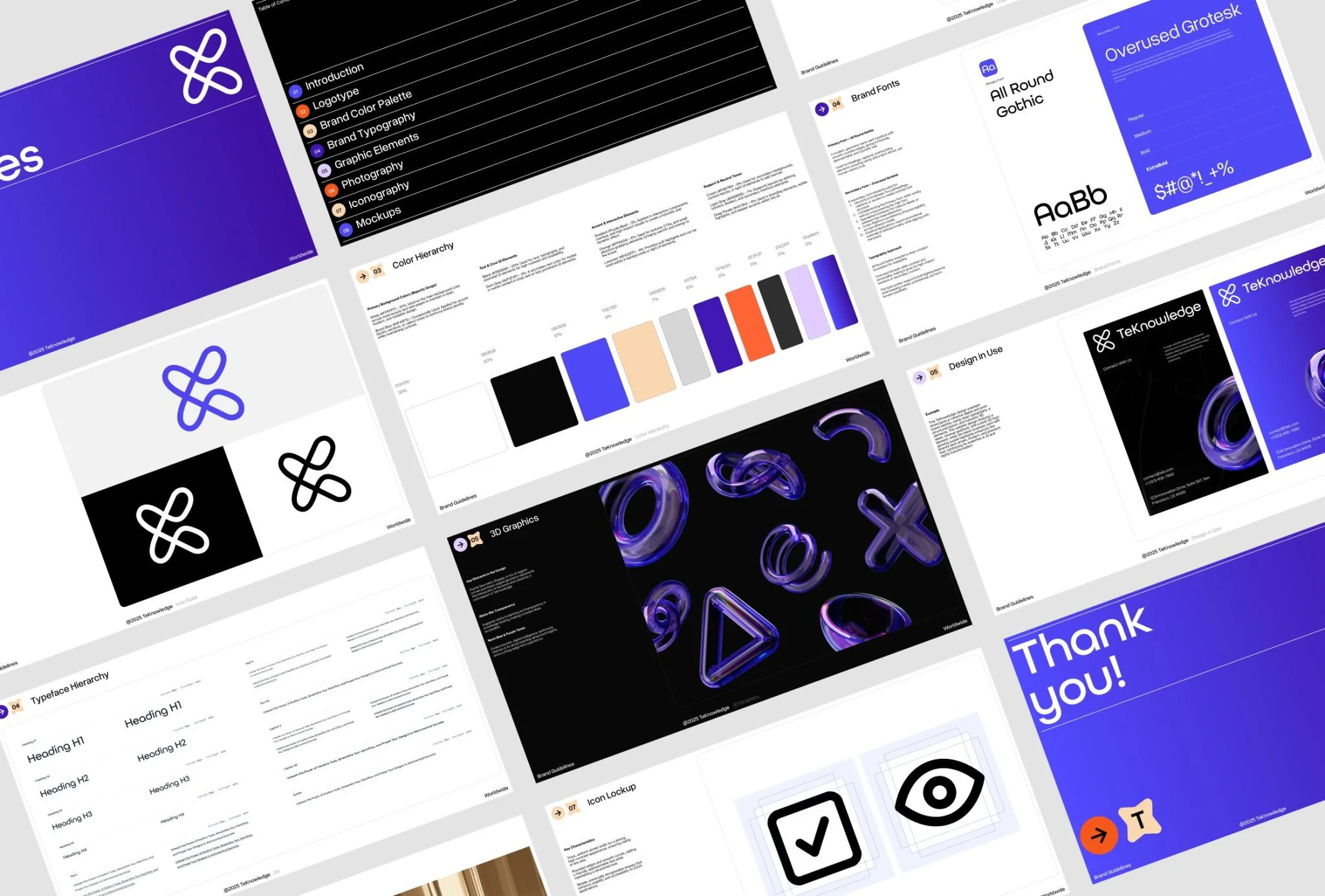
One of your clients, TeKnowledge, set out to do a full rebrand — starting with the verbal identity and then moving into a complete design reboot.
TeKnowledge delivers AI‑first technology services & consulting, spanning AI-driven customer experience, Microsoft Copilot adoption, digital skills training, cybersecurity, advisory services, and fully managed tech operations. They help enterprises, governments, and tech vendors simplify complexity and scale securely.
TeKnowledge came to us for a rebrand after realizing their logo looked too similar to their competitors’ one — and that was the push they needed to rethink how their brand showed up and stood out. The team understood that a simple logo redesign wouldn’t be enough. They needed to:
- avoid legal and brand confusion,
- clarify their positioning,
- and develop a visual system aligned with their values and voice.
We helped TeKnowledge take their new verbal identity and bring it to life through a visual system that feels just as modern, confident, and distinct.
💡 Takeaway for Businesses
If your visual identity is misaligned with your growth or creates confusion in the market, don’t treat rebranding as just a design task. Start with strategy, work with professionals, and make sure every visual element reflects your unique brand story.
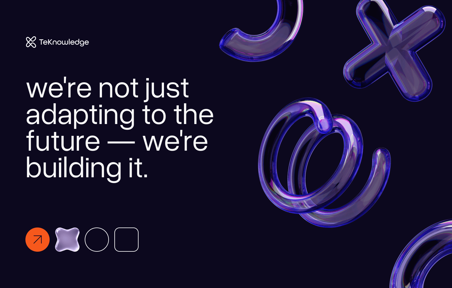
Our role was to translate the new tone of voice into a visual language and wrap it all into a usable brand guideline. Such guidelines cover how and when to use the logo, typography, imagery, and all the core elements we developed during the rebrand. We explored multiple visual directions — as we usually do to find the perfect fit — and here’s where we landed to reflect the core message: ‘We’re not just adapting to the future — we’re building it’.
What to do after the rebranding is done
Rollout & implementation
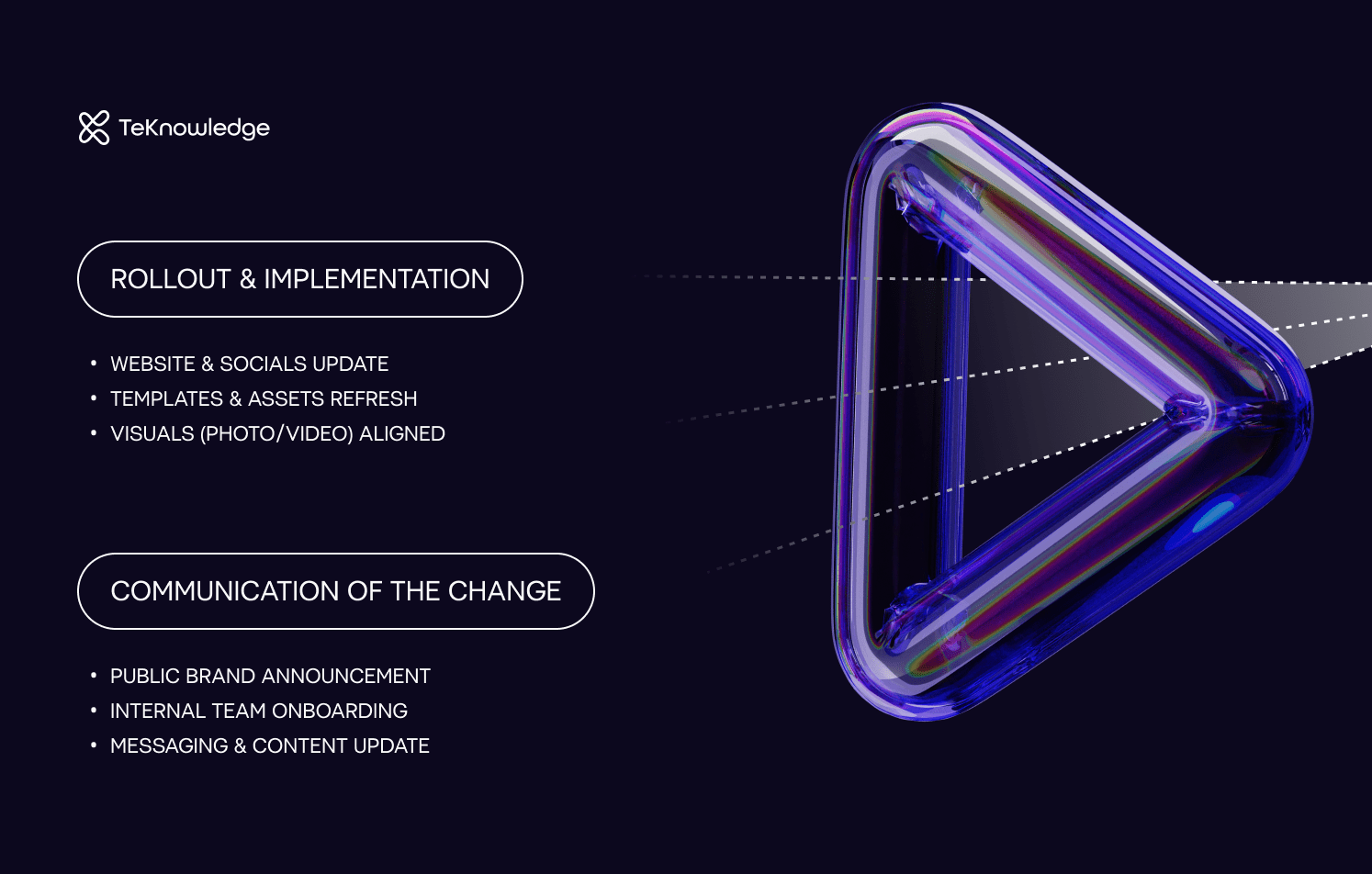
When rebranding your company, the real work begins once the new identity is finalized: making sure it shows up everywhere, consistently and cohesively. Rebranding needs to translate new identity across all touchpoints, so users immediately recognize who you are and what you stand for. Start with your website, digital platforms, social media, and marketing materials. Update layouts, templates, and components — but don’t stop there.
Focus on your content.
What you talk about matters just as much as how you look. Revisit your photo and video style: Does it reflect the tone of your new brand? Is it authentic, consistent, and aligned with your message? Review your copy and content themes: Are you telling the right stories, using the right tone, and speaking directly to your audience’s needs?
💡 This phase requires strong internal alignment. Make sure everyone from dev teams to content managers knows how to apply the new guidelines and why it matters.
Communication of the change
How you communicate the change is just as important as the change itself. The communication kicks off the next phase: embedding the new identity into how people experience your brand. And this doesn’t happen automatically. If your audience doesn’t understand what changed or why it matters, you risk confusing the very people you were trying to better connect with.
External communication
That’s why one of the first steps after launch is teaching your audience what the new brand means. You’re essentially asking them to re-learn who you are. So, show them. Through your website, email campaigns, social media — reinforce the story across channels:
- What led to the rebrand? Growth, change in direction, new audience.
- What does it represent? New values, new positioning, or a refined purpose.
- How does it benefit your users or customers? Clearer communication, better experience, more relevant products.
💡 Rebranding is a great chance to reconnect with your audience and show that your business is evolving with them.
Internal communication
When a company is rebranding, external understanding is only half the equation.
Internally, the challenge is consistency. In the first few weeks after a rebrand, it’s easy for things to drift — for teams to mix old and new materials, or for tone to revert to the “way we’ve always written it.” That’s why you’ll need a tool for coherence. Equip teams with tools: brand guidelines, messaging docs, updated templates. Additionally, explain the strategy behind the change — what’s shifting, and why it matters.
How to pick the right rebrand partner
- Strategy first
Expect a roadmap that starts with discovery and ends with launch support. Typical milestones look like this: discovery → brand strategy → creative concepts → iterations → guidelines → rollout planning. If any step feels fuzzy, keep asking questions. - Discovery before design
A rebrand agency’s first deliverables should be interviews, workshops, or audience research summaries, not polished mock-ups. Insight-led design prevents costly detours later. - A cross-functional team
Great rebrands need more than visuals. Make sure the agency can cover brand strategy, copy, UX, and design — and that senior specialists stay involved beyond the kickoff call. - Transparent pricing and scope
A fixed price with well-defined deliverables beats an hourly “let’s see.” Clarify whether naming, messaging, website updates, or collateral templates are in or out of scope. - Regular touchpoints
Weekly or bi-weekly check-ins help you steer the project while there’s still time to pivot. Agree on a communication rhythm (Zoom, Slack, shared Figma) before work begins. - Post-launch support
Rollouts can be messy. Ask if the partner offers a “brand guardian” phase: template hand-offs, style-guide walk-throughs, and on-call tweaks for the first month or two.
If your brand no longer feels aligned with who you are — don’t wait for your audience to notice first. When it’s time for change, it’s worth doing it right.
👉 VALMAX guide businesses through rebranding with strategy, clarity, and impact. Book a consultation to map out your next brand move.
FREQUENTLY ASKED QUESTIONS
My logo “still works.” Do I really need a full rebrand?
Maybe not. A simple logo refresh can be enough if the only problem is aesthetics. But if your strategy, audience, or reputation has shifted, a surface-level tweak will paper over deeper misalignment. Ask yourself: Does our visual and verbal identity still match who we are and who we’re trying to reach? If the answer wavers, go wider than just the mark.
How long does a proper rebranding actually take?
Expect 3–4 weeks for a thoughtful process: research → strategy → creative exploration → guidelines → rollout planning. You can also book a call with us to get the exact timeline.
Will rebranding confuse our existing customers or hurt brand recognition?
Not if you plan the rollout. Redirect people from old brand touchpoints, keep key content live, and communicate the change early (and often) across channels. When done right, a rebrand can actually strengthen recognition by aligning your message and visuals across the board.
What should I budget for strategic branding and rebranding services?
Ballpark ranges vary based on rebranding type:
– Partial refresh (visual tweaks, updated guidelines)
– Full rebrand (strategy, naming, identity system, launch assets)
Add implementation costs — web dev, packaging, signage on top. It’s an investment, but cheaper than losing relevance or fighting legal confusion down the road.
Can I keep our name but change everything else?
Absolutely. Many brands evolve visuals, tone, and messaging while preserving a recognizable name to keep equity intact (Massimo Dutti is a textbook example). But if the name itself blocks growth (too generic, region-locked, or legally risky), consider renaming early in the process.
How do I get my team on board so the new brand actually sticks?
Bring key people into discovery interviews, share interim moodboards, and explain why each decision maps back to strategy. Provide ready-to-use templates and a “brand first-aid kit” (logo files, tone cheatsheets, slide decks) on day one of launch.
rate this article
5 / 5.0

based on 4 reviews

