Pitch decks are often dismissed as “just slides” — a box to tick for investors, partners, or internal meetings. But that perception couldn’t be further from the truth. What is pitch deck design then? It can become a strategic business tool — it shapes how your company is perceived, steers critical decisions, and, done right, drives real action.
In other words, your pitch deck can make or break your next big opportunity. Whether you’re seeking funding, closing a deal, or aligning internal teams, what’s on those slides matters more than you think.
Let’s break down what separates forgettable decks from pitch-perfect ones — and how you can build a deck that does more than inform.
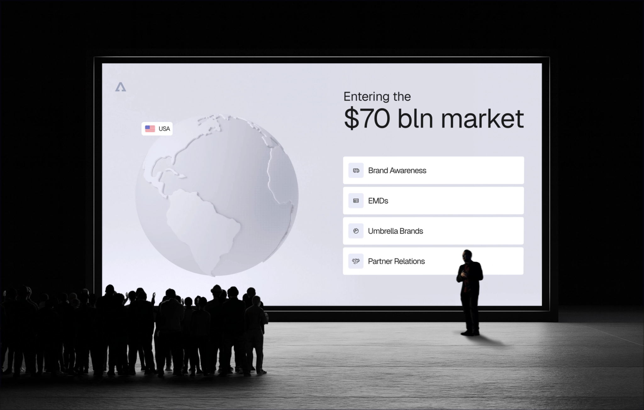
Pitch decks are not just for startups
If you’re in the digital space, you don’t just pitch for money. You pitch all the time: to land enterprise deals, roll out new features, win a marketing budget, hire top talent, or get the board behind your roadmap. In every scenario, you’re asking people to believe, decide, and act. Here are some cases in which pitch deck design becomes relevant:
| Use case | What the deck must do |
| Investor deck | Turn complex tech into a clear, investable story |
| Sales enablement | Show prospects exactly how the product solves their pain — and why now |
| Marketing/idea validation | Package a campaign concept so stakeholders feel the spark |
| HR & culture | Help top candidates see themselves inside your mission |
| Internal buy-in | Align teams and boards around a roadmap or strategic shift. |
What turns a deck into a persuasive tool — lessons from pitching to Uber
When we designed the deck for Voyager — a platform that makes it easy to book and manage group transportation, from charter buses to custom shuttle systems — our goal was to secure the funding round. In building that deck, we pulled together a set of principles any founder or top manager can use to make complex tech persuasive for any goal. Here’s how to make your slides work, step by step.
Step 0: Make sure your brand means business
If a pitch deck is your story, branding is the language it’s written in. We can’t move past branding — we couldn’t do it with Voyager, and it’s not a good idea for you either, no matter where your brand stands.
Branding is the shape your company takes in people’s minds: the name, the story, the tone, and the visual language (type, colour, graphic cues) that ties it all together.
Without a clear identity — logo, name, style — it’s tough to earn trust, let alone secure funding. No matter who you’re presenting, they want to have the proof you know who you are and where you’re going.
Fonts, colors, layout, and visual language work together to create one recognisable style. That’s what makes a deck feel polished and professional — even before a word is read.
And it’s not just for startups. Legacy companies need this just as much. A business running on a logo from 2005 (or even 2015) risks feeling dated, even if the product is excellent. In today’s market, relevance is part of credibility.
💡 Remember, design in a pitch deck isn’t lipstick on a slide — it tells a unified story about who you are. So, start with the meaning. Design can amplify your message, but it can’t create it from scratch. Before you pick a typeface or color scheme, ask yourself: What’s the story we’re trying to tell? Only then should your visual system come in to support that message, not distract from it.
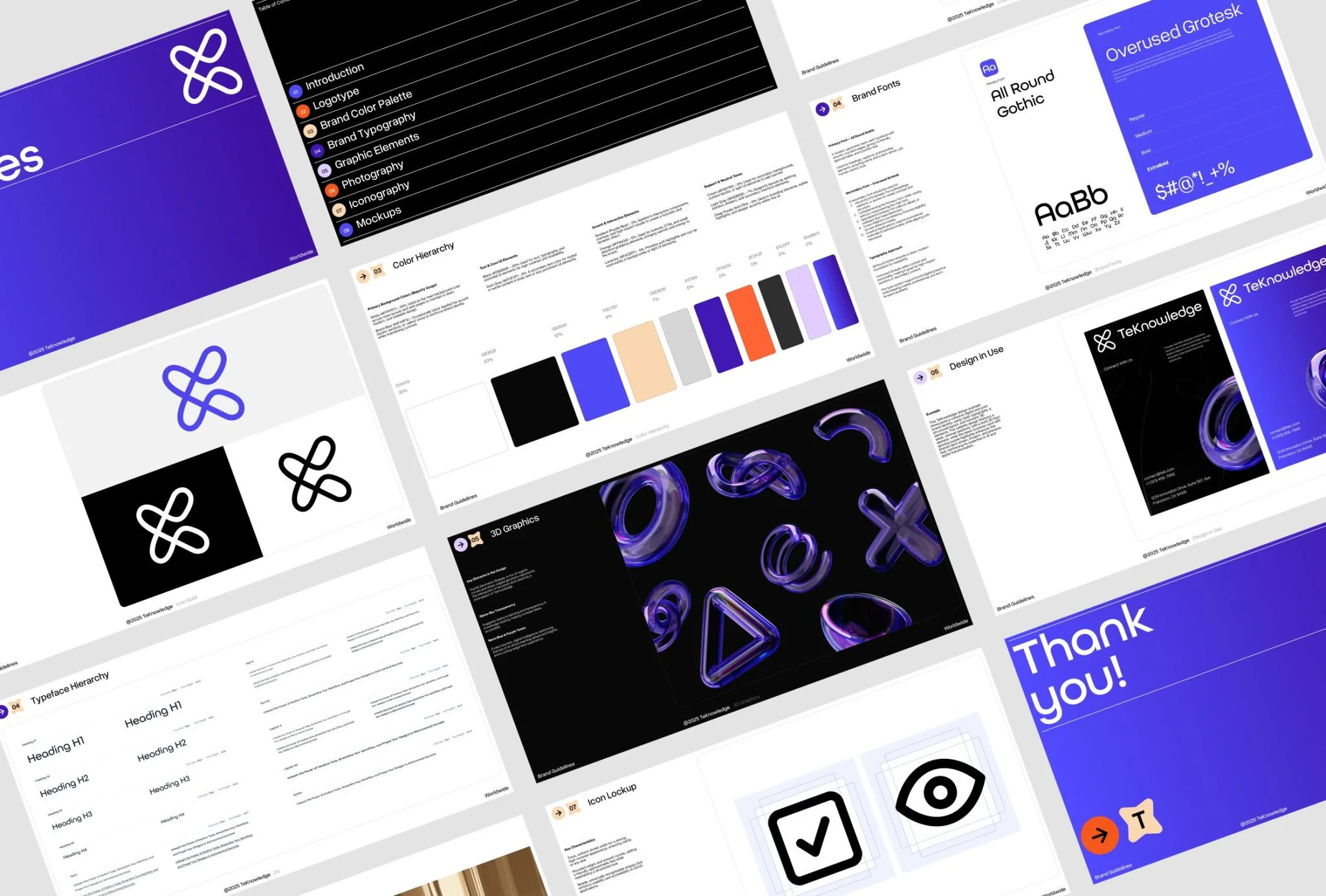
With Voyager, the groundwork was already in place: we had developed the brand identity from scratch and packed it into a practical brand guide:
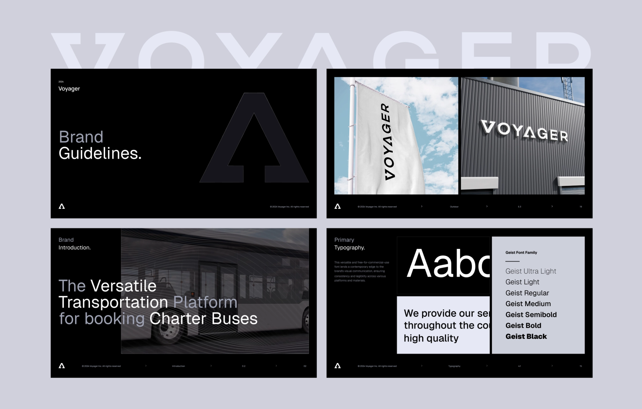
So, we started working on a pitch deck with a fresh identity ready and the website on its way. Now, we needed to turn the deck into a full-fledged visual product that works on a business level. It had to match the brand style yet do a different job: sell the idea and deliver complex tech with a genuine wow.
Step 1: Build the narrative first
For whatever you’re pitching, chances are that what you’ve got right now is a set of scattered notes on the doc without a ready script or sequence. That’s what we’ve had with Voyager — and that’s perfectly normal. What’s important here is to treat content as part of design, as that’s the first step towards a visual logic. For our case, we needed to build a logical story that would match the logic of an investor.
If you’re an HR pitching for candidates, follow the candidate’s logic during this step. If you’re in the middle of pitching an idea to your manager, do the same. Ask yourself:
- What do they care about most?
- What objections might they have?
- What do they need to believe, step by step?
Resist the urge to drop text into PowerPoint right away. First, sketch the logic any decision-maker expects:
- Problem → why now?
Start by showing that the problem you’re solving is real, urgent, and worth tackling. Help the audience feel the pain point and make it relevant to current trends or shifts in behavior. - Solution & demo highlights
That’s where you introduce your product or idea and explain how it solves the problem in a smart or innovative way. - Market proof & traction
A few screens, diagrams, or even a short video can go a long way here. If possible, embed a simple prototype or walk through the main experience so the viewer gets it right away. - Business model + numbers
This could include users, revenue, pilots, waitlists, or any other proof that things are moving forward. - Team
Highlight the key people behind the project. Why are you the right team to pull this off? Show relevant experience, domain expertise, or past wins.
At this stage, it’s also worth thinking of:
- Your key messages — what you want whoever you’re presenting to know. When the time for design comes, we will use it to.
- A slogan that describes your product or business. With Voager, it sounded like: “Voyager App for Customers – Charter Bus is few clicks away!”

💡 Use the structure (Problem — Solution — Proof) as a starting point, but adapt it to fit your needs. The logic may shift depending on your goal — for example, if you’re pitching to attract a top-tier candidate, the storyline will follow a different path than a fundraising deck.
Step 2: Visual logic matters
Visual logic may sound complicated, but that’s just how you show what you’ve outlined in the structure before. Here are the best practices to follow when you’re working on a visual logic:
One slide, one message
Here’s the rule: every slide gets one message. One slide, one action, one idea. That’s it. When you try to squeeze three concepts onto one slide, people get confused. They don’t know where to look or what to remember. So keep it simple.
Make it interactive
Build something people can explore. Let people see the connections and relationships. That could mean using diagrams, layered visuals, or even interactive prototypes to break down a flow or structure. In the Voyager deck, we used visual storytelling to show how their investment model stands apart, especially when compared to competitors and its backers. Here’s how we brought that to life:
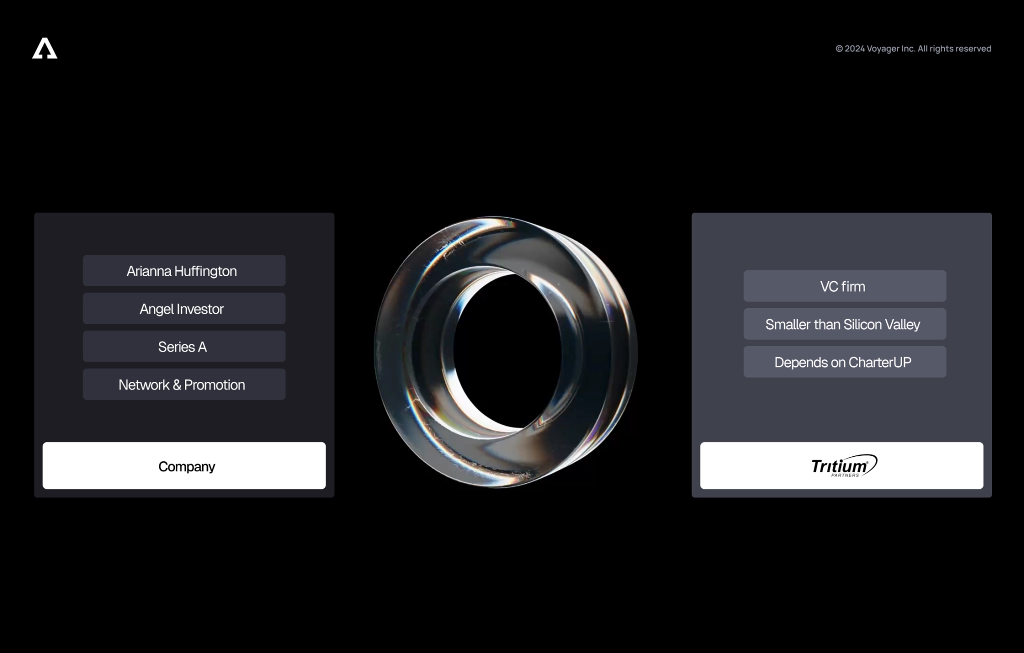
This works because people remember what they interact with. Passive viewing is forgettable. Active exploration sticks.
If you go to a pitch deck design agency, they will be looking for ways to let people play with your story, even in static pitch decks. Interactivity turns a passive slide show into something they remember long after the call ends. Here are a few ways to build touch-and-feel moments connected to the goal you’re chasing.
| Use case | Interactive idea | Why it works |
| Sales enablement | Clickable product/service path. Embed a mini-prototype so prospects can click through the core flow without leaving the deck. | Turn complex tech into a clear, investable story |
| Marketing / concept testing | A/B swipe. Show two creative routes side by side with a slider the viewer can drag to reveal before/after or Option A/Option B. | Stakeholders feel the difference, making feedback faster and more focused. |
| HR recruiting | Culture hotspot map. An interactive office/culture photo where clicking different hotspots reveals team rituals, values, or employee quotes. | Candidates picture themselves inside the company —engagement shoots up. |
| Board or roadmap update | Timeline scrubber. A draggable timeline that highlights completed milestones and upcoming releases as you move the handle. | Directors see progress at a glance and drill into the details they care about. |
| Feature rollout | Component dependency diagram. Much like Voyager’s animated logo, let viewers toggle layers to see which modules talk to which services. | Makes backend complexity understandable for non-engineers, speeding approval. |
Use metaphors that your audience knows
Text-heavy slides make people work too hard, especially for a startup pitch deck design. Visual metaphors do the heavy lifting. Pick metaphors your audience already understands, then map your concept onto them.
Take our chess slide example. We had a strategy decision to explain — something abstract and hard to visualize. So we used a chessboard and showed it as a rook’s move. What looked like a static brand mark in Voyager’s deck turned into an interactive animated diagram.
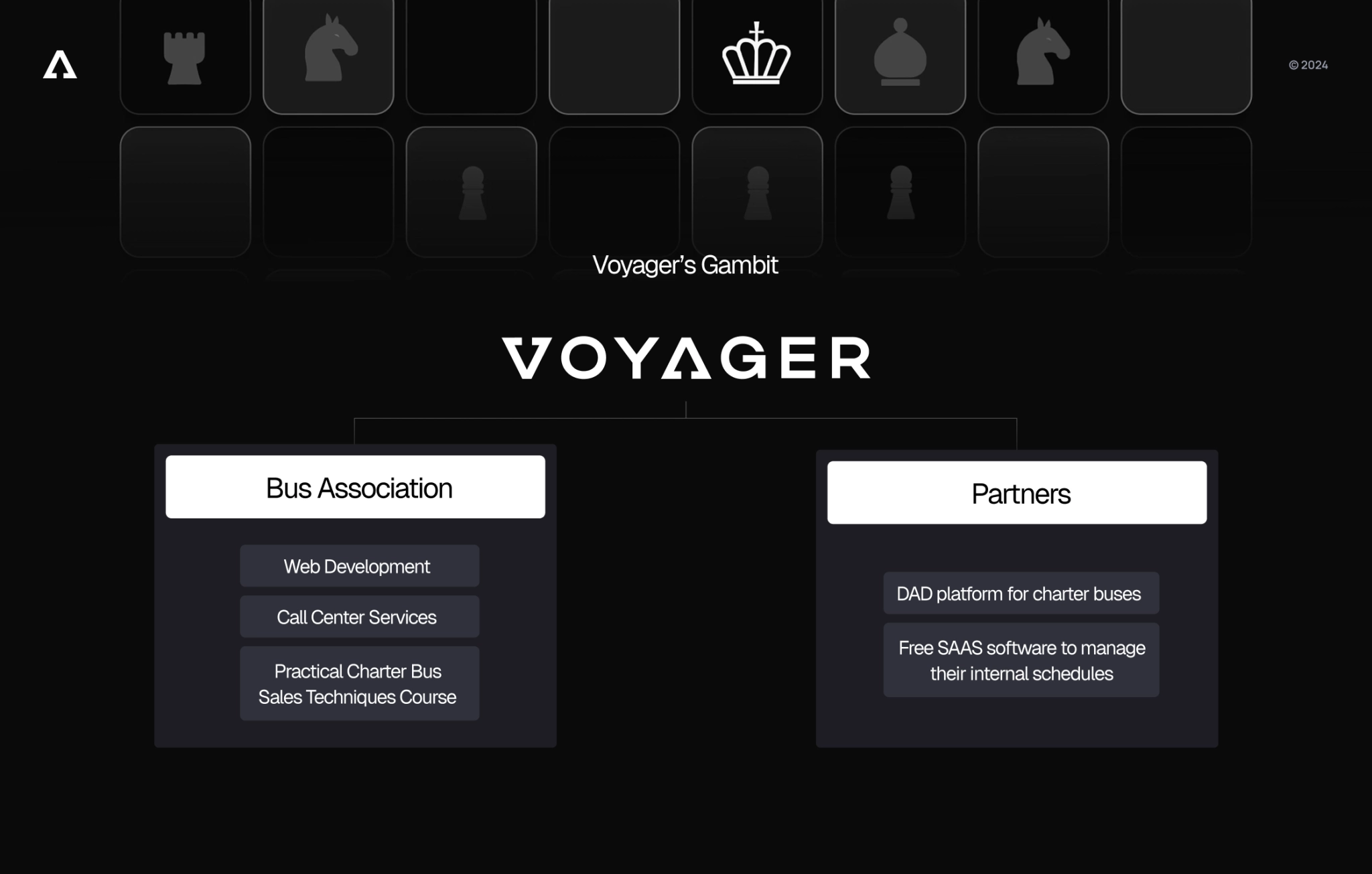
Why chess? Because everyone knows chess requires thinking ahead. The rook’s L-shaped move shows you’re making calculated decisions, not random ones. This creates stronger memories.
That’s why pitch deck experts use metaphors in design: it sticks.
Step 3: Add WOW-effect to control attention
Motion and interaction, when designing a pitch deck, turn slides into moments your audience can’t ignore — and lead their eyes exactly where you need them.
Start strong — and make it stick
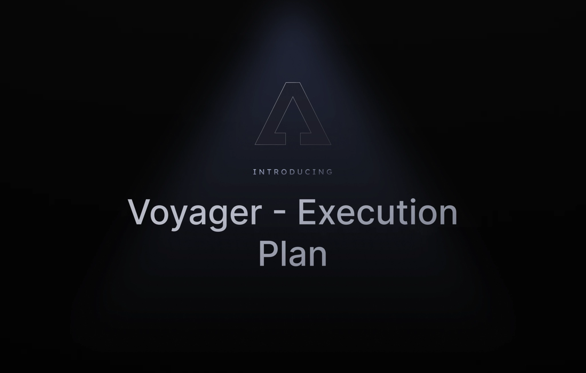
The first slide of your pitch deck is your chance to spark interest and break through banner blindness. It’s always a smart move to lead with something unexpected or visually bold — something that makes people look up, lean in, and want to know more. Remember, people remember the beginning and the end the most. So make them count.
Show, not just tell
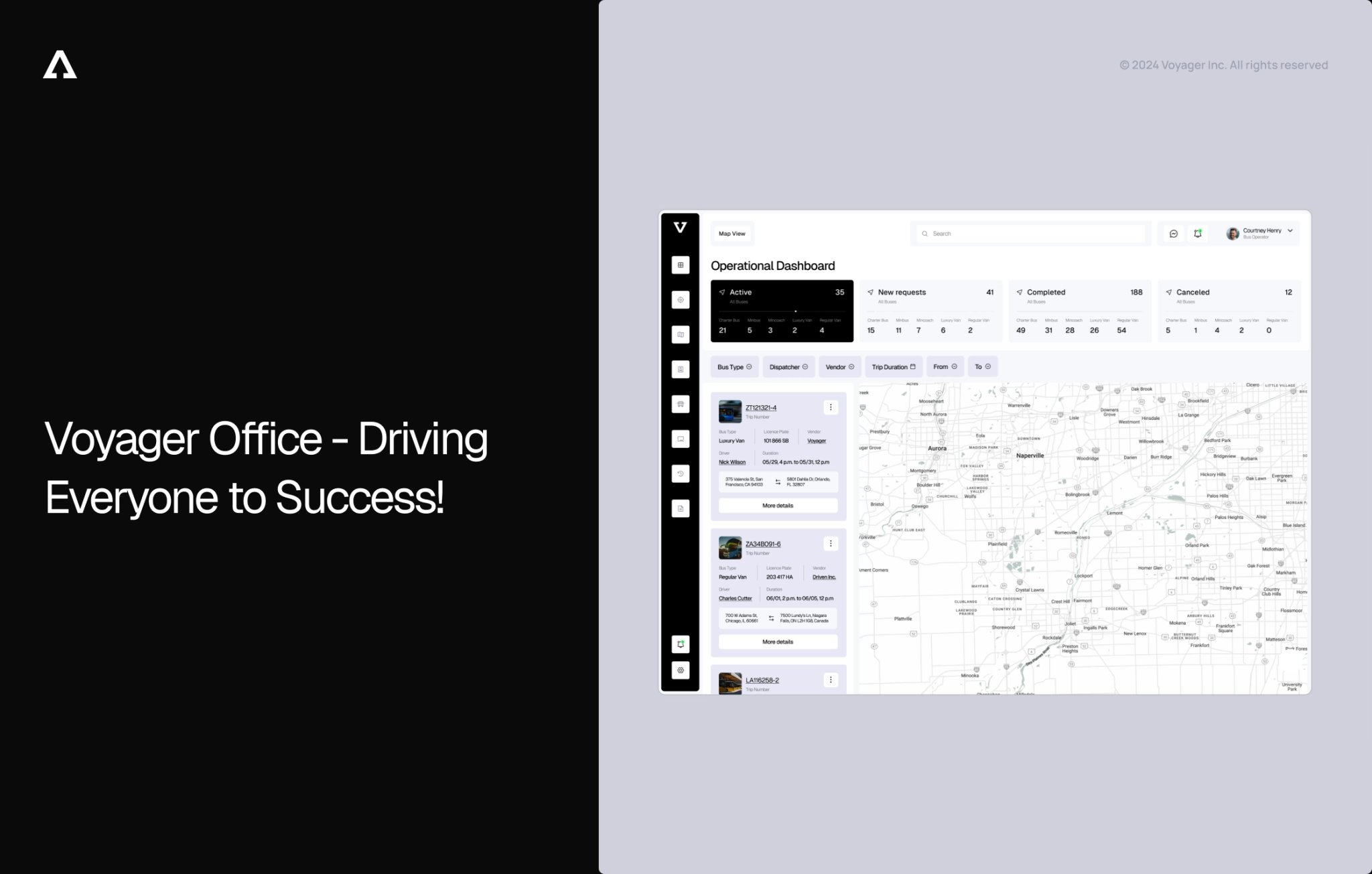
How do you show a product that doesn’t exist yet? That’s right, you’re building it from scratch — or at least that’s what we did. Voyager had no finished product yet, so we designed full-fidelity screens, mocking up the platform’s next-gen interface and embedding those visuals right in the deck. It wasn’t UI for UI’s sake, but rather a part of the goal: it let investors see the roadmap instead of reading about it.
Do the same for your pitch deck: visualize as much as you can.
- If you’re pitching internally to align your team or board, use diagrams or mock-ups to show how the new initiative fits into your current ecosystem.
- If you’re hiring, show a day-in-the-life storyboard or team culture snapshots — it’s much more persuasive than bullet points about values.
- For marketing ideas or campaigns, build visual previews of what the campaign might look like across channels. Show a mock web design, social creative, or a quick prototype.
- Even when rolling out a new feature, a simple flowchart or motion walkthrough helps stakeholders understand it faster — and trust it more.
💡 The rule is simple: show like whatever you’re pitching looks like (even if it doesn’t exist yet).
Use motion as a guide, not a gimmick
Motion in modern pitch decks should never be just for show. That’s how you direct attention, clarify structure, and enhance the story. Good motion design acts like a presenter. It helps guide your viewer’s focus to what matters most on the screen, in the order that makes the most sense.
- Reveal in sequence: Instead of showing everything at once, use step-by-step reveals to walk the audience through your message. It builds anticipation and keeps them engaged.
- Control pacing: Subtle transitions create rhythm. So, by showing the content, you’re also setting the tempo. Smooth fade-ins, quick highlights, and slide-ins can all mimic how you’d naturally guide someone through an idea in conversation.
- Anchor with consistency: Motion should feel like part of your brand — clean, intentional, and on beat with your tone. Repeated patterns in animations (like how charts appear or how images transition) help build a consistent, trustworthy experience.
With Voyager, for example, we used motion not just to animate, but to guide the pitch like a live demo. Complex components were introduced one by one, metaphors unfolded smoothly, and the entire presentation mirrored the speaker’s voice. That’s what makes motion memorable — when it’s used to support the story, not distract from it.
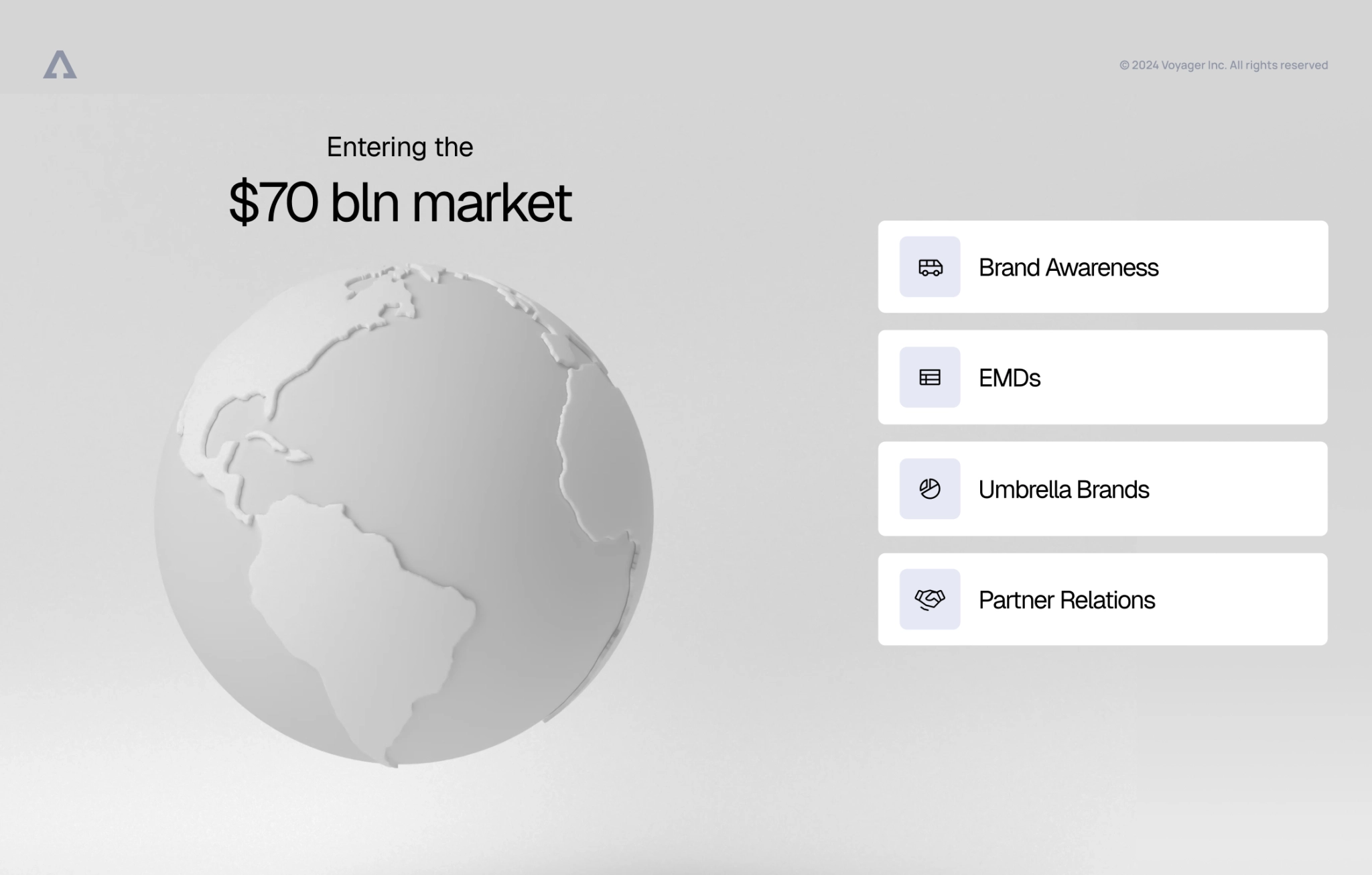
💡 Pro tip: Time your transitions to match the speaker’s rhythm — it makes your visuals feel like a co-narrator, not just background slides.
Takeaway: Persuasion = logic + emotion
Best-designed pitch decks work when they speak to both the head and the gut. For Voyager, the content carried the technical depth, but it was the visual storytelling that brought it to life and helped bring logic and emotion together.
- The logic: A strong structure and clear narrative flow conveyed in design helped investors quickly grasp the opportunity.
- The emotion: Bold visuals and brand consistency signaled confidence, ambition, and clarity of vision.
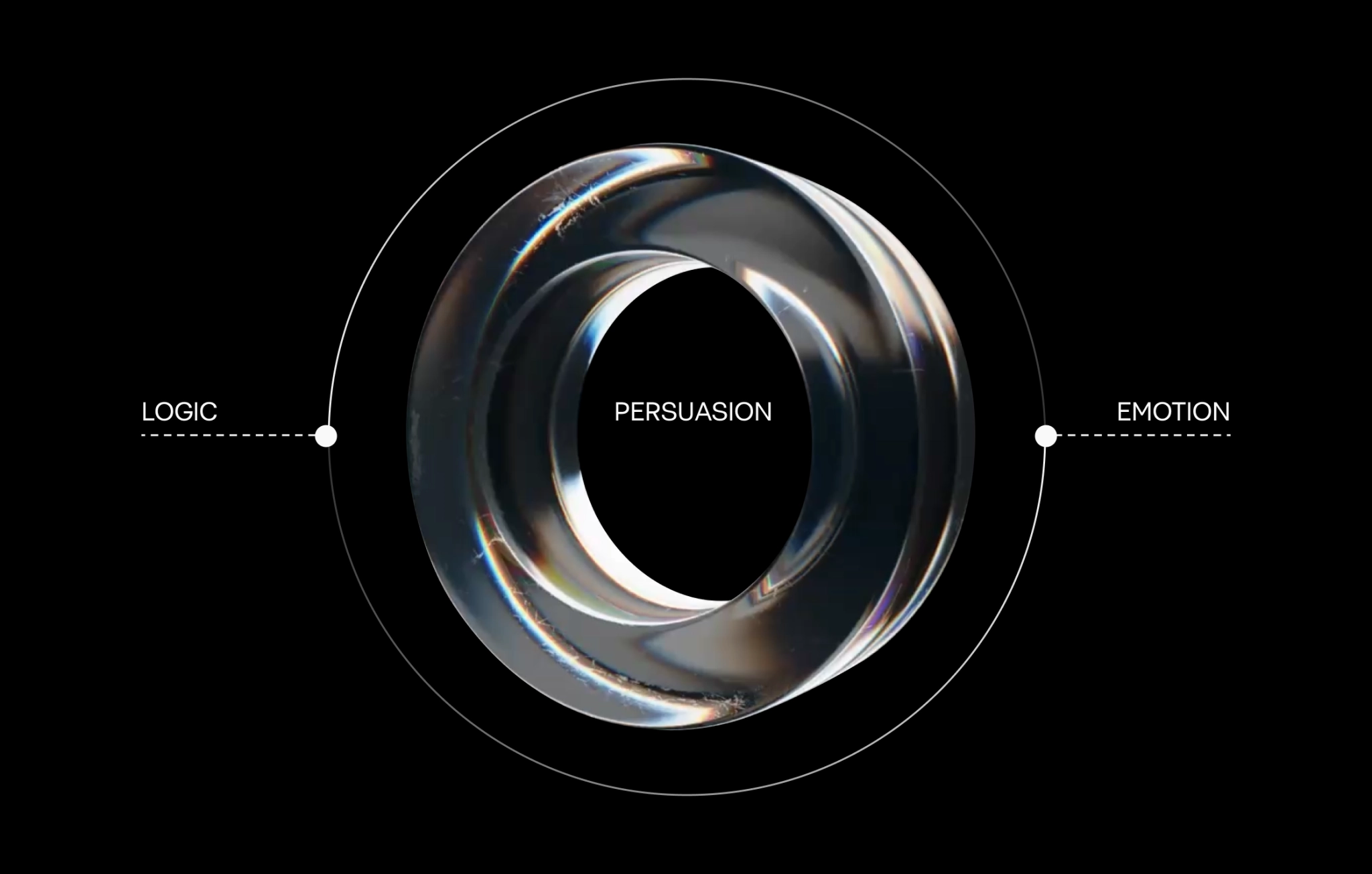
Together, these elements built trust, excitement, and opened the door to meaningful follow-ups.
Advice to teams preparing a pitch deck
By now, you see how your deck is telling a story, making a case, and guiding someone toward a decision. Below, we’ve distilled practical advice into focused tips — each one designed to help you build decks that are clear, intentional, and genuinely persuasive.
1. Don’t use cookie-cutter templates — they kill clarity
Pre-built templates look convenient, but they force your story to bend around someone else’s layout rules and placeholder copy. The result is a deck that looks polished yet feels generic — and generic messages slide right past busy decision-makers.
Why templates backfire
- Slides appear in a preset order (problem/solution/market/ask) that may not match the logic your audience cares about.
- Random icons, multiple font styles, and trendy color gradients clutter the page instead of highlighting your big idea.
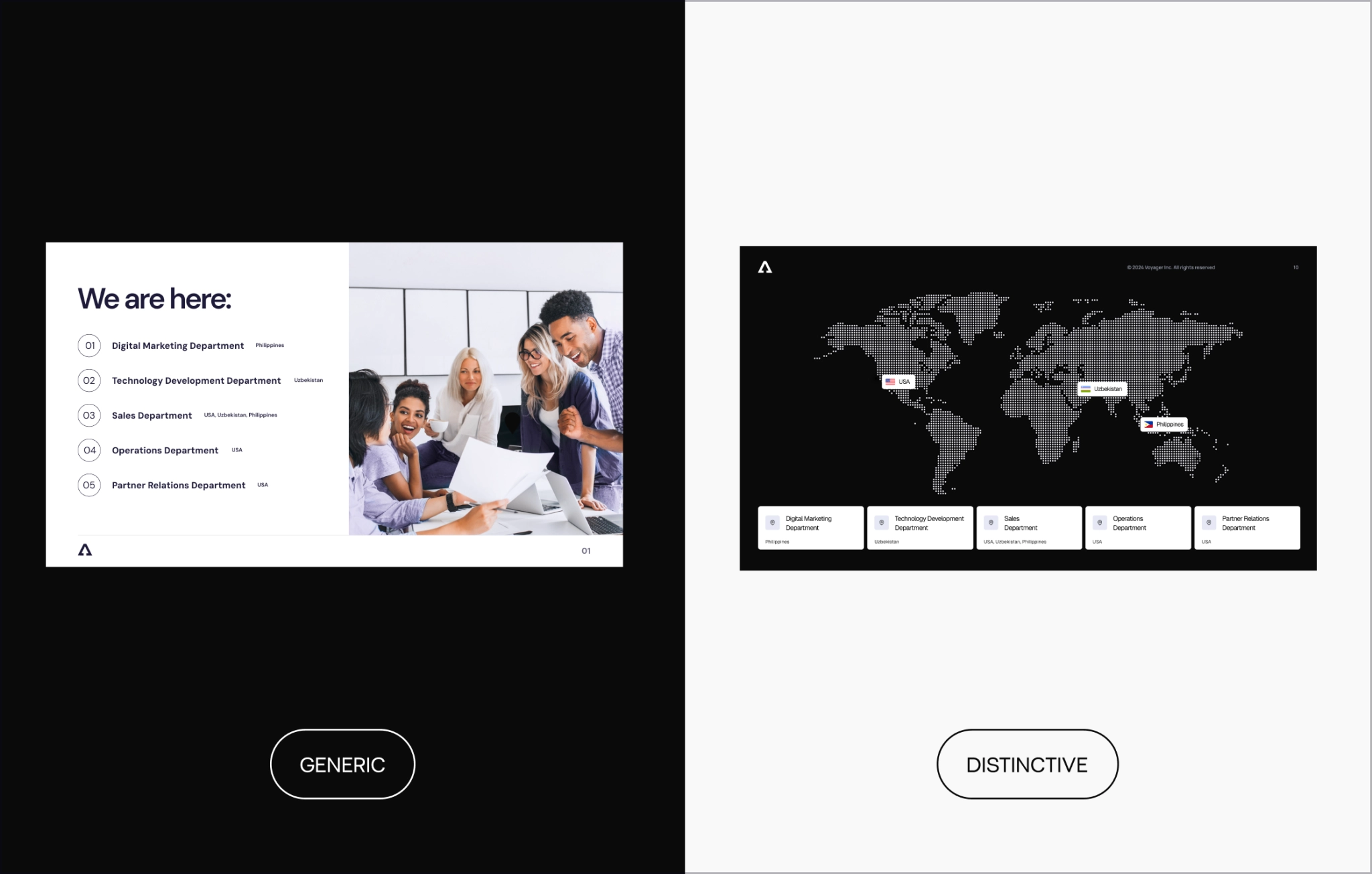
Investors, enterprise buyers, and hiring candidates see hundreds of decks; they’ll spot stock design in two seconds.
What to try instead
Every slide in your deck should answer a question your audience actually has. Start by asking yourself: “What question does this slide answer?”
Is it: What’s the product? How does it work? Why now? What proof do we have? Who’s behind this? If that answer doesn’t jump out in three seconds, it’s time to rethink. Either:
- Simplify the layout — cut the noise, focus on one idea
- Split the content — two clear slides are better than one crammed mess
- Rephrase your message — the best slides deliver clarity
💡 Pro tip: Before finalizing, go slide by slide and ask: “Would someone skimming this deck still get the message?” If not, revisit.
A template saves minutes up front but costs you clarity, credibility, and connection. Start clean, stay on brand, and let the story dictate the design, not the other way around.
2. Invest time in the storyline
Bad logic can’t be fixed with great visuals, so make sure you work on your script well.
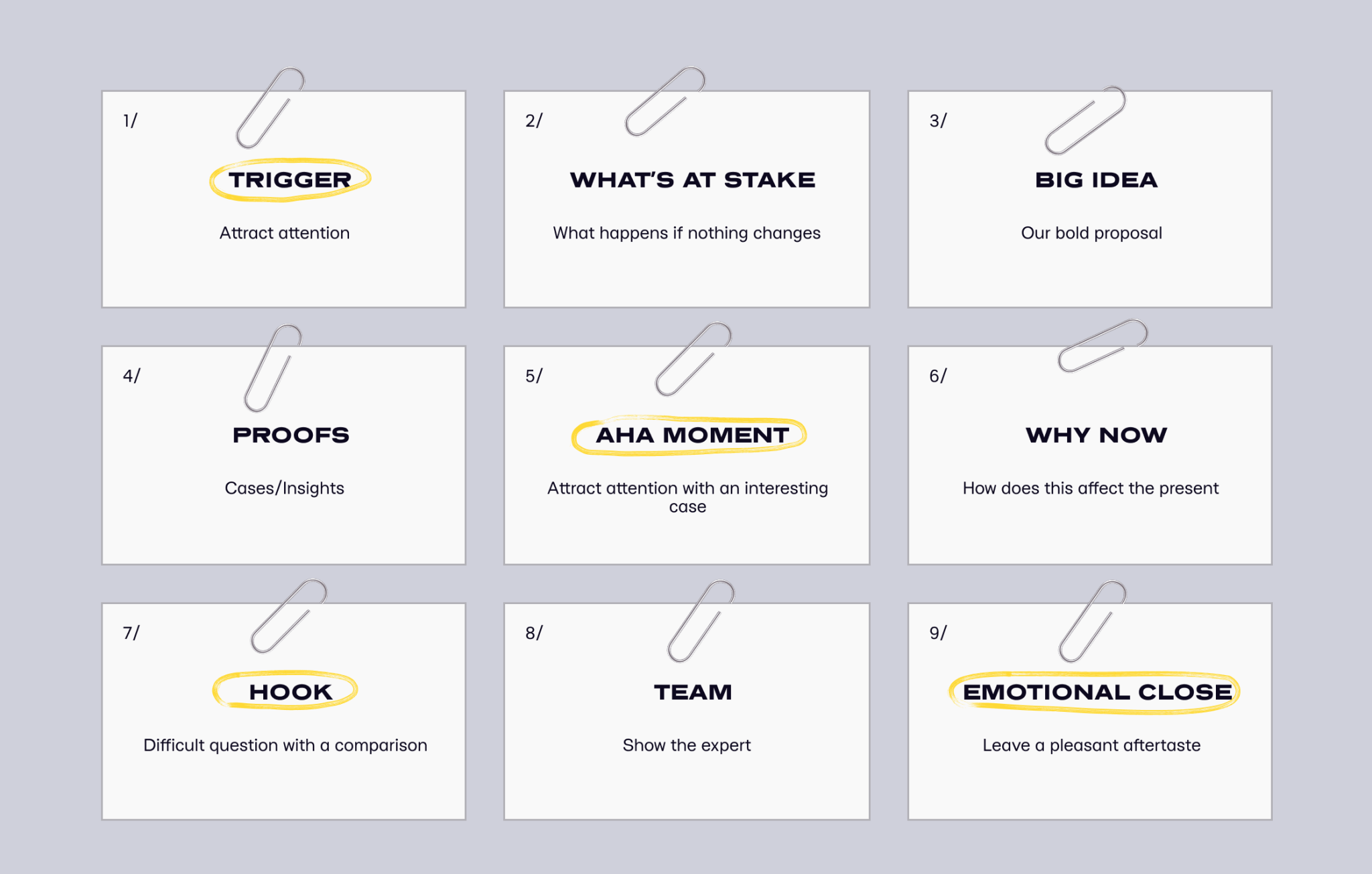
You might have beautiful slides, but if they don’t follow a logical arc (one that reflects how your audience thinks), they’ll lose attention fast. A good storyline guides people through your thinking, answers their questions before they ask them, and builds pace toward your key ask.
Why it matters
- A pitch deck isn’t just a visual asset — it’s a narrative tool.
- Confused viewers won’t convert, invest, or follow up.
What to try instead
Before opening any design tool, write out your pitch as a short narrative. One paragraph. No slides yet. Just describe what your audience needs to understand, believe, and feel by the end. This gives you a north star. Then, map it out like a journey. What comes first? What proof do they need? What moment will hook them emotionally? Break this into key beats, and only then start assigning one slide per idea.
This helps you avoid clutter, keeps the storyline intentional, and works no matter the goal: fundraising, hiring, internal buy-in, or selling a product feature.
💡 Visuals amplify meaning — they don’t create it. If your narrative is foggy, no amount of beautiful gradients or mockups will save it. That’s how you reach your goals: not by dressing things up, but by making them land.
Test the deck on someone unfamiliar with your offering
No matter what you’re pitching — a new product, a feature launch, a culture shift, or a job opportunity — your deck should make sense even to someone who’s never heard of it.
Once you’re done, share it with someone outside the team and outside the bubble. Someone who isn’t familiar with your product, brand, or internal context.
Then ask them:
- What do you think this is about?
- What felt confusing or too detailed?
- Was there anything that made you want to learn more?
- If this was a job/idea/product/campaign — would you be curious or convinced?
This simple test often reveals what’s unclear, too vague, or unnecessarily complex. It helps you see your content through fresh eyes, just like your real audience will.
💡 Tip: Don’t walk them through it. Let them read it cold. That’s the only way to see if your storyline and visuals truly work without you there to explain.
This works across all use cases:
- For sales: see if they understand the offer and want to act.
- For recruitment: check if the deck reflects the culture and value of joining.
- For internal updates: confirm the narrative is aligned and actionable.
- For fundraising: validate if the logic and ambition come through clearly.
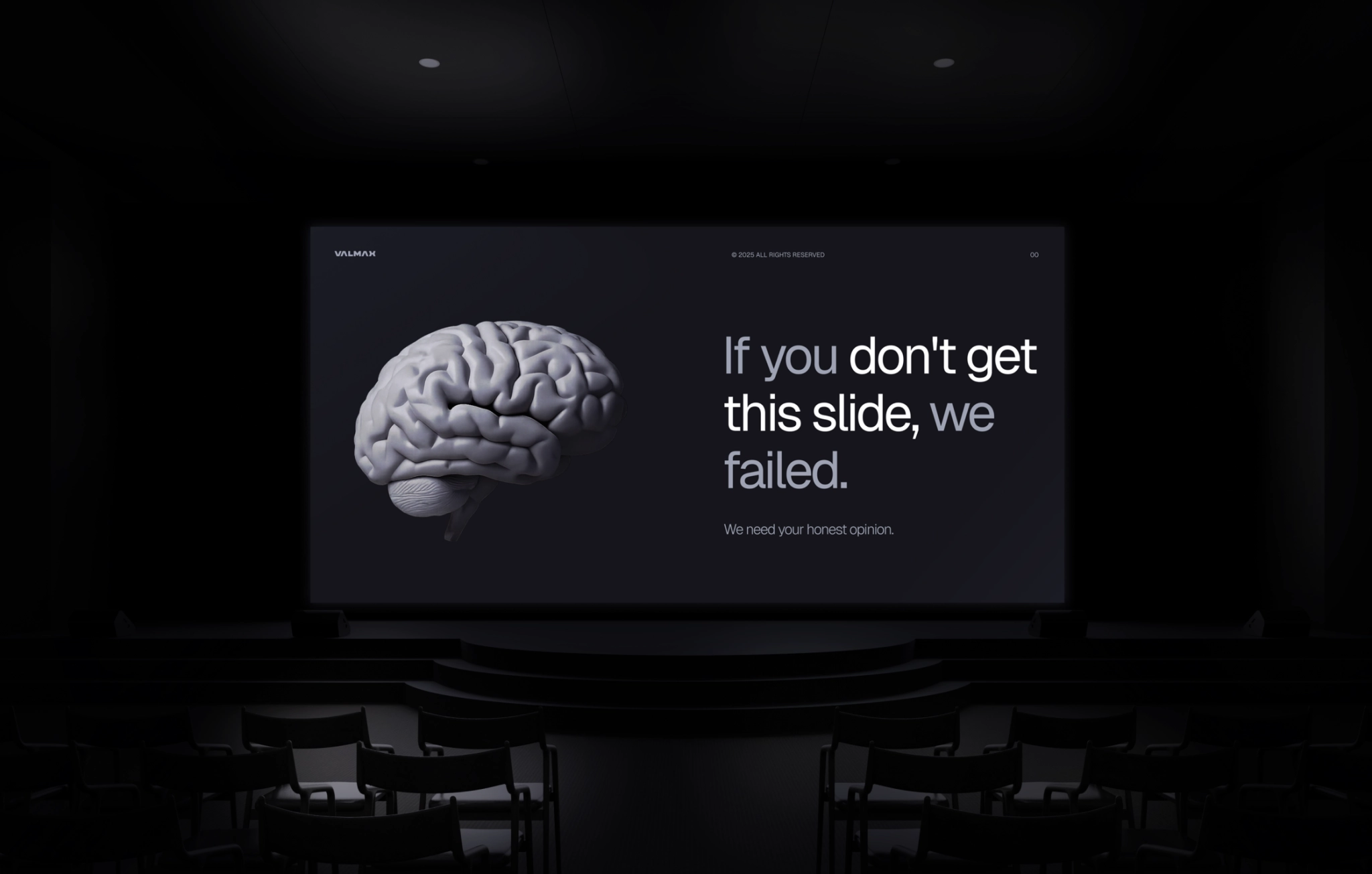
If you’re not ready to show it to anyone yet, make sure to check it yourself and guide through questions. Look at the slides like someone unfamiliar with the offering and make sure the content is easy to grasp, that there is engagement, and it provokes action.
Start the other way around
One of the most effective ways to build a presentation deck is to start from the outcome you want. Not the intro. Not the product. The action.
Ask yourself:
What do I want the person on the other side of the table to do after seeing this?
That single question can shape the entire structure of your deck. Because once the destination is clear, it becomes much easier to map the route. Let’s say your goal is:
- A follow-up meeting with investors — your story needs to build credibility, spark curiosity, and leave room for questions.
- Buy-in from leadership — your flow should highlight trade-offs, risks, and long-term value.
- A top-tier candidate saying yes — your slides should sell the culture, the mission, and what’s in it for them.
- Green light on a roadmap — your content has to make the plan feel inevitable and the decision low-risk.
Working backwards helps you avoid generic intros or bloated “about us” sections. Instead, you stay focused on building momentum toward one specific decision.
So, before you open a slide editor, try writing your call to action first. Then, ask:
What does my audience need to know, believe, and feel to get there?
That’s your real deck. Everything else is just design on top.
Pitch deck as an experience
Pitch decks can do a lot more than pitch for funding — they’re tools for sales, hiring, partnerships, and internal alignment.
In a world where dozens of decks fly by every day, design is what makes yours stand out. Visual storytelling helps your message land, your value get across, and your audience stay engaged. Design shapes trust, clarity (structure or chaos), and emotion (inspiration or indifference). When form and content work together, your pitch persuades — and that’s the ultimate goal.
💡 At Valmax, we’ve helped startups and B2B brands turn ideas into decks that work. If you’re building one, we’d be happy to help you do it right.
IMPRESS INVESTORS WITH A POLISHED PITCH DECK
Custom design, clear structure, and storytelling that sells
Your questions, answered
Are pitch deck design services only for startups looking for funding?
Not at all. Pitch decks are used in sales, marketing, recruiting, internal alignment — anywhere you need buy-in. Whether you’re selling a product, a campaign idea, or a company vision, the same storytelling principles apply.
What should come first: design or content?
Always content. Design supports the message, but doesn’t replace it. Start with your narrative and flow, then use design to make it clearer, more engaging, and more memorable.
What makes a pitch deck persuasive?
It balances logic and emotion. The best decks combine structure, proof, and clarity (logic) with bold visuals, ambition, and brand consistency (emotion). This builds trust and sparks curiosity — the two things you need to move someone to act. Pitch deck design companies know how to make it right, so reach out to look at your case.
What if my product doesn’t exist yet?
That’s where mockups and high-fidelity visuals come in. Show what it will look like. People trust what they can see. Use motion, metaphors, or even prototypes to turn abstract ideas into tangible ones — or chat with our team today to see how we can help.
How do I know if my pitch deck actually works?
Test it on someone outside your bubble. If they understand the story, ask the right questions, or feel excited, your deck is doing its job. If they’re confused or disengaged, go back and simplify.
rate this article
5 / 5.0

based on 3 reviews

