BLACK, WHITE, AND BUILT RIGNT: DESIGN FOR A FOOD CONSULTANCY
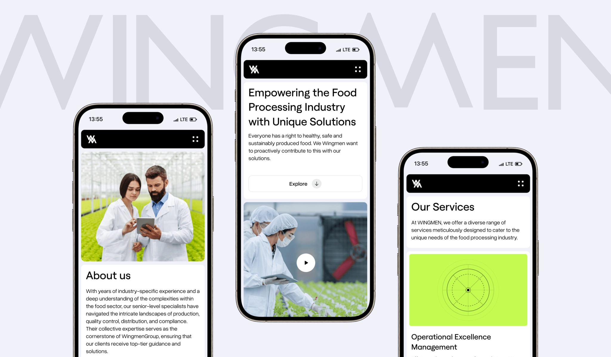
A global consultancy, a clear direction, and a site that went from relic to reputation builder in six sprints. Wingmen Group now looks as engineered online as their plants run on the factory floor — black, white, a dash of grey, and a whole lot of confidence.
Services we provide
Headquarters
Switzerland
Industry
Consulting
Website
Timelines
3 months
COMPLEX SYSTEMS, SIMPLE STORY
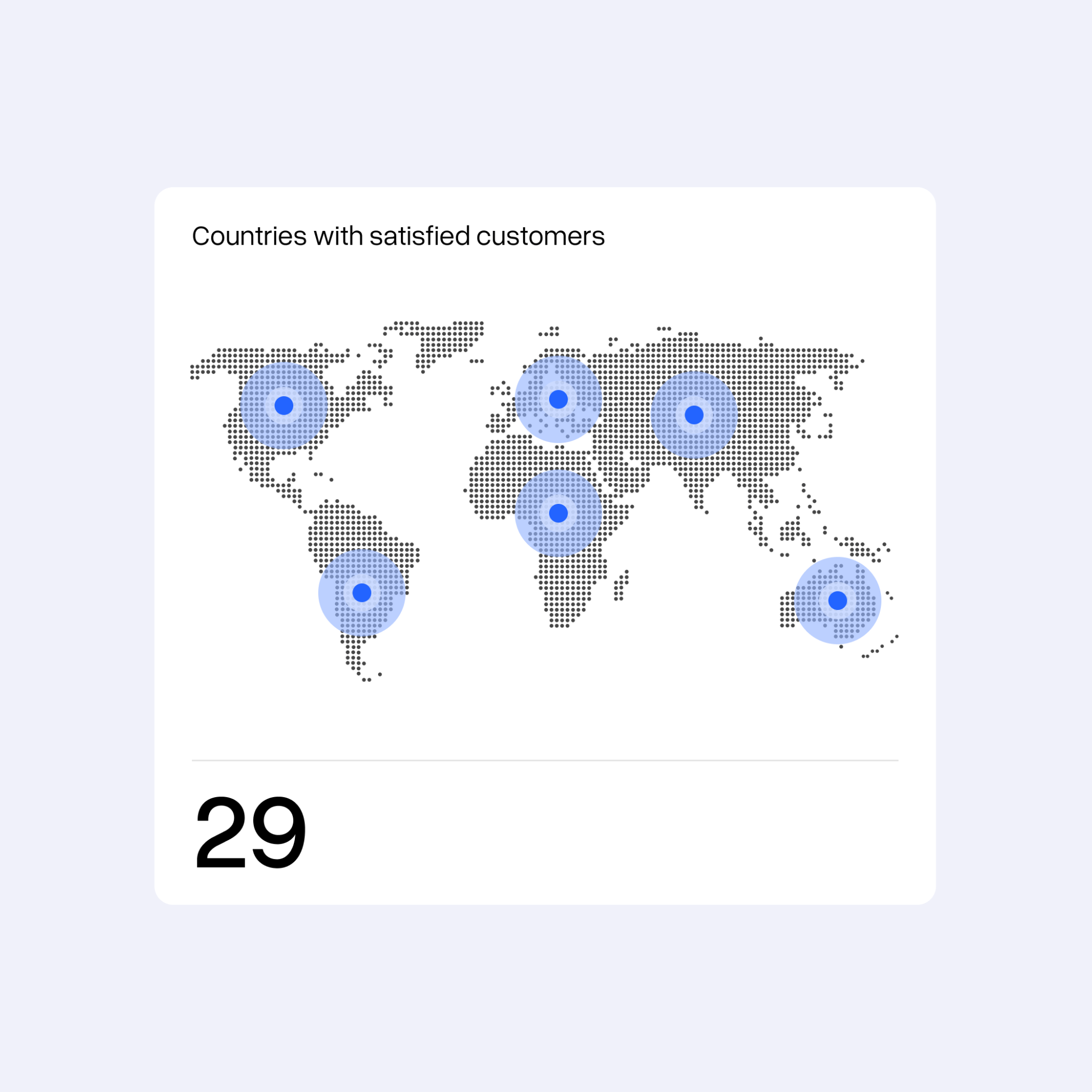
Wingmen Group is a consulting and engineering firm helping food-processing plants run smarter across 29 countries. They refine operations, cut energy use, automate production, and raise quality standards — backed by in-house R&D and deep industry know-how.
Process
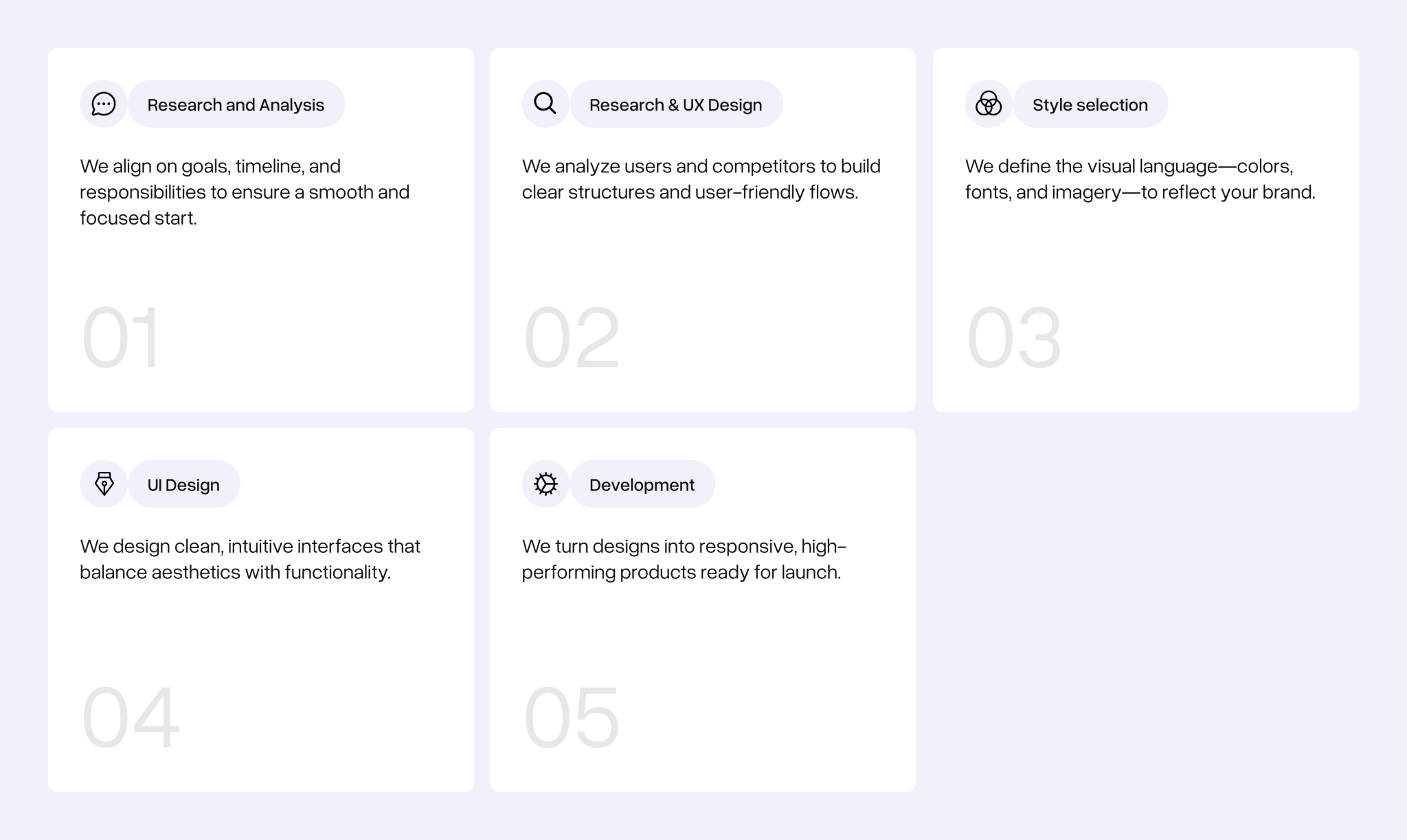
SMART SYSTEMS DESERVE A SMARTER SITE
Before
After
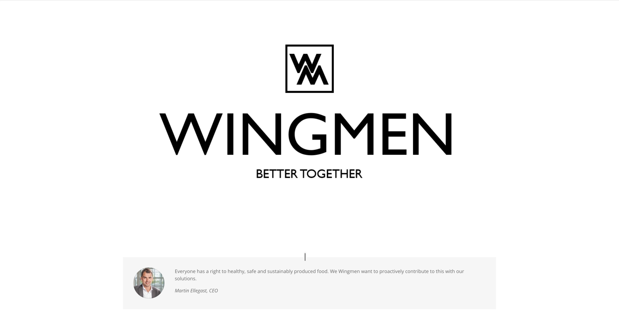
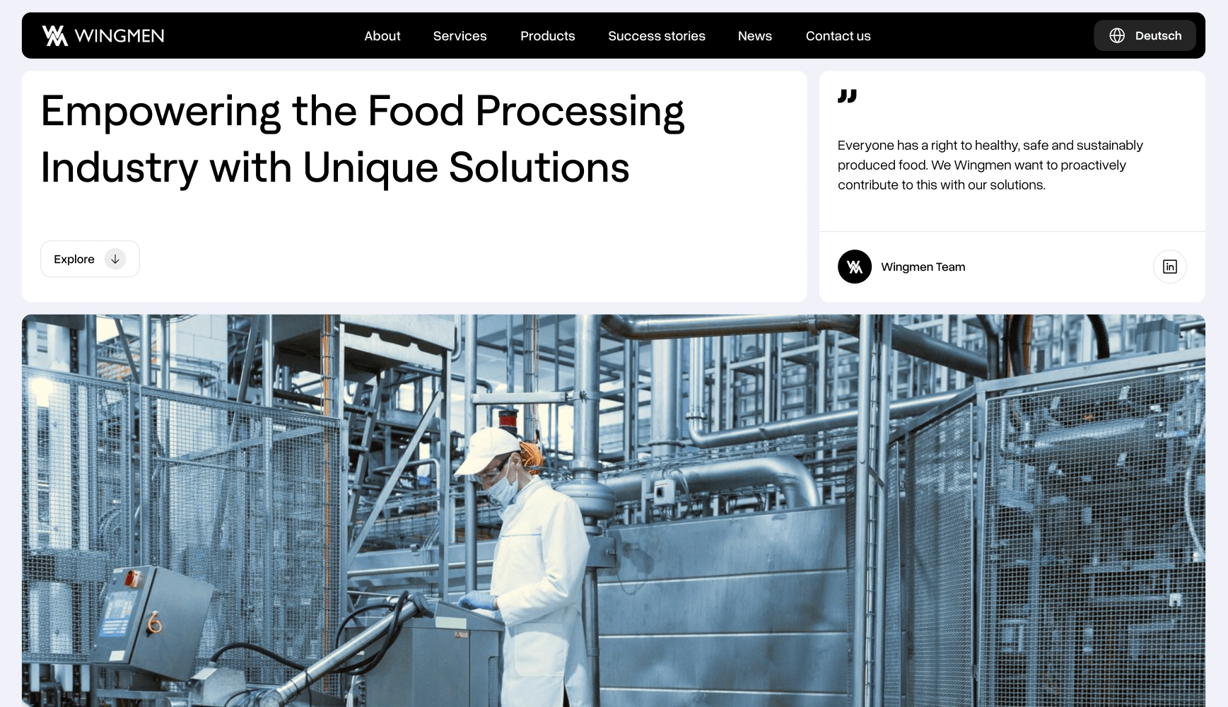
Drag
BUILT ON BLACK
AND WHITE
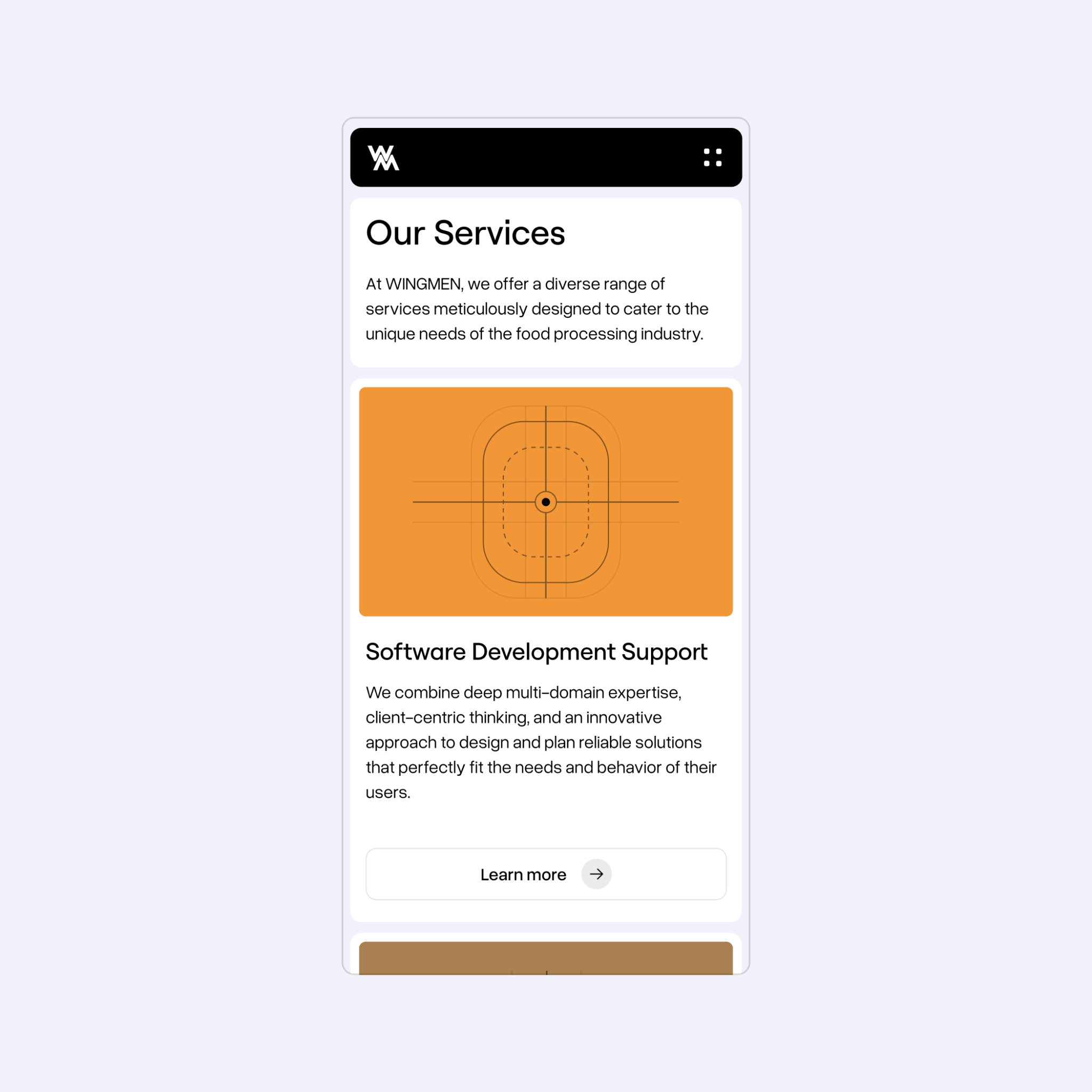
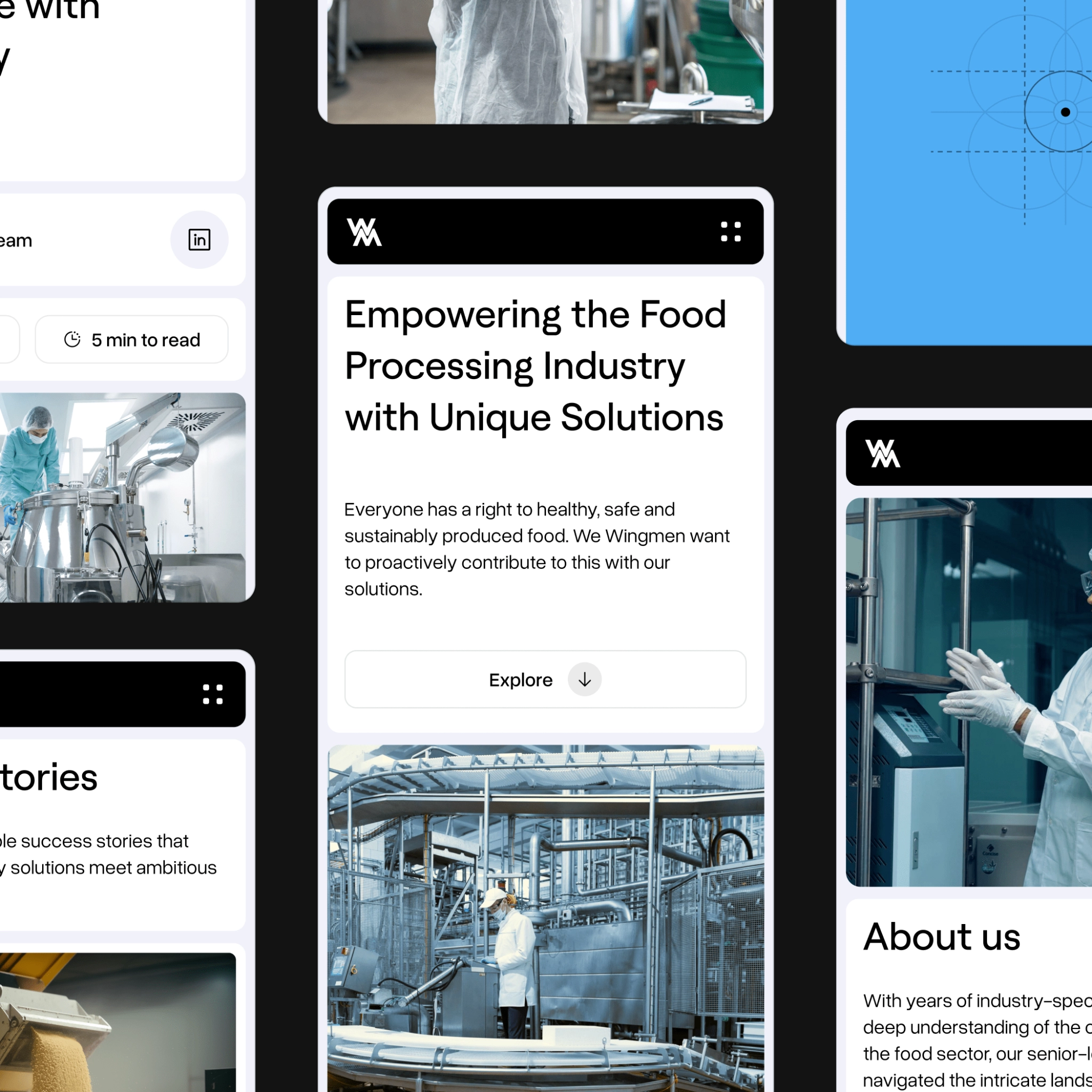
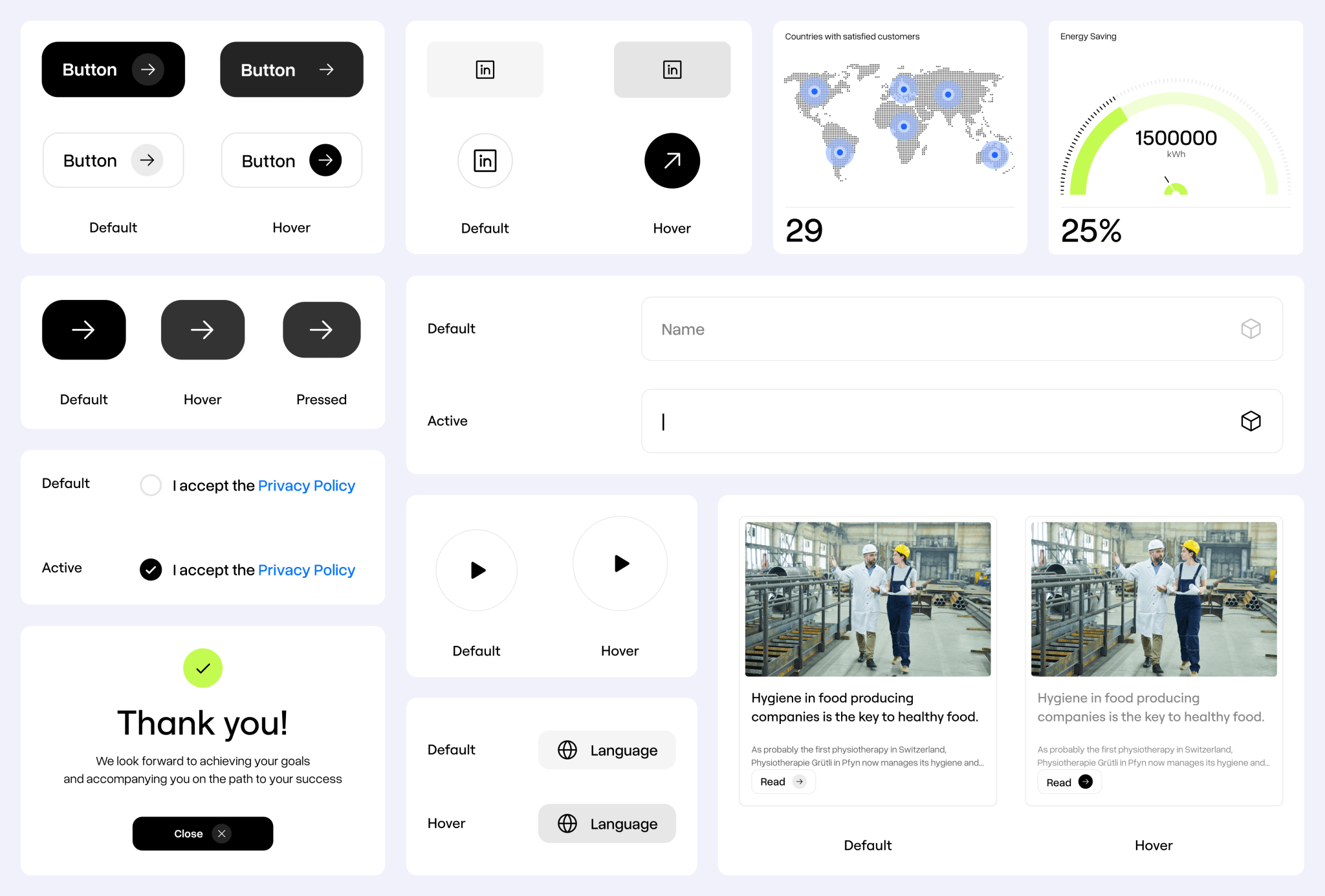
The visual direction was up to us, so we kept the core black-and-white palette — refined the tones, added subtle greys for depth — and then built on that foundation with accent colors.
These came into play in key sections (like services), adding just the right amount of vibrancy. Every visual element, from typography to iconography, was custom-crafted to reflect the brand’s confidence.
ENERGY MATTERS — AND SO DO THE NUMBERS
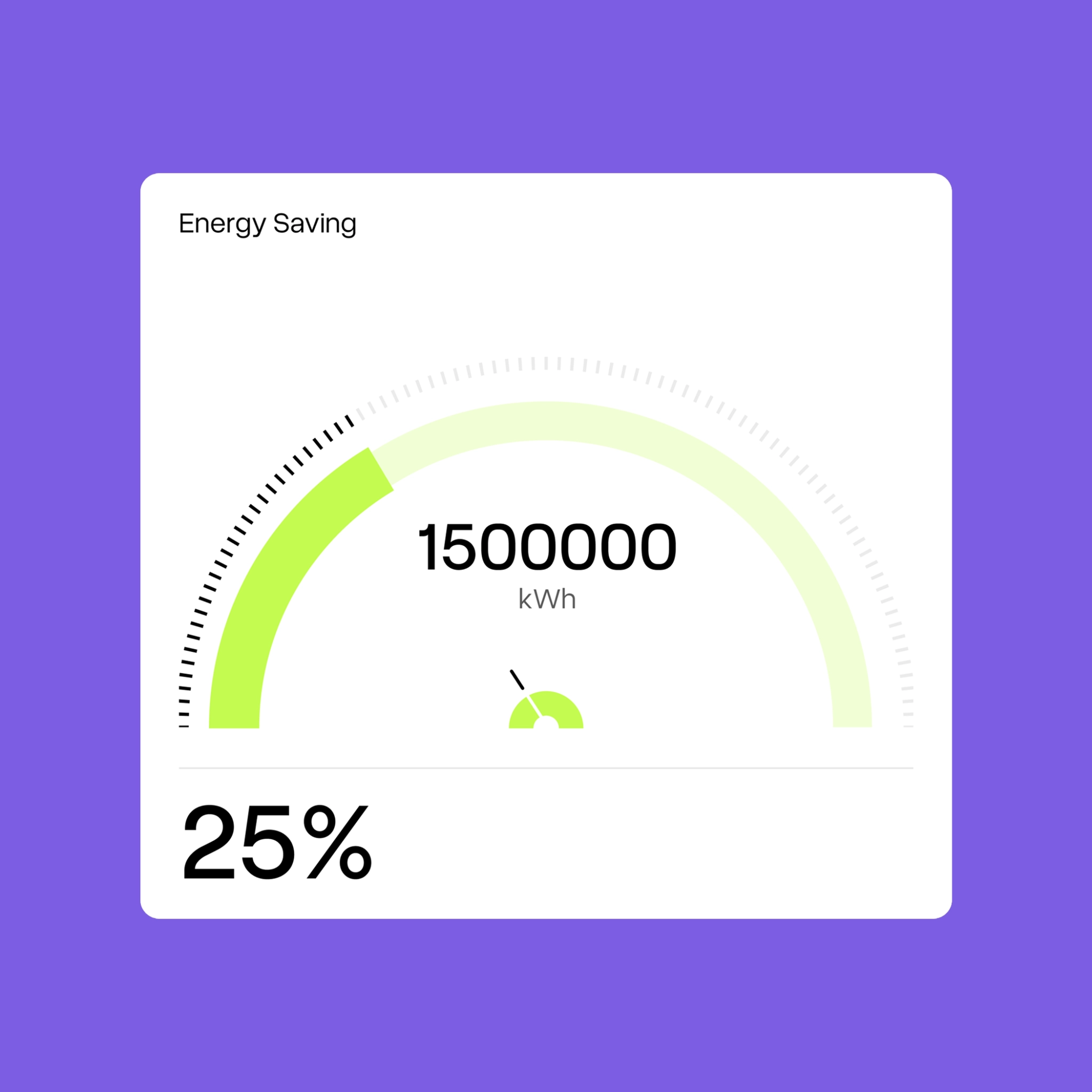
The food and beverage sector consumes roughly 30% of global industrial energy
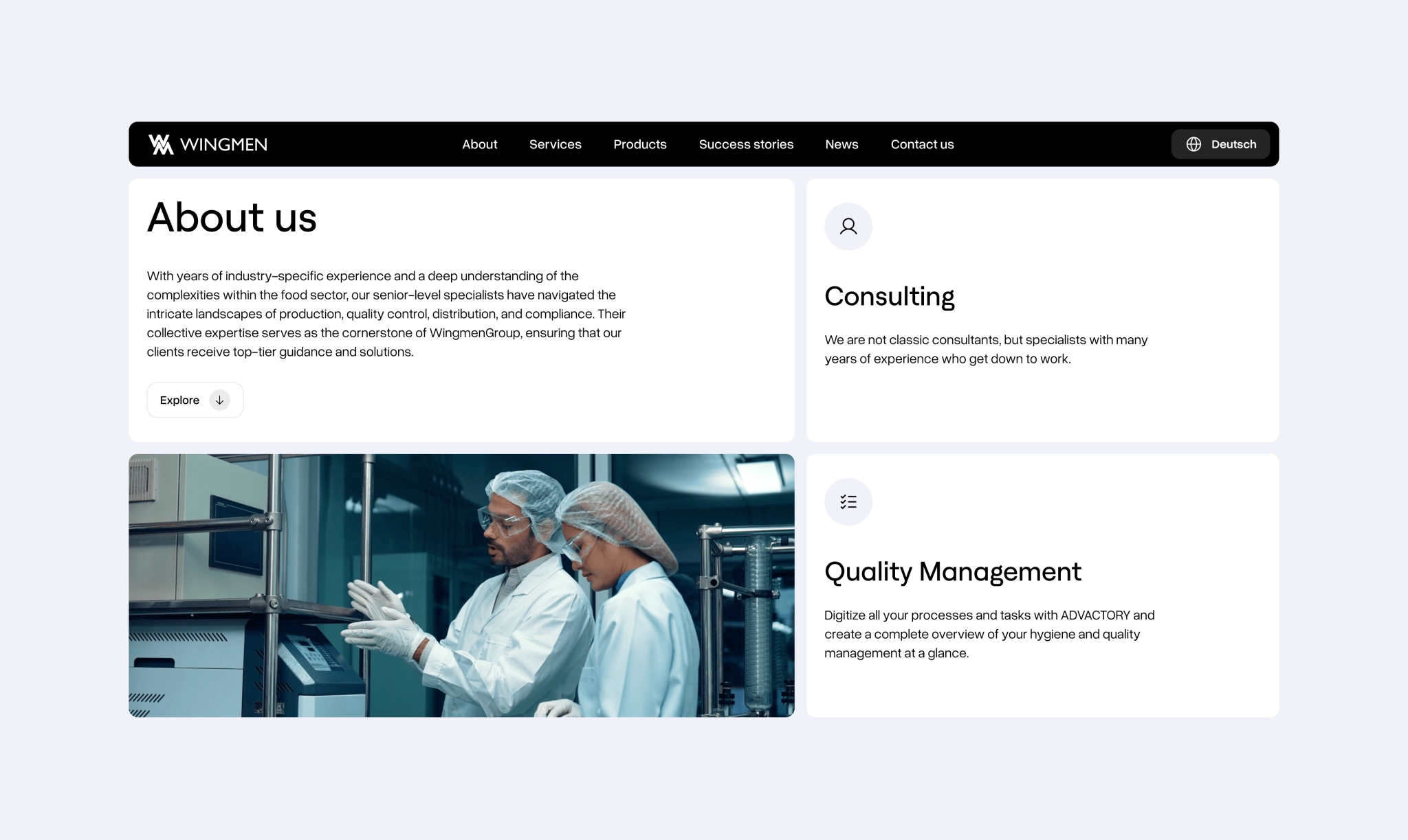
That’s why, right on the “About Us” page, you’re met with a simple animation we designed, showing just how much energy Wingmen clients save on average. It’s what sets the tone from the first scroll: this is a team that delivers real, measurable impact.
ABSTRACT IN PURPOSE, CLEAR IN IMPACT
When you can’t say it all — draw it smart
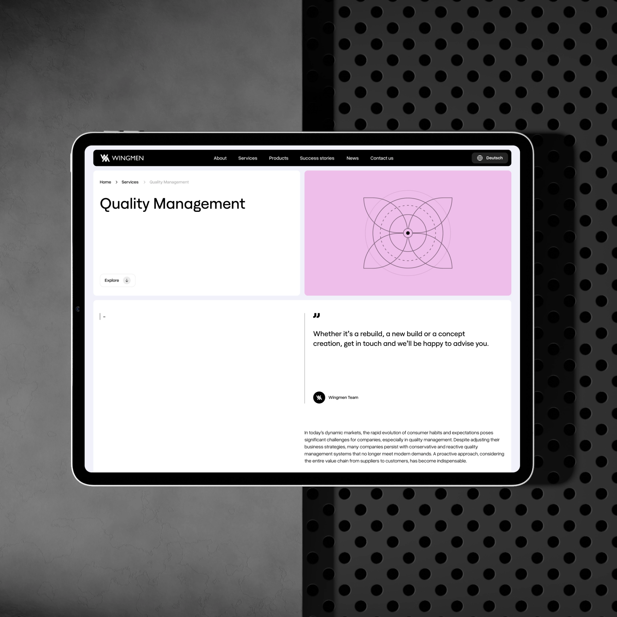
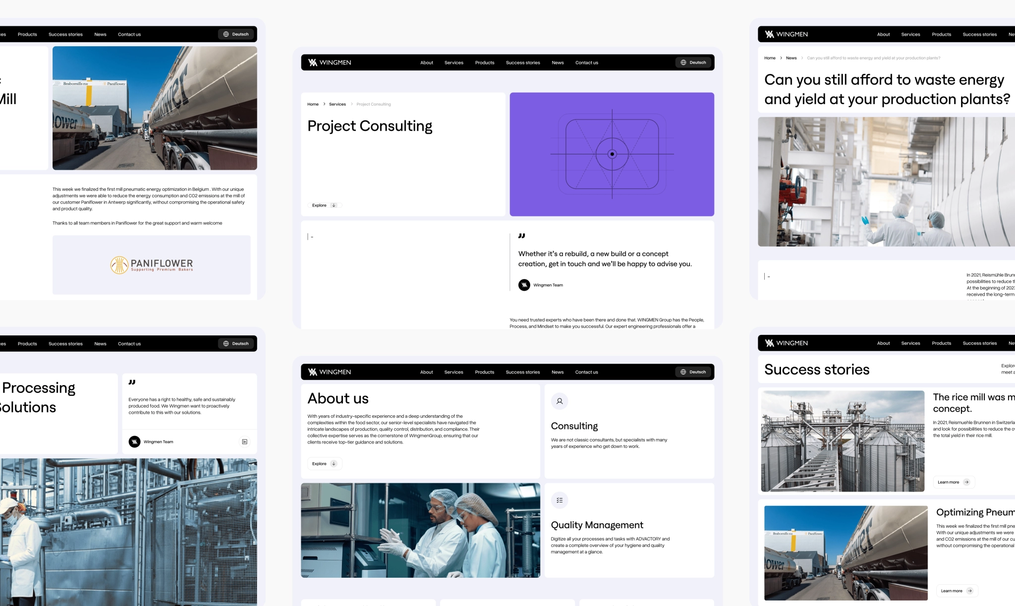
In the web design for b2b companies that are complex (production, quality control, distribution, and compliance), we needed visuals that actually explain what Wingmen does. So we skipped the stock icons and built a full set of custom illustrations from scratch. Abstract, thoughtful, and tailored to each service, they don’t explain things literally, but they trigger interest and give the brand a distinct, modern edge.
Photostyle that speaks factor fluently
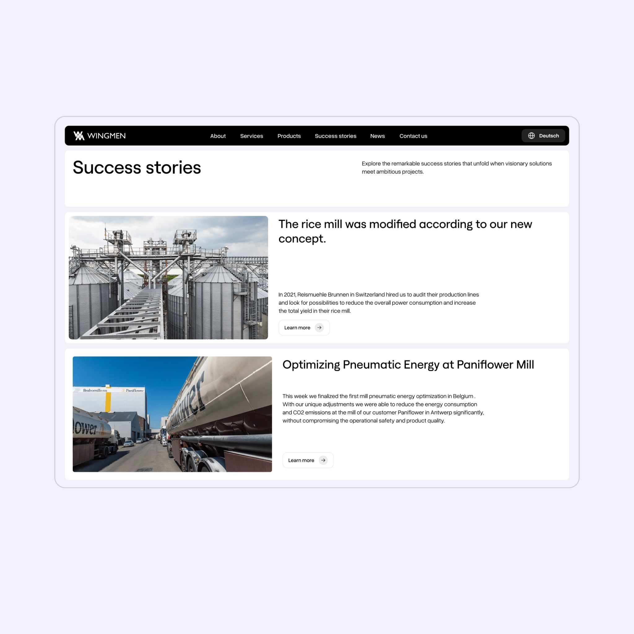
To ground the abstract, we paired it with a photo style rooted in Wingmen’s real world — factory floors, machines mid-motion, spaces their clients know by heart. It’s a mix that doesn’t over-explain, but lands fast and with just the right weight.

CONFIDENT BY DESIGN
The final design hit the mark: a minimalist, modern B2B style that reflects Wingmen’s engineering mindset. But the strongest signal came from their clients — ones who noticed, appreciated, and shared their feedback.
Client’s review
“What I like most about VALMAX is that they’ve really pushed us to move forward.”

Andreas Hummel
Managing Director

