How we pitched to Uber — and made a bus startup look like a tech giant
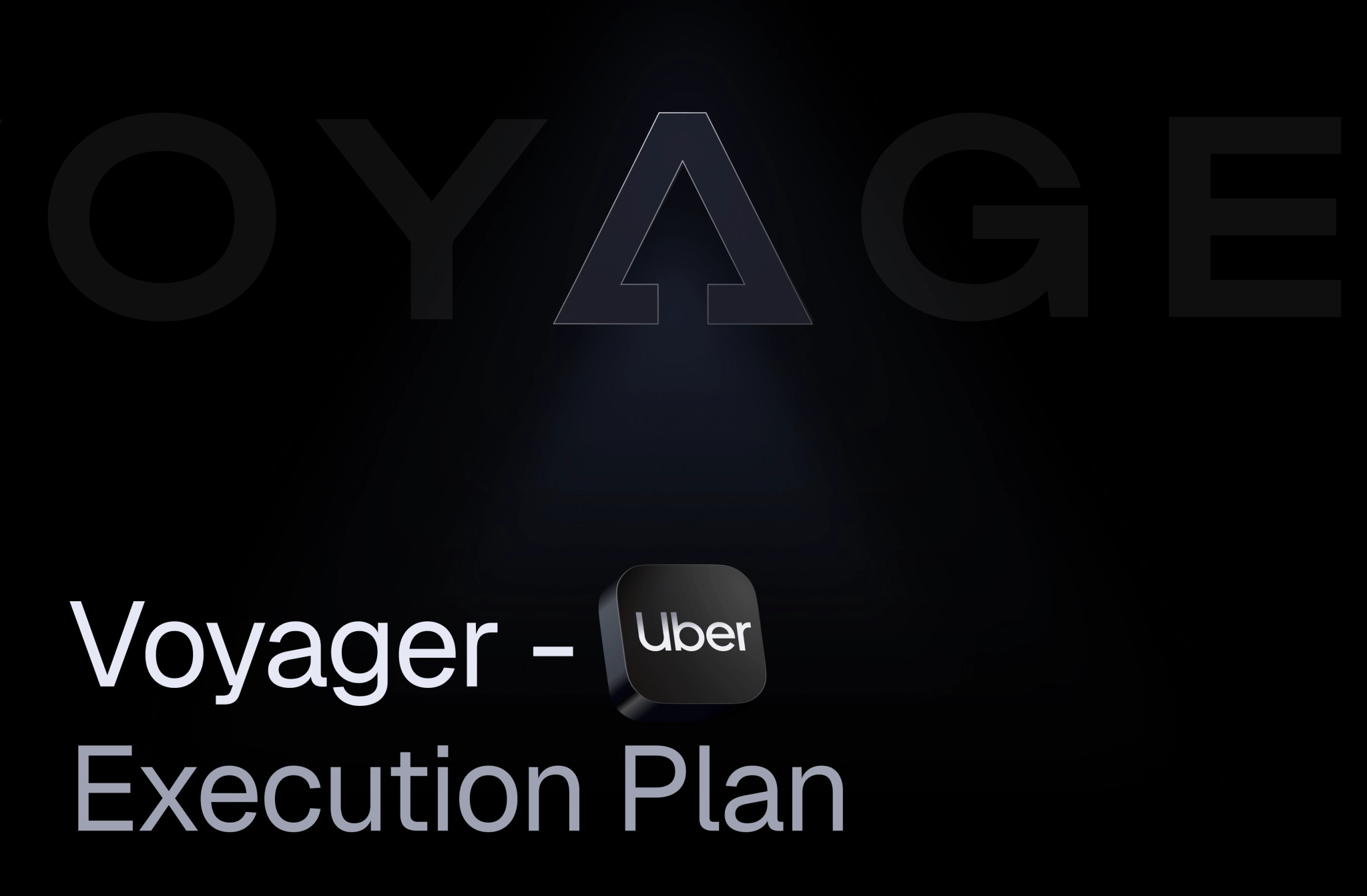
Pitch decks are easy. Great pitch decks? Not so much. When Voyager asked us to build one strong enough for Uber, we knew design alone wouldn’t cut it. So we stitched together story, structure, and visuals into a deck that worked more like a product demo than a presentation.
Client
Services we provide
Headquarters
San Francisco, USA
Industry
Logistics
Slides
15
Timelines
2 weeks
REINVENTING THE BUS RIDE
Voyager was a San Francisco–based mobility startup that wanted to reinvent how people thought about buses entirely. Think of it as “Uber for buses”: a digital-first platform connecting passengers, corporations, and small bus operators under one umbrella. From high-comfort vans for VIPs, to safer and smarter school buses with GPS tracking, Voyager’s vision was to disrupt one of the most conservative industries in America.
BRAND FIRST, PITCH SECOND
We started by building the brand tone — and the pitch deck became its stage. With a strong identity in place, the presentation could do its job: convince Uber and other investors that Voyager was the future of mobility. They wanted to look like a tech product first, transportation second, so we gave them a visual language that looked more at home in a Silicon Valley keynote than on a parking lot.
THE MISSION: CLARITY, STORY, WOW
The pitch deck had to do three things at once: sell the idea, keep attention, and stay visually structured with wow effects and a clear story. What we got was a raw, messy document — and our task was to spin it into a sharp, investor-ready narrative.
THE GOLDEN RULE OF
PITCHING
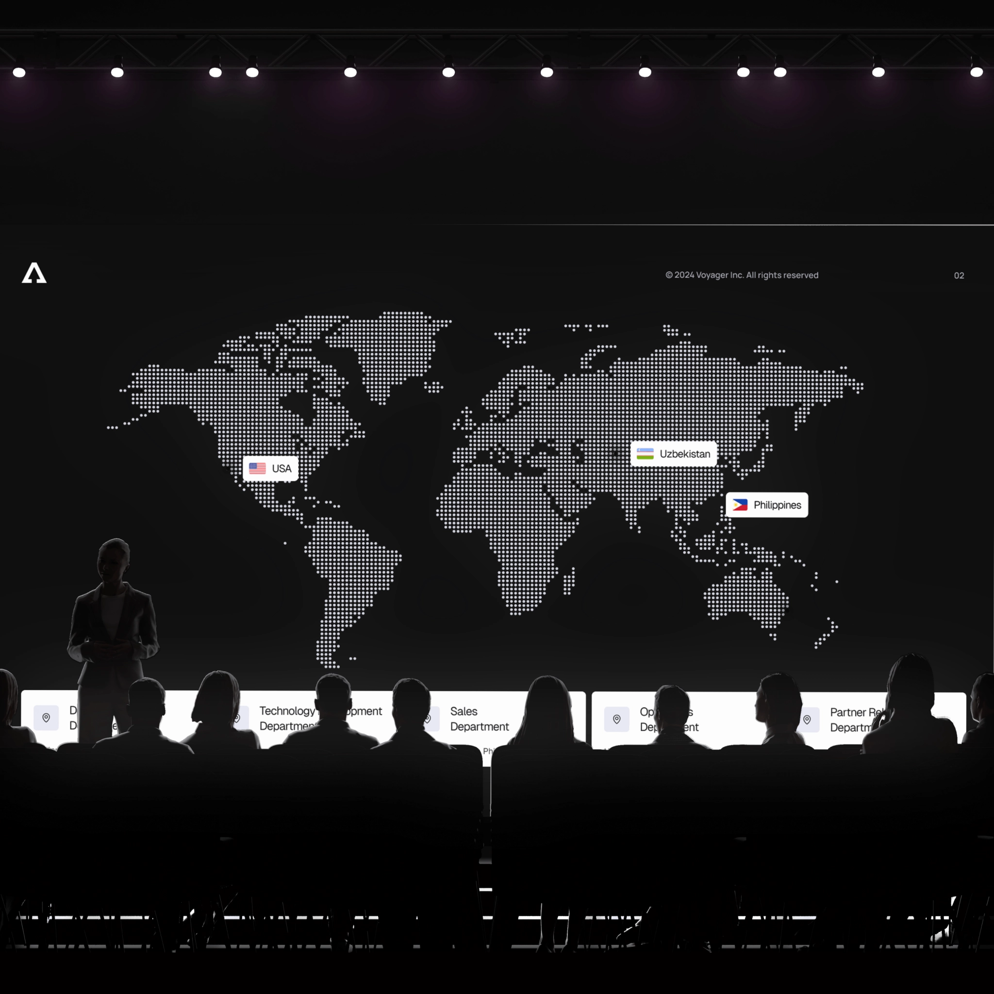
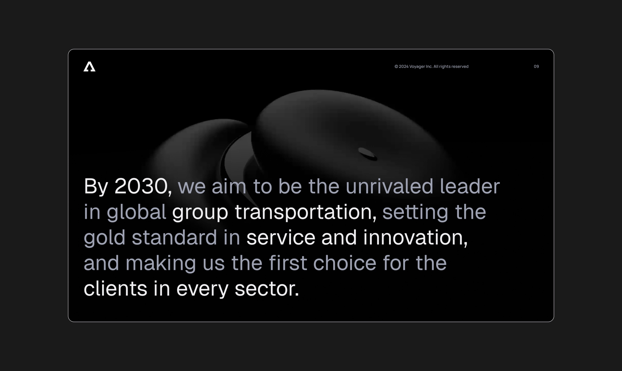
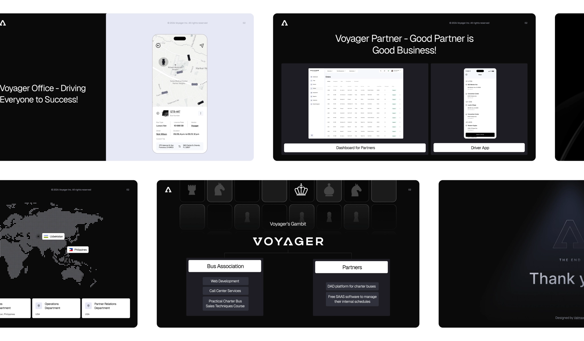
We built the whole deck on one golden rule: one slide, one idea. Every slide was treated like a mini-scene in the story, and we broke it down into a sequence that investors could easily follow.
The shape of clean
The degreaser forms a kind of connected foam — bubbles merging into each other. We echoed that in the brand pattern: soft, fluid forms that hint at cleaning action without screaming it. It’s modern, minimal, and unmistakably tied to what the product actually does.
MAKING STRATEGY MOVE
We animated the pieces to illustrate a strategic move — a visual way to explain the client’s business transitions. Investors could literally see the logic of planning unfold on the board. It turned an abstract concept into something you could follow and remember.
SCREENS FROM THE FUTURE
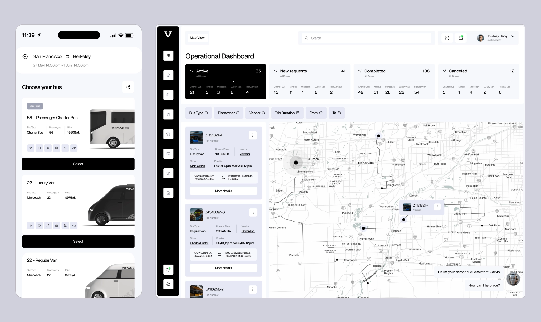
There was just one tiny problem: the Voyager app didn’t exist yet. But who says you need a finished product to show the future? We designed full UI screens from scratch, based on the brand guidelines, product logic, and technical notes from the client. These slides worked like a time machine: investors were able to visualize the product as if it already existed.
A PITCH THAT DID ITS JOB
The final deck contained 15 slides, each with its own role. In a great pitch deck, content and visuals merge into one experience — investors absorb the story as a whole. And in this case, it worked: the pitch landed exactly as intended, the story was crystal clear, investors were impressed, and the client walked away knowing their idea had been taken seriously.
client’s feedback
VALMAX is pretty fast when all requested information is given.

Jay Inoyatov
Co-founder
