AN AWARD-WINNING VISUAL TRANSFORMATION — THE CONSULTING EDITION
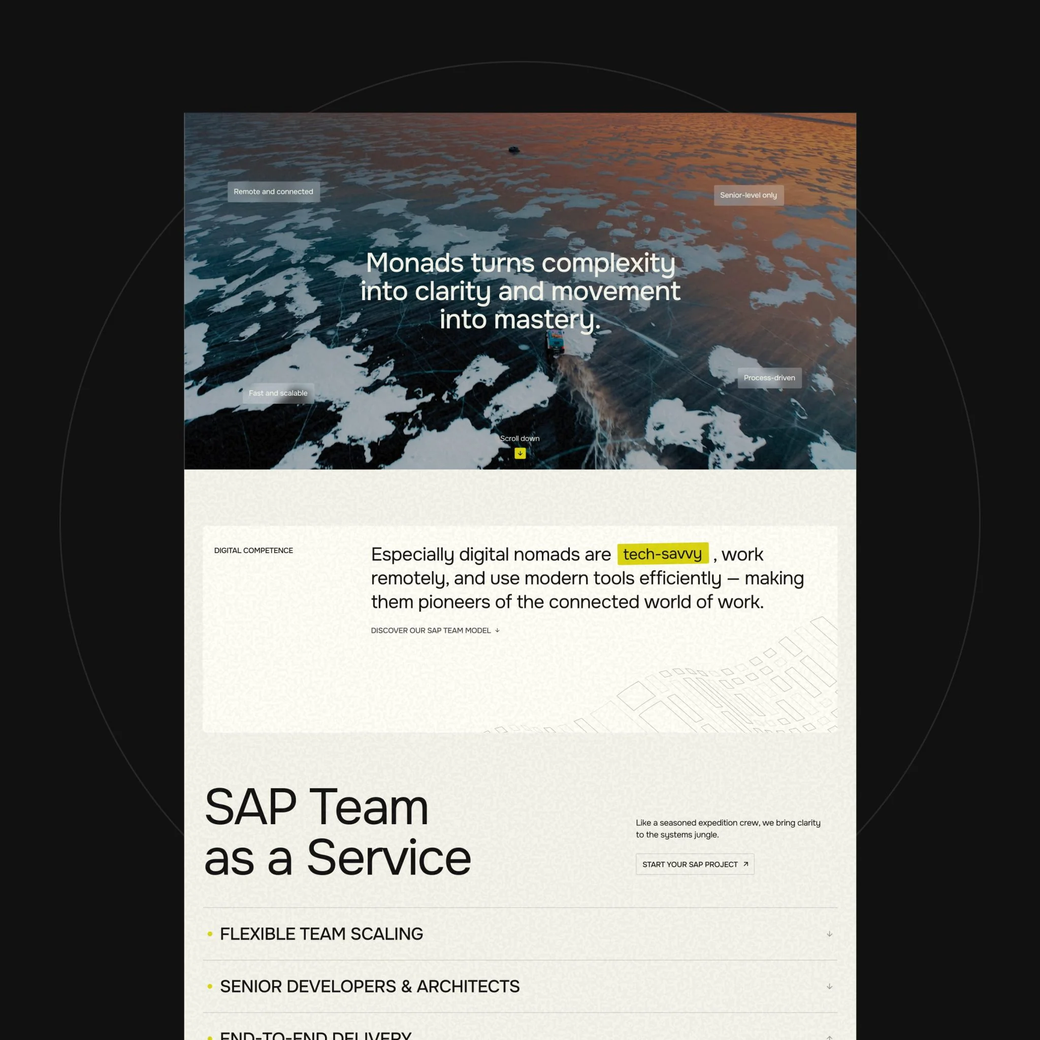
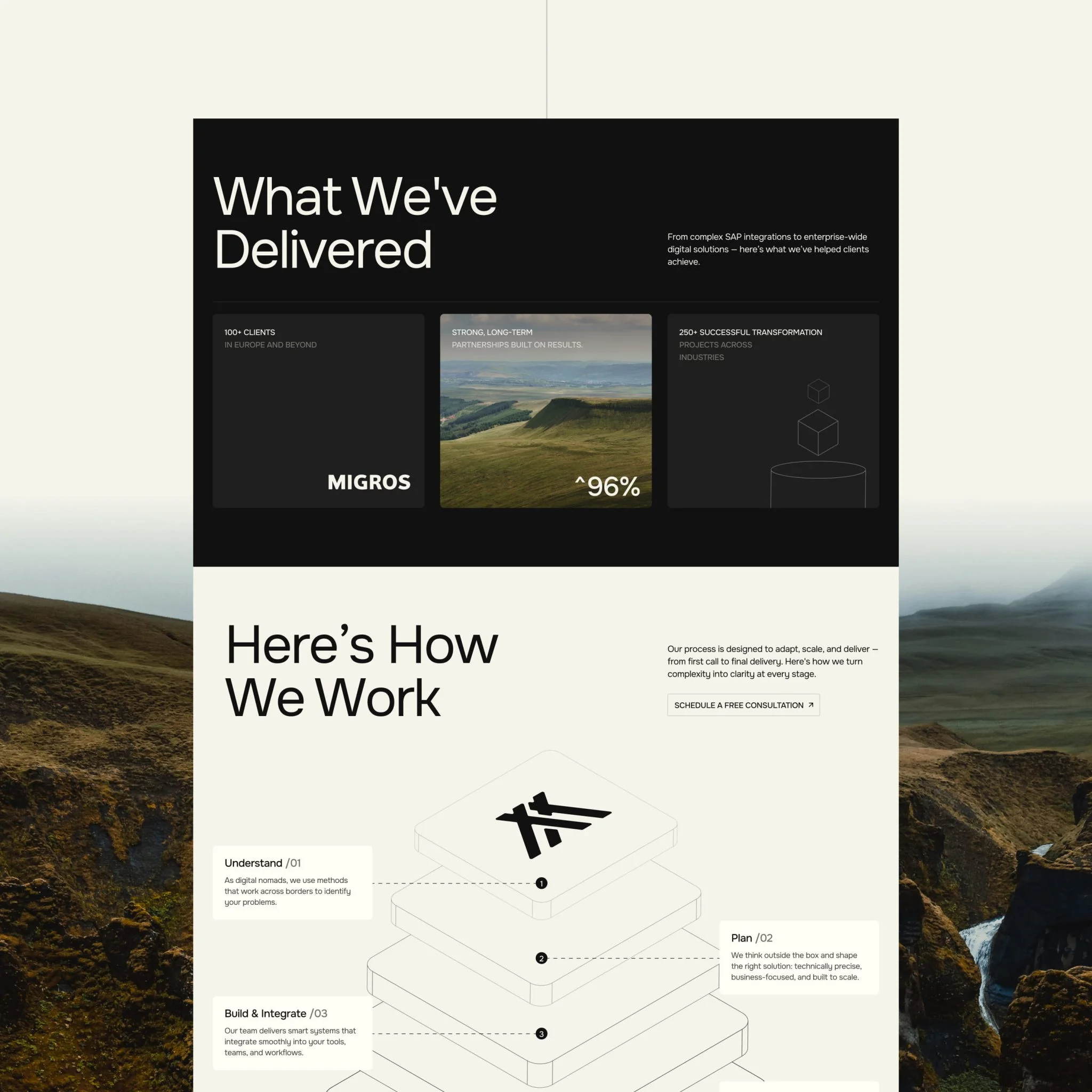
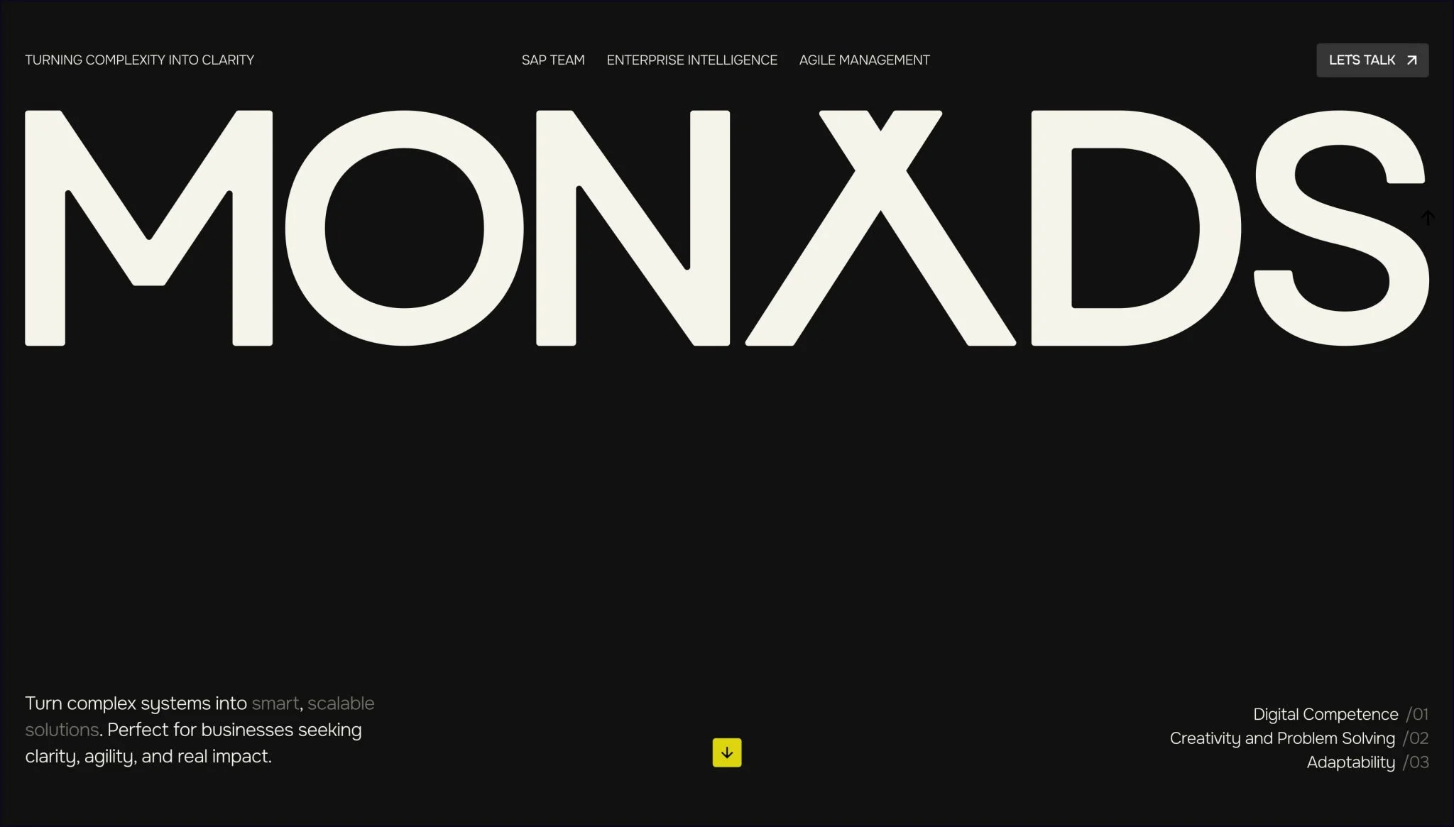
A digital makeover for a consulting firm that outgrew its old site. We helped Monads transform how they look, communicate, and present their expertise, all through a new website.
Services we provide
Headquarters
Switzerland
Industry
IT, Consulting
Website
Timelines
3 months
INDEPENDENT EXPERTS,
ENTERPRISE IMPACT
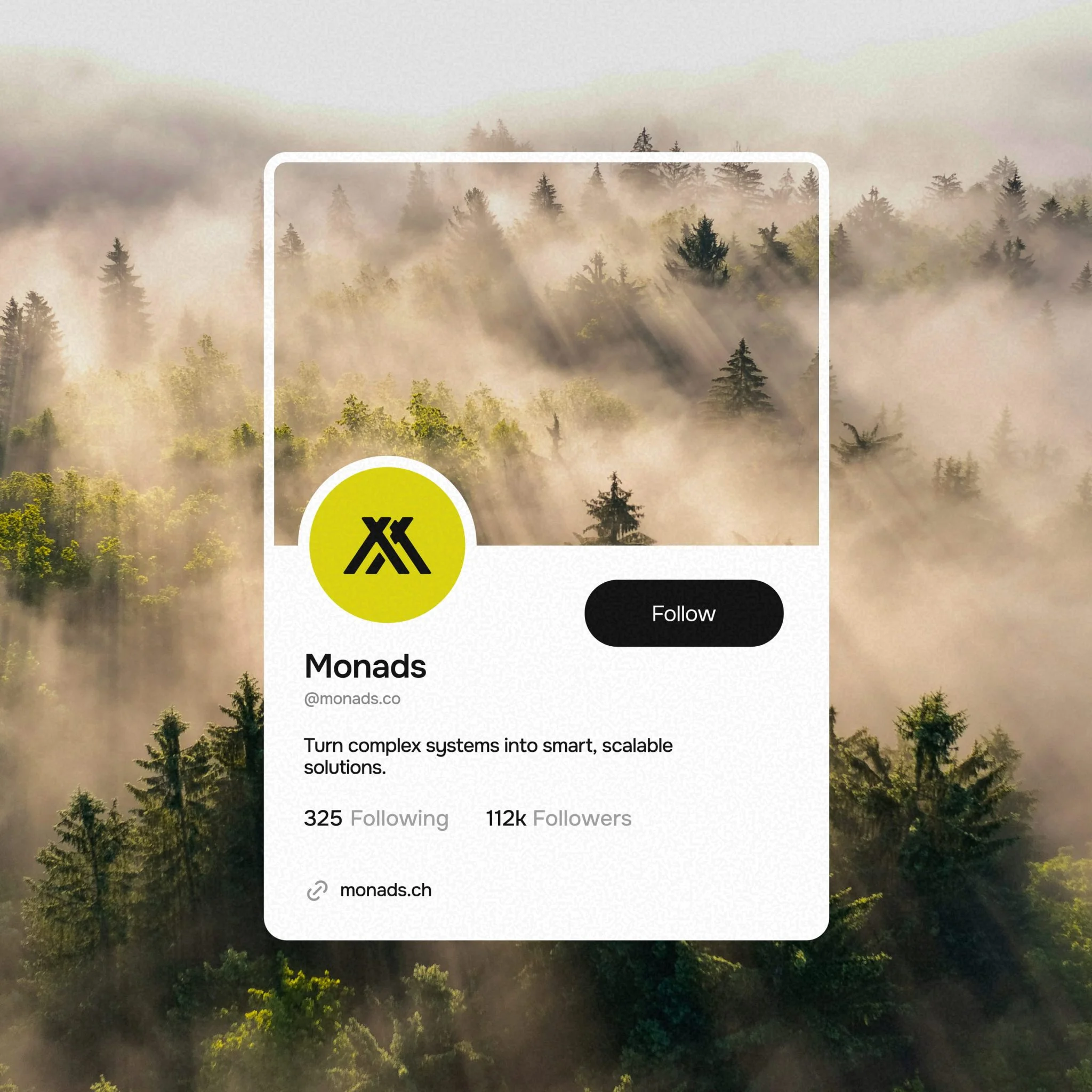
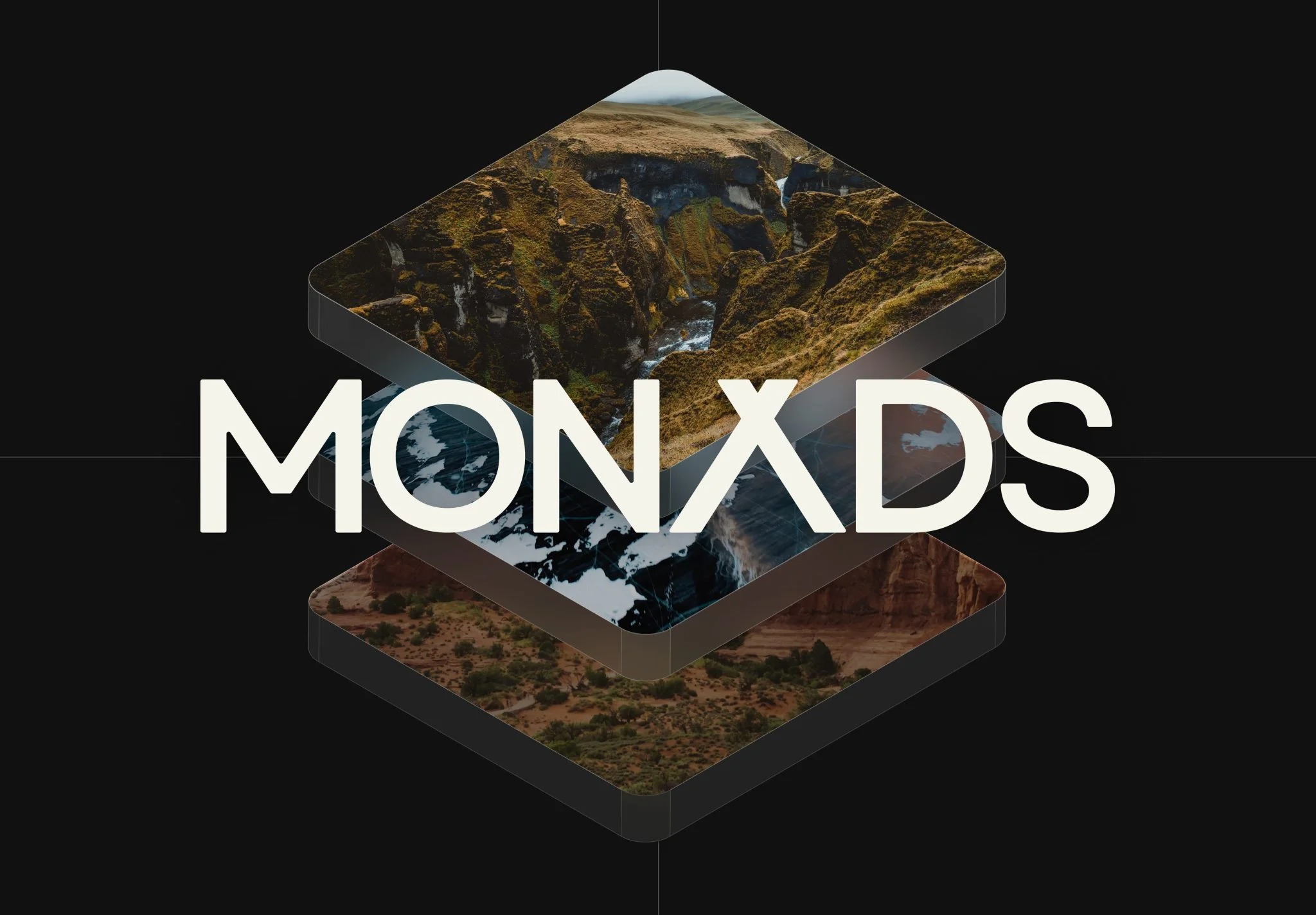
Monads is a Switzerland-based consulting and systems integration company specializing in SAP services and digital transformation. Their consultants step directly into complex enterprise environments, acting as independent experts who align technology with the business, not the other way around.
OUTGROWING THE OLD SITE
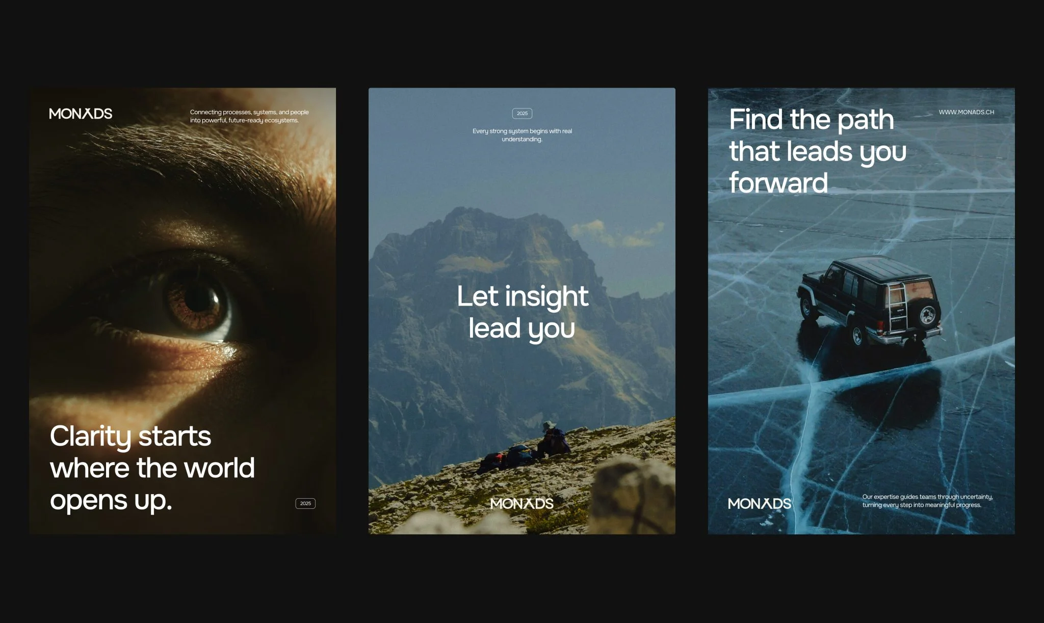
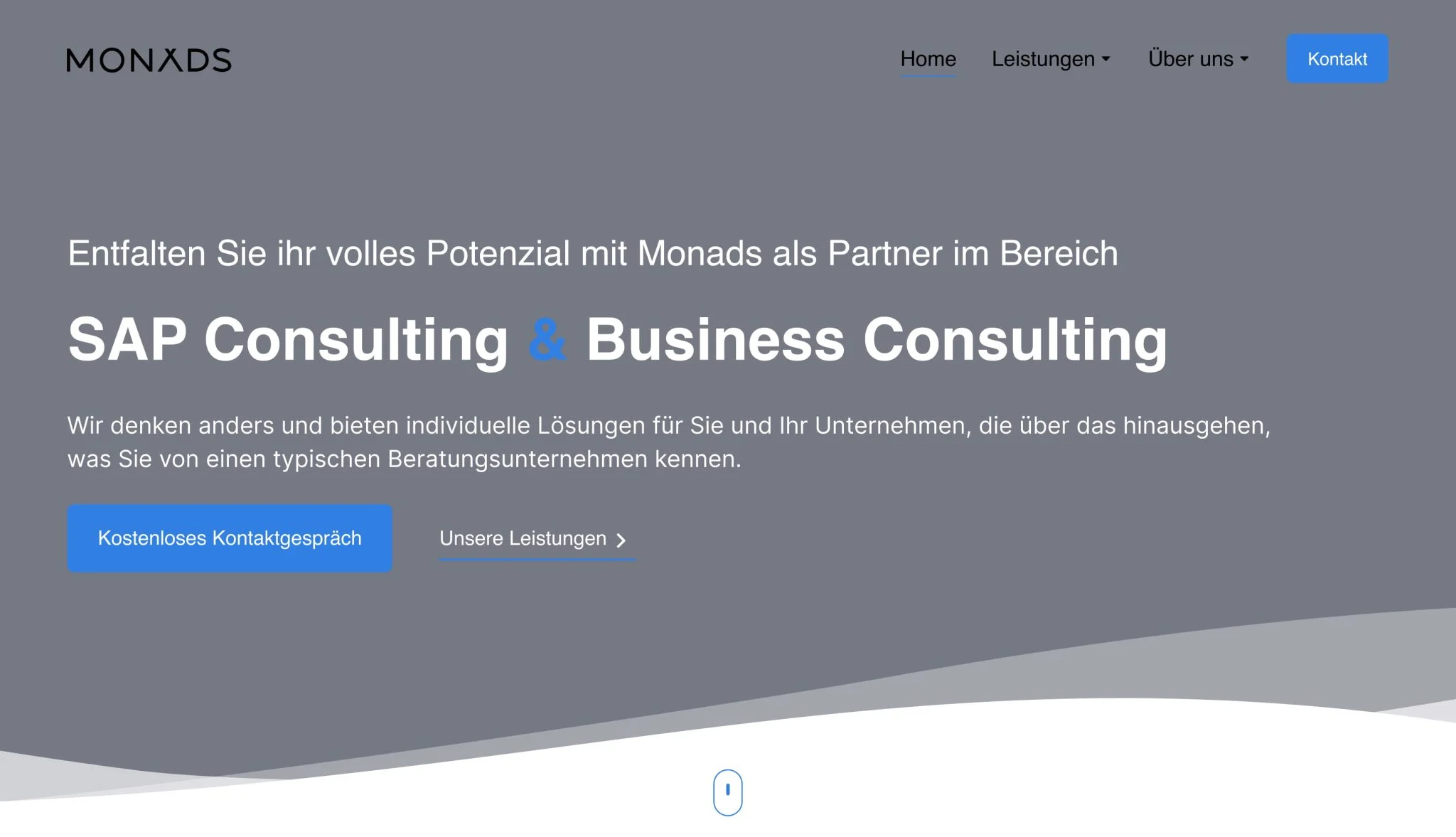
Monads came to us with something familiar to many growing consultancies: their online presence hadn’t kept up with the business they’d become. They needed a visual transformation that would express Monads’ distinct identity alongside with their services — a way to show how they think, how they solve problems, and why clients trust them.
Before
After
Drag
FINDING MONAND’S TRUE VOICE
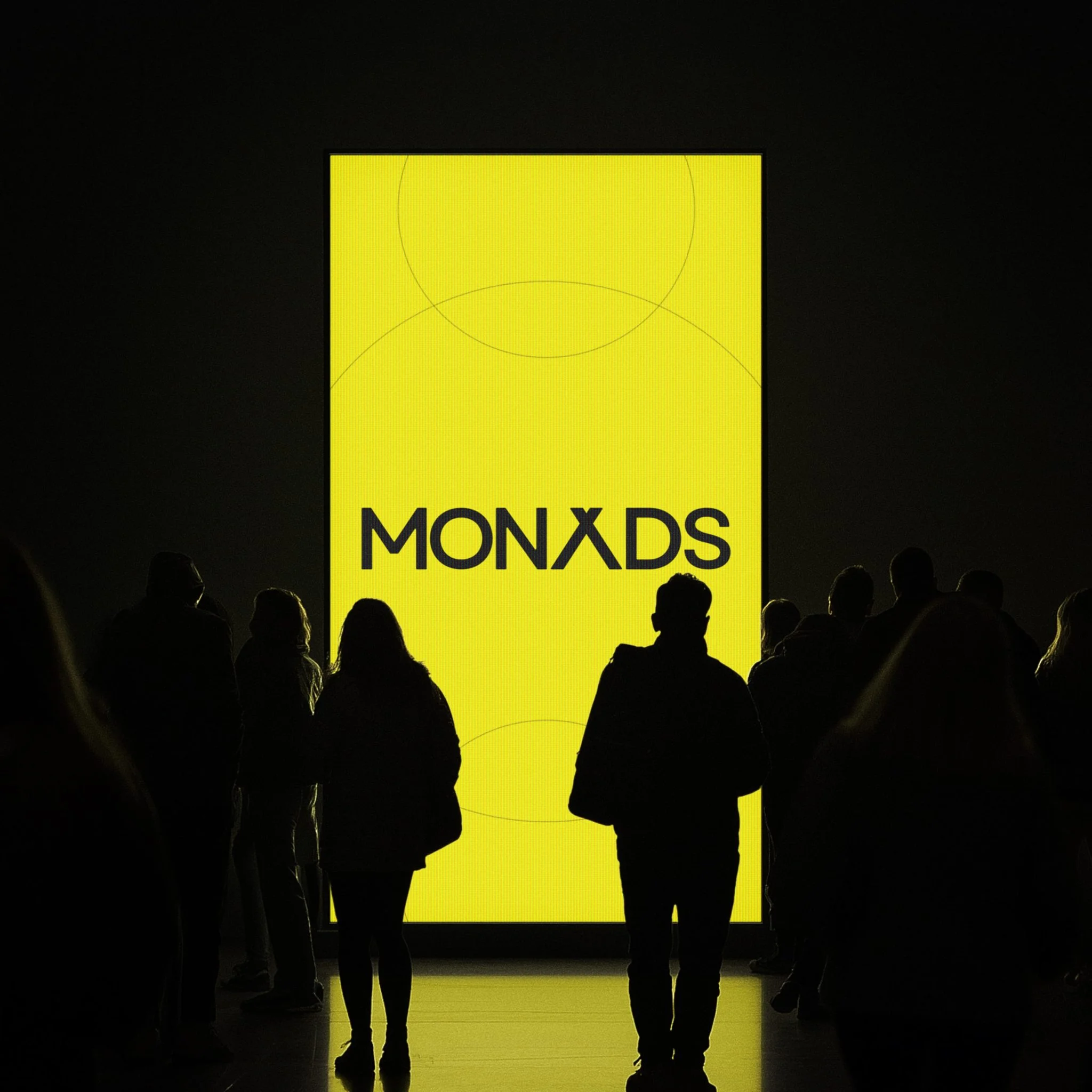
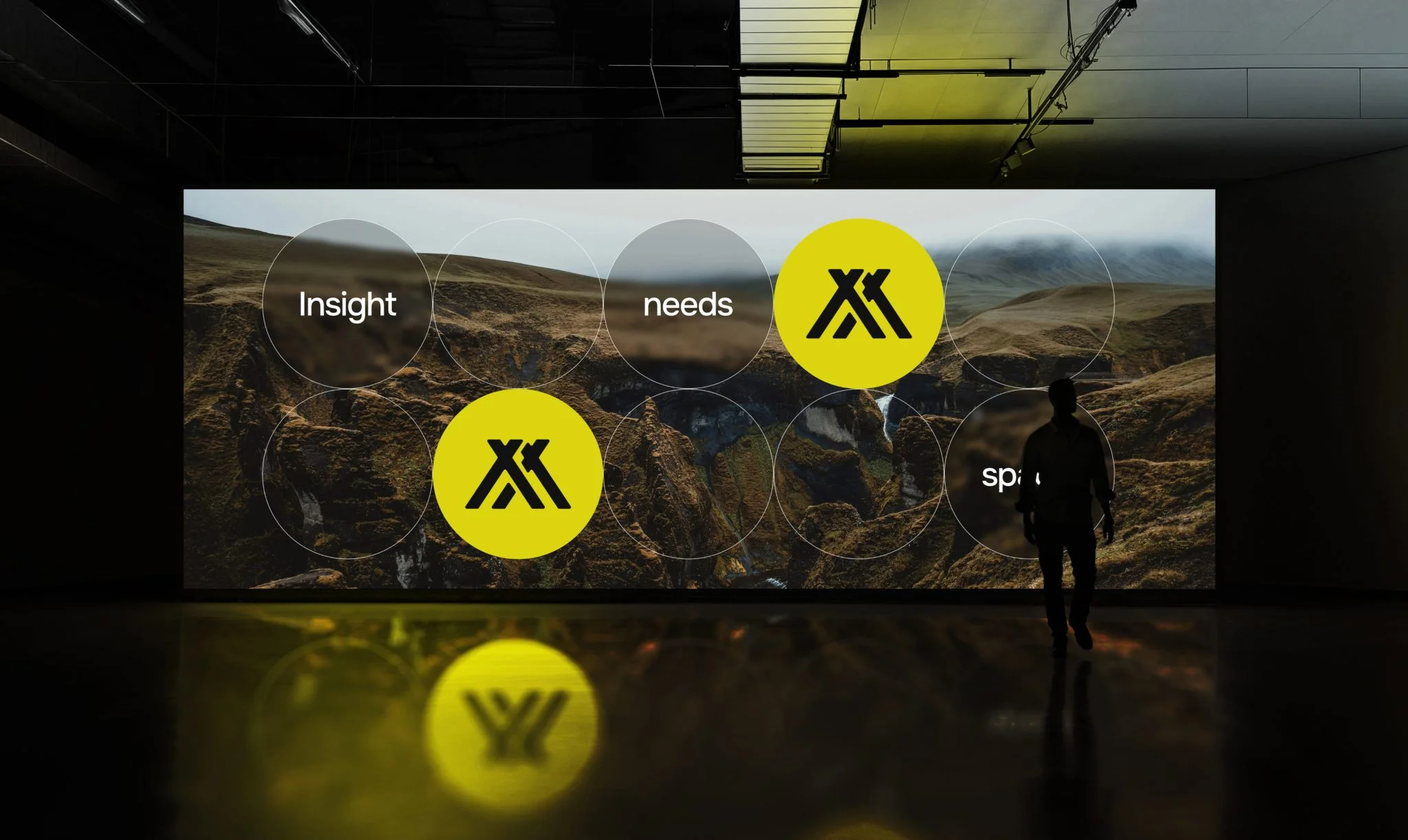
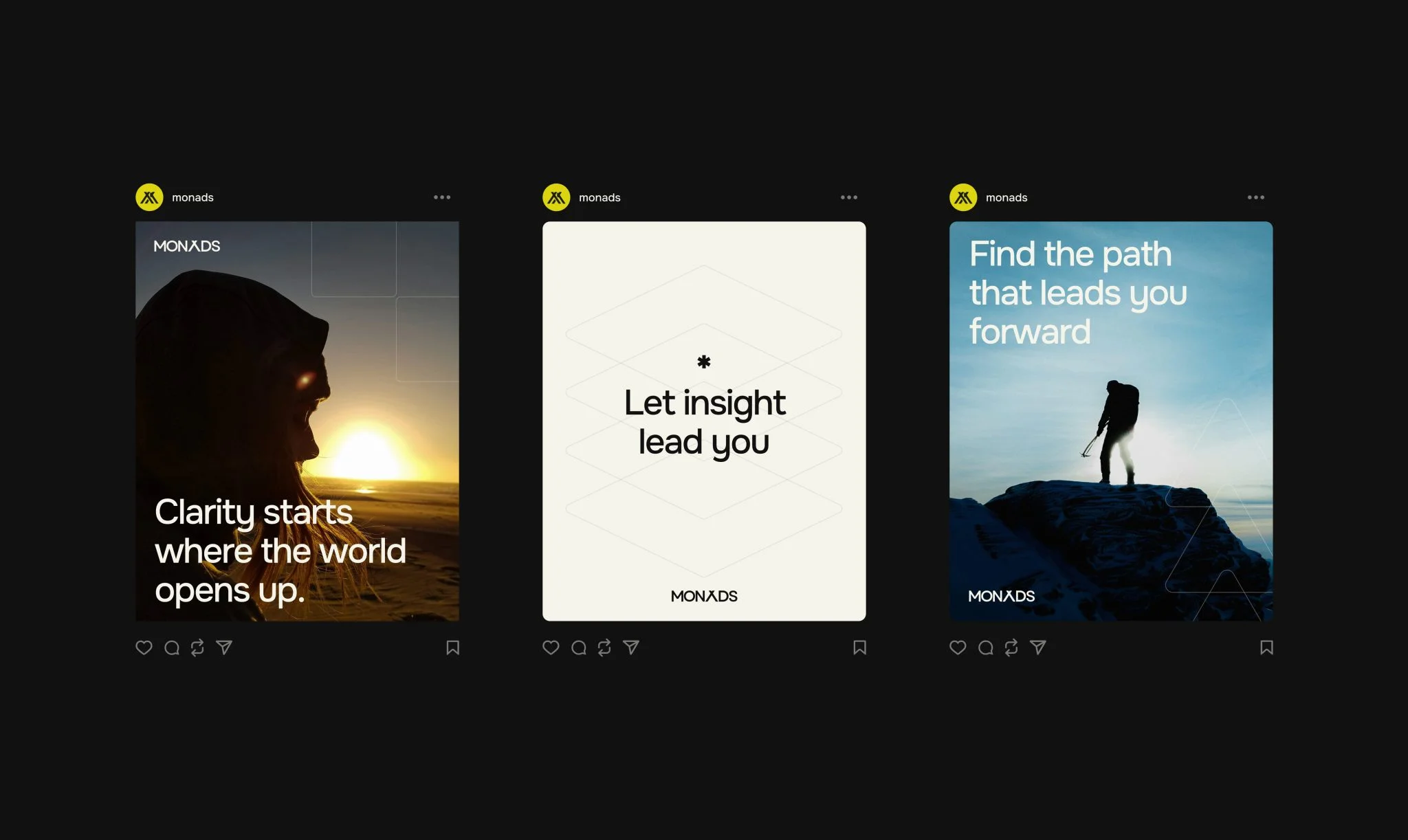
After mapping the brand’s center of gravity (audience insights, positioning, and deeper research), we all agreed that archetypes should guide how Monads communicates and how the UI is shaped. Together, we landed on a three-archetype mix: Creator and Sage to express expertise and vision, and Rebel to capture their independent, adaptive, boldly nomadic mindset. Seeing those threads side by side, the client could finally point and say, “This is us.”
FOUR DESIGN GOALS
We simplify. We challenge norms. We balance expertise with humanity. We speak clearly.
To strengthen the visual identity, we needed to express what sits at the core of Monads: simplifying complexity and bringing structure where it matters. That’s why the design goals centered on clarity, emotional connection, immediate value, and flexibility — principles that guided every design decision.
BUILD INTENTIONALLY
On the website, every part of the interface responds to one of the goals we’ve set. Sections shift, stack, unfold, and guide the eye — not for show, but to echo how Monads approaches complexity. As you scroll, the logic of the site slowly uncovers the logic of the company: clear reasoning, layered thinking, and a flexible system that adjusts to the client’s needs.
NOT YOUR SIMPLE ‘CONTACT US’ FORM
Instead of a simple ‘Contact us’ button, the site ends with a glowing white circle holding the Monads logo, almost like it’s waiting for you to tap it. The moment you click, the circle opens up into the contact form. Behind it, an animated background keeps the section in motion, making the invitation hard to ignore.
ALIGNING MARKETING & SALES
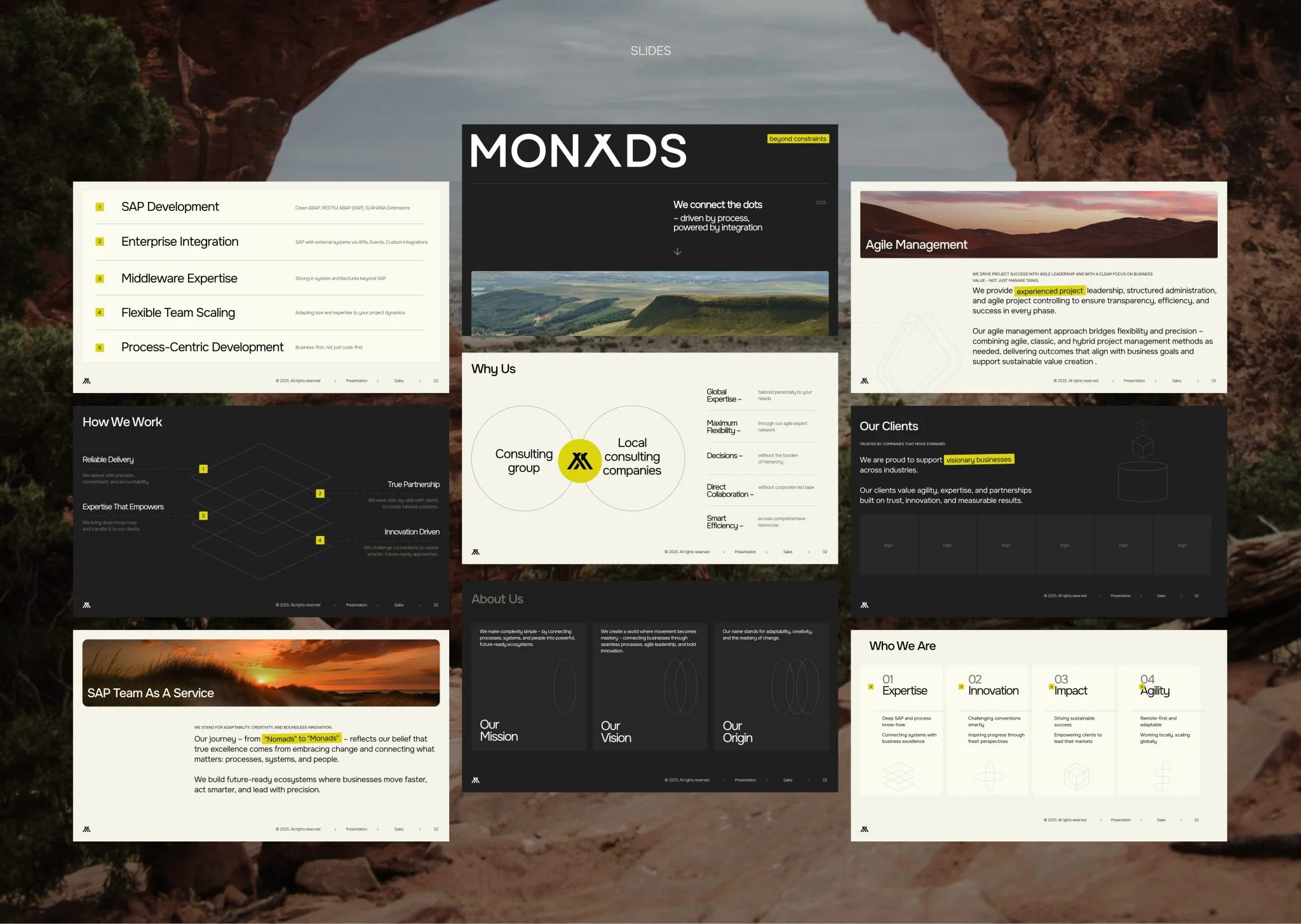
We brought marketing and sales into the same lane. Presentation templates and commercial proposals were rebuilt to match the new voice and visuals — refreshed layouts, clear value framing, and brand-consistent design so every offer aligns with the new direction.
WHERE IT ALL LANDED
The project came full circle with strategy, design, development. The site went on to win two industry awards and got an Honarable Mention on Awwwards, SOTD by CSS Design Awads and CSS Winner.
But the bigger win came from the client: the brand now looks and sounds exactly as they envisioned and aligned with how they want to communicate with their audience.
client’s feedback
VALMAX demonstrated strong project management and delivered all items on time. They were flexible and responsive.

Fabian Diehl
Managing Partner
