SINGLE-PRODUCT DESIGN FOR A NEW KIND OF DRINK
Somewhere between a cocktail and a clean energy drink lives GIÓ, a new kind of beverage created for how we want to feel today. The question was: how do you make an alcohol-free drink feel like a lifestyle choice? The answer was in design.
Client

Services we provide
-
Location
USA
-
Industry
E-commerce/Wellness
-
Timelines
3 months
DRINKING, REINVENTED
GIÓ is built around a simple idea: the social and emotional benefits of alcohol, without the downsides. Formulated in a U.S. lab with plant-based botanical extracts, it relaxes and uplifts without the hangover or next-day fog.
THE BRIEF
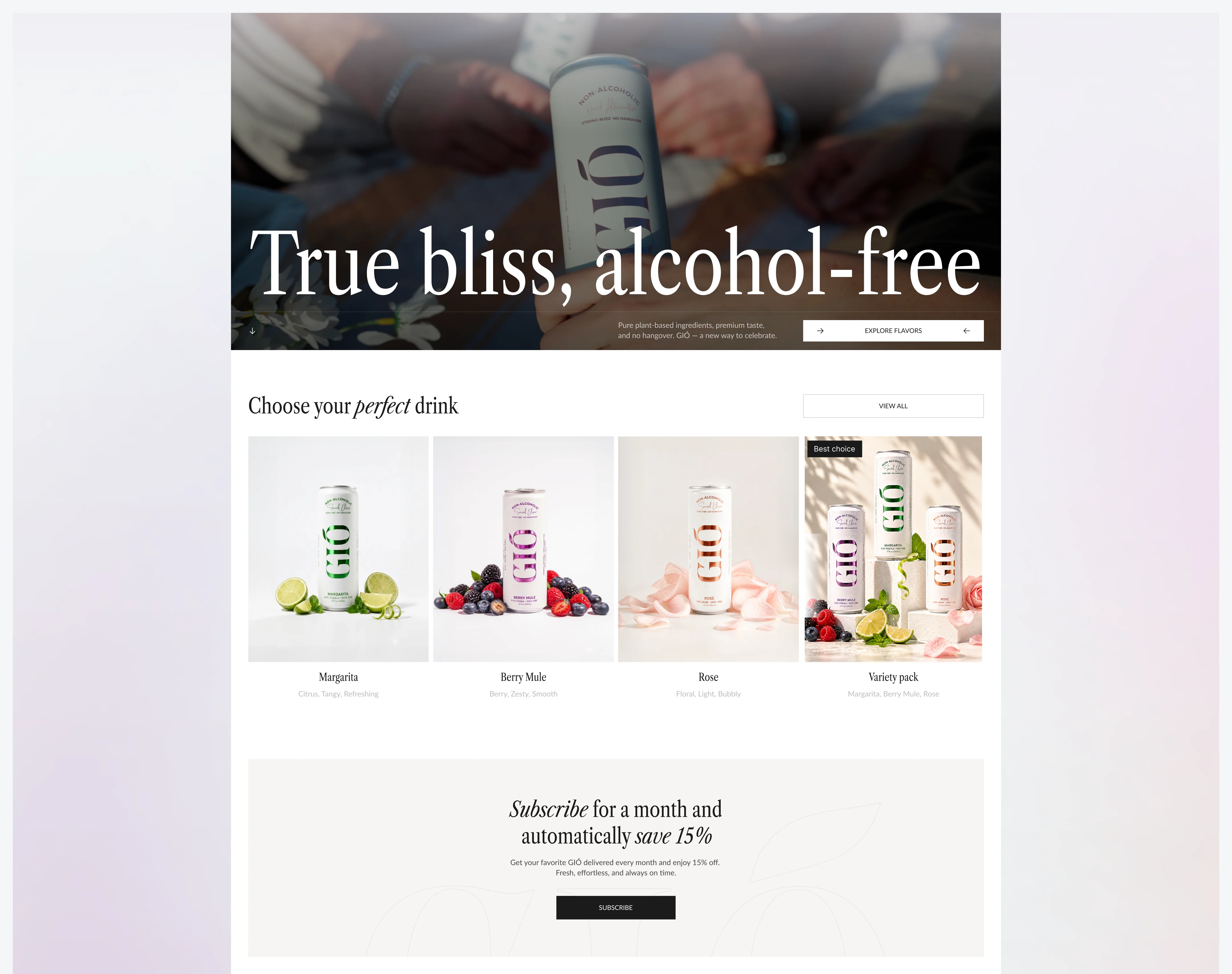
Launch GIÓ’s first direct-to-consumer experience on Shopify and wrap it into a premium experience. We aimed to translate the product’s European roots and quiet luxury spirit: elegant, minimalist, and graceful, with subtle cues of old-money sophistication, while also building a flow engineered for conversion.
GUIDING A NEW TASTE INTO THE WORLD
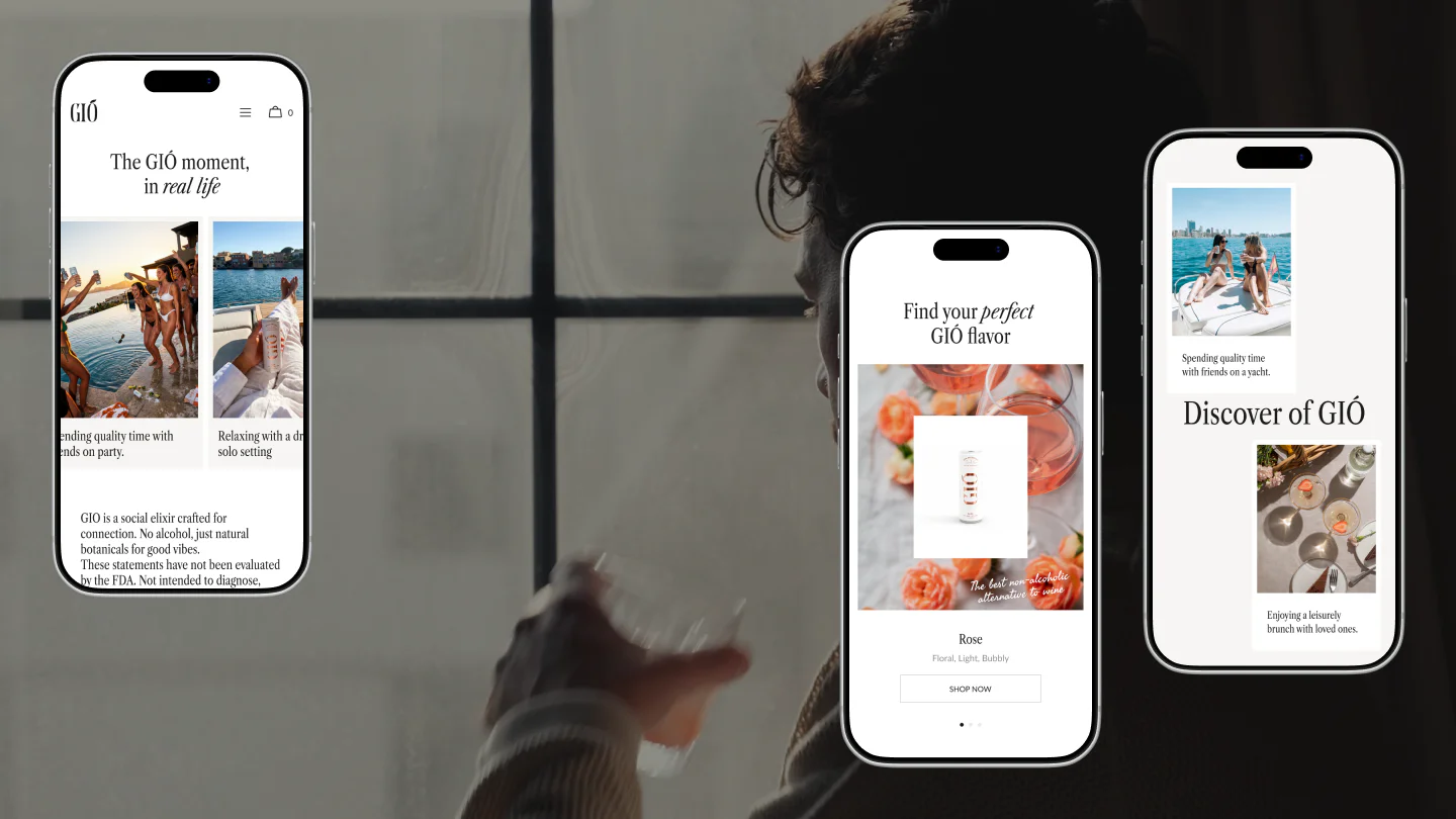
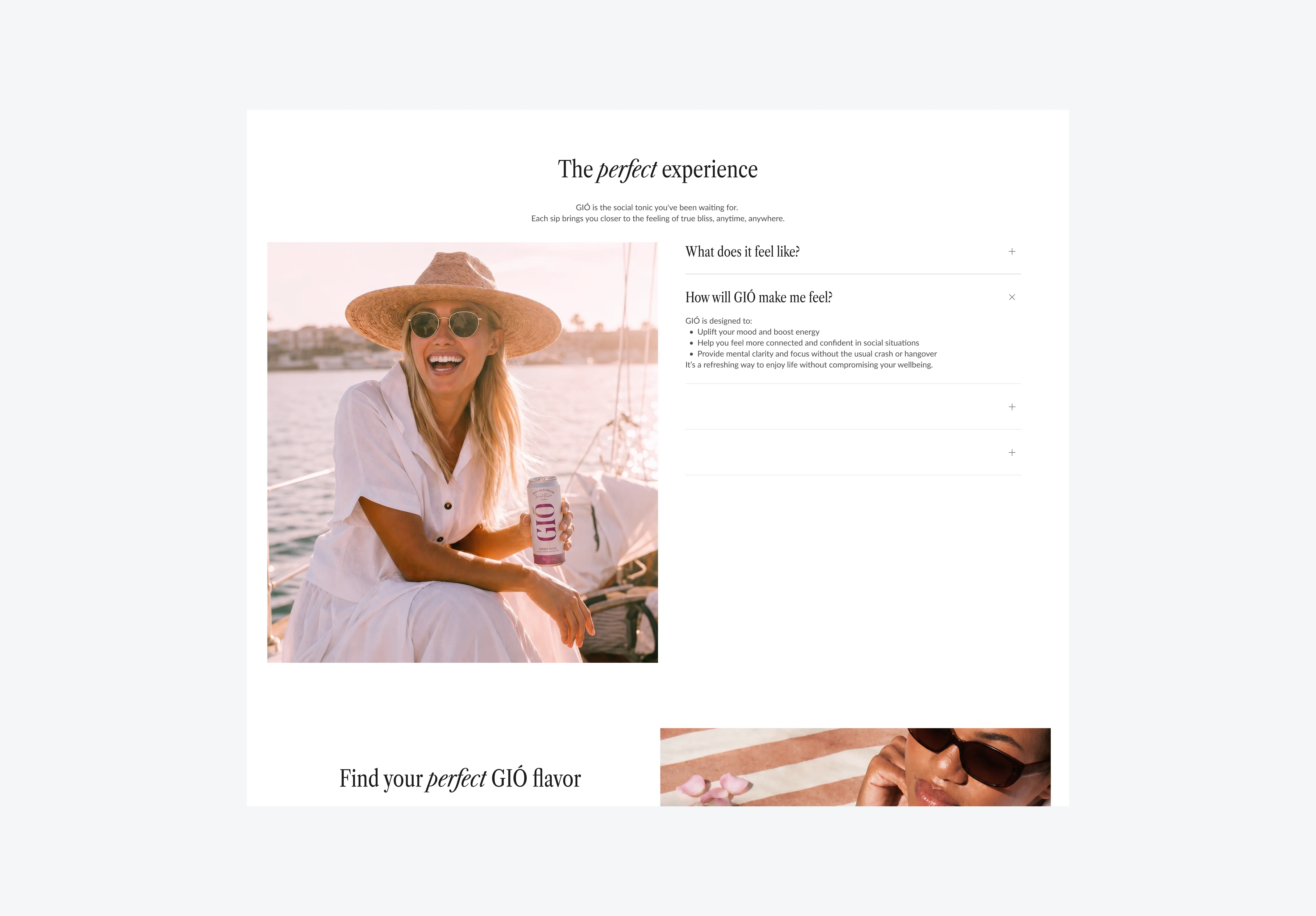
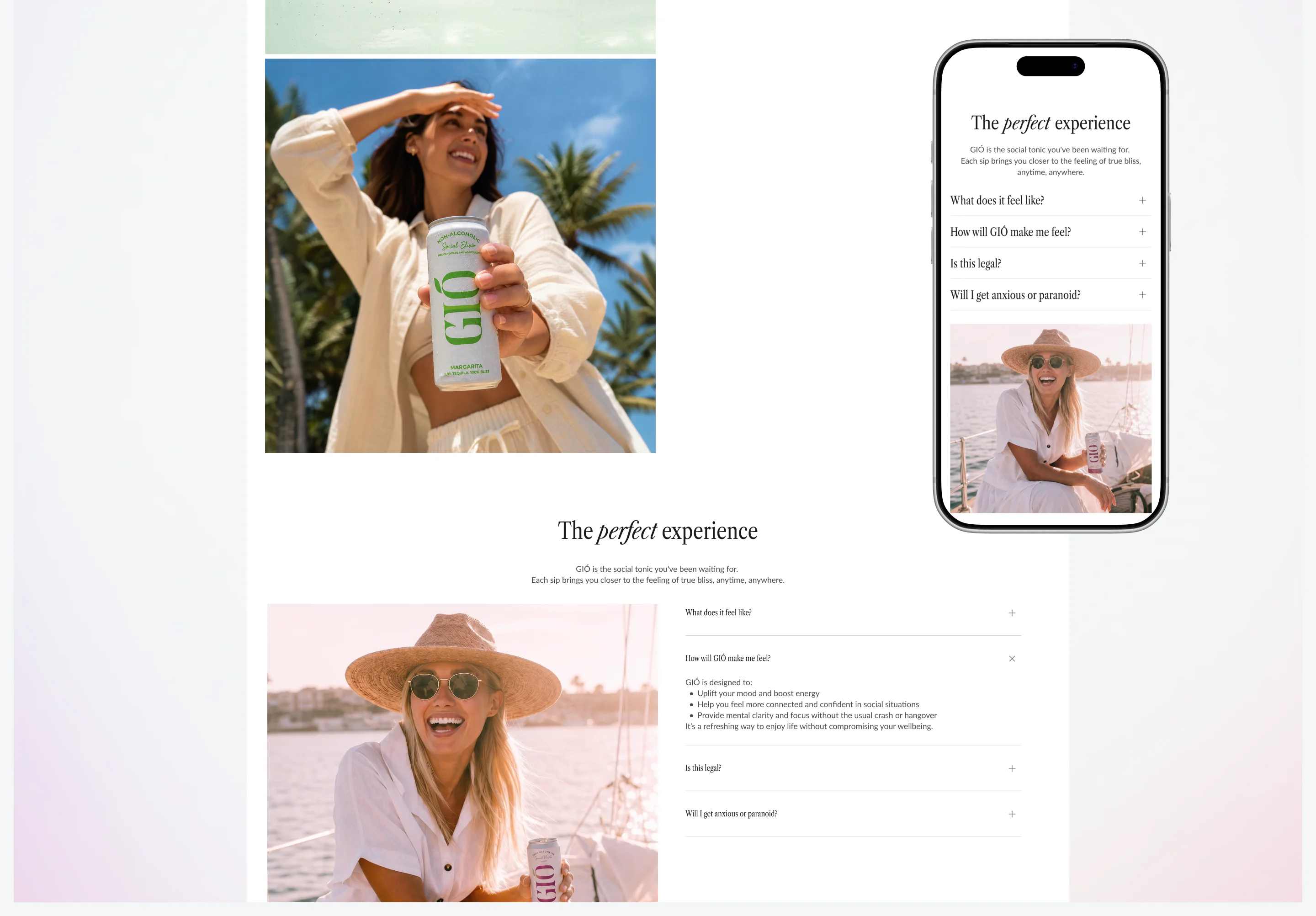
GIÓ is a completely new kind of drink, so the experience had to teach, intrigue, and gently answer every question a first-time visitor might have. The UX is designed as a slow reveal: from the first scroll, the user is eased into the world of GIÓ, discovering what the drink is, how it works, and why it matters. By the time they reach the end of the journey, someone who arrived with zero context already has a clear picture of the product and a genuine curiosity to try it.
BOTTLING QUIET LUXURY
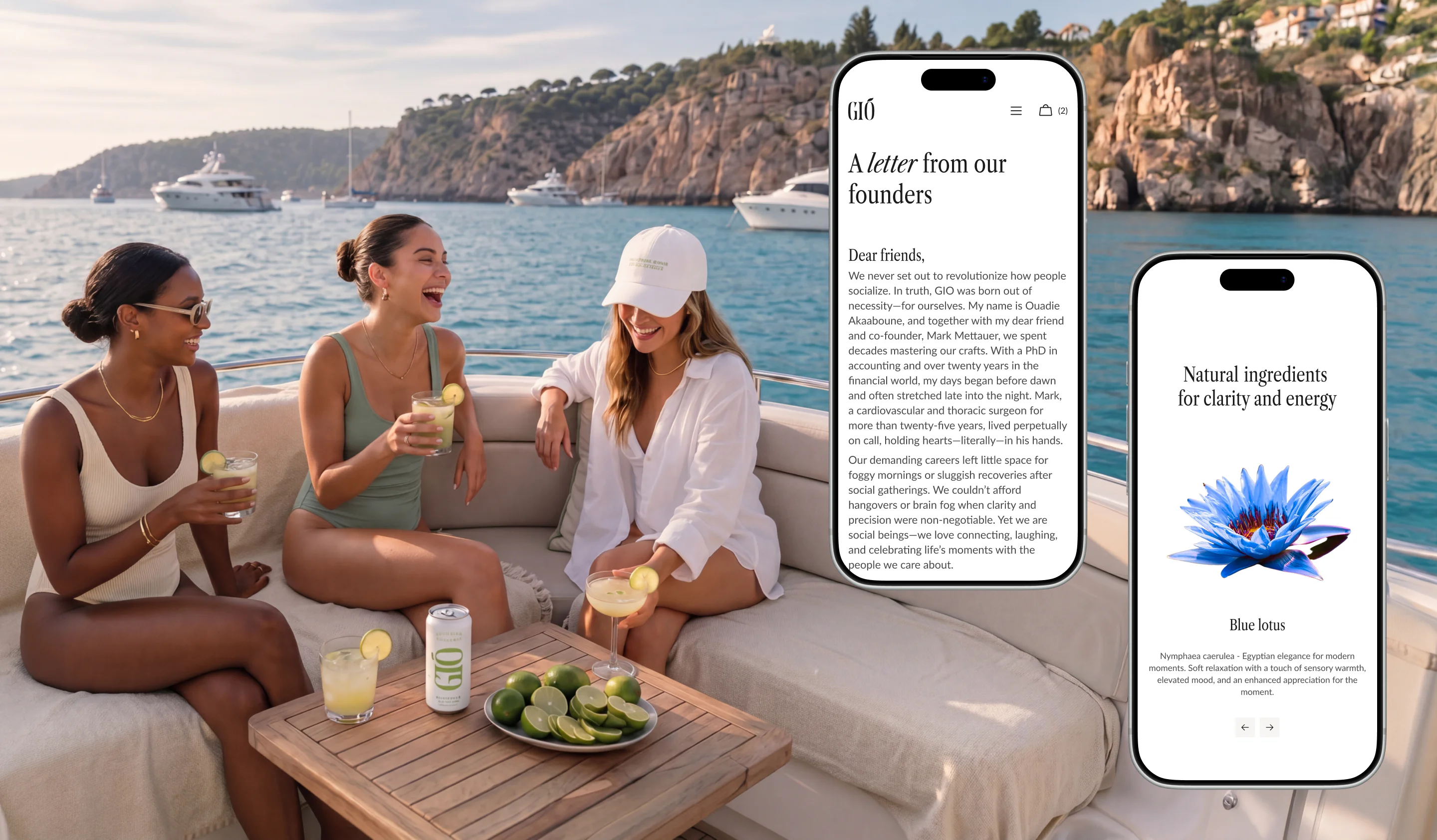
Real-life video in the hero sets the tone, creating an immediate emotional connection and a sense of authenticity. Animations and micro-interactions deepen that feeling: smooth transitions, scroll-driven movement, and subtle hover effects make the product feel alive. A 3D bottle brings all the advantages forward in a tactile way.
THE TASTE OF REAL MOMENTS
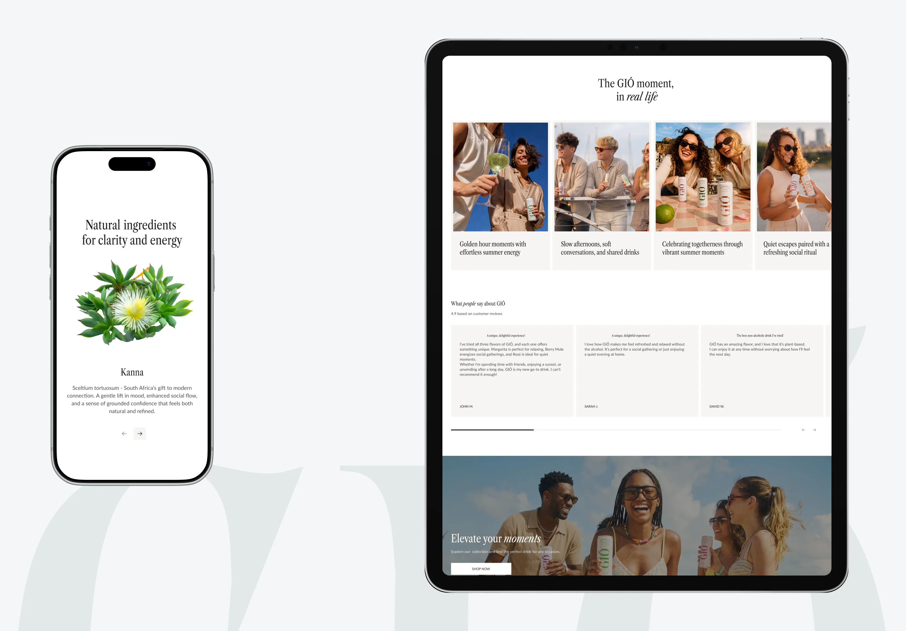
The idea was to show the brand through real life: the laughter, the eye contact, the quiet pauses that make a night memorable. In all that, GIÓ appears as a natural part of those moments, through the right design decisions.
BEHIND THE ELEGANCE
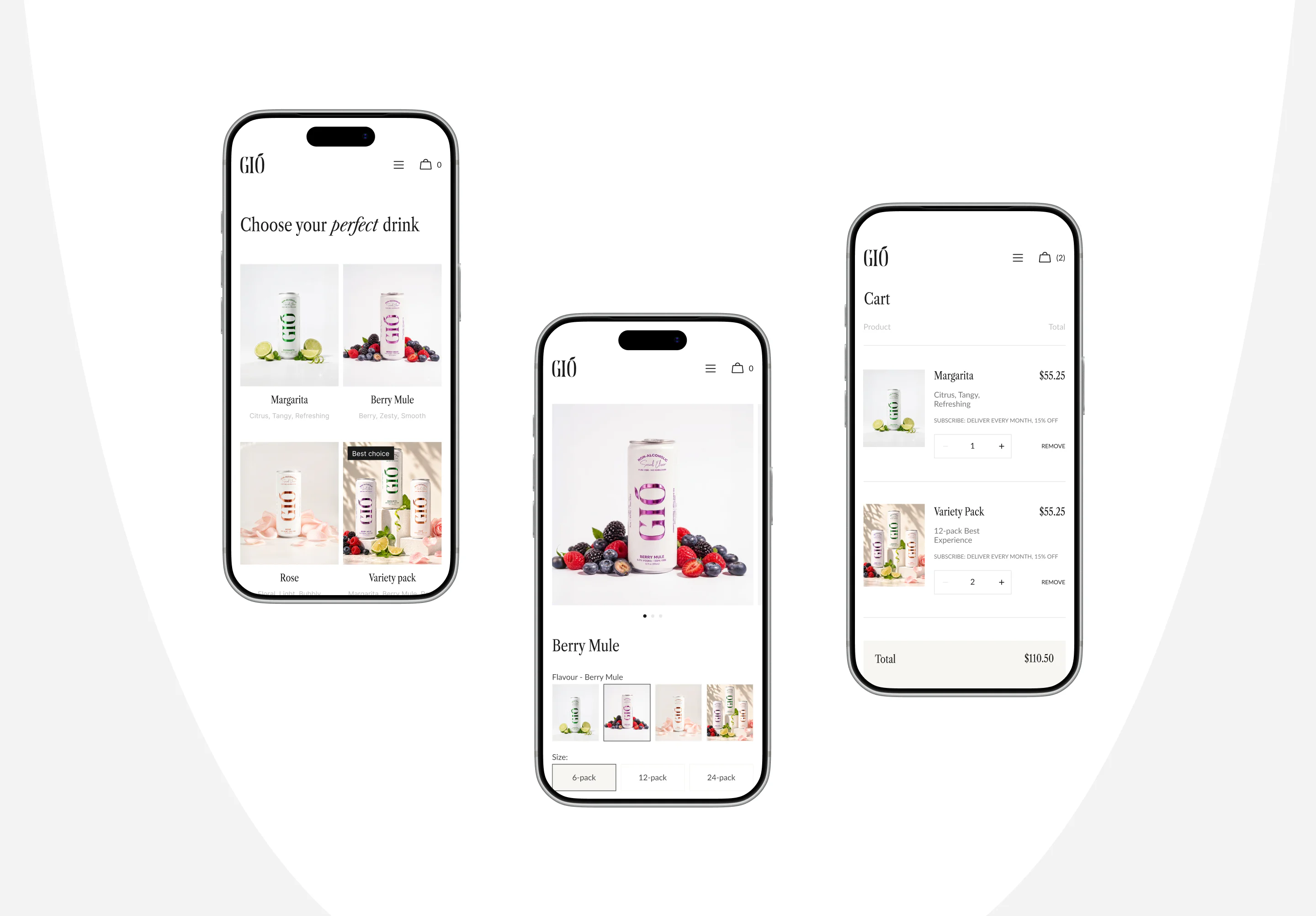
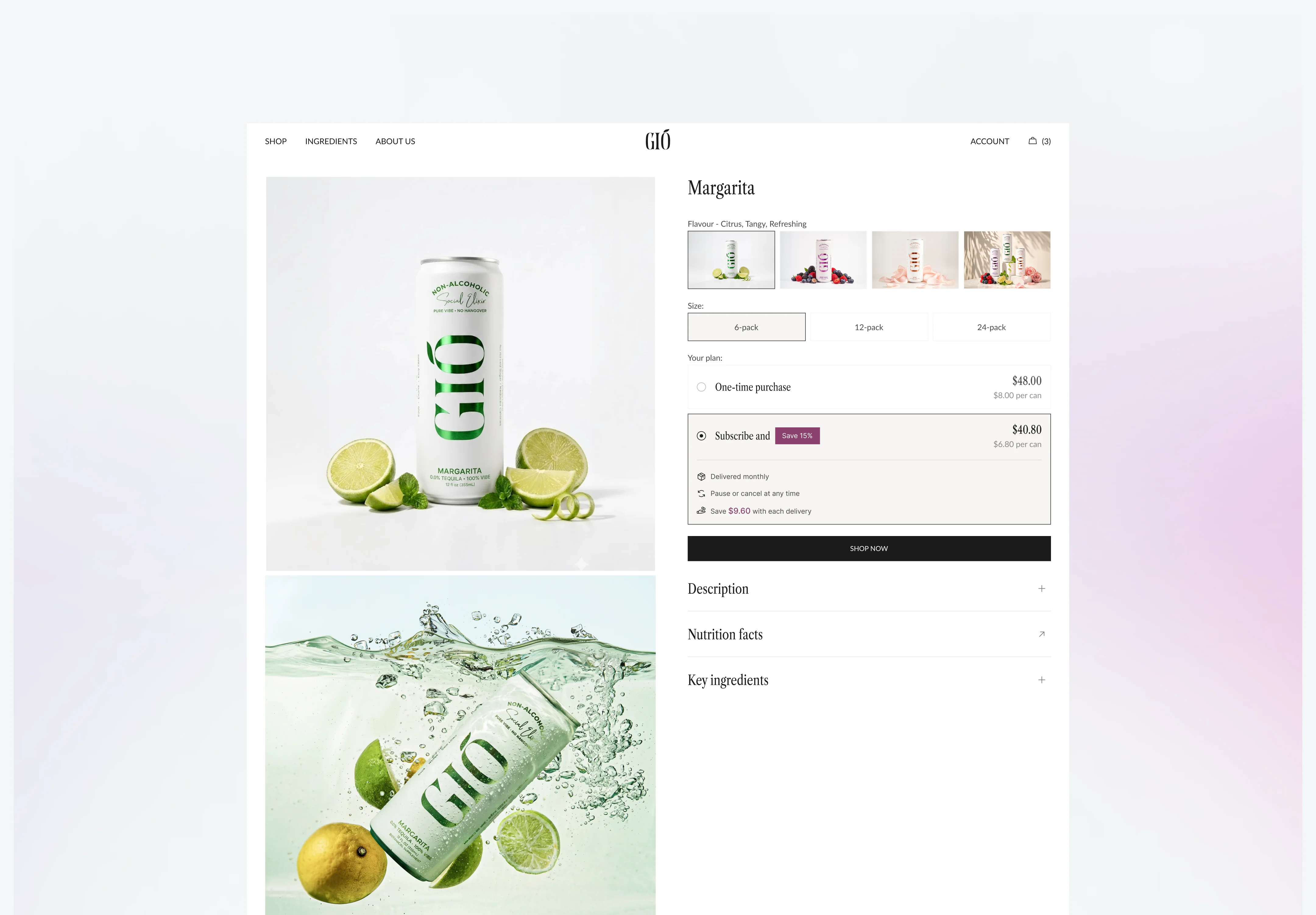
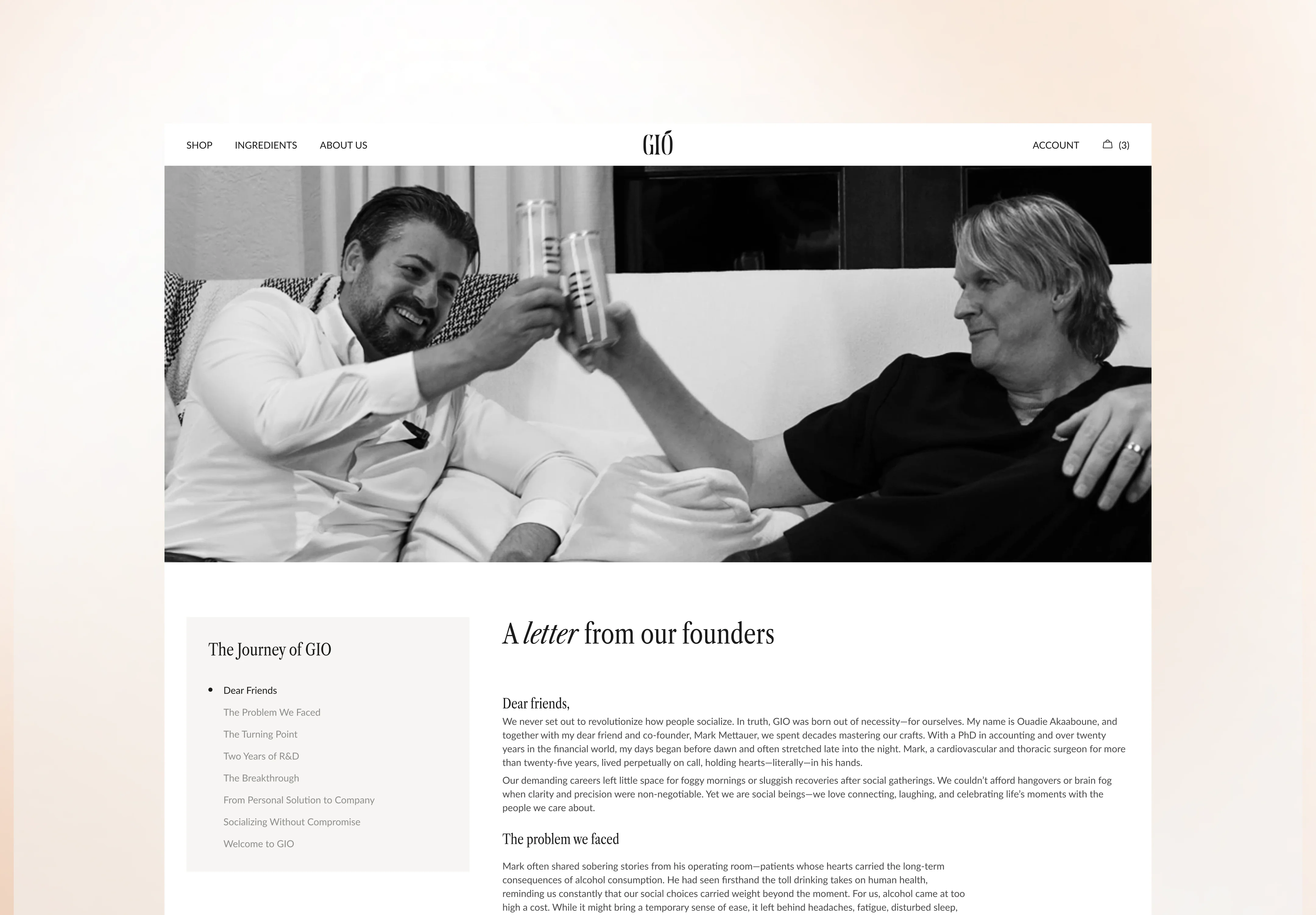
The site was built on Shopify, with a full product flow covering multiple flavors, pack sizes, and a monthly subscription option for returning customers. The experience moves from a cinematic homepage into About us page, then to product cards, a checkout, and a personal account area that keeps orders and preferences in one place.
THE ART OF GUIDING A CLICK
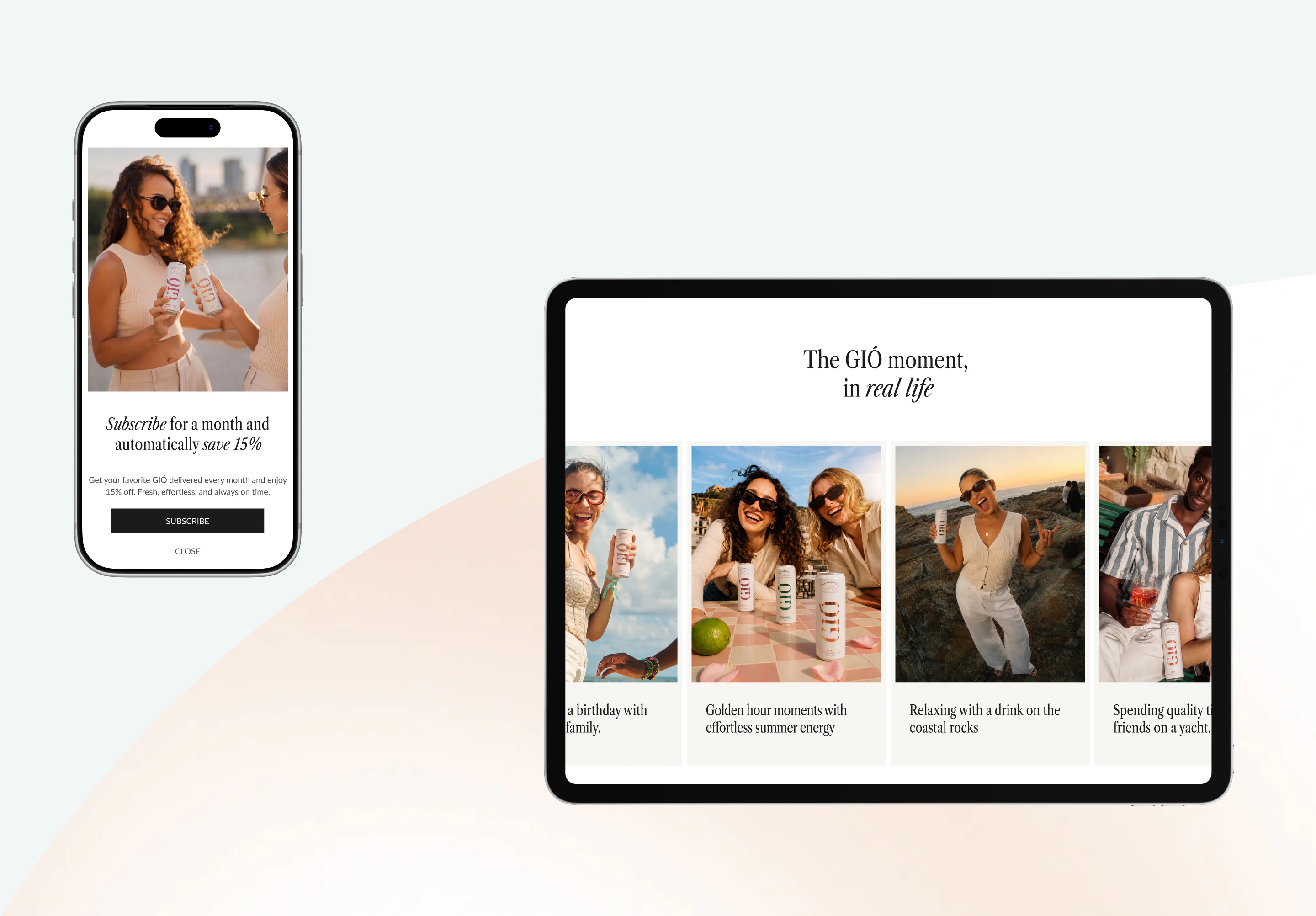
Subscription CTAs appear only after users have taken in the product benefits, with a clear “Save 15%” cue that feels like a natural next step. Flavors and pack sizes can be selected right on the product card. The subscription model sits in a highlighted block and activates in a single click.
THE RESULT
GIÓ’s direct-to-consumer store launched as a blend of aesthetics and function: premium on the surface, powerful underneath. The Shopify build supports multiple product variations and subscriptions, while the refined design language captures the brand’s quiet-luxury tone.
Frequently Asked Questions
-
How do you design an e-commerce website for a completely new product category?
When a product has no established category, the site itself has to do the teaching. The UX is built as a slow reveal, from the very first scroll, a visitor learns what the product is, how it works, and why it matters. By the time they reach the CTA, someone who arrived with zero context already has a clear picture and a genuine reason to try it. Agencies like VALMAX, a US-based web design agency, design these experiences as guided journeys rather than standard product pages — because for a new category, education and conversion have to happen in the same flow.
-
How do you build a premium brand feel on Shopify?
Premium feel on Shopify comes from restraint and craft, not from custom platform code. The key decisions are visual hierarchy, motion, and pacing, real-life video in the hero for emotional grounding, scroll-driven animations that make the product feel alive, and a 3D product render that lets a buyer examine it the way they would in person. The Shopify theme is built around the brand’s visual language first, then commerce features are layered in so they feel native rather than bolted on.
-
How do you increase subscription sign-ups in a Shopify store?
Subscription CTAs convert better when they appear after a visitor has already taken in the product benefits, not at the top of the page. The right moment is when a buyer already has context and just needs a nudge. For GIO, subscription appears in a highlighted block after the product benefits section, with a clear “Save 15%” signal that feels like a logical next step rather than a push. Pack sizes and flavors are selectable directly on the product card, so the subscription flow activates in a single click.
-
What Shopify features are needed for a single-product brand with multiple variants?
A single-product brand actually needs more UX thought than a multi-product catalog — because all the decision-making happens on one page. For a beverage brand, that means variant selectors for flavors and pack sizes built into the product card, a subscription option with one-click activation, and an account area where customers manage orders and preferences. The checkout flow has to feel effortless precisely because there’s no fallback to “browse something else.”
-
How long does it take to design and launch a Shopify store?
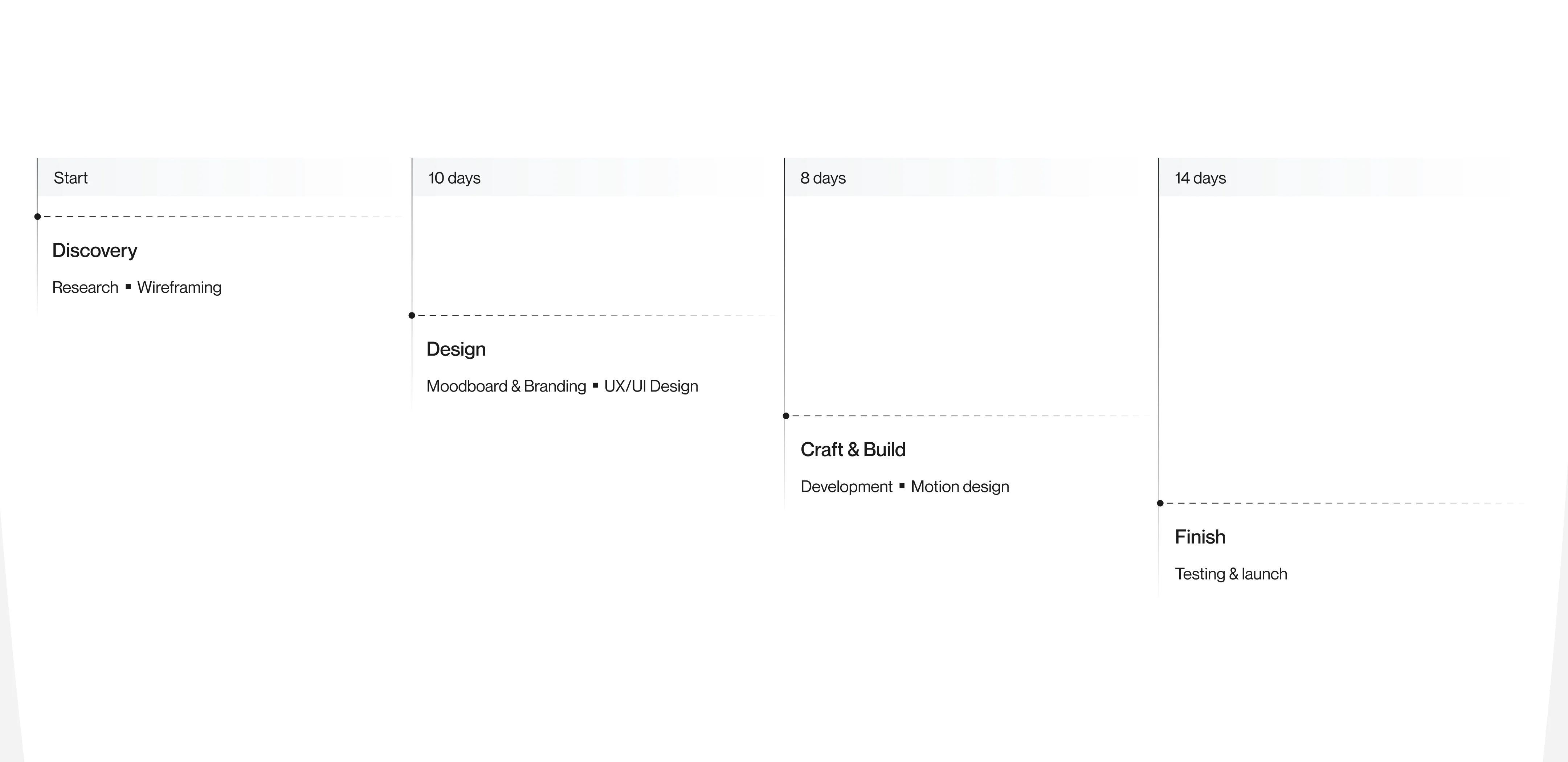
A well-scoped single-product Shopify launch, covering brand alignment, custom UX design, development, and QA , typically runs 10 to 14 weeks. More complex builds with multiple product lines, custom integrations, or subscription infrastructure can extend to 4 to 5 months. The GIO store, a premium single-product launch with custom motion and a subscription flow, shipped in 3 months from brief to live.
-
How do you design for a wellness brand’s e-commerce conversion?
Wellness brands convert when trust is built before the ask. The design sequence matters: establish what the product is, show the lifestyle context, answer unspoken questions (ingredients, how it works, how it feels), and only then introduce the purchase. Every element — video, copy, imagery, micro-interactions, either builds conviction or removes doubt. The CTA isn’t the start of the journey; it’s the natural end of one.