They Move Tons of Cargo, We Transformed Brand Identity
Discover how we crafted a minimalist brand identity for a global trading company. Designed to reflect the strength of their sea freight work, our creative approach delivers confidence for a serious, no-nonsense business.
Client
Services we provide
Headquarters
London, UK
Industry
Trading, Logistic
Design team
3 specialists
Timelines
1 months
The Client
Over 10.7 Billion Tons of Cargo Shipped by Sea Annually
DICE Europe Ltd is a major trading and brokerage company specializing in global logistics, primarily focusing on sea freight. They facilitate the movement of goods across international waters, managing the complex logistics of shipping and ensuring smooth, efficient delivery for businesses worldwide.
The Challenge
The client’s request was clear and to the point: “We need a minimalist logo, but nothing too ordinary — it should look strong and have a clear connection to maritime logistics.” To us, this sounded like, “You’ve got creative freedom. Go wild.” And that’s exactly the kind of challenge we thrive on.

Logo Insights
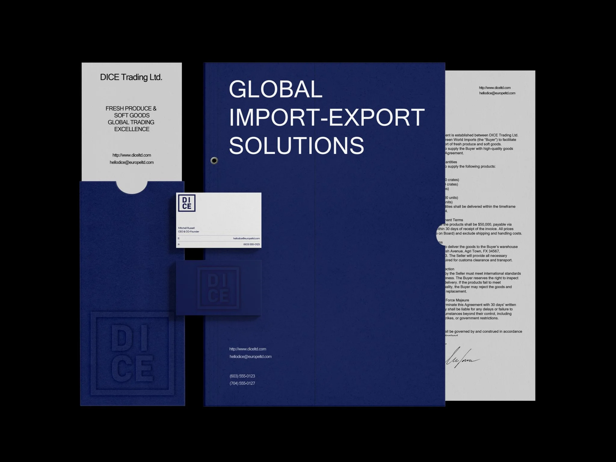
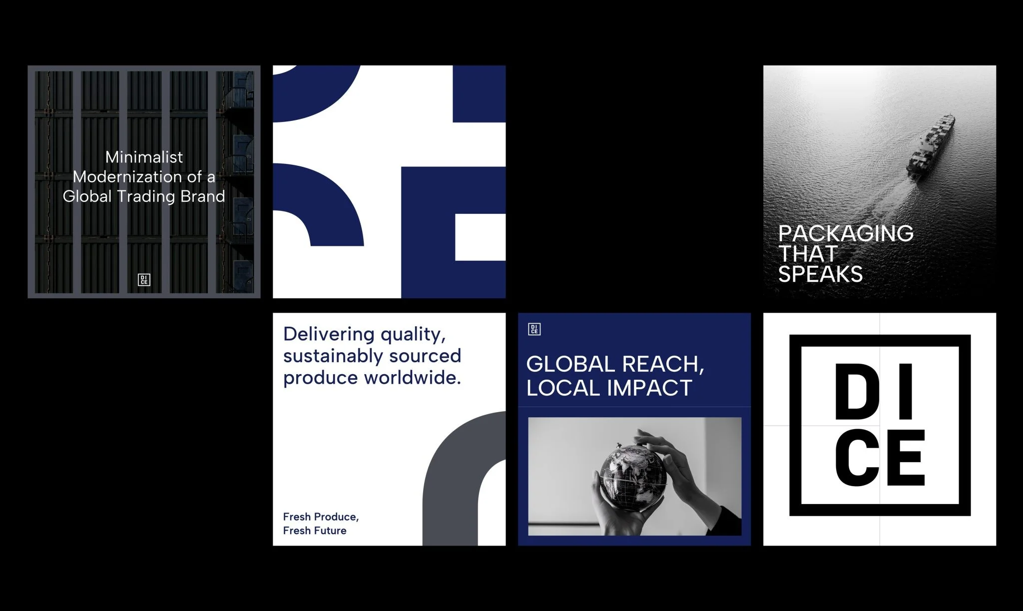
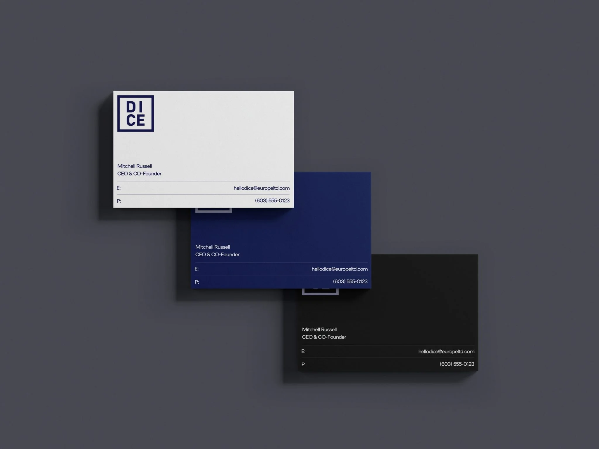
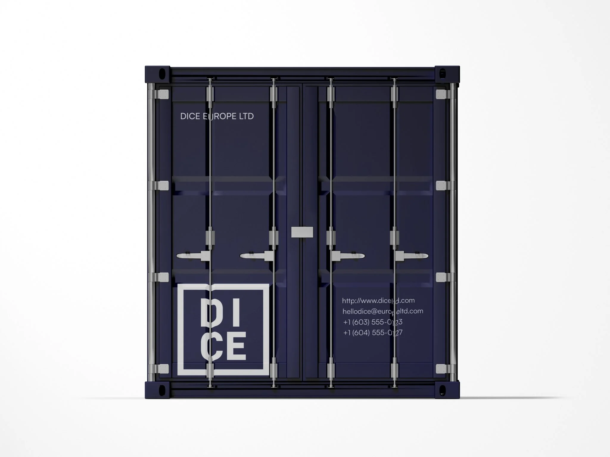
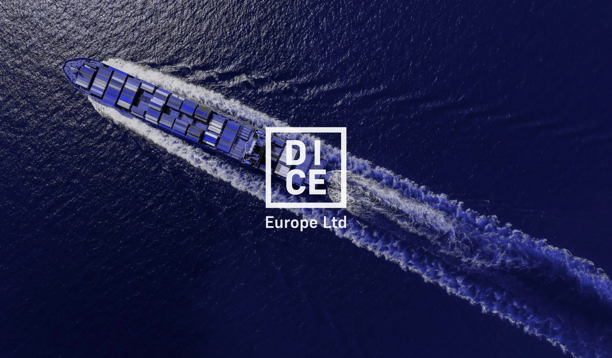
In what seems like a simple logo, there’s a depth of meaning. DICE symbolizes risk, luck, or strategy in business — ideal for a trading company. While dice usually refer to a game piece, we focused on the visual: a square logo with four letters stacked like a die showing the number four. But this isn’t about gambling — it’s about logistics. The design also mirrors the front of a shipping container, tying into their work. It all comes down to how the brand and logo are presented. Do you see a die or a container?
