EYE ON THE BLOCKCHAIN: BRANDING IN FULL COLOR
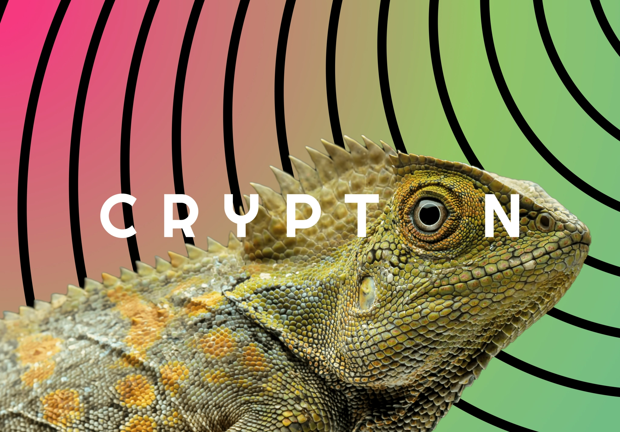
What does an iguana have to do with blockchain? Everything. Adaptability, resilience, vision — the creature’s traits became the DNA of a brand that jumped from business cards to merch, and proved its power on the conference.
Client
Services we provide
Headquarters
USA
Industry
Blockchain
Team
3 Specialists
Timelines
2.5 months
BLOCKCHAIN, BUT BETTER
On the frontier of blockchain, this IT company specializes in blockchain development, building projects at the intersection of smart contracts & web3.
BRANDING FOR THE
BLOCKCHAIN ERA
The goals was to create a concept and ship a minimalist, high-velocity website, plus event visuals and merch, that translate complex blockchain ideas into a memorable story the team can scale with.
A FUTURE YOU CAN SEE
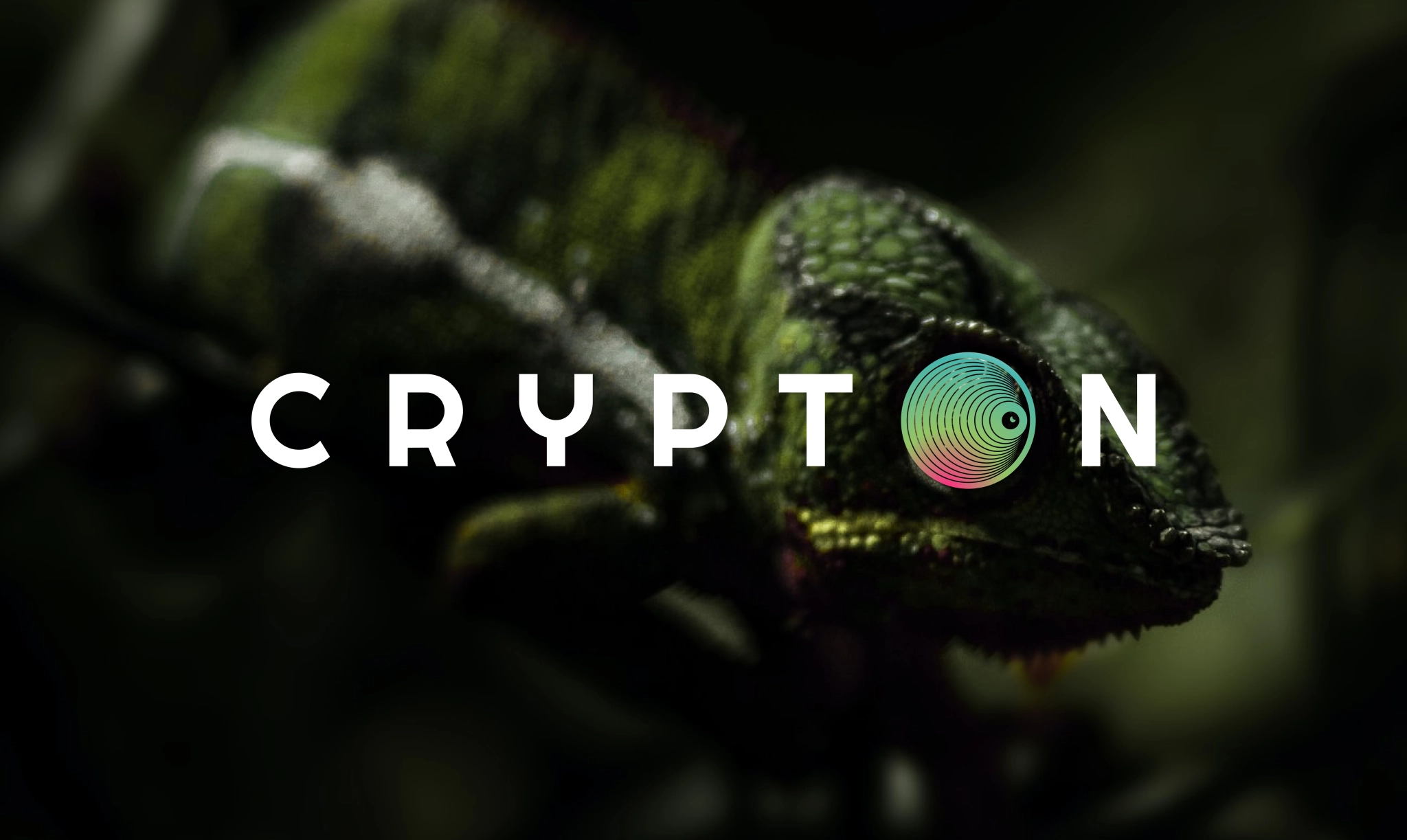
The story begins with the iguana — a creature of resilience and adaptability. In the wild, it thrives by shifting to its surroundings: adjusting colors, conserving energy, and blending in without losing its sharpness. For us, it became a mirror of the client’s own ambition in blockchain: a technology that must adapt to environments and stay agile in a competitive landscape.
Seeing blockchain through
new eyes
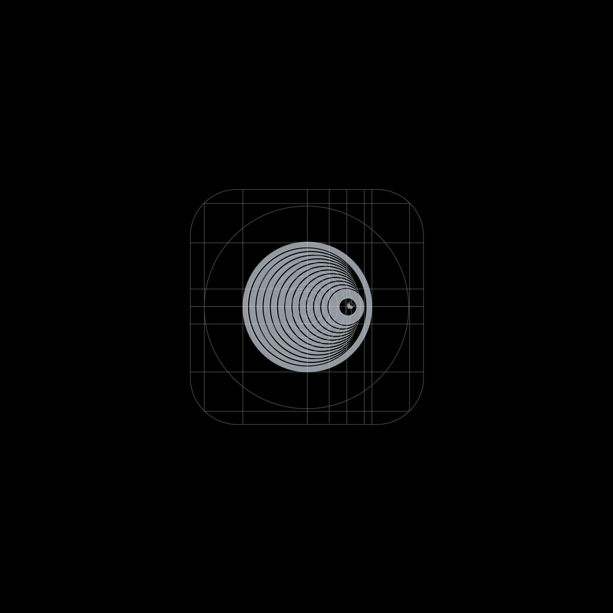
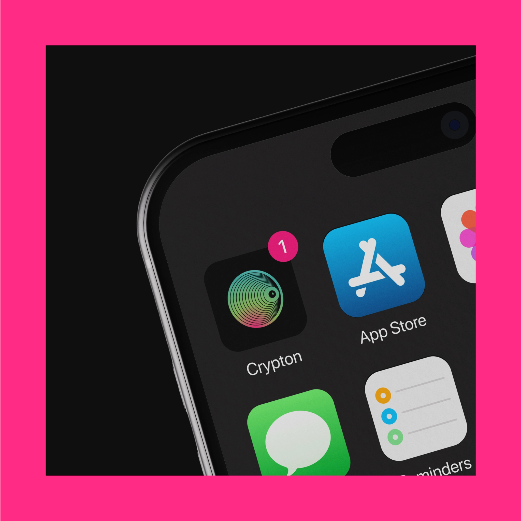
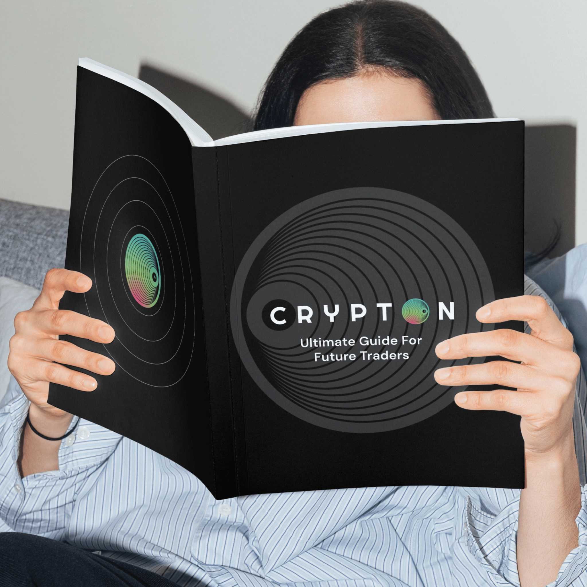
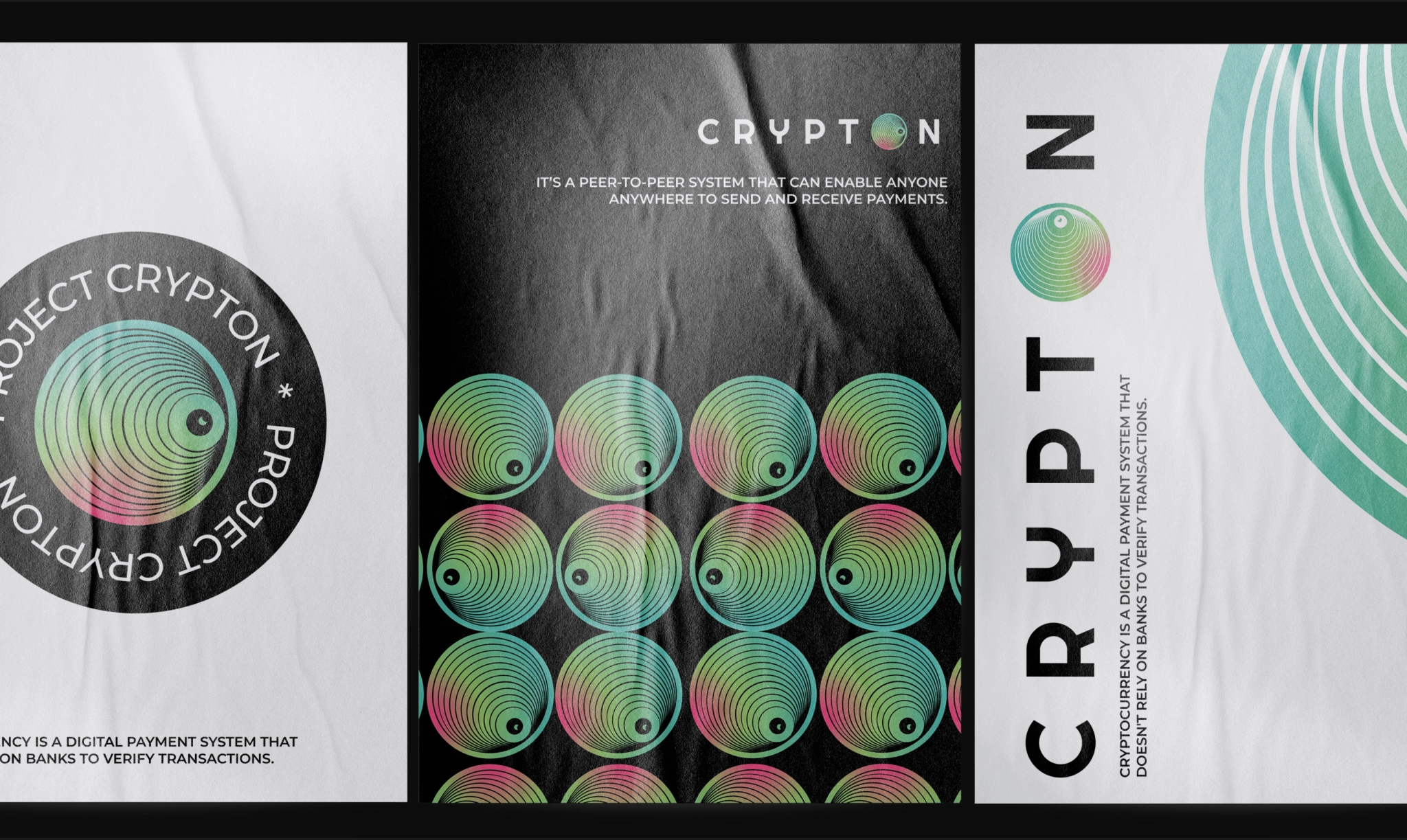
From that symbol, we zoomed into its most striking feature: the eye. Layered like blockchain stacks, scanning like a ledger in motion. We transformed it into the audacious “O” in the wordmark: alive, pulsing, and adaptive.
A PALETTE THAT SHIFTS
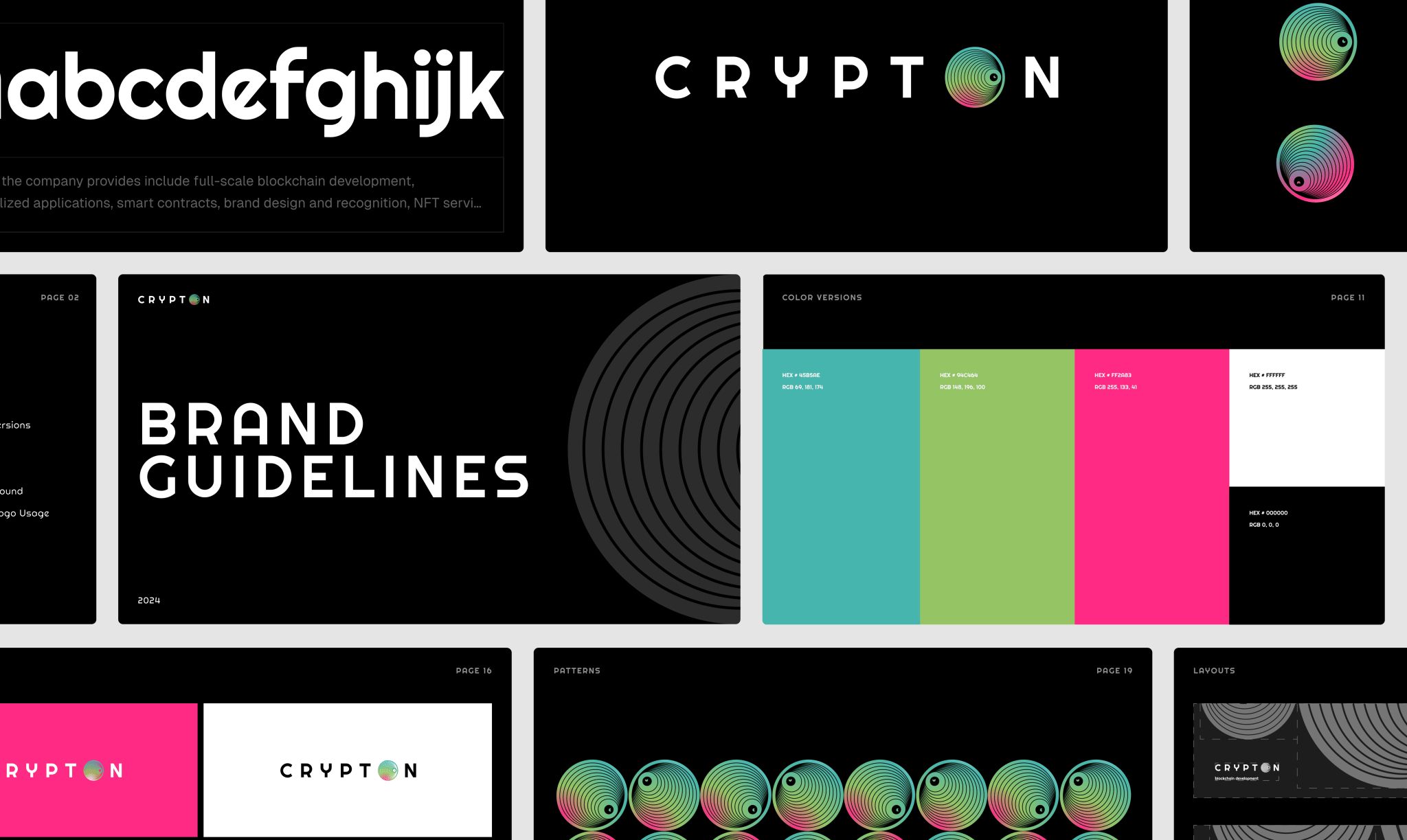
Colors were never decoration, but part of the metaphor itself. Emerald greens echo growth and resilience. Fierce reds signal alertness and energy. Metallic blues add a digital, futuristic sheen. Together, they form a palette that shifts like living skin, dynamic & contextual.
LOUD AND QUIET IN ALL THE RIGHT PLACES
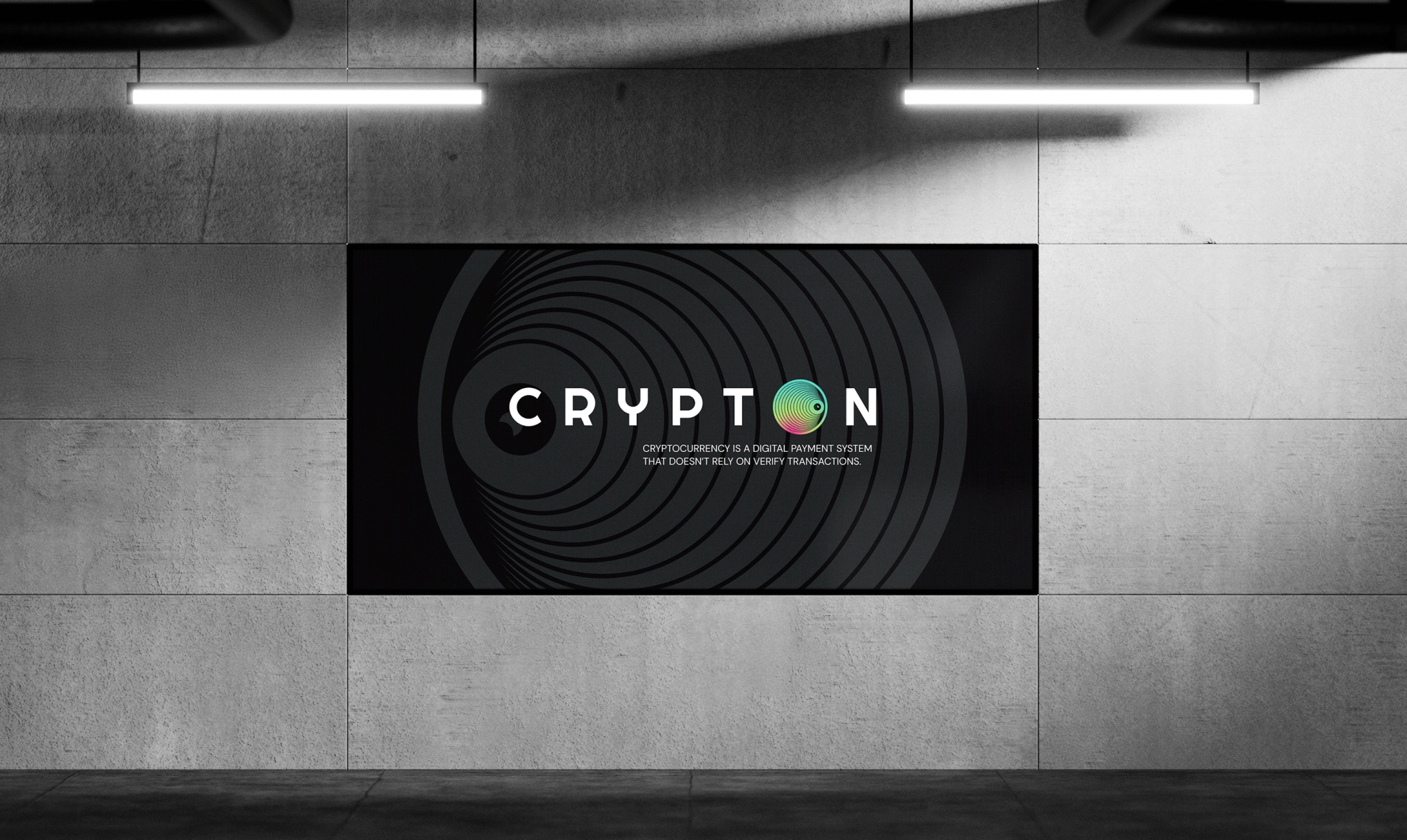
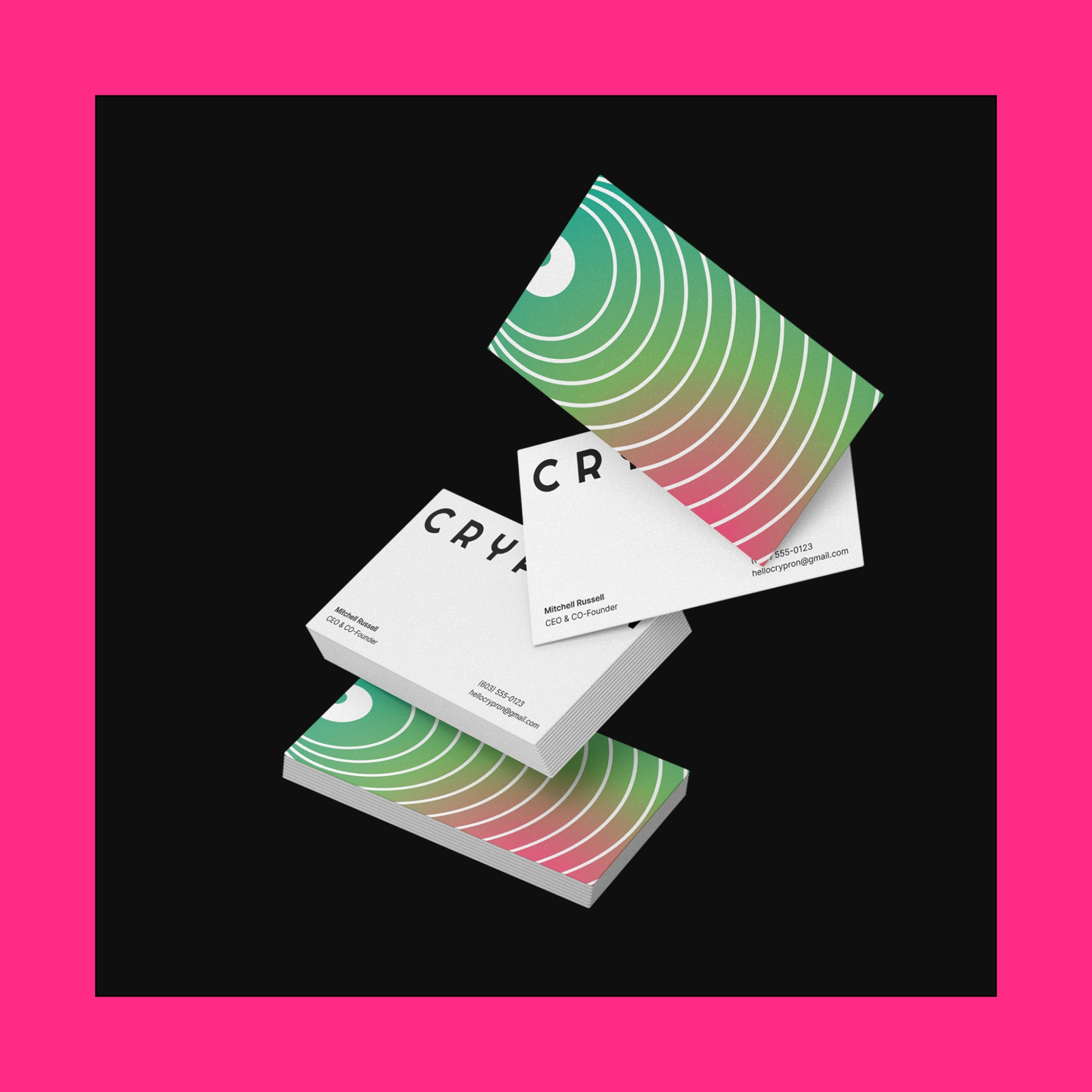
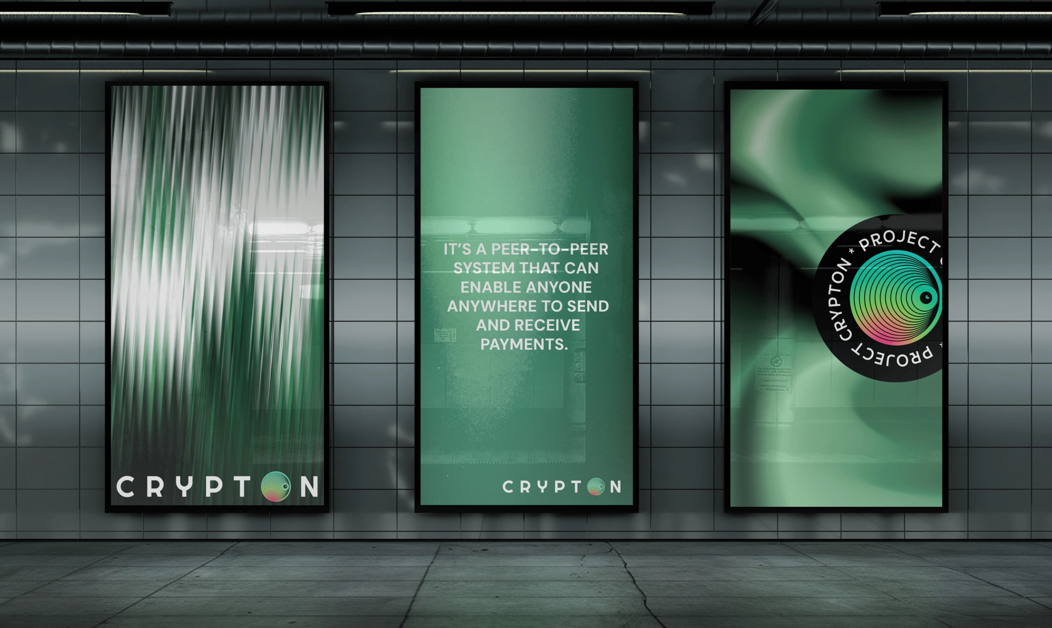
Concentric rings morphed into motion textures, dividers, and hero fields that feel like scanning a ledger in orbit. We paired it with disciplined, legible typography and a technological sheen. It’s loud where it should be (posters, banners, tees) and respectfully quiet where clarity matters (product pages, docs, UI labels).
FROM IDEA TO SCREEN
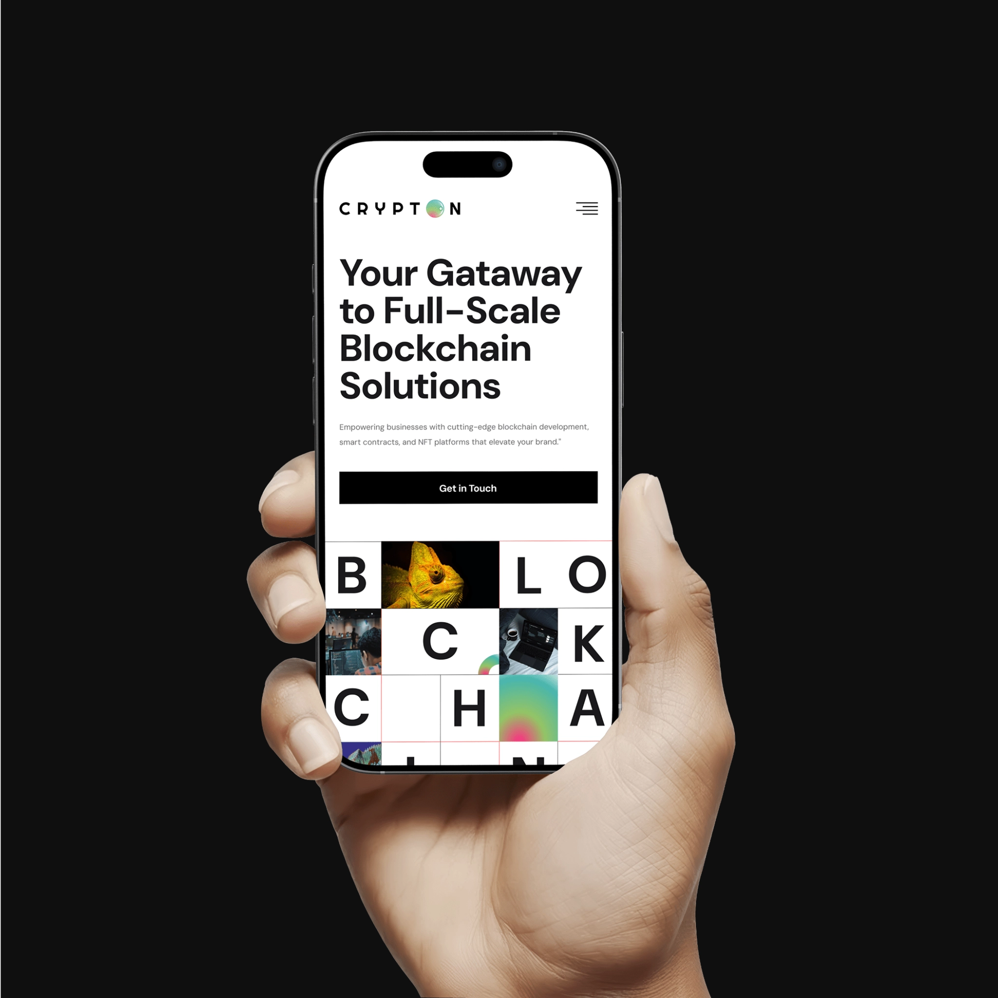
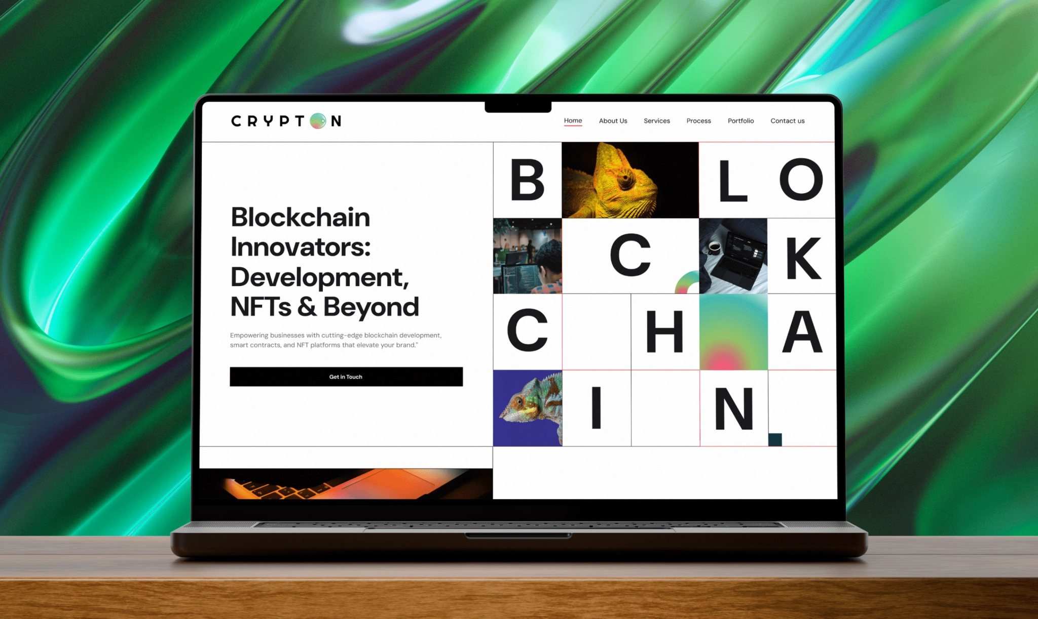
When it came to the website, we built modular sections that spotlight real use cases: NFT drops, smart contracts, while micro-interactions echo the layered eye. A developer-friendly build keeps performance sharp; QA tightened the screws across devices; PM kept deliveries crisp.
FROM SCREEN TO SCENE
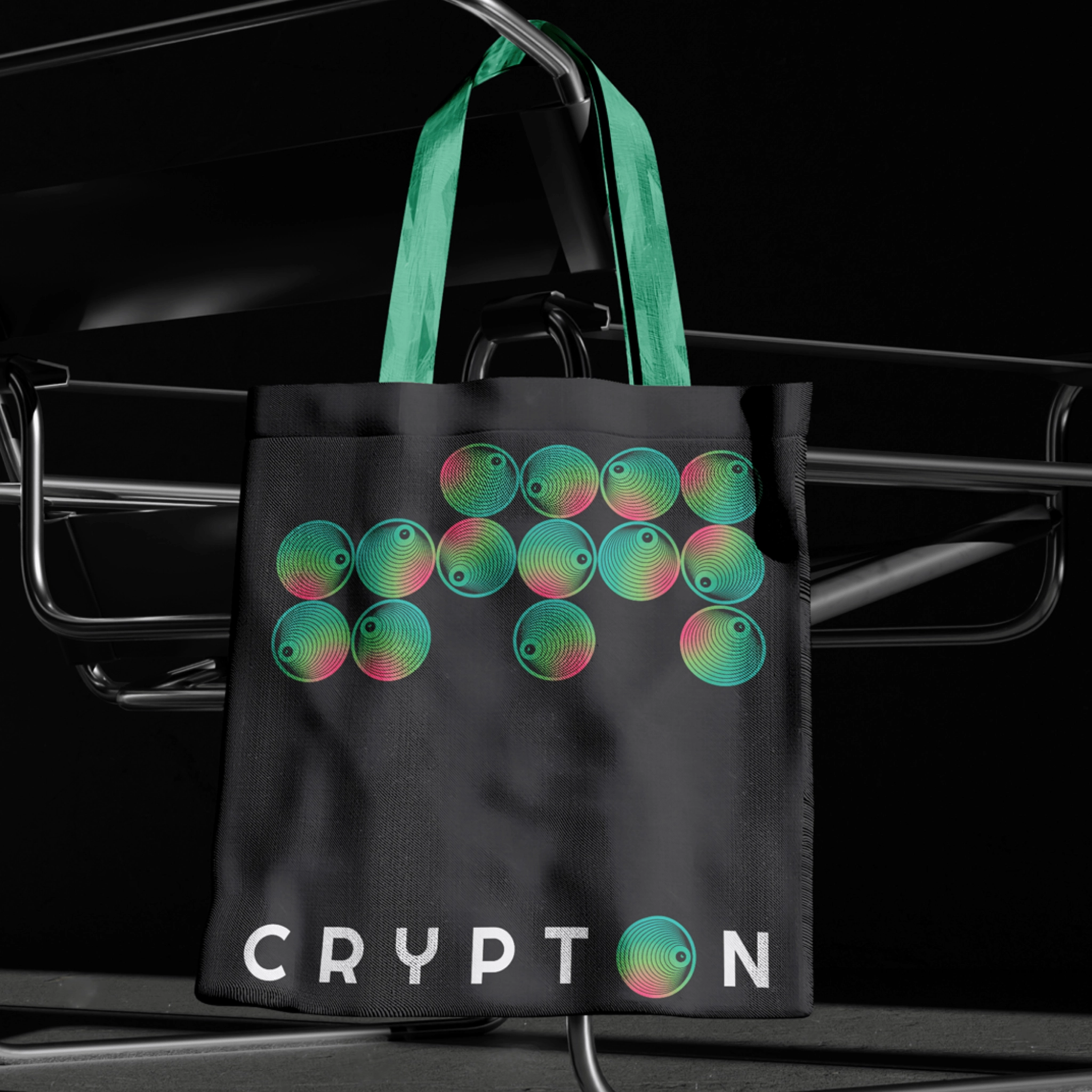
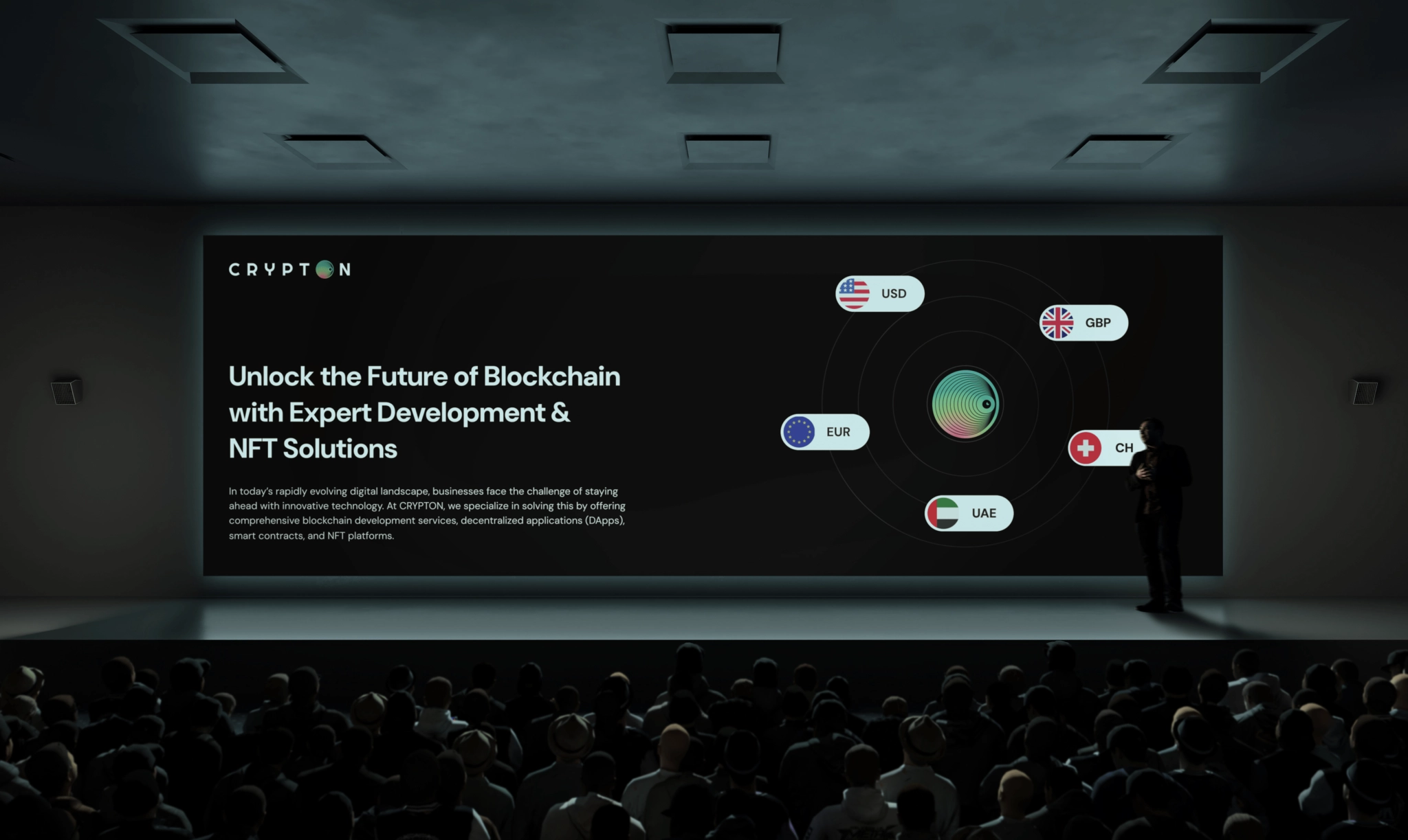
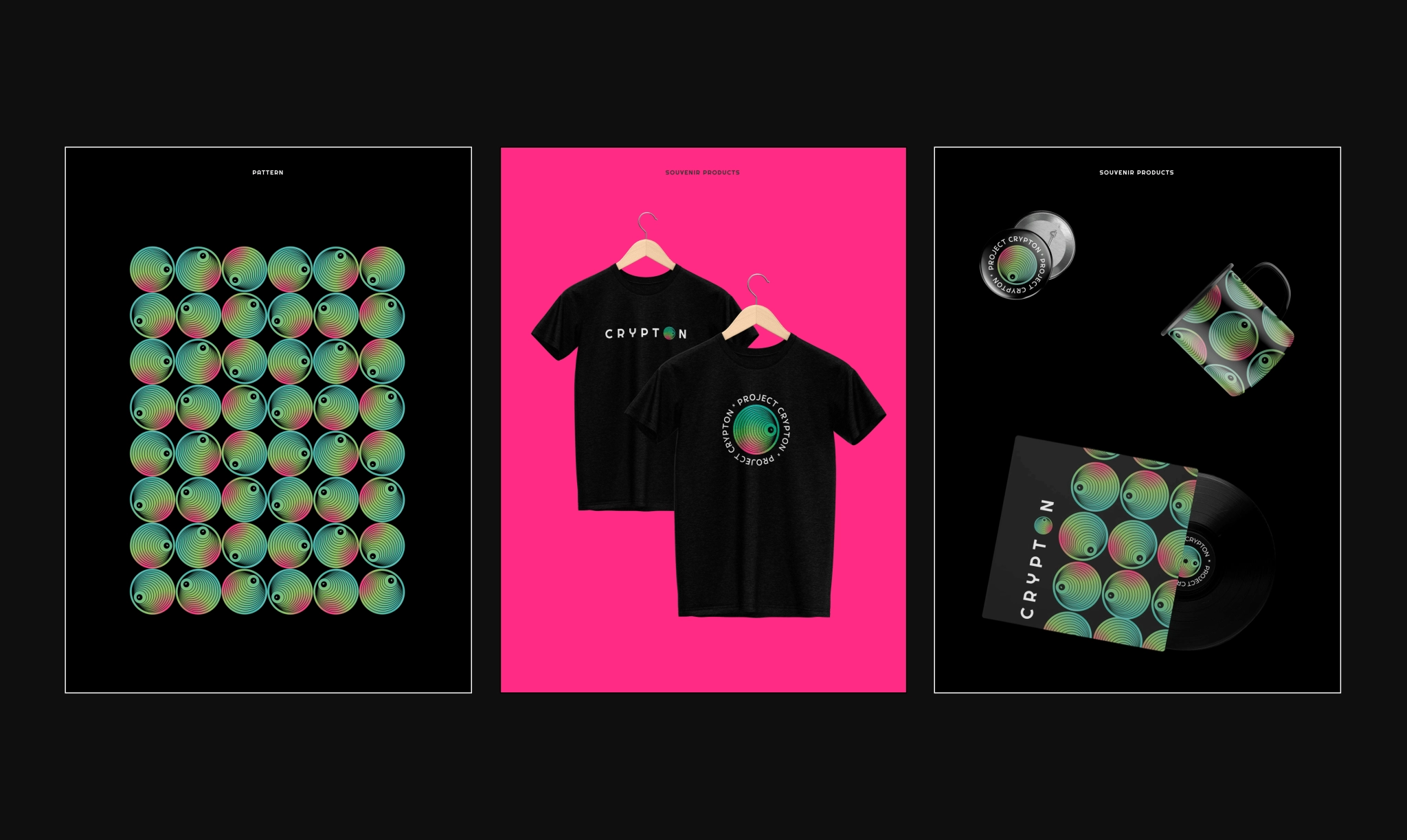
Then we carried it into the real world. Stickers, lanyards, hoodies turned the concept into a tribe. One metaphor, many surfaces. And most importantly, the identity was successfully adopted at conferences, where the bold visuals and merch made the booth a magnet.
LAUNCH, LOVED, AND REMEMBERED
The studio launched with a distinctive, adaptable identity and a website that’s easy to grow. The client loved it, the merch flew, and the layered-eye hook made the booth recognizable and memorable.
