Rebranding for an Industrial Powerhouse with 45 Years Behind
How do you update a manufacturing company branding that’s been powering oil rigs for decades? You start with the bead — and build a system that moves, scales, and sticks.
Services we provide
Headquarters
HOUSTON, TX
Industry
Manufacturing
Website
Timelines
2 months
OIL, GAS, AND THE BEAD THAT HOLDS IT TOGETHER
Carbo is a US-born global player with over 45 years on the market, a footprint that includes four manufacturing plants, and operations that stretch far beyond American borders. At its core, Carbo produces ceramic beads — highly engineered components used across multiple industries: different sizes, different forms, endless applications. But the heartbeat of the business lies in oil and gas, where their products support some of the most demanding extraction environments on the planet.
REBRANDING FOR AN
INDUSTRIAL LEADER
Refreshing, not replacing
The rebrand was part of Carbo’s corporate rebranding strategy — they were turning the page after the crisis under new leadership. A fresh identity, a new site, and a clear signal: this company is moving forward.
When less does more
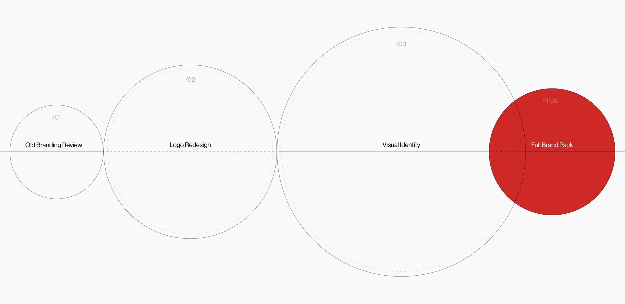
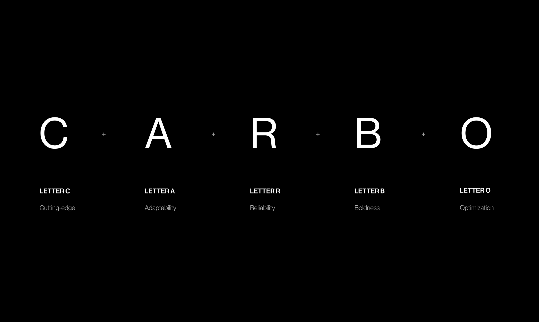
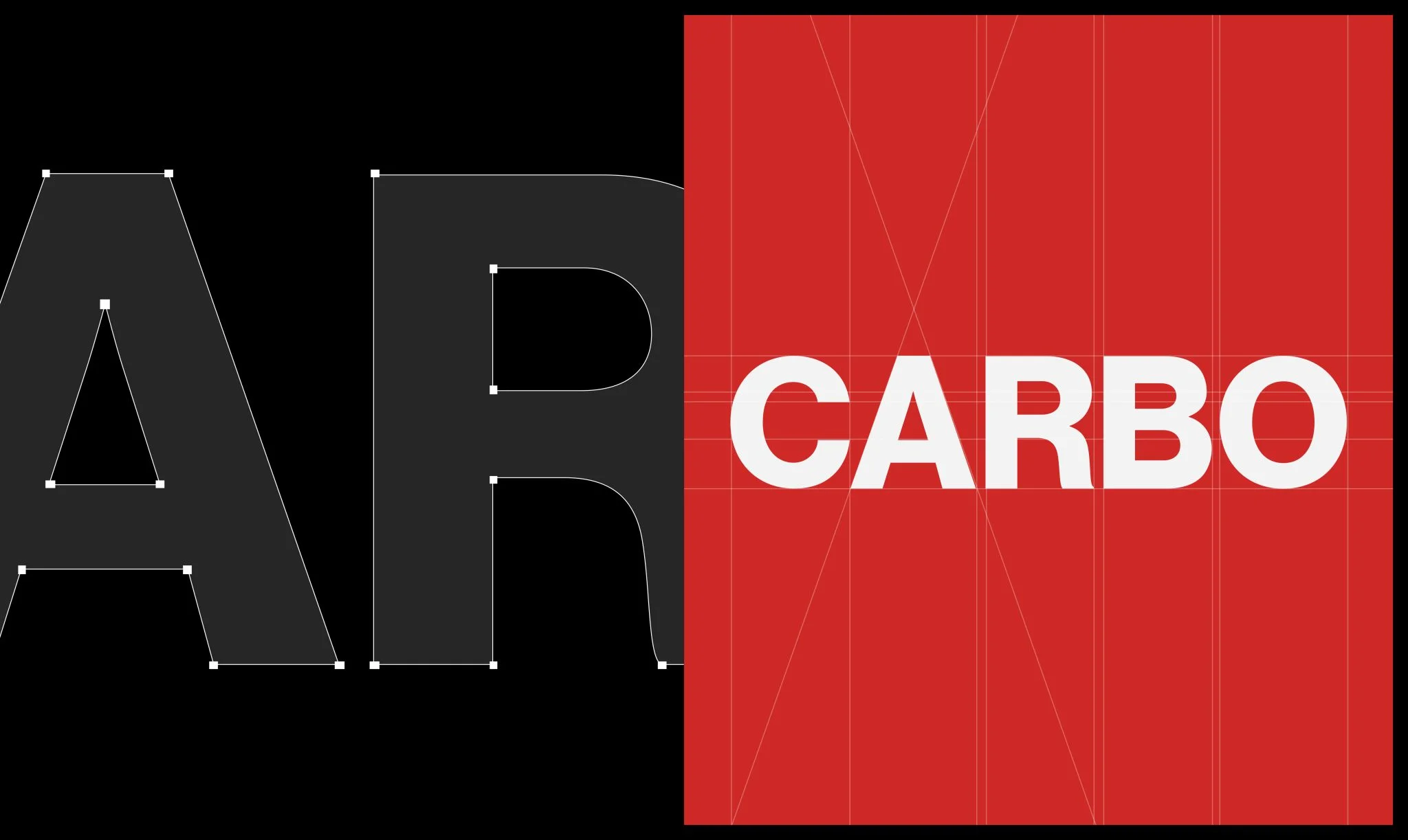
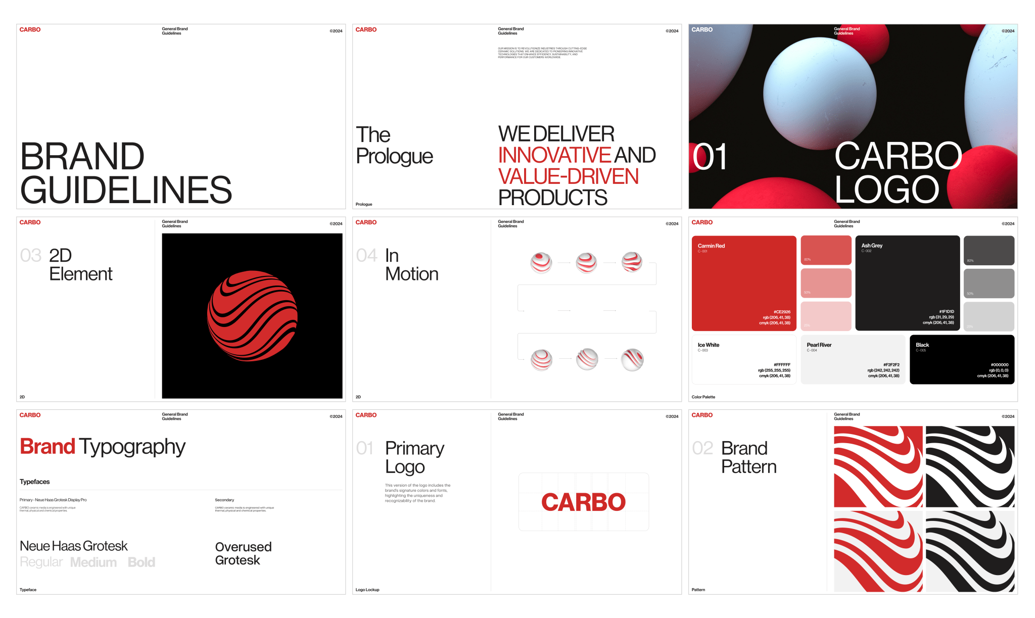
Carbo’s brief landed on our desk with a desire to keep the heritage, but give the logo and everything around it new energy. We chose intentional minimalism for this goal. The logo was redrawn — same recognizable core, cleaner geometry, tighter spacing — while a light neutral palette and a crisp modern typeface keep the system flexible on stark white or deep black.
HEAR IT FROM THE SOURCE
In a quick video shot on-site, Carbo’s leadership reflects on the process — and why the new identity became a foundation for what’s next.
BRAND THAT DOESN’T
CRACK UNDER PRESSURE
Ceramic beads can withstand crush pressures up to 10,000 psi, making them significantly more durable than natural sand. Impressive, right?
Carbo’s product is tough to describe, simple to visualize — so we turned it into the centerpiece of the brand’s motion language. Now, Carbo’s identity revolves around a single shape: a white ceramic bead shot through with a flash of Carbo red. White speaks to the product; red signals the ongoing R&D that keeps it evolving. Always in motion, always improving — just like Carbo’s core product.
EVERYTHING,
EVERYWHERE, ON-BRAND
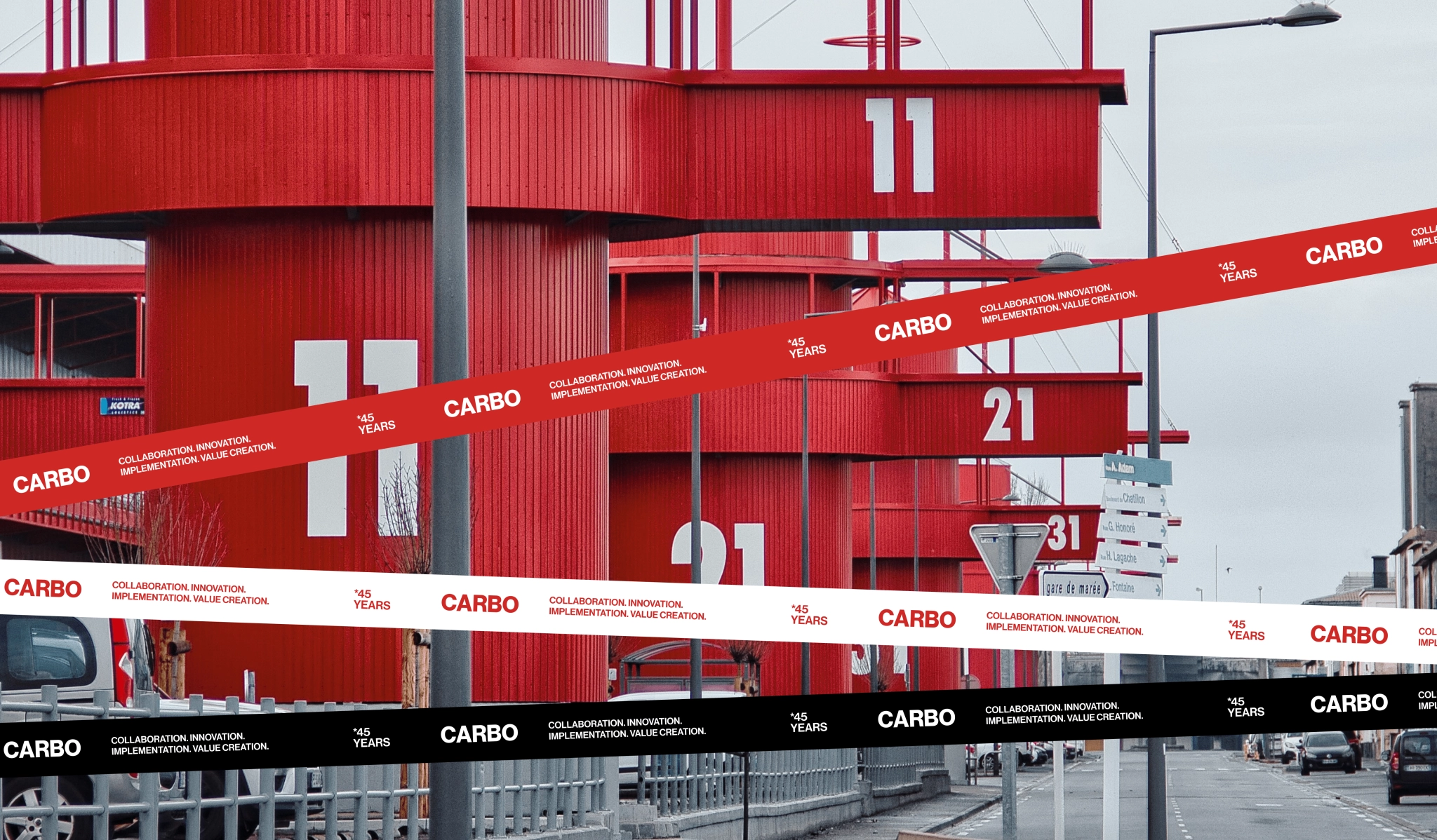
From brand patterns to the photoshoot
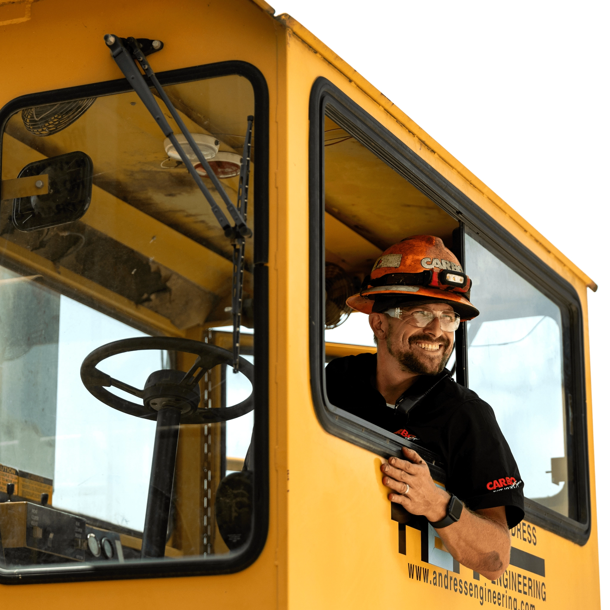
Once the core of the brand identity was in place, we pulled everything together into a full brand guideline: brand patterns, colors, type, motion, rules — the whole system. The client even organized a full-on factory photoshoot, guided by references we helped curate, to capture their equipment and people in the right light. See the man in the hard hat? Not stock — it’s a real Carbo worker.
Templates? Covered
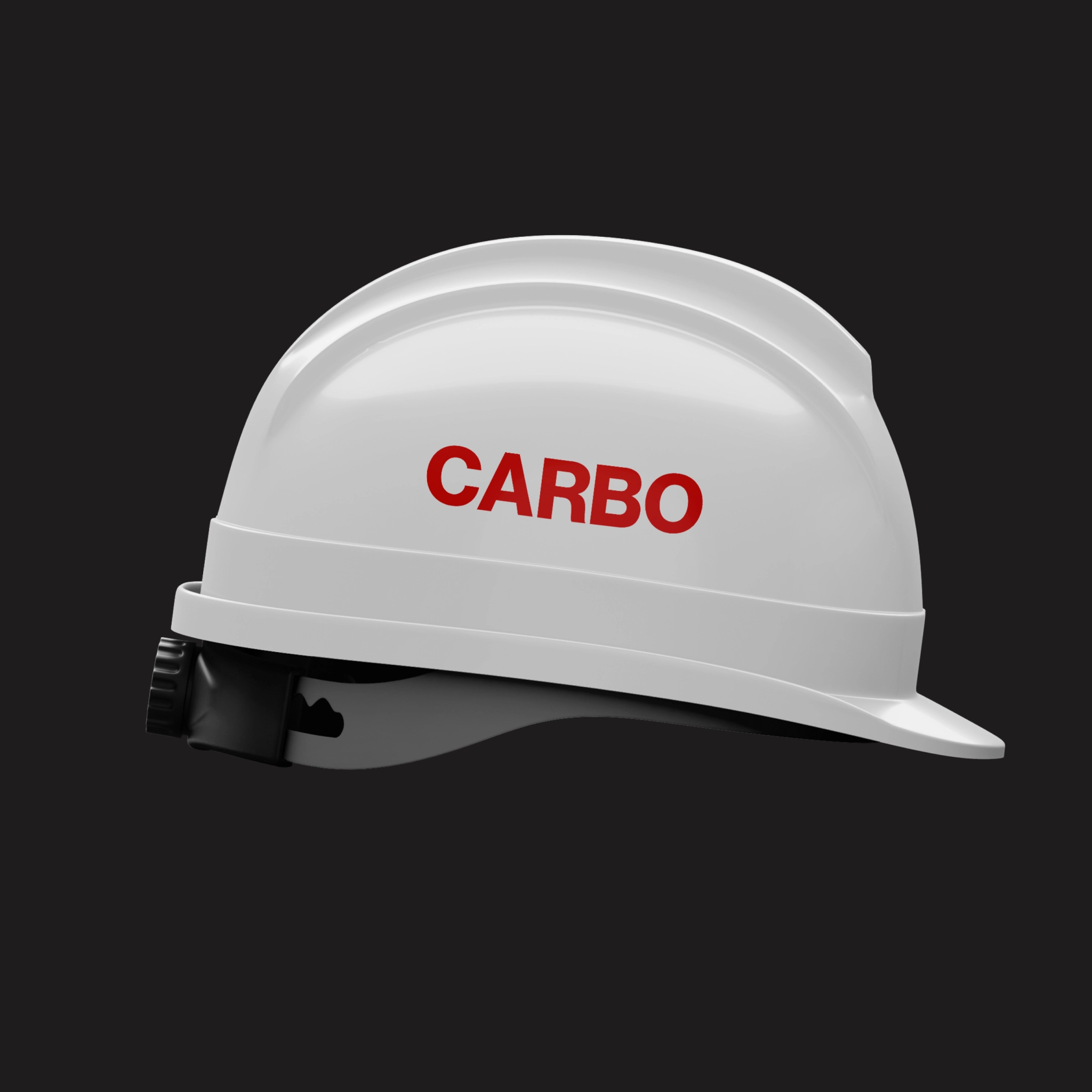
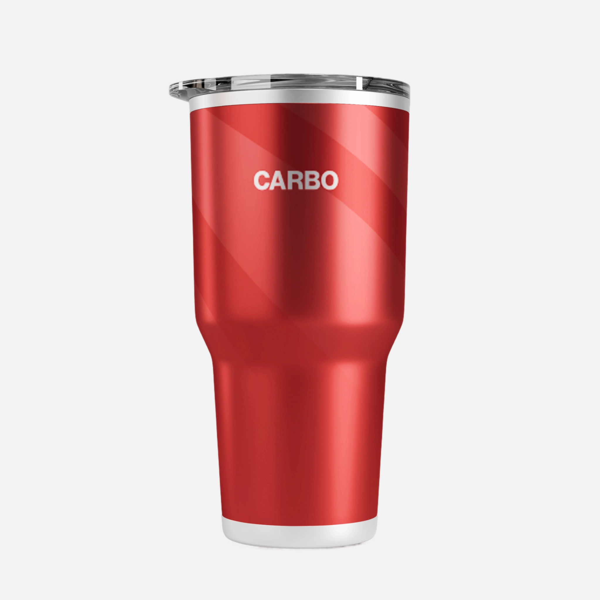
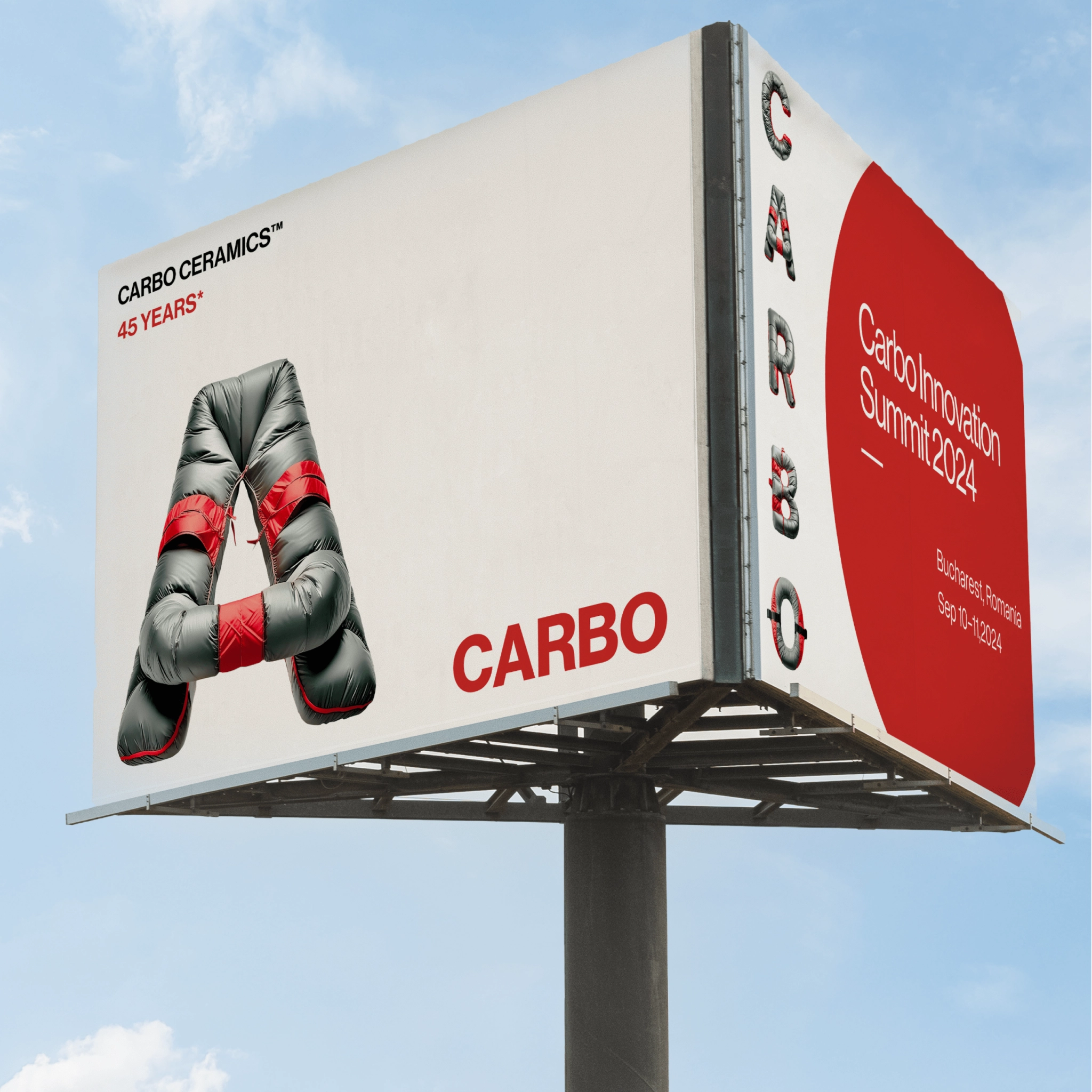
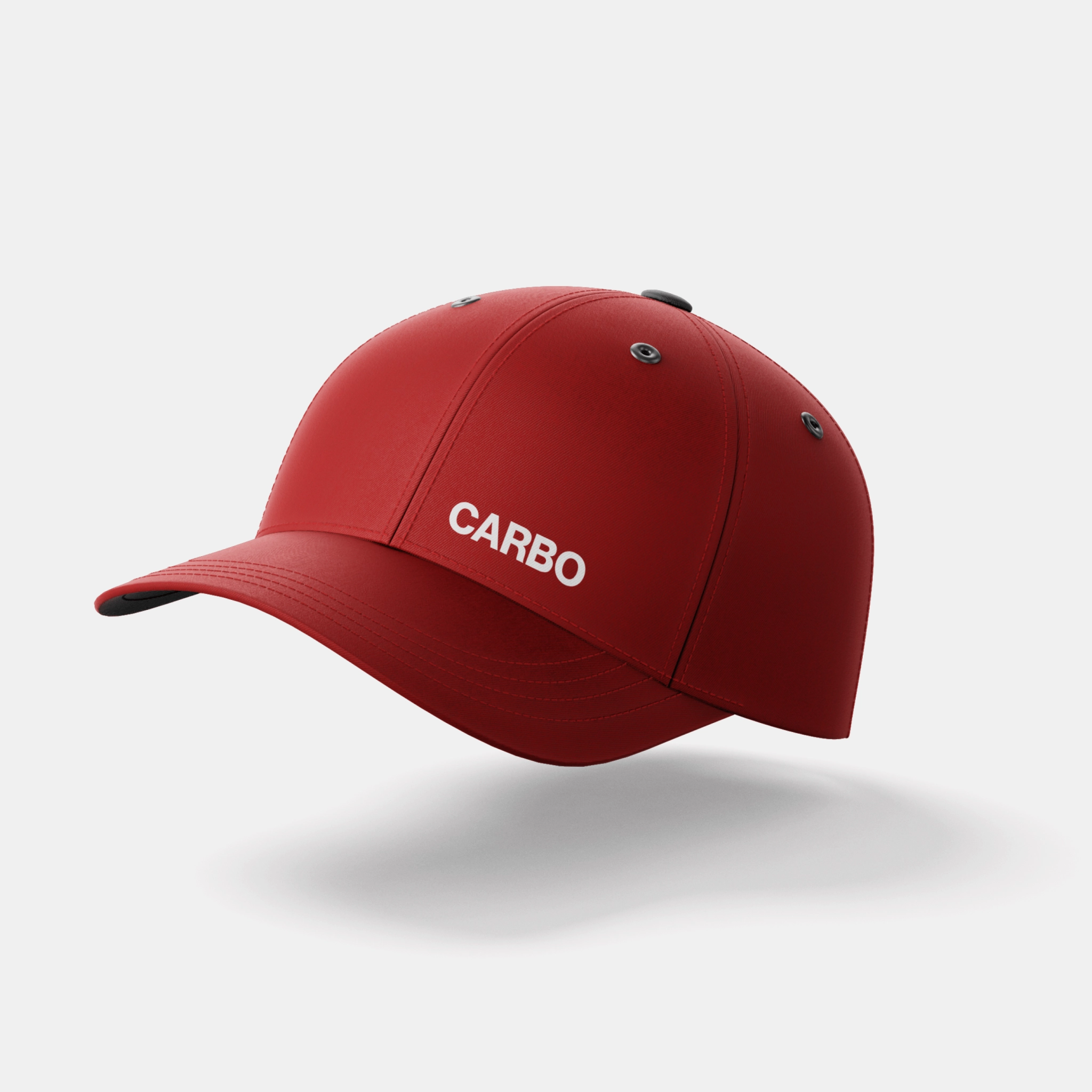
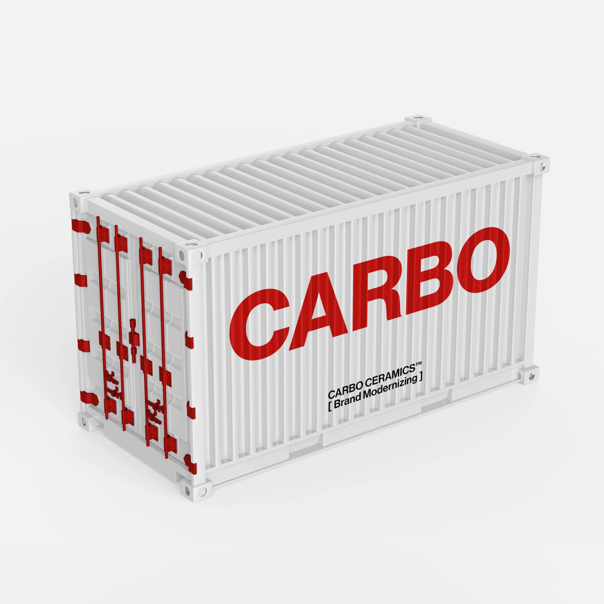
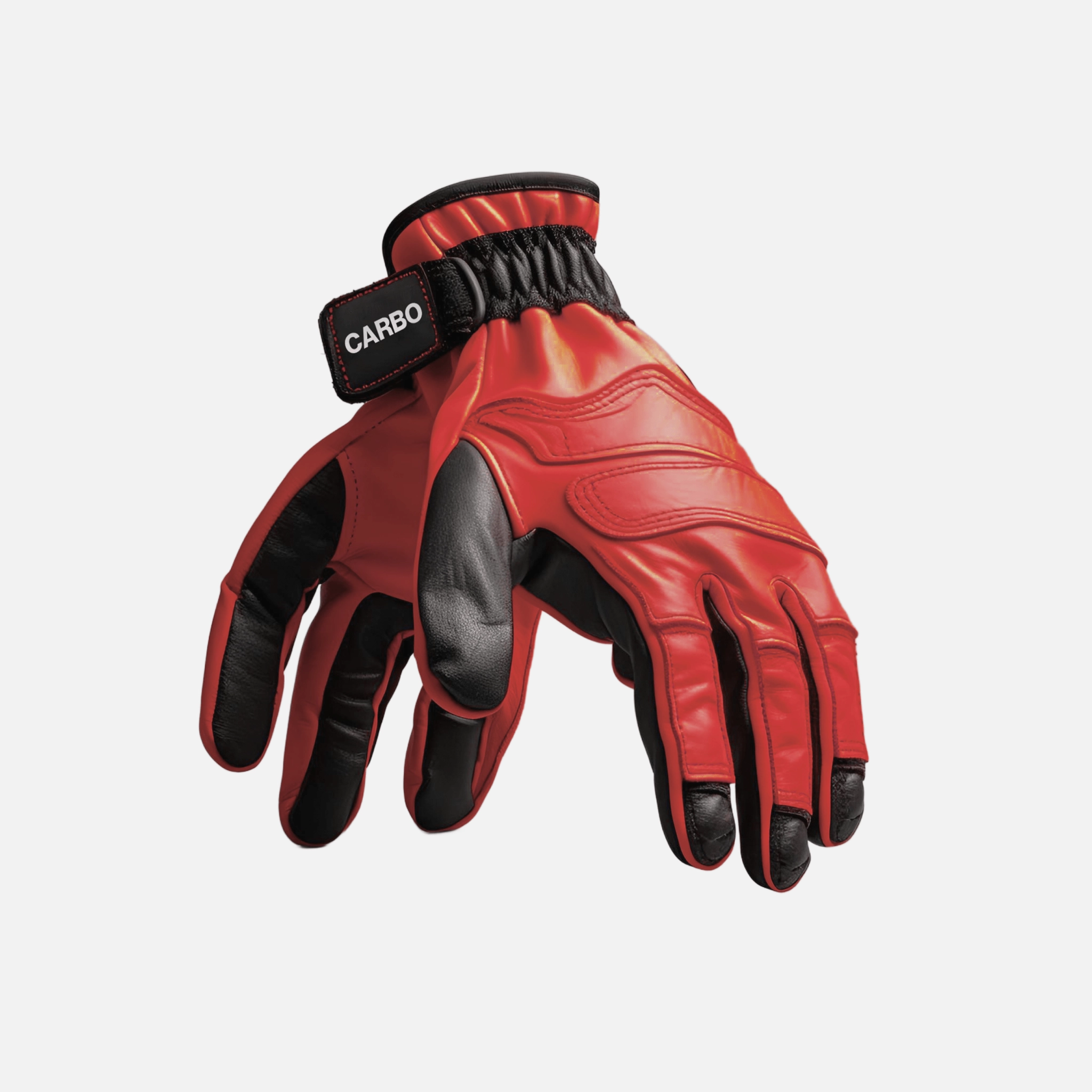
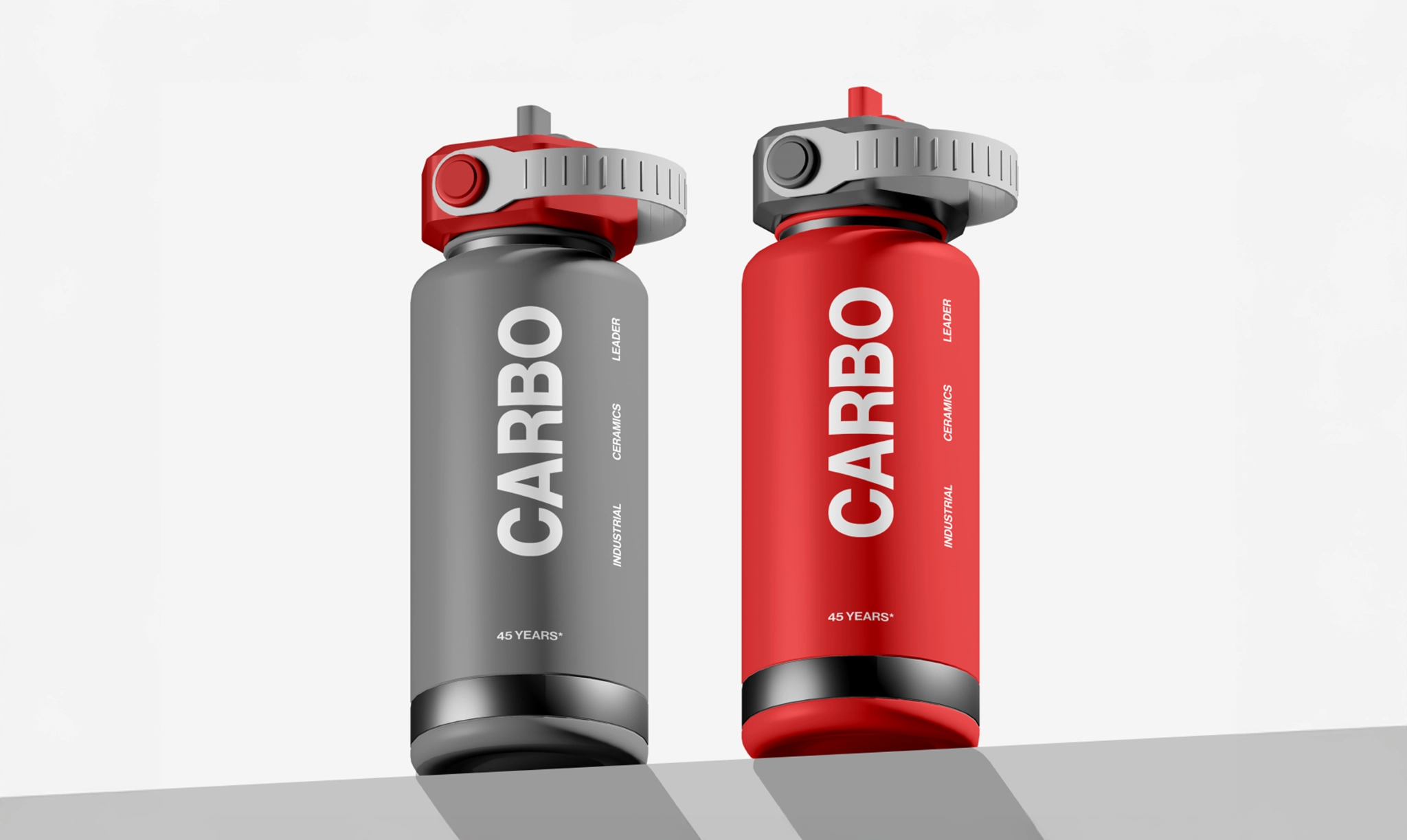
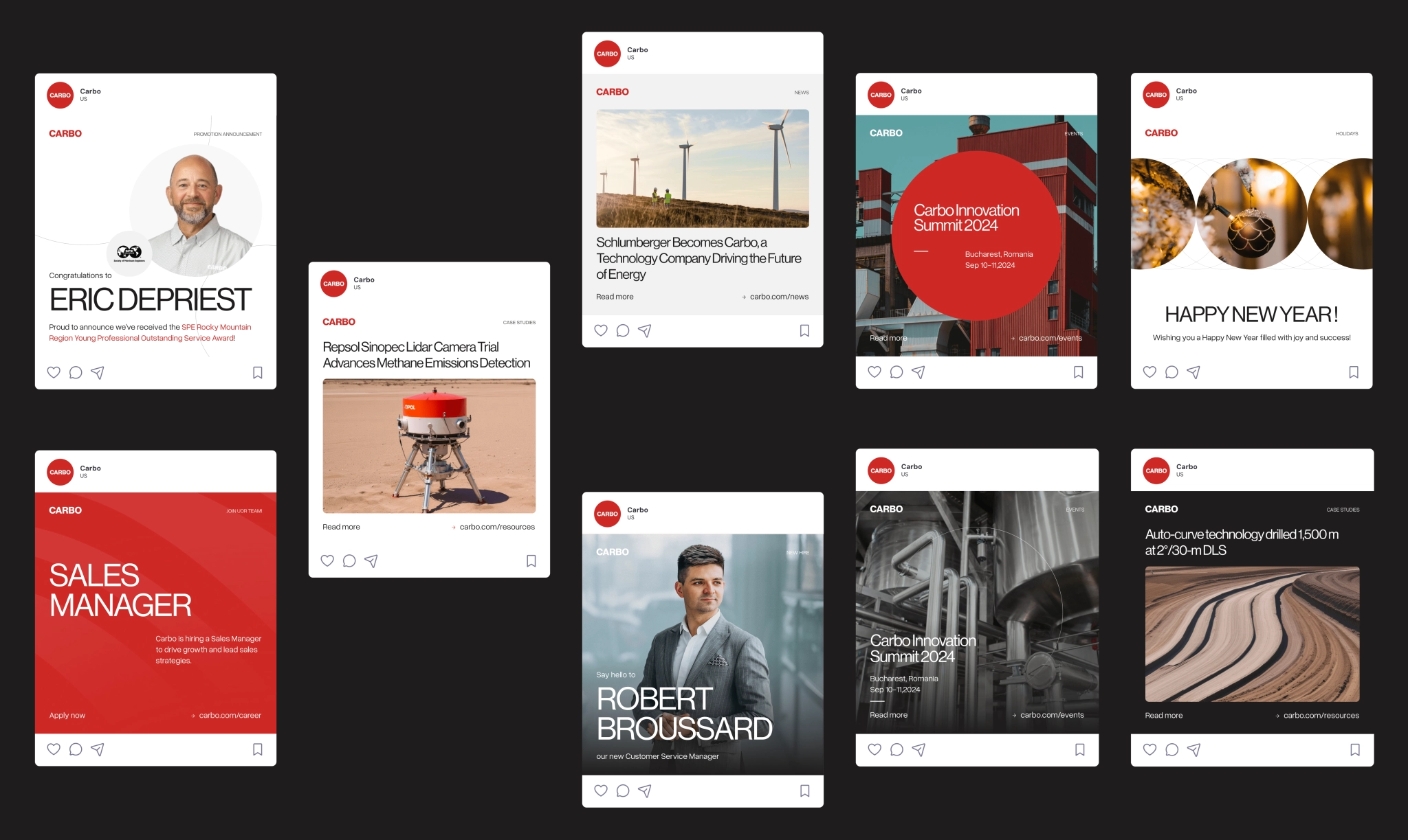
From there, we rolled out social media templates, merch design, and a full presentation deck. Clean, flexible, and ready to use across touchpoints, teams, and territories. We’ve thought about internal teams too — they now have a dedicated brand page with all the core assets in one place.
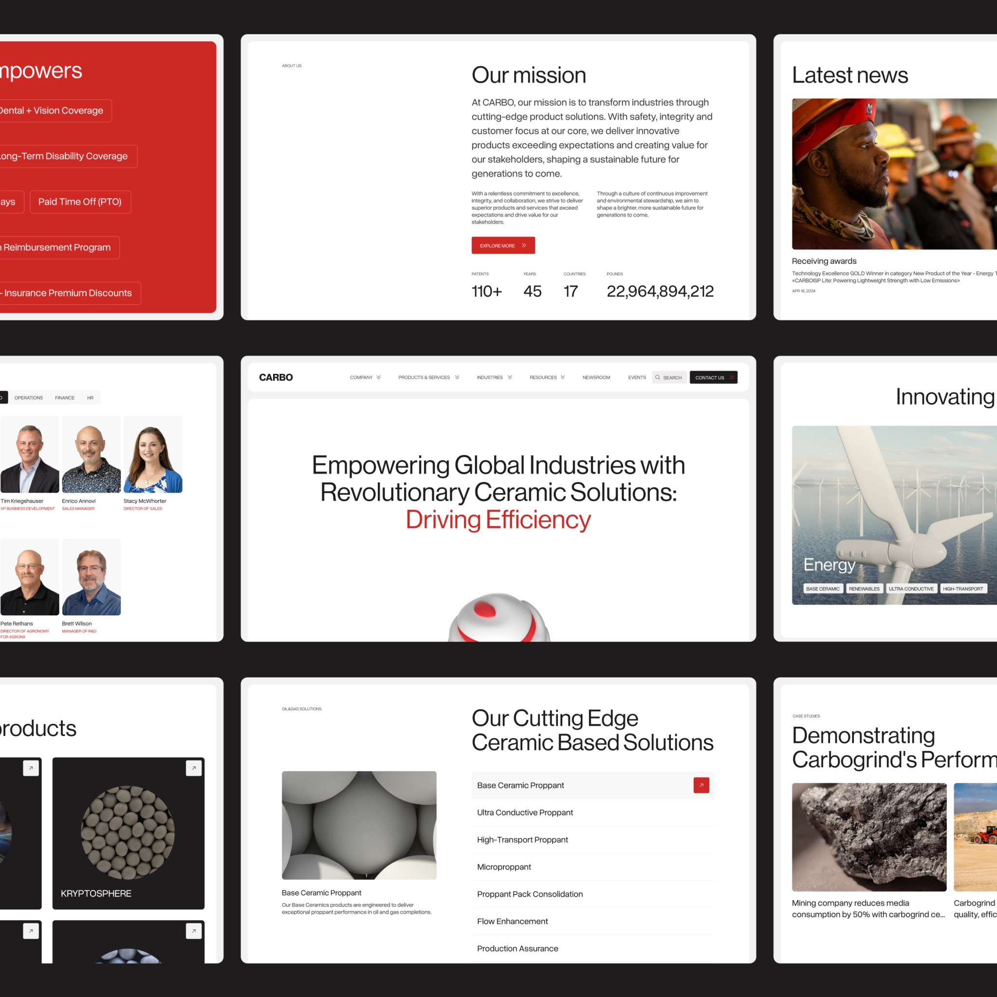
Right after wrapping up the brand identity, we jumped straight into website design and development, bringing everything we’d built so far to life.
STRENGTH IN SIMPLICITY
In the end, the work wasn’t about reinventing Carbo — it was about building a brand as durable and engineered as the beads behind their name. Their management team invited us to join their 45th anniversary in Houston to celebrate that legacy, now carried forward by a modern, functional identity built for the next 45 years.
Client’s review
“From day one, Valmax brought incredible depth of
knowledge, creativity, and professionalism.”

Max Nikolaev
Chief Commercial Officer

