Industrial Product Branding That Plays It Clean
Join us for the (very) short story of how we delivered multi-functional branding, spanning both online and offline presence, for an e-commerce cleaning products brand that now steals the show in California’s crowded B2B market.
Client
Services we provide
Headquarters
San Francisco, CA
Industry
Manufacturing
Team
2 Specialists
Timelines
1 months
MEET APG: CALIFORNIA’S
CLEAN-UP CREW
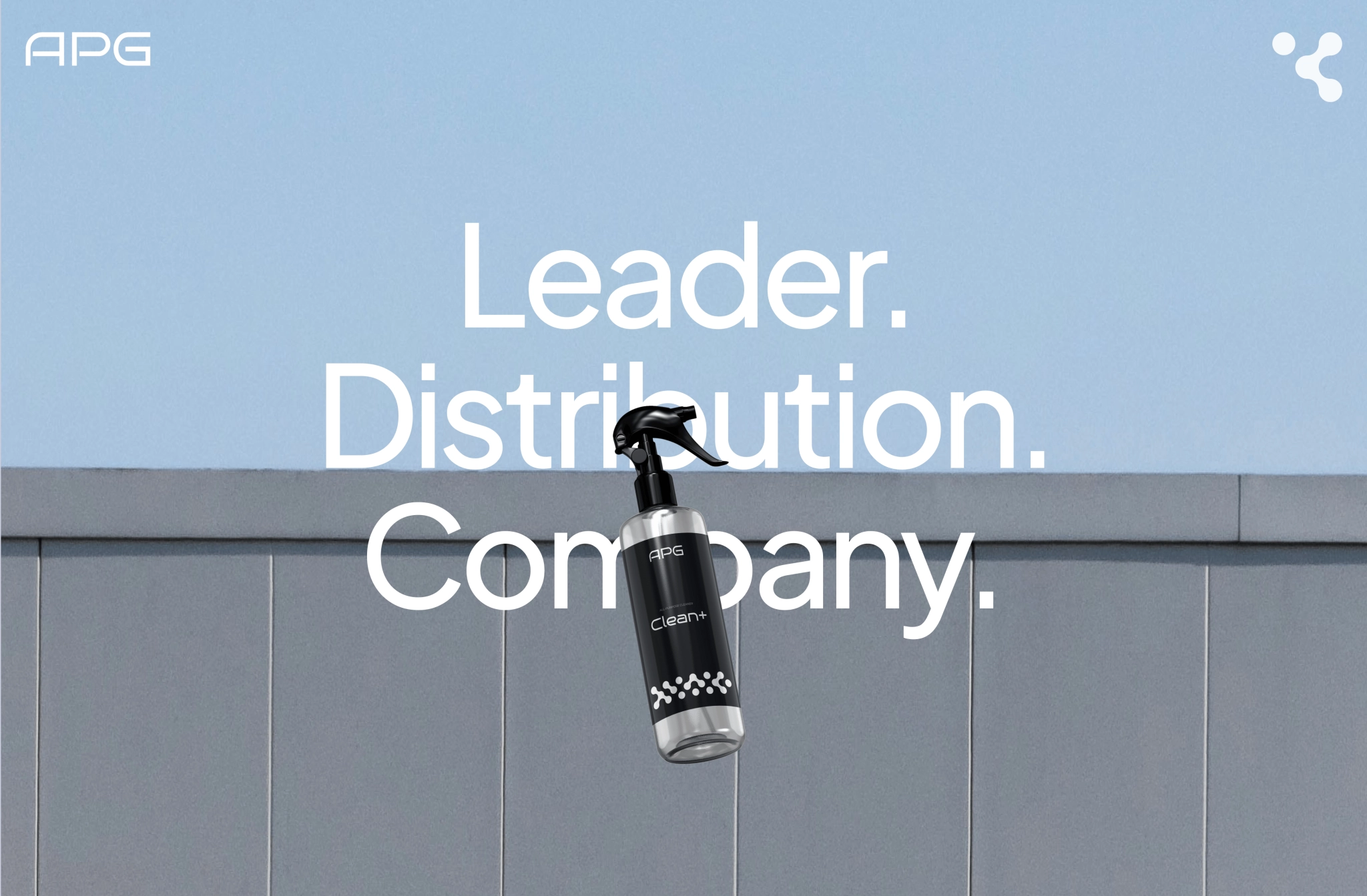
APG is a San Francisco chemical distributor on a mission to keep California businesses spotless. Their hero product is a custom-formulated, non-toxic degreaser that is tough on grime, safe on surfaces, and approved by some of the strictest municipal standards in the U.S.
FROM FORMULA TO FAME
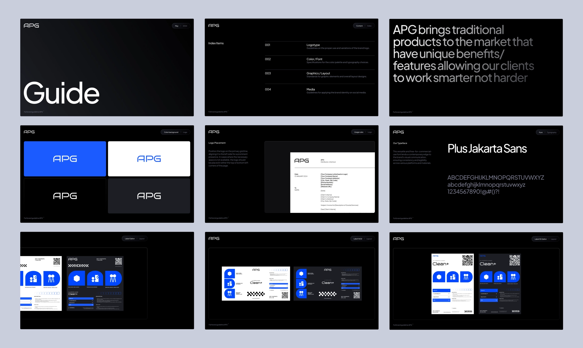
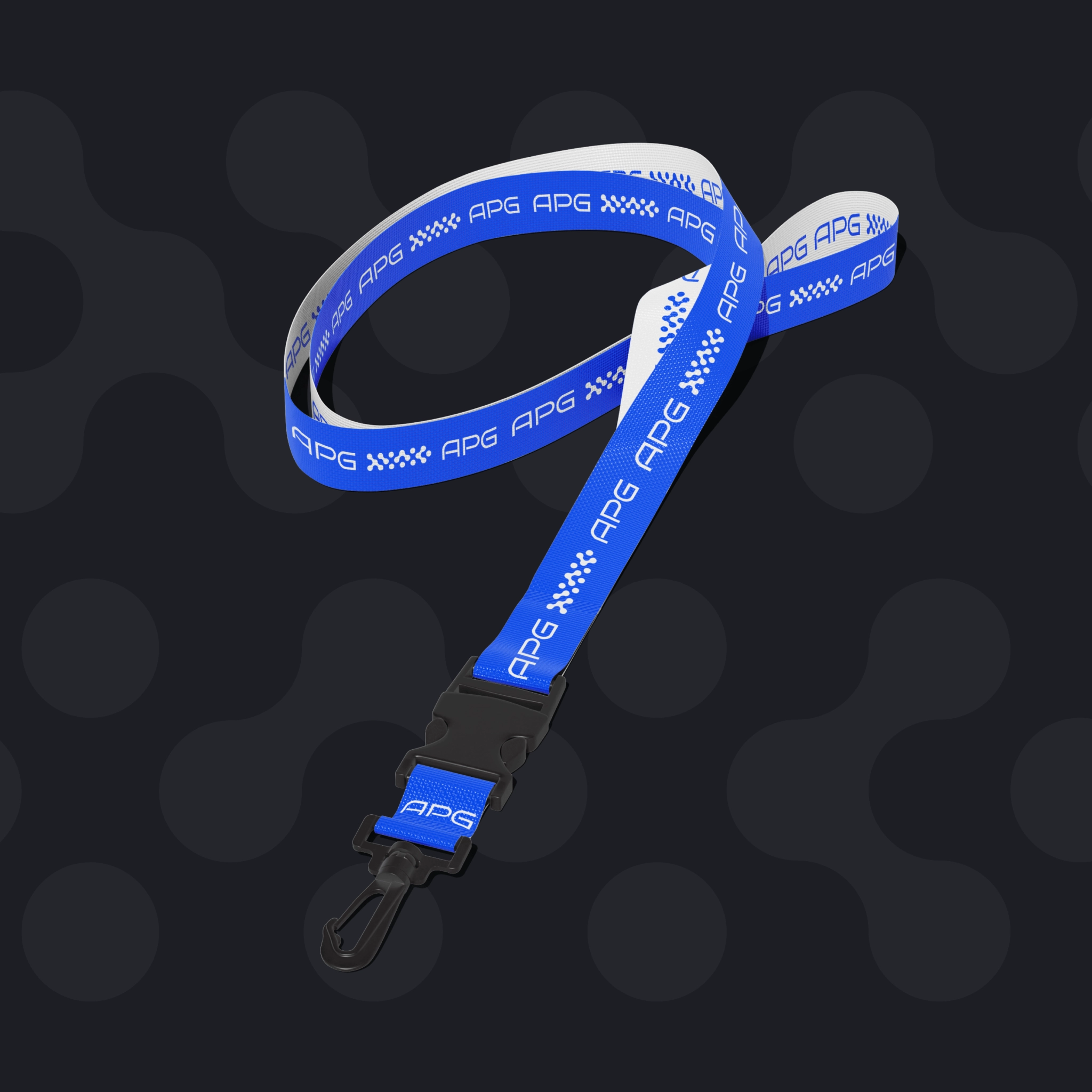
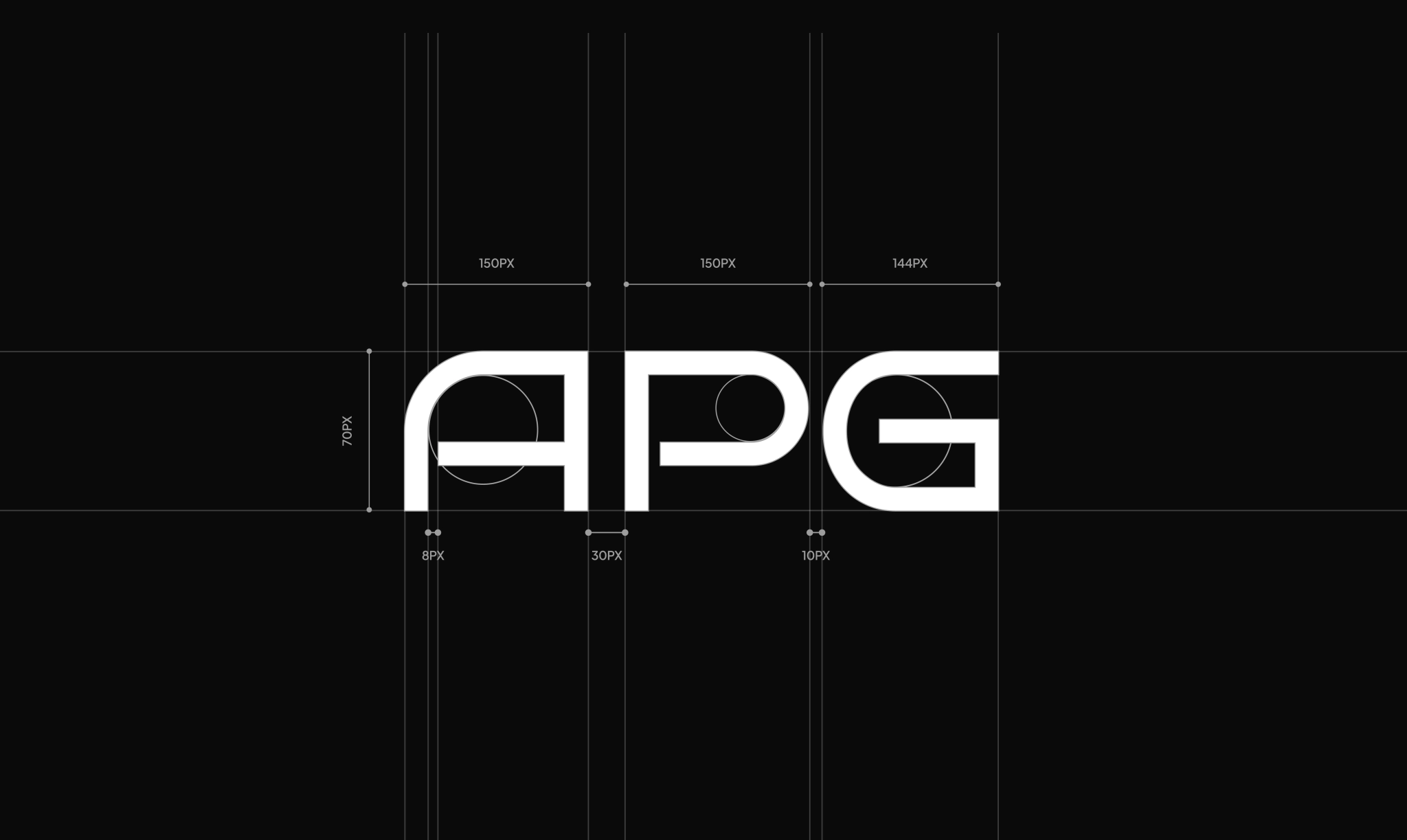
While competitors leaned into bright, neon-heavy designs, APG took the opposite route: a clean, minimal look in black, white, and just a touch of blue. To turn that vision into reality, we built out every piece of the brand: logo, brand book, followed by an e-commerce website, and a label ready to hit the shelf.
CRAFTING CLEAN
CONFIDENCE
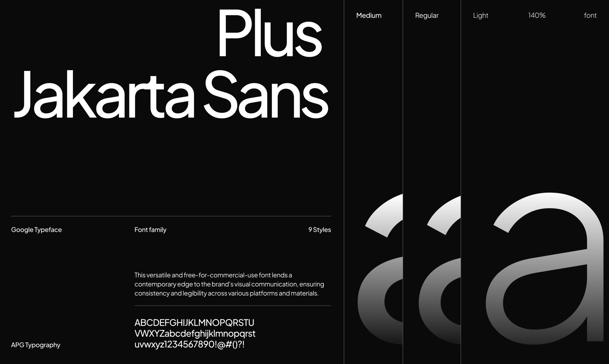
We kept the visual language clean, but not cold. A cool, confident blue became the base, evoking trust, cleanliness, and a professional tone that feels right at home in B2B.

The shape of clean
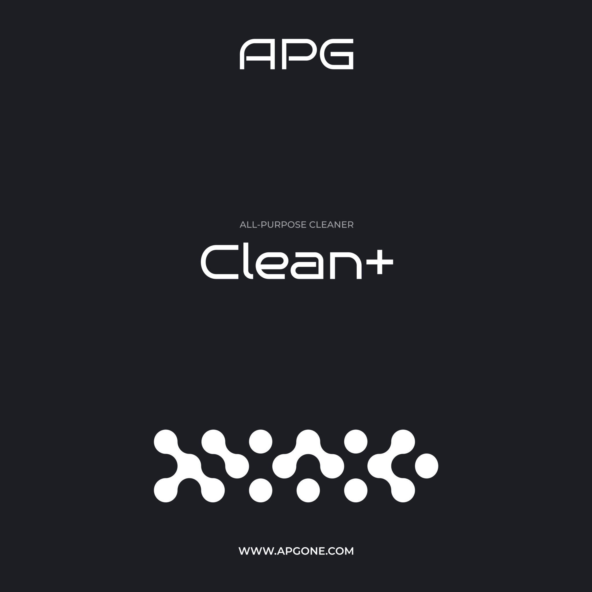
The degreaser forms a kind of connected foam — bubbles merging into each other. We echoed that in the brand pattern: soft, fluid forms that hint at cleaning action without screaming it. It’s modern, minimal, and unmistakably tied to what the product actually does.
A LABEL BUILT FOR B2B
SHELVES
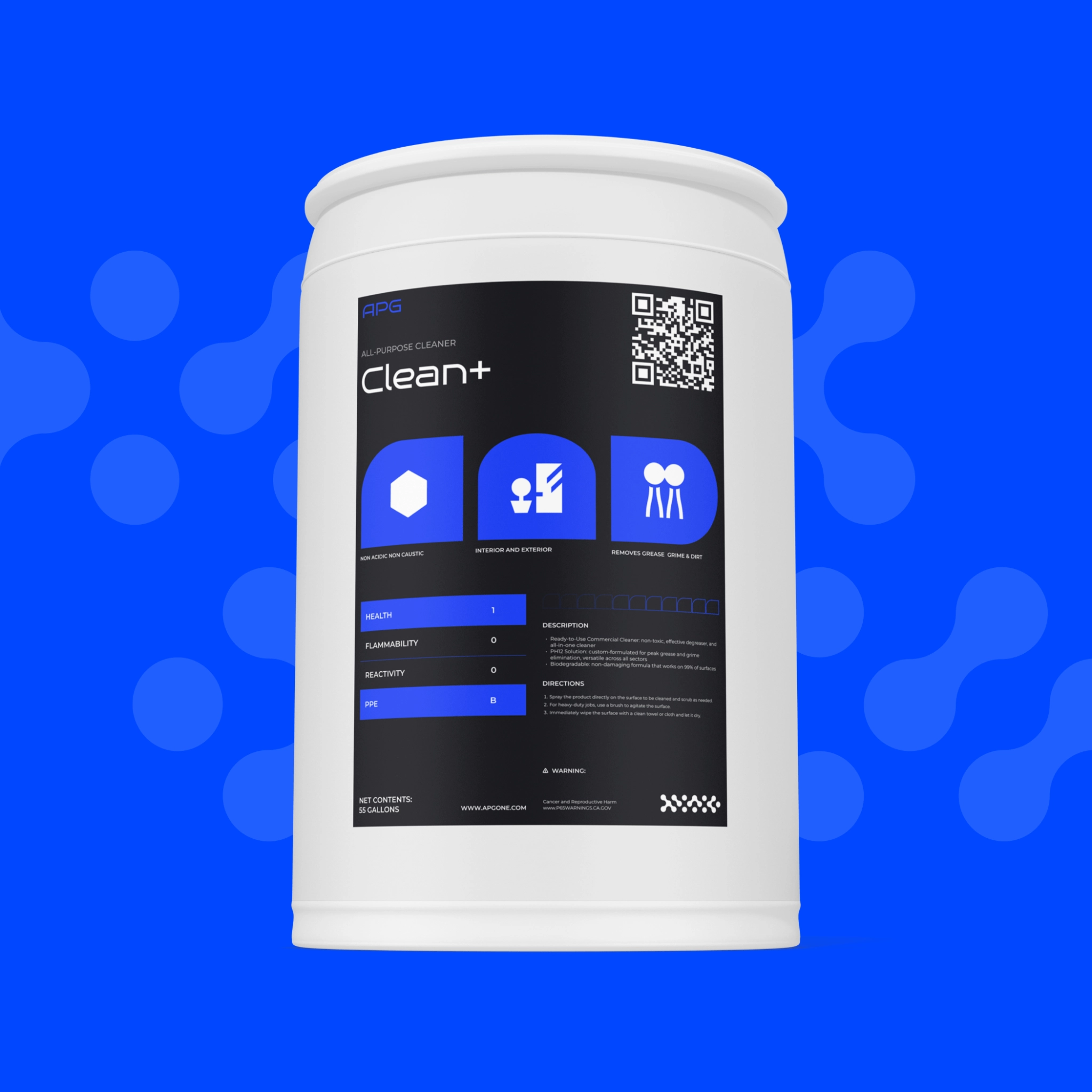
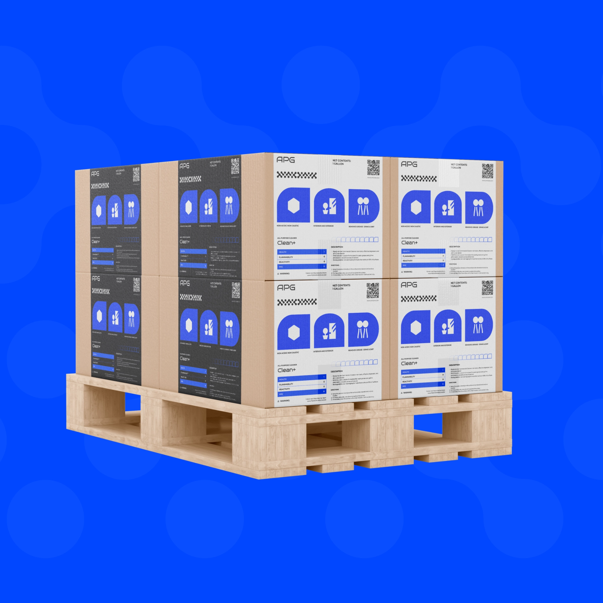
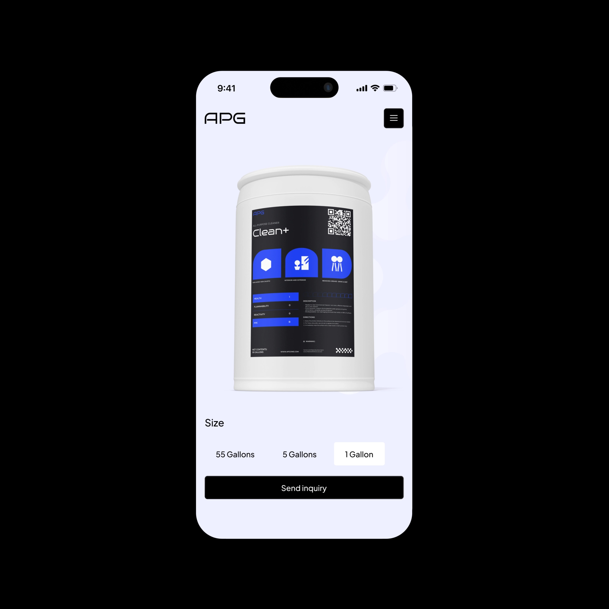
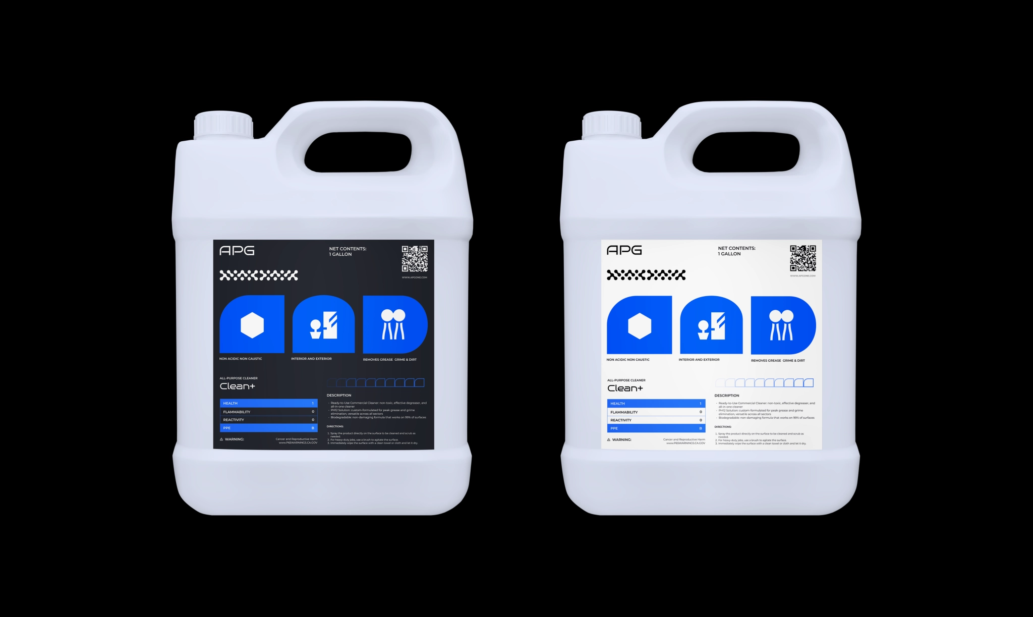
We designed a label with a technical feel: clean, compliant, and easy to scan, but we made sure it still carried the brand. Whether it’s on the product itself or stamped across bulk supply boxes, APG’s identity holds its ground.
WEBSITE
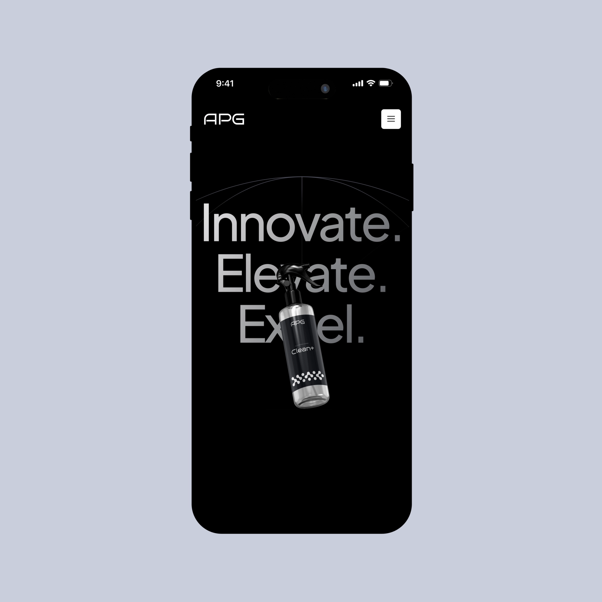
After shaping the brand, we brought it online with a focused B2B e-commerce site built around a degreaser — the key product. It carries the identity we developed, cutting through a noisy category while guiding buyers through the product’s details toward purchase.
THE FINAL RINSE
By the end, APG had everything they needed to hit the market looking sharp and ready: a minimalist visual identity with the logo that fits the brand, a brand book, labels for packaging, and a cohesive presence — both online and offline, website included.
