FROM ONE-PRODUCT B2B BRAND TO A WEBSITE EXPERIENCE
How do you build visibility and trust when you have just one product and dozens of competitors? You treat the project like a product launch: focused, strategic, and designed to differentiate from the very first scroll.
Client
Services we provide
Headquarters
San Francisco, CA
Industry
Manufacturing
Team
4 Specialists
Timelines
2 months
ONE PRODUCT.
STATEWIDE CLEAN
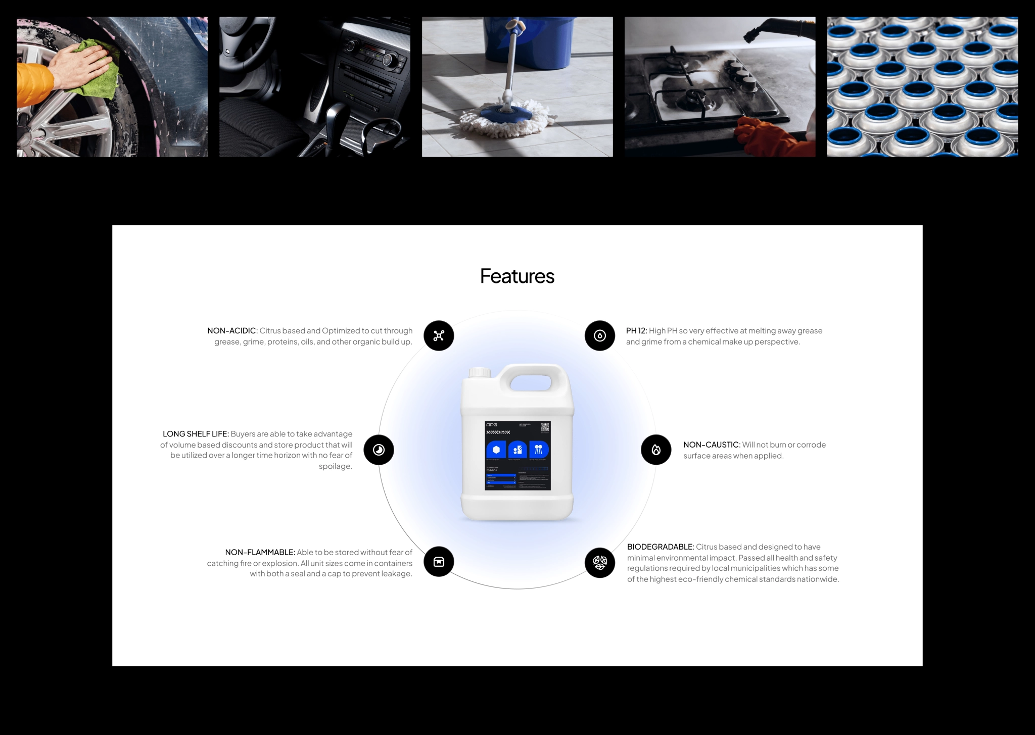
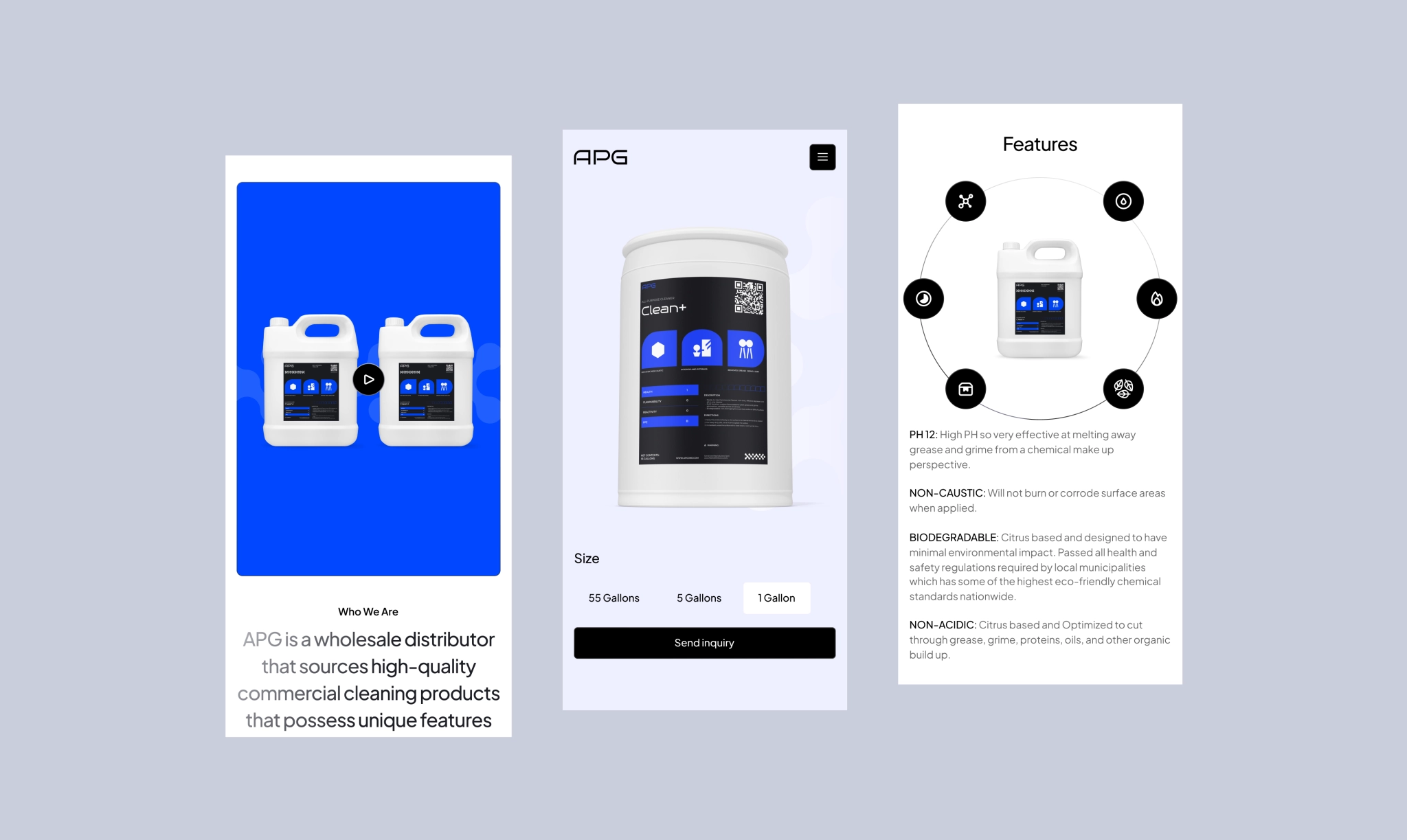
APG is a San‑Francisco startup with a laser‑focused catalog of one: a heavy‑duty degreaser. Think of it as a chemical “rinse” that strips oil, grease, and grime from everything that keeps factories and fleets moving. Serving only California, APG set out to become a visible leader in the state, delivering its single product to city and state crews.
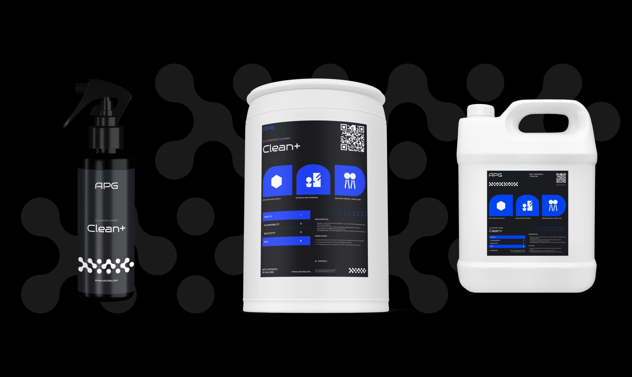
BUT FIRST, BRANDING
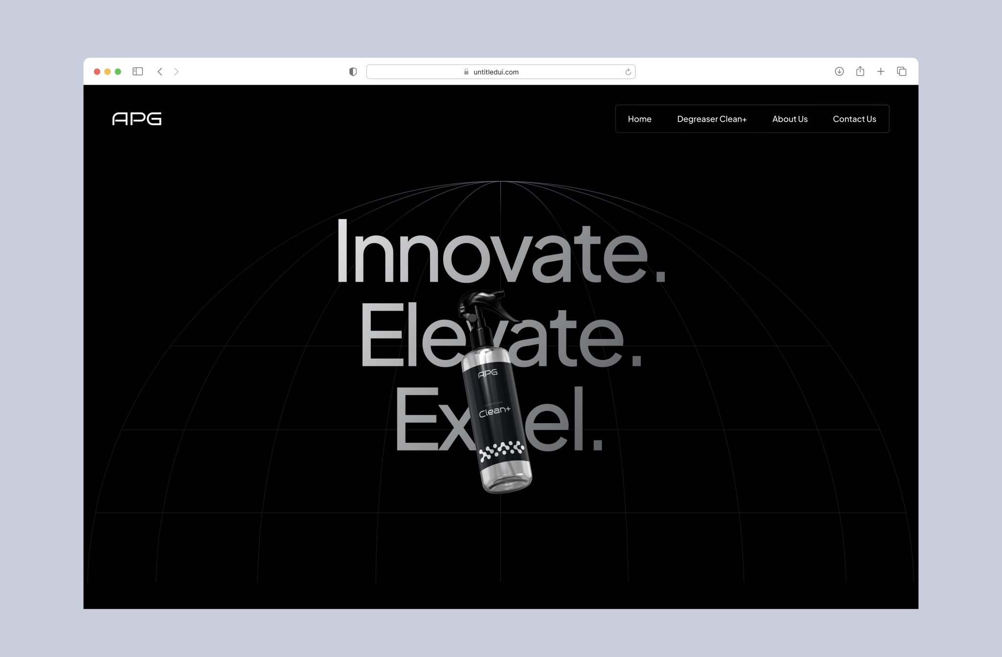
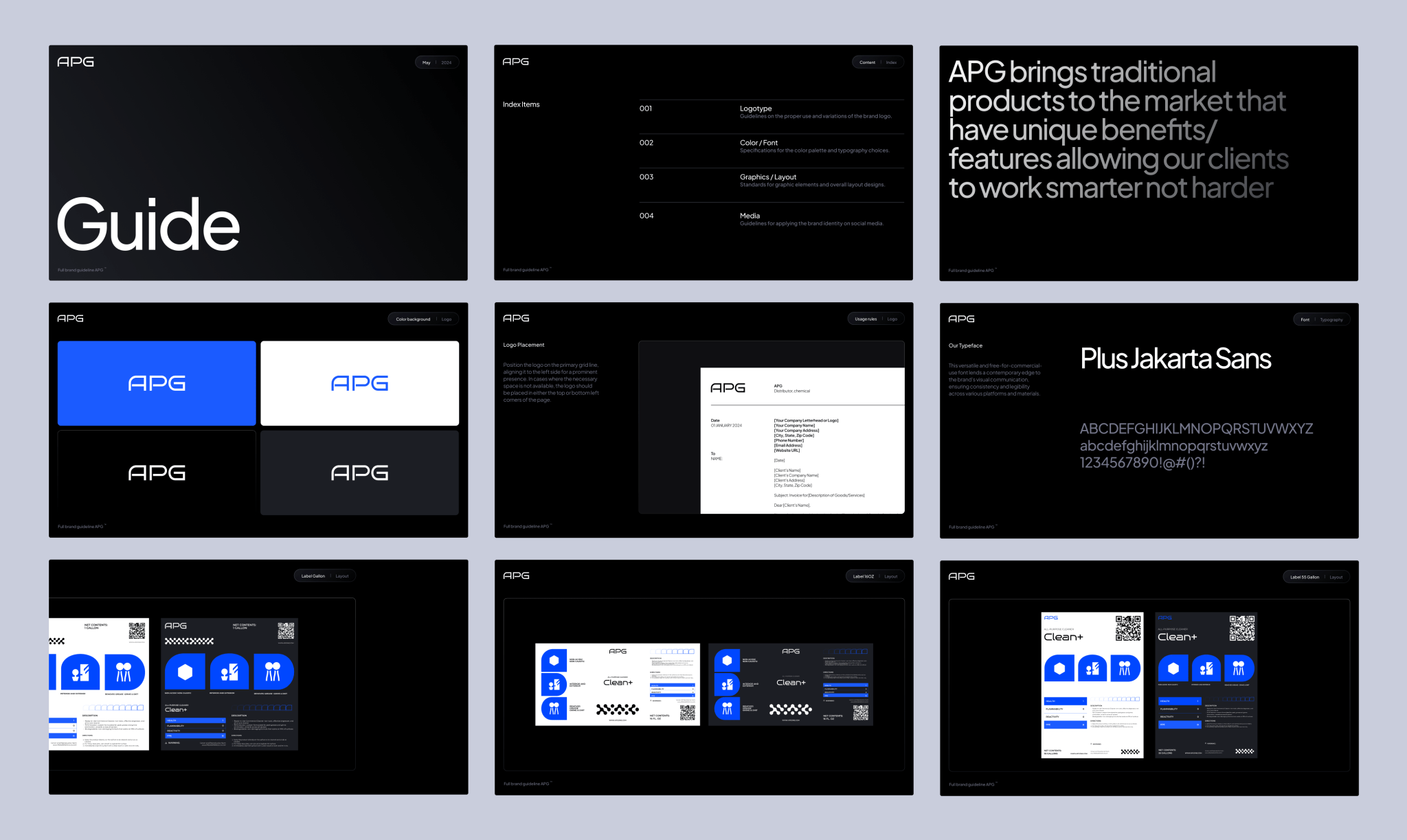
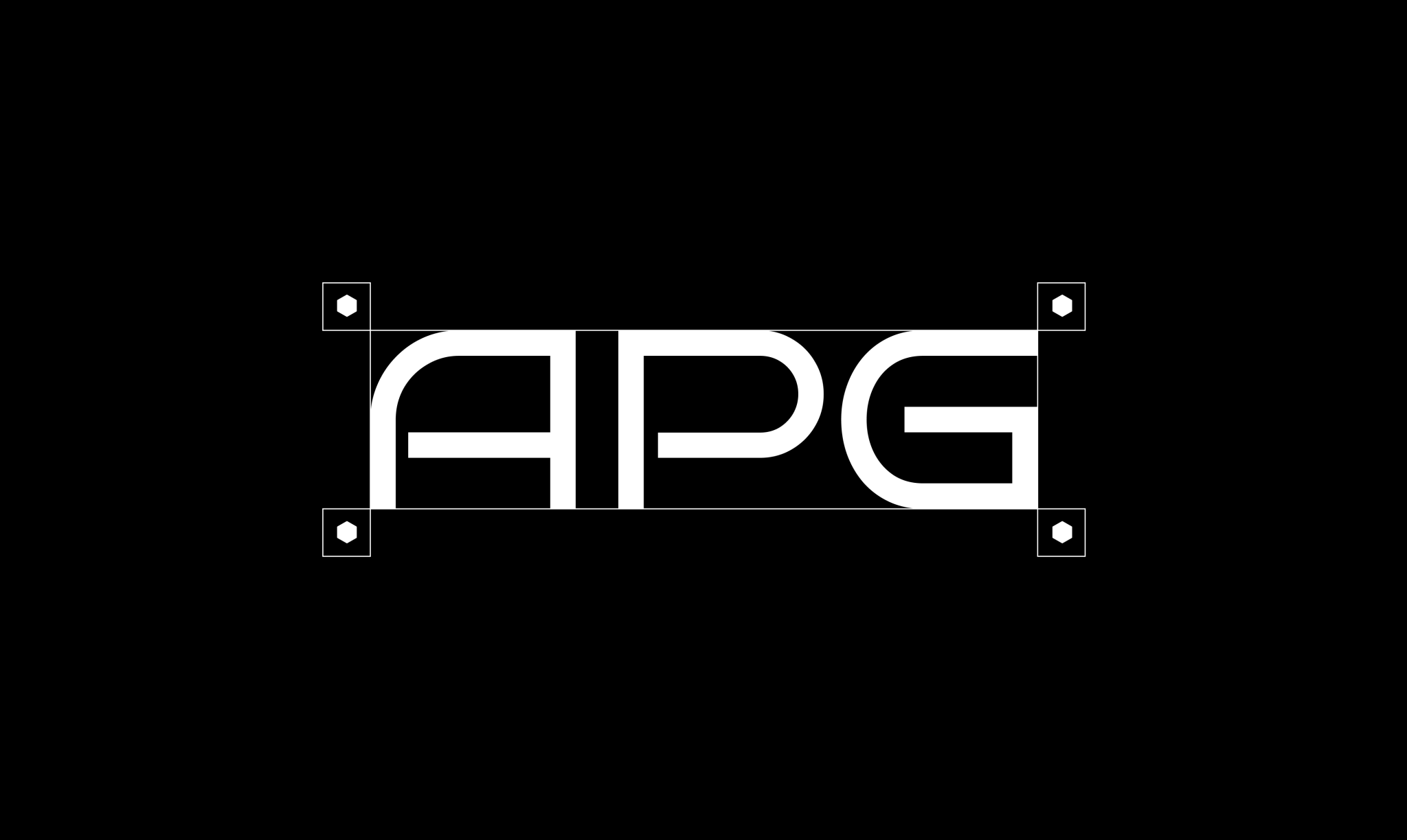
After a sprint of research, mood boards, and concept approvals, the essentials dropped: logo, label, and brand kit, giving the product an identity ready to stand out from competitors, which was a top priority for the client. Minimalistic and modern, now setting the tone for everything to follow.
HOMEWORK BEFORE
HOMEPAGE
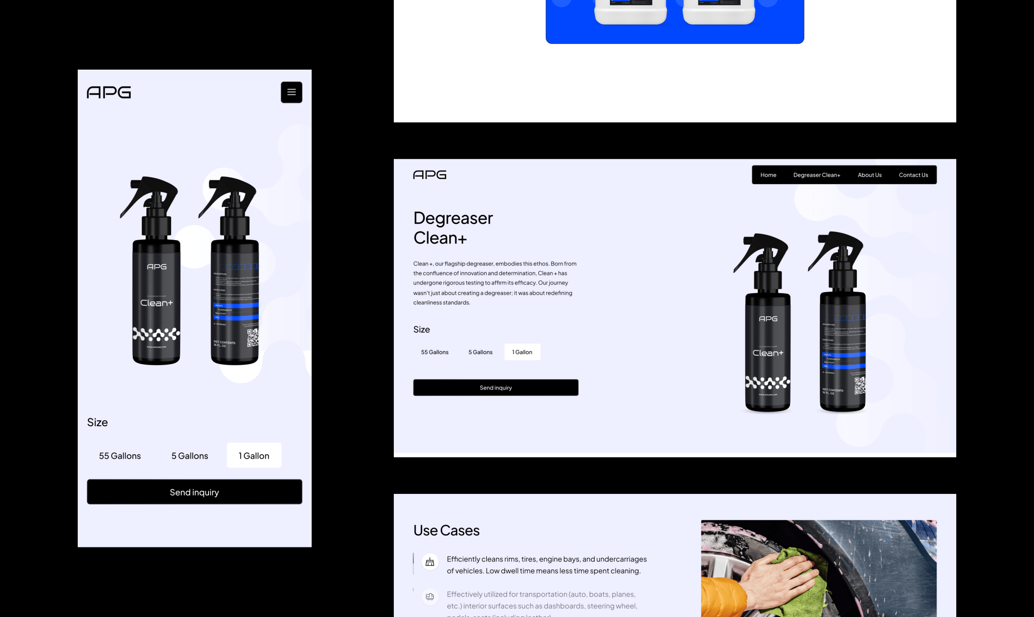
Site built with marketing in mind
All started with a marketing deep‑dive: auditing competitor missteps, mapping buyer pain points, and surfacing the degreaser’s real edge. Those insights set concrete sales targets and shaped a design direction that answers objections first, features second.
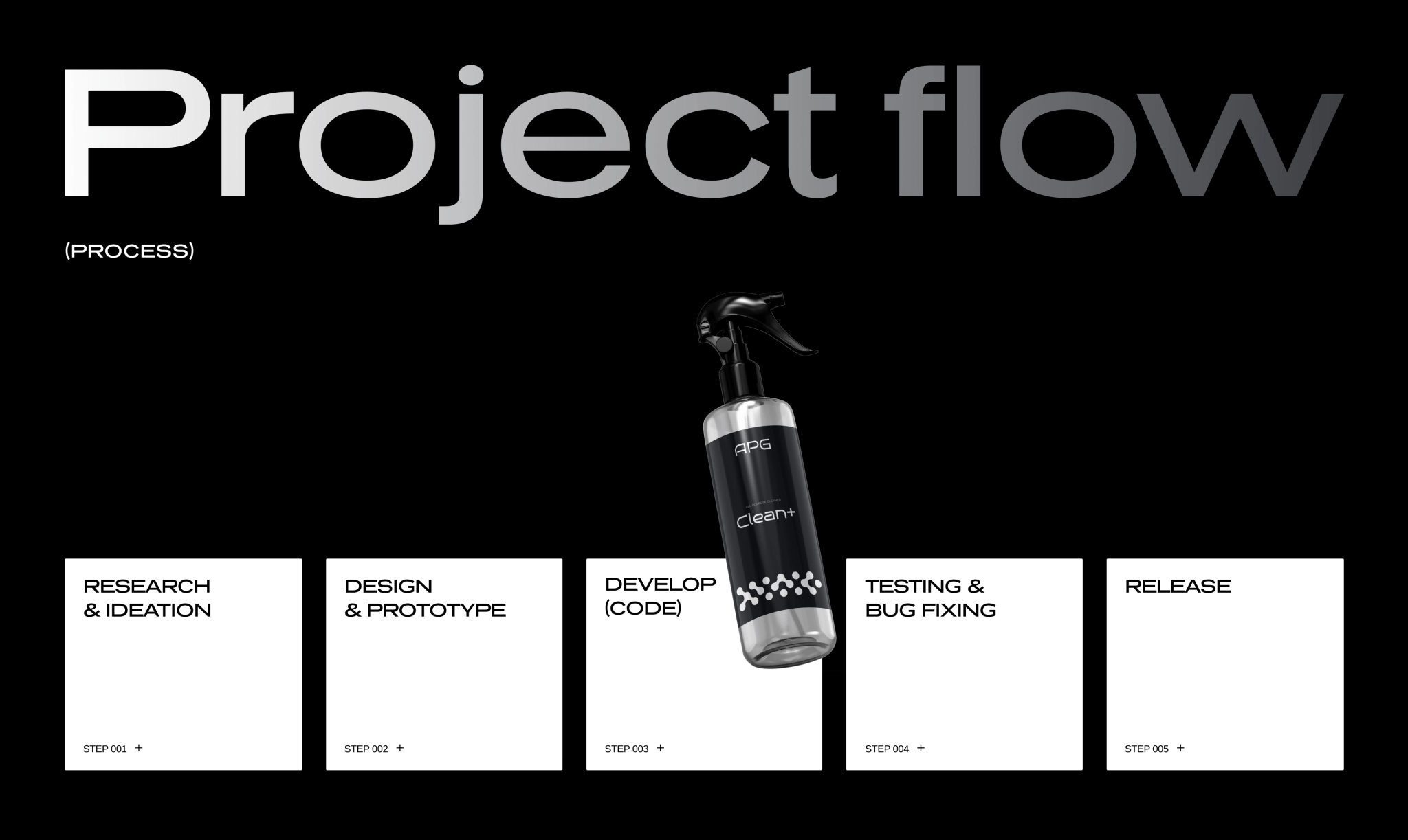
WRAPPING TECHNICAL
INTO VISIBLE
Goodbye static
To stand out in a sea of static, lookalike competitor sites, we set a different tone from the start. Others rely on basic layouts and uninspired visuals — so we leaned into a high-tech, product-first aesthetic: sharp photography, 3D animations, and video showing real before/after use cases. Instead of just packaging shots, we brought the product’s impact to life.
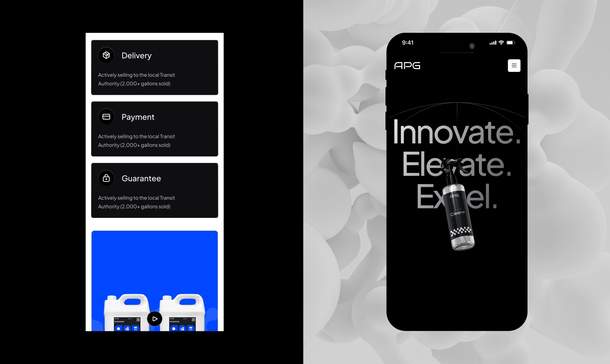
Narrative in motion
To elevate the experience, we built a scroll-triggered animation. As users scroll, they see the product in action: layers separate, text highlights product benefits in sync, and dynamic transitions reveal features one by one. This creates a sense of depth and interactivity, keeping attention high and making the value instantly clear.
DESIGNED LIKE A
PRODUCT LAUNCH
Brand launched from logo to label, anchored by a marketing‑driven website that speaks the client’s new positioning. With the full identity live, the business is up and running under a cleaner look.
