When users visit your site, they’re not just clicking around — they’re picking up on visual signals about trust, professionalism, and control. Subtle design cues tell them: you’re safe here — or don’t enter your card details.
That’s the thing about fintech. When the stakes are high (budget, identity, legal compliance), your design is doing far more than guiding clicks. It’s communicating security and trust. It’s teaching users how to feel about your product.
The site might not process transactions or store data — but it’s often the first touchpoint for investors, partners, and users. If it feels disconnected, rushed, or inconsistent, confidence drops. Even if everything under the hood works perfectly.
In this article, we’ll start by breaking down specific financial website design choices from fintech websites — what works, what raises friction, and what actually builds trust. Then, we’ll pull back to analyze key design principles that make fintech such a high-leverage part of your growth engine.
Designed to win — or to lose: web design for financial services
BANKS:
Strong example
Revolut blends emotional relevance with functional clarity — making the interface feel not just usable, but genuinely human. Here’s how:
✅ Functional, yes. But also human.
Revolut does a great job engaging the user from the very first screen — the moment you land on the site, it zeroes in on a key pain point: salary and income.
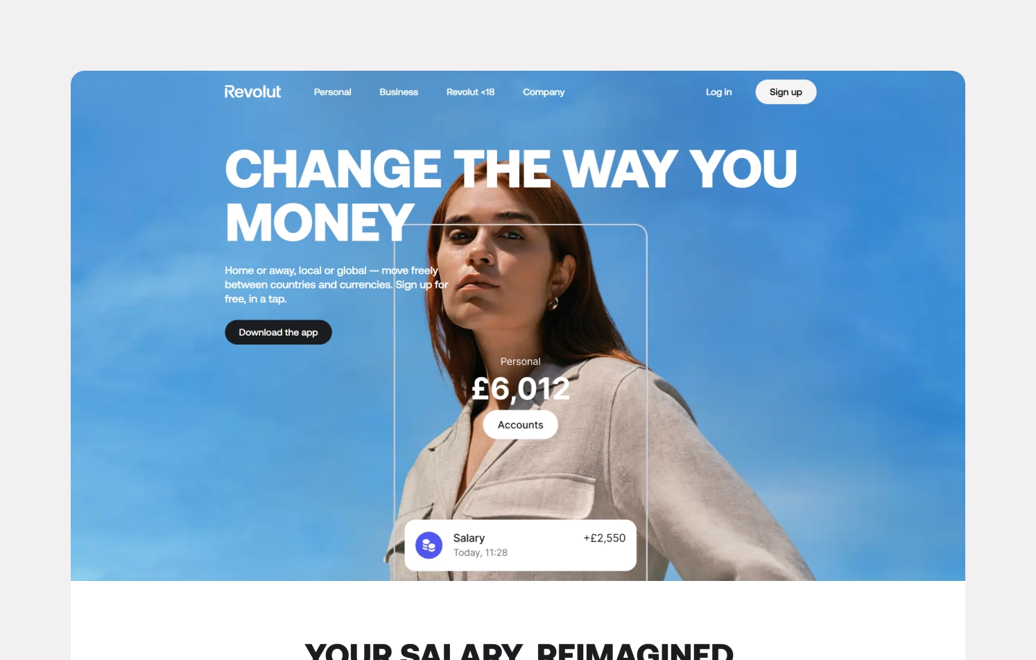
From there, it guides you and immerses you in the experience:
- Large 3D visuals and real photography of people humanize what could easily be a cold, transactional interface.
- Typography blends with the interface: no trendy fonts for the sake of it, just clean, legible type that works across screens.
- The visual style is clean and monochrome, and thanks to the focus on animation and photography, it all comes together harmoniously and feels user-friendly.
💡 Design cue: With relatable visuals, clean typography, and purposeful motion, the interface feels less like a dashboard and more like a conversation. Use it to guide users and not distract them.
✅ A minimalist interface with emotional depth
Where Revolut really shines is how it integrates real-life context into the interface. The bank uses a largely monochrome palette. It’s clean, quiet, almost reserved — until you notice what it’s making space for: motion, real-life imagery, and moments that trigger emotion. A wedding. A trip. A future home.
These are more than aesthetic choices. They’re reminders that money is always tied to meaning.
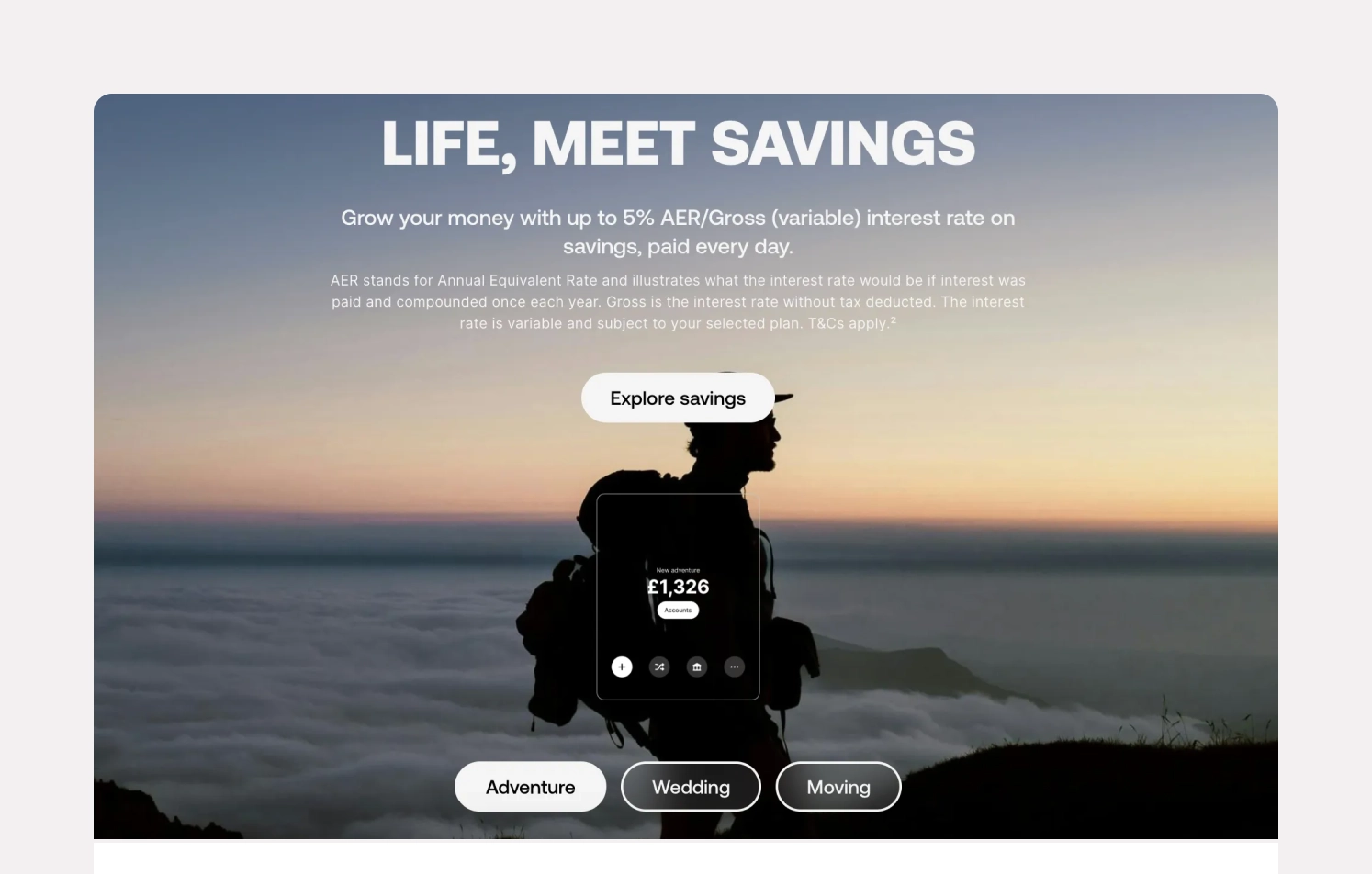
💡 Design cue: Minimalism works well when paired with emotional anchors. This is what strong fintech design does: it doesn’t just show you what the product does — it shows you how it fits into your life or business.
The only noticeable flaw? Depending on screen resolution, some visuals (like people’s faces in hero images) can get awkwardly cropped. It’s a minor thing, but in a product that’s otherwise this thoughtful, it stands out.
Weak example
Bank of America: Not all design mistakes come from lack of effort — sometimes, they come from trying to do everything at once. This is a textbook example of how overloading the user leads to frustration and loss of trust, especially in fintech, where clarity and hierarchy are non-negotiable.
❌ A chaotic first impression
You land on the homepage looking to explore professional services — and instead, you’re hit with everything: login form, card options, informational blocks, all at once. There’s no hierarchy, no onboarding, no clear path.
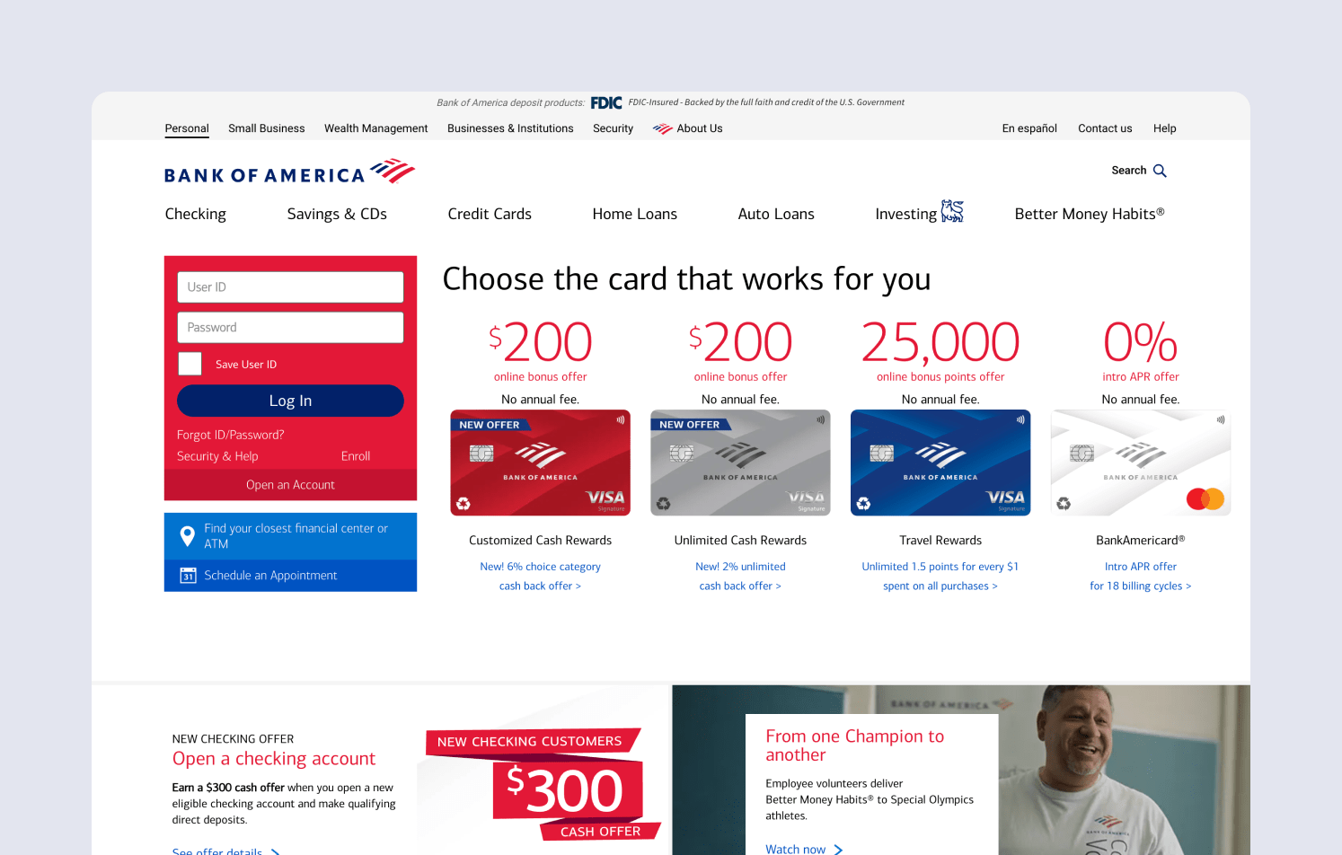
💡 Design cue: Your homepage isn’t a dashboard. Prioritize. Guide the user step by step — don’t make them play “Where’s Waldo” with your content.
❌ Visual inconsistency everywhere
Icons and headers feel like they were picked from different libraries. Arrows look thrown in as afterthoughts. Fonts clash rather than complement. It’s not just dated — it’s disjointed.
- Navigation is overloaded with sections and submenus.
- Layout lacks air and spacing, making the interface feel suffocating.
- There’s no consistent visual grid, and the imagery feels like stock filler from 2012.
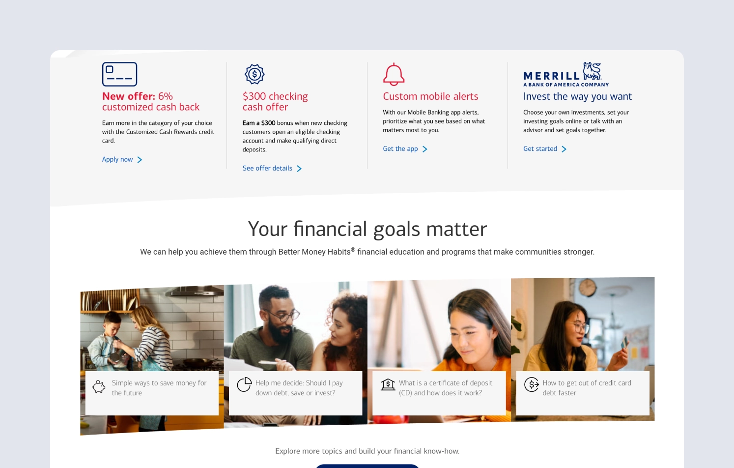
💡 Design cue: In fintech, inconsistency equals unreliability. If the design feels chaotic, users won’t trust the product to handle their money. Alignment, cohesion, and restraint matter.
❌ Fatigue instead of focus
Design should make people feel confident, not tired. This site feels like hard work to use. You can’t quickly find what’s important because everything is presented as equally important.
It lacks space to breathe, a proper grid, modern visual choices, high-quality imagery, and updated interfaces. And without that, the product may struggle to communicate value or trust.
💡 Design cue: A strong grid system, modern UI elements, and intentional use of imagery allow users to process information effortlessly. When the interface guides the eye, it reduces cognitive load and builds trust.
CONSULTING SERVICES:
Strong example
Everandother is a design-driven, emotionally intelligent website that builds trust from the first glance. It’s tactile, immersive, and above all, trustworthy. The kind of trust fintech products must earn before a single transaction happens.
✅ From the first screen: sensory depth
The creative financial design makes it feel like you step into the interface and not just land on a website. Soft, deliberate animations and dimensional elements create a sense of depth and tactility. It feels like the motion is there to guide, to invite, to immerse.
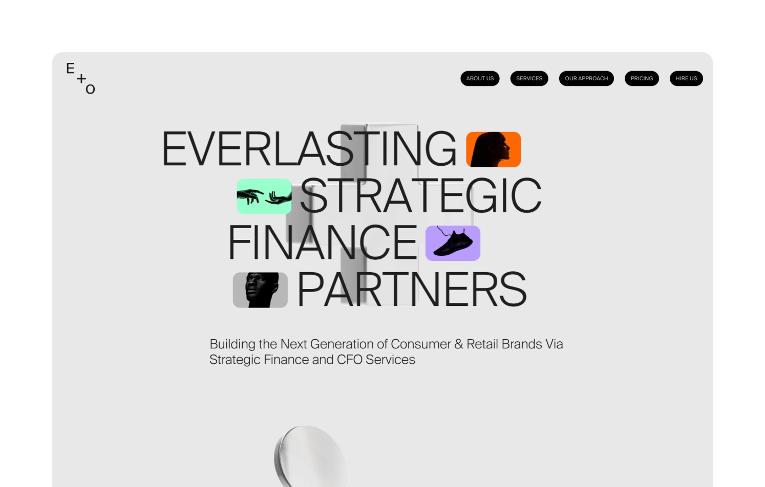
Even though the navigation isn’t what we’re used to seeing, the interface does its job by intuitively guiding the user through animation. It’s a unique approach — but one that’s thoughtful. You’re never lost, because the flow feels natural, even without relying on familiar patterns.
💡 Design cue: Animation in fintech shouldn’t be flashy — it should be functional, subtle, and sensorial. A well-crafted transition can make your interface feel alive without feeling chaotic.
✅ Bold but balanced
Everandother is a deeply design-led website — every element feels intentional, from typography to motion:
- Typography is daring yet grounded: clean, slightly geometric, highly readable.
- Layout features oversized elements — but thanks to generous whitespace and intentional flow, it never feels crowded.
- The color palette leans on neutral monochrome with vibrant accents — a smart mix that adds freshness while keeping focus.
- Visuals use 3D thoughtfully — they feel alive, but never distract. Big elements are counterbalanced by emptiness.
💡 Design cue: You can push boundaries — as long as you respect clarity and accessibility. Good design builds tension between boldness and restraint.
Weak example
Some design misfires come from a slow accumulation of visual clutter, inconsistent decisions, and lack of intention that erodes user trust. The example of Sapling Financial shows exactly that. A website for consulting services that, instead of signalling competence and clarity, feels… tired.
❌ Outdated logo and cluttered identity
The logo is the first red flag — overloaded with small, intricate details that add no functional or emotional value. Rather than establishing a strong brand presence, it visually overwhelms and confuses.
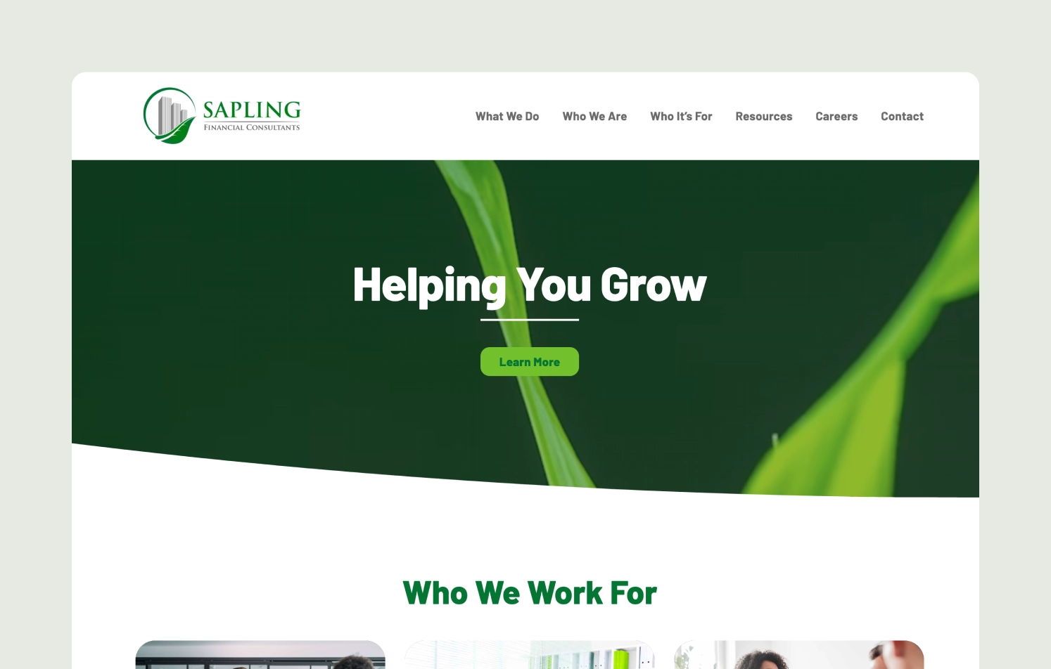
💡 Design cue: In B2B and consulting, your logo is the face of your credibility. If it’s outdated, the perception is that your thinking might be too.
❌ Typographic chaos
- There’s a disconnect between fonts and colors — they feel randomly chosen.
- The gray used for body text is too dull and kills readability.
- Green, used across headlines, navigation, buttons, and hover states, appears in mismatched shades with no clear hierarchy or logic.
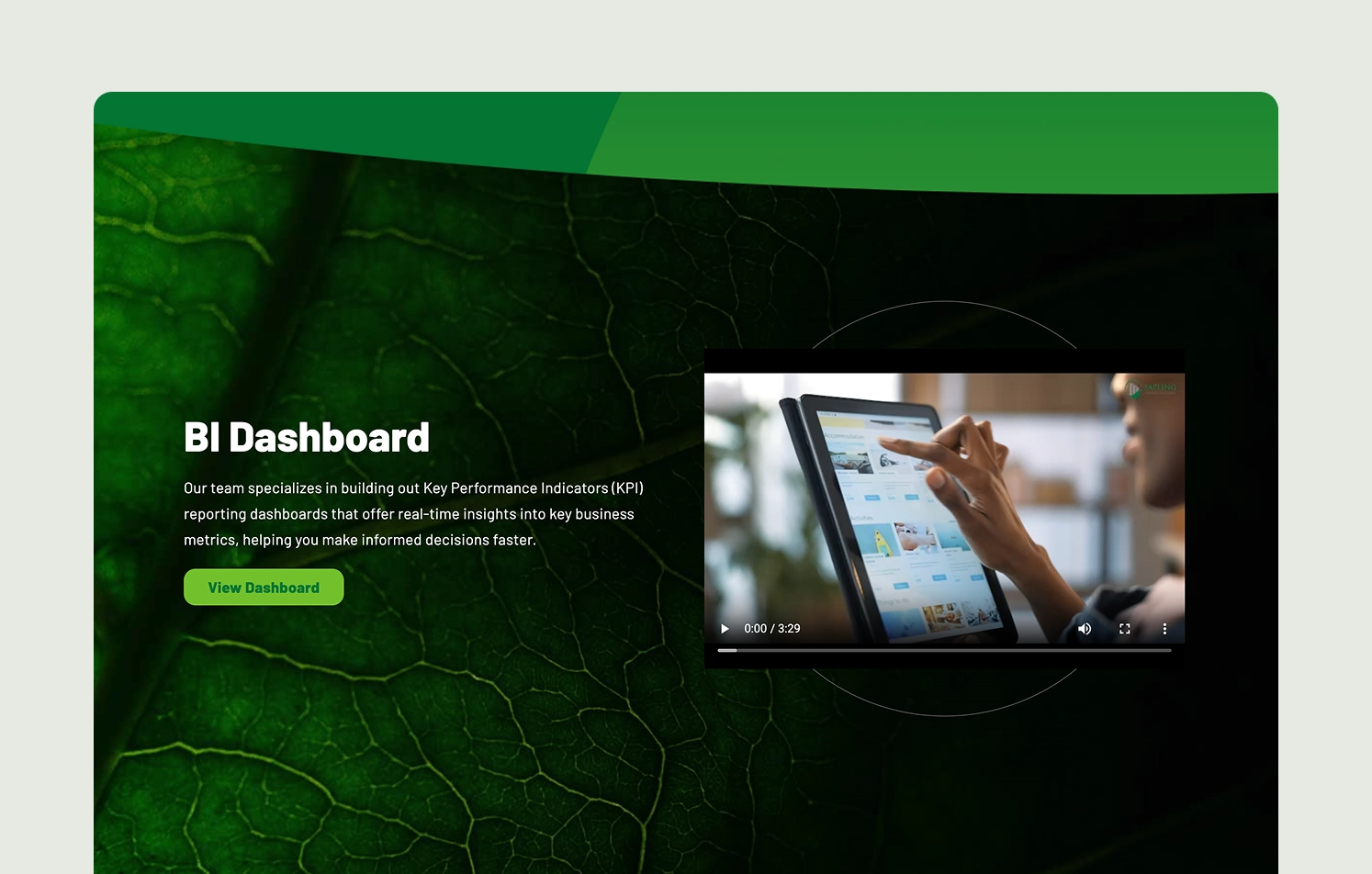
💡 Design cue: Color and typography should do more than look pretty — they must support clarity and flow. Inconsistent application creates friction and fatigue.
❌ Off-brand visuals
You’ll notice plenty of visual elements like leaves and curves — likely intended to reinforce the brand identity. But do they create the right impression? It feels more like eco/agriculture than strategic consulting.
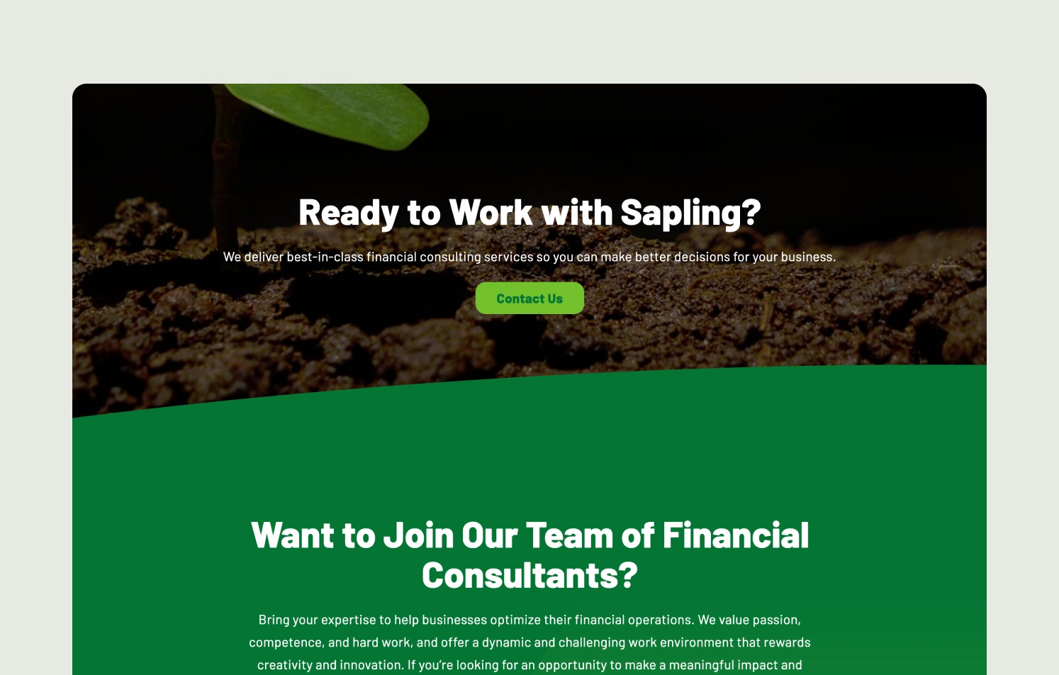
💡 Design cue: Visual metaphors are powerful — and risky. If the metaphor isn’t aligned with your core offer, it breeds confusion instead of connection.
❌ Structural breakdowns
We’ve previously talked about the importance of structured navigation and how it builds clarity and authority. Here’s where it falls short in this case:
- Block layouts feel stitched together without a clear system.
- Spacing is inconsistent, and card components appear duplicated with no variation or design intention.
- Sections don’t transition smoothly — creating friction instead of flow.
💡 Design cue: A strong structure is invisible when it works — but impossible to ignore when it doesn’t. Layout issues signal a lack of polish and planning.
PAYMENT PLATFORMS:
Strong example
Stripe is not the kind of financial website design that wins awards. But that’s exactly why it’s a good example. It puts clarity over cleverness, keeps users in control, and does one thing really well: it helps people get things done — fast, and without stress.
Let’s break it down.
✅ The power of visual silence
At first glance, Stripe’s website doesn’t scream for attention — it’s minimalist, but the more you explore, the more intentional it feels.
- Bright accents in the form of soft gradients, geometric shapes, and custom icons create a sense of harmony, without overwhelming the eye.
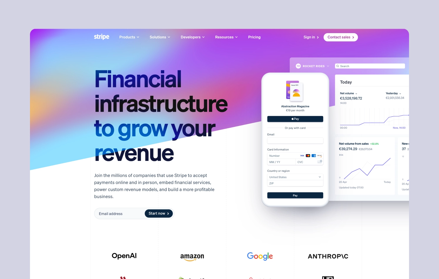
- Interactive elements are obvious but not flashy. The layout is clean and open, with a structure that intuitively guides the eye without forcing it. There’s no showboating here. And that’s exactly the point.
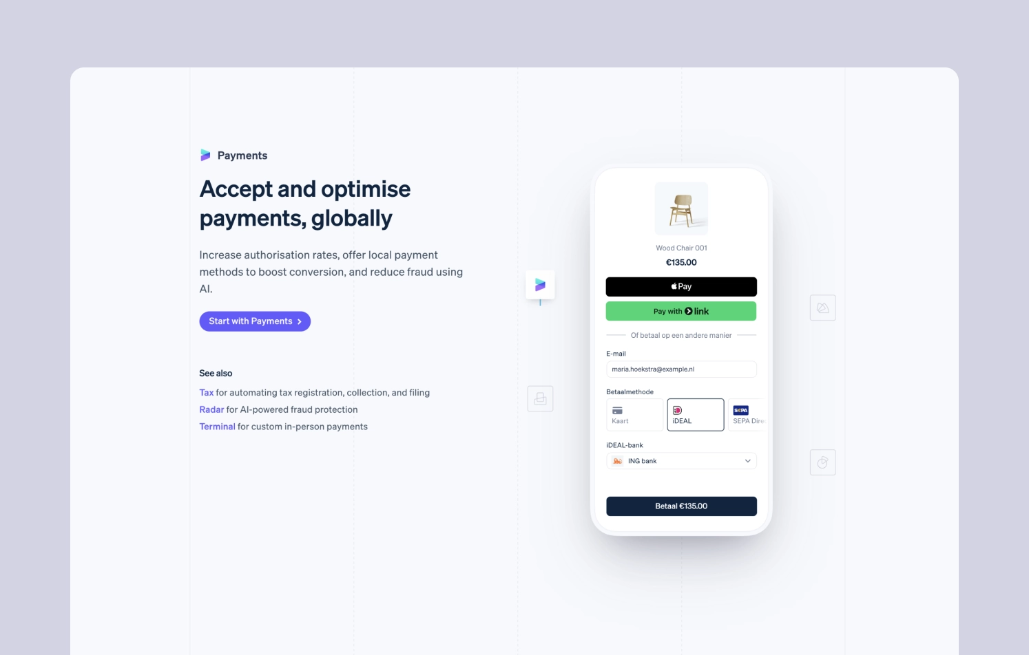
💡 Design cue: Consistent, well-labeled menus and straightforward site architecture reduce cognitive load, helping users find what they need without second-guessing. With minimalism done right — calm layouts, thoughtful accents, and intuitive structure — the design communicates clarity and authority. It feels like a product that knows what it’s doing, so you can focus on what you need to do.
✅ Clear click targets and predictable structure
There’s no second-guessing what’s clickable and what isn’t. The moment you hover over a clickable section, it gets highlighted. You don’t think “Can I click this?” You just do. Buttons and links are where they’re supposed to be. The layout guides you, not confuses you.
Content is easy to skim, easy to find, and easy to act on. The user never gets lost — because the structure is doing its job in the background.
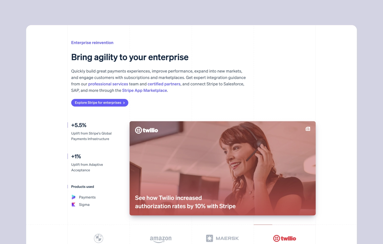
💡 Design cue: In fintech, trust is everything. It’s built through clarity, predictability, and the sense that someone thought about every detail so you don’t have to.
Weak example
Let’s look at the other side of the spectrum, where design actively gets in the way. You probably know this feeling of landing on a website and feeling lost within the first few seconds. That’s exactly what happens when a product’s digital experience lacks visual hierarchy, consistency, and emotional clarity.
Here’s what went wrong in the particular case with Authorize — and what we can learn from it:
❌ Cluttered, outdated interface
At first glance, the design doesn’t seem that bad — until you actually try to use it. The design feels visually outdated and overloaded with competing elements. Fonts are too small to comfortably read, and there’s little breathing room between content blocks. When everything is loud, nothing is heard — users get tired fast and don’t know where to look.
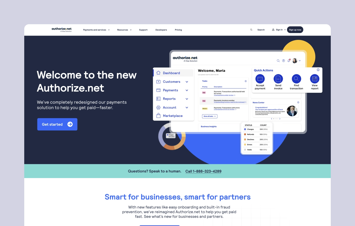
💡 Design cue: Minimalism is about focus, not emptiness. Prioritize clarity and spacing to help users make sense of what they see at a glance.
❌ No clear visual flow
Information is stacked chaotically — one block after another, without any structure or grid. There’s no rhythm or flow. Even though the buttons are visible, the surrounding context doesn’t support user actions. It’s like being given a map with no landmarks.
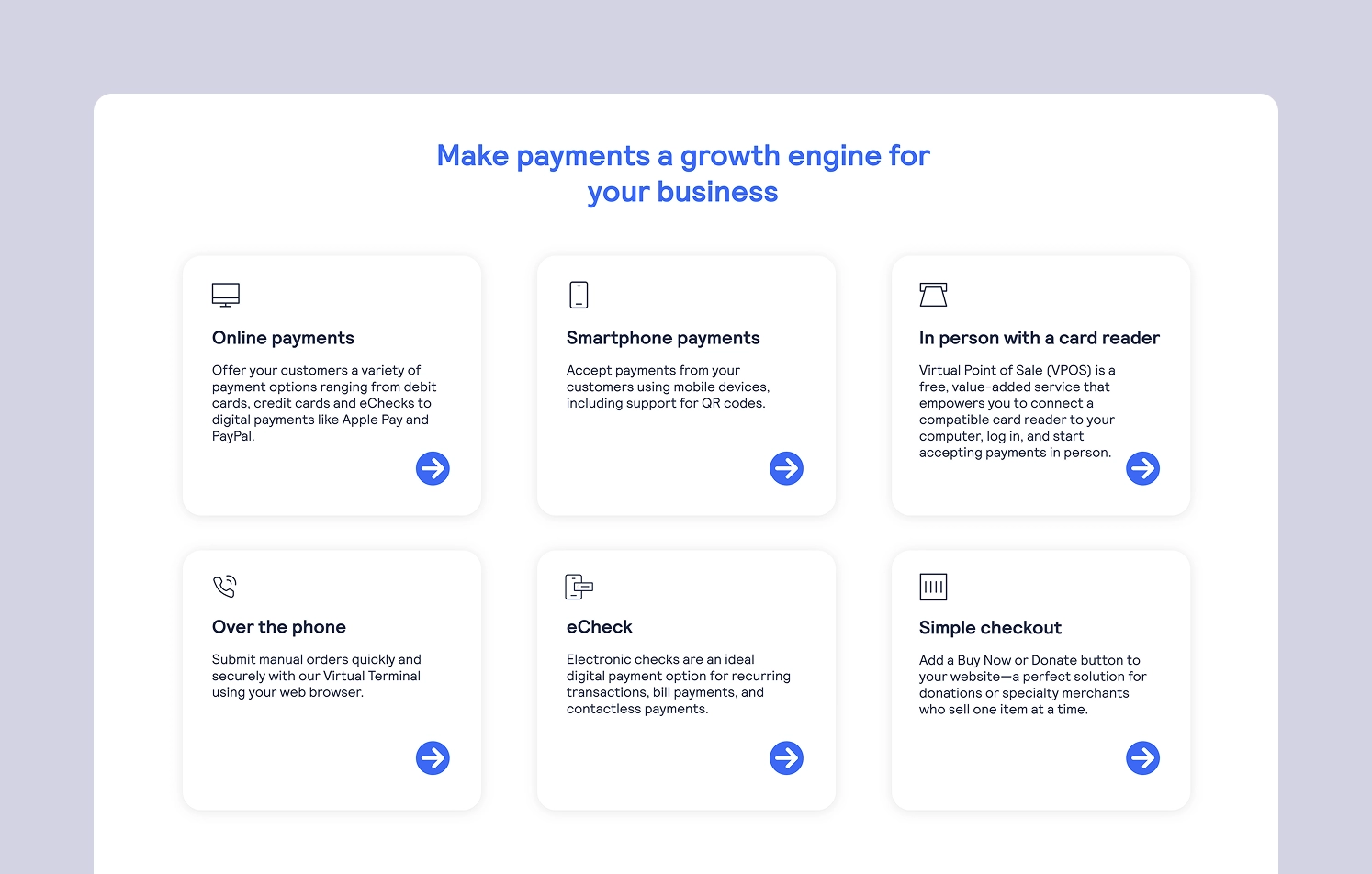
💡 Design cue: A strong layout creates mental anchors. Grids, spacing, and consistent block structure guide the eye and reduce friction.
❌ Lack of unity in style
Each element looks like it belongs to a different product. Buttons, icons, inputs — all feel disconnected, as if designed by separate teams without a shared vision. Clickable elements are visible, but the absence of a visual system makes the whole experience feel unstable and untrustworthy.
💡 Design cue: Visual coherence helps users feel that they’re in safe, well-designed hands.
❌ Static experience, no engagement
There’s barely any interaction or animation. The interface feels static, dated, and emotionless — the opposite of what a fintech product should aim for. It doesn’t invite exploration or build momentum.
💡 Design cue: Subtle animation and interactive cues breathe life into fintech. Users expect responsiveness — both in the product and in the interface.
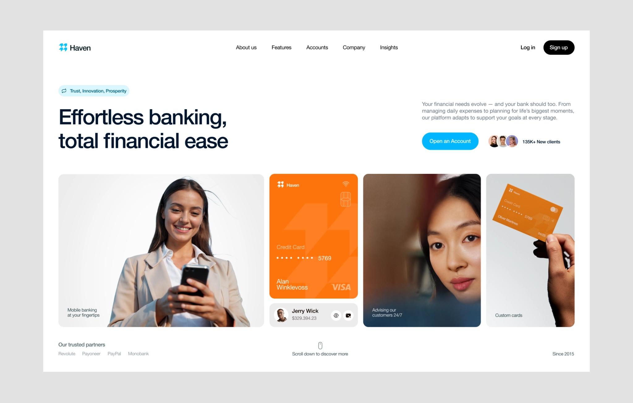
Web design for financial advisors done right: key takeaways from the examples
Design that doesn’t make you think
Weak examples above — like Bank of America or Authorize — make one mistake over and over again: they force users to work too hard. Nested menus, unclear labels, and cluttered layouts make users second-guess every click.
You probably know the feeling when you’re on a fintech site, trying to find their pricing details or a support contact quickly, but the main menu is a jungle of nested links and overlapping drop-downs. You scroll, click, backtrack, and still feel lost. Frustrating, right? Best financial web design create a clear, intuitive site architecture — so users can find what they need without confusion, hesitation, or extra effort. Think of these points:
Logical hierarchy. Pages are organized from broad to specific in a way that reflects how users think. For instance:
Home → Products → Payment Solutions → International Transfers
Recognizable labels. Navigation uses clear, everyday language — not internal jargon or clever branding.
✅ “Pricing” instead of “Value Options”
✅ “Support” instead of “Client Enablement Center”
Minimal clicks to value. Key actions and top-priority content are never buried. Users should reach what they came for in 2–3 clicks, max.
User-first structure. The site is organized based on user goals, not internal departments. Instead of separate tabs for “Consumer Banking” and “Business Banking,” they can be grouped by task:
✅ “Send Money”
✅ “Get Paid”
✅ “Manage Accounts”
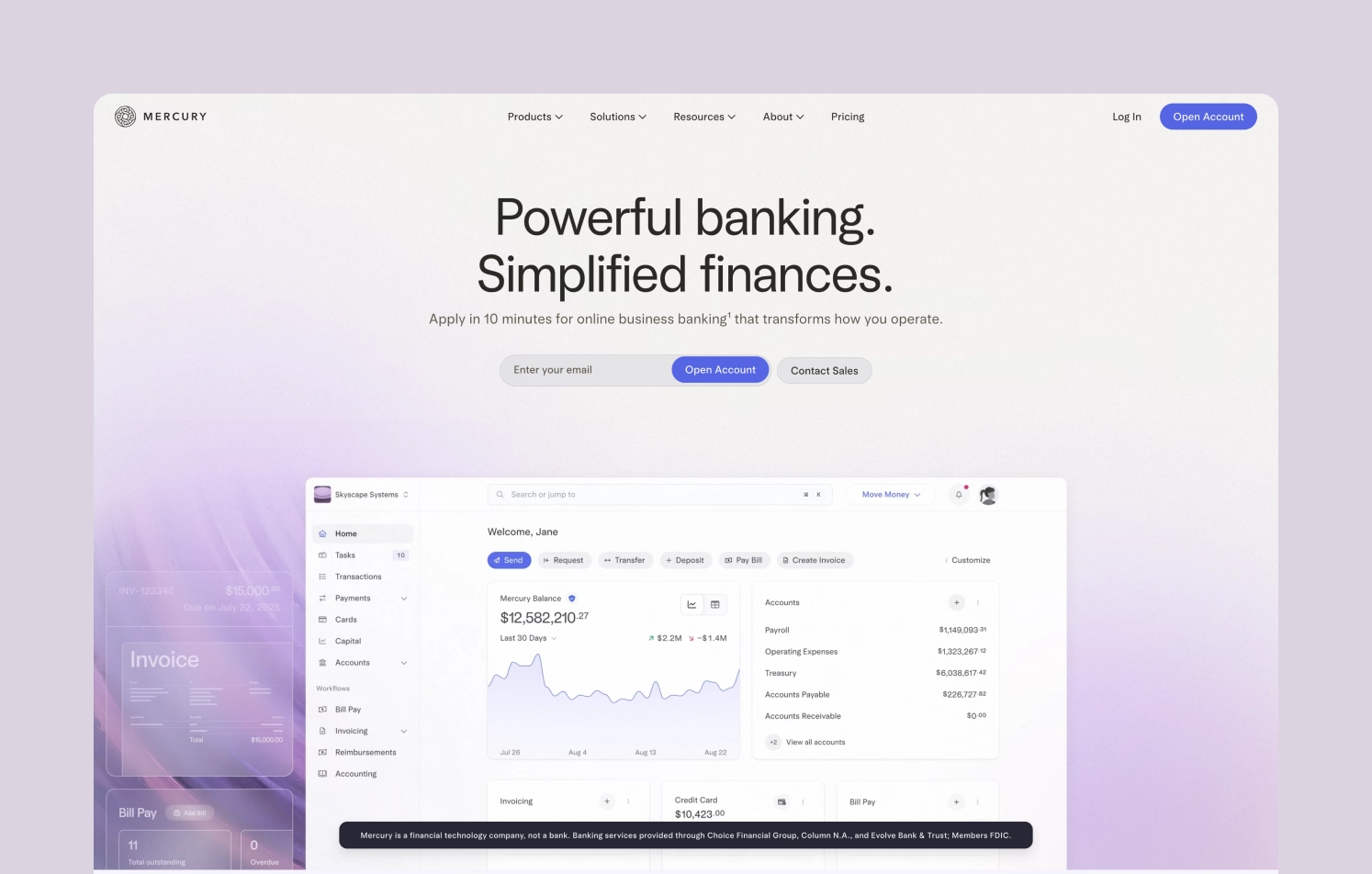
Consistent branding evokes trust
From the first landing page to the sign-in form, every visual and verbal element should feel like it belongs to the same story. Again, we’re talking about trust here. When your brand identity (colors, typography, tone of voice, button styles, iconography) is consistent, users subconsciously feel like someone is in control. Menus, layouts, and language should stay the same across all pages. This reduces cognitive load and builds user confidence as they move through the site. The experience feels stable, intentional, and safe — all critical for a product that handles people’s money, even if it’s a website. Inconsistent branding and positioning may create micro-moments of doubt. When users sense chaos or fragmentation, their trust dips — even if the functionality is perfect.
Micro interactions
Ever clicked a button on a website and weren’t sure if anything happened? That split second of doubt — “Did it work?” “Should I click again?” — is exactly what micro-interactions in expert web design are meant to solve. These subtle design details create a sense of responsiveness and build trust with users. On fintech websites — where the stakes are higher than just browsing — clear visual feedback helps reduce friction and uncertainty. Weak examples lack this entirely. On Authorize, for instance, the absence of motion makes the experience feel static and lifeless — as if the site doesn’t care what you do. Here are some micro interactions to look out for:
Hover effects show interactivity. When links, buttons, or menu items respond on hover (with a color change, underline, or slight animation), it signals: “This does something.”
💡 For example, a “Start Investing” CTA that subtly lifts on hover feels more engaging — and tells users it’s ready to be clicked.
Click feedback confirms the action. A button that slightly changes color or animates after clicking reassures users that their action was received.
💡 Especially helpful on key pages like “Open an Account” or “Submit Application”, where hesitation often leads to drop-offs.
Loading indicators reduce anxiety. After clicking a link — say, “View Annual Report” — a quick progress bar or spinner helps users know something’s happening. It’s the difference between wondering if a page is broken and patiently waiting for it to load.

Navigation cues keep users oriented. Highlighting the active section in the top nav or breadcrumbs helps users understand where they are within the site.
💡 Useful for multi-layered sections like “Business Solutions” → “Payments” → “Pricing” — where clarity prevents backtracking.
So, what should fintech design feel like?
In fintech, you’re asking people to trust you with their finances, goals, and fears. That trust is emotional. So, every design choice — from button copy to homepage layout — is either reinforcing that trust or chipping away at it.
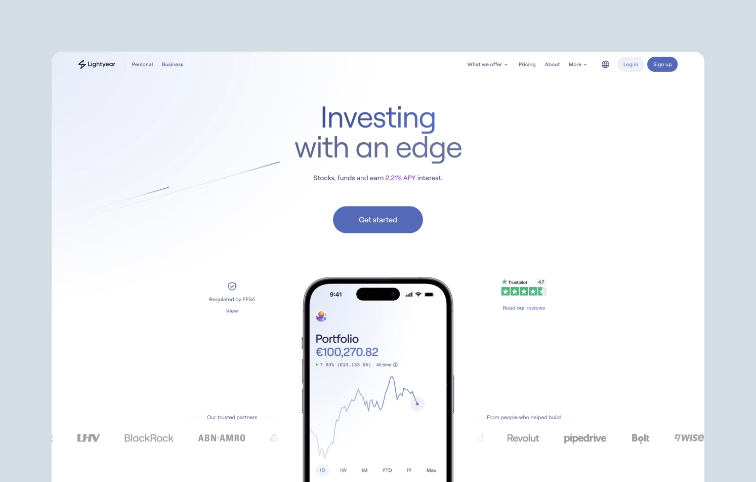
Companies that prioritize emotional design in their products see a 20% increase in customer satisfaction and a 15% increase in customer loyalty.
Best web design for financial services makes fintech feel trustworthy, usable, and human — and that’s what drives growth. Here are some of the key emotions that design evokes — we’ll explore the creation of designs that inspire these feelings in the next chapters.
1. Calm & clarity
Most users come to fintech platforms already overwhelmed. Either they’re unsure about finances, worried about money, or trying something new (investing, budgeting, crypto, etc).
How design solves this:
- Layouts that breathe — whitespace, predictable patterns, clean lines
- Clear, digestible content without jargon
- Gentle animations that guide, not distract
2. Competence & authority
When it comes to financial website design, users need to believe that your product knows what it’s doing — without being condescending.
How design and branding support this:
- High-contrast, well-balanced color schemes (think dark neutrals with focused accent colors)
- Professional typography, thoughtful microcopy (clear but never casual where it counts)
- Subtle motion or feedback cues that show “this product is smart and aware”
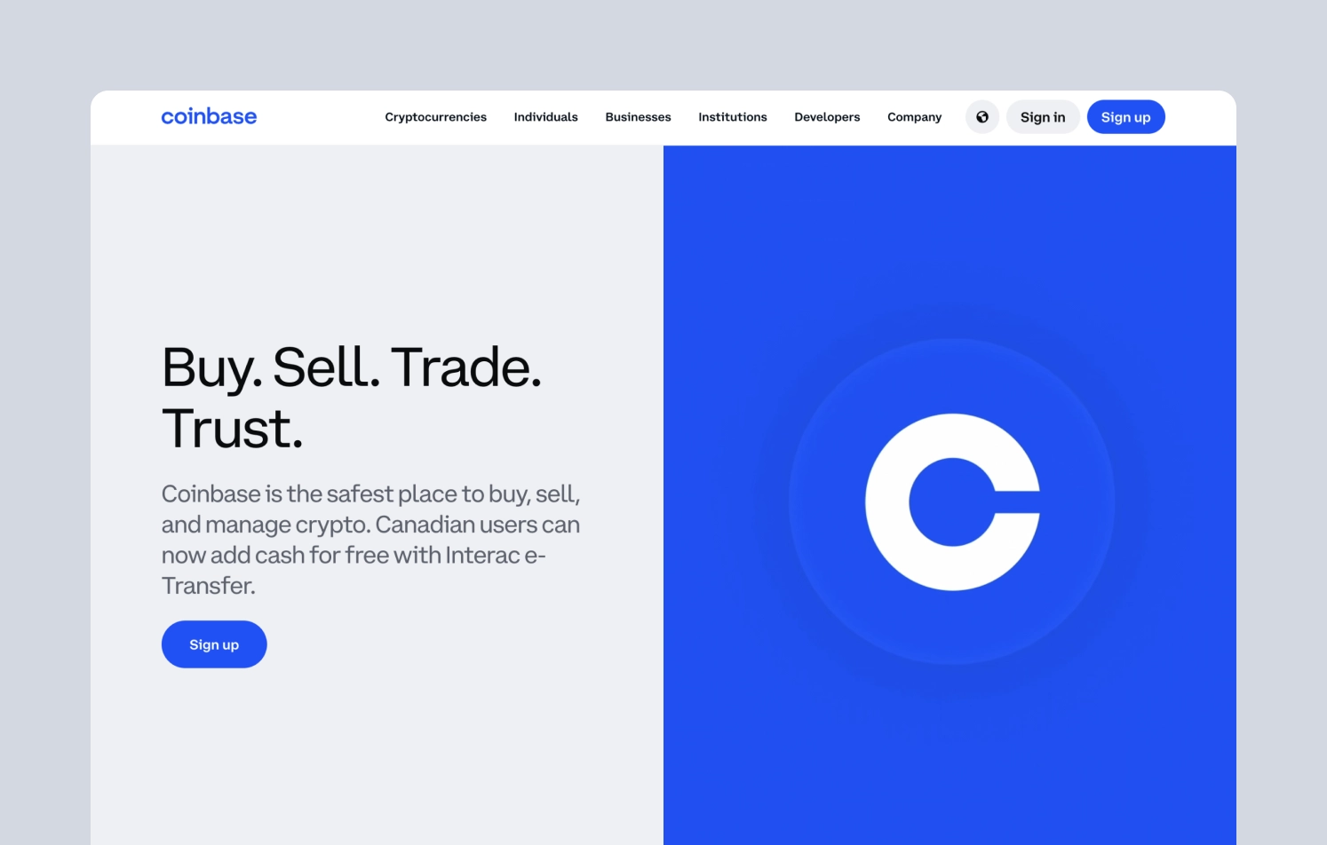
3. Trust & reliability
You’re not just selling something — you’re asking people to share financial information. Web design for financial companies must feel stable, secure, and intentional from the first scroll.
How design and branding support this:
- Consistent UI patterns, spacing, and hierarchy across all pages
- Clean, uncluttered professional layouts that reduce noise and signal clarity
- Predictable navigation and visible CTAs — no guessing required
4. Transparency
Financial UI experts know that fintech has a trust problem. If anything feels hidden, vague, or too “slick,” it immediately creates doubt.
Design strategies:
- Clear language around fees, risks, processes
- Design patterns that expose key options upfront and let users easily drill deeper when they want more detail (don’t bury important info)
- Visible, accessible links to terms, FAQs, and support to reassure users they’re never left guessing
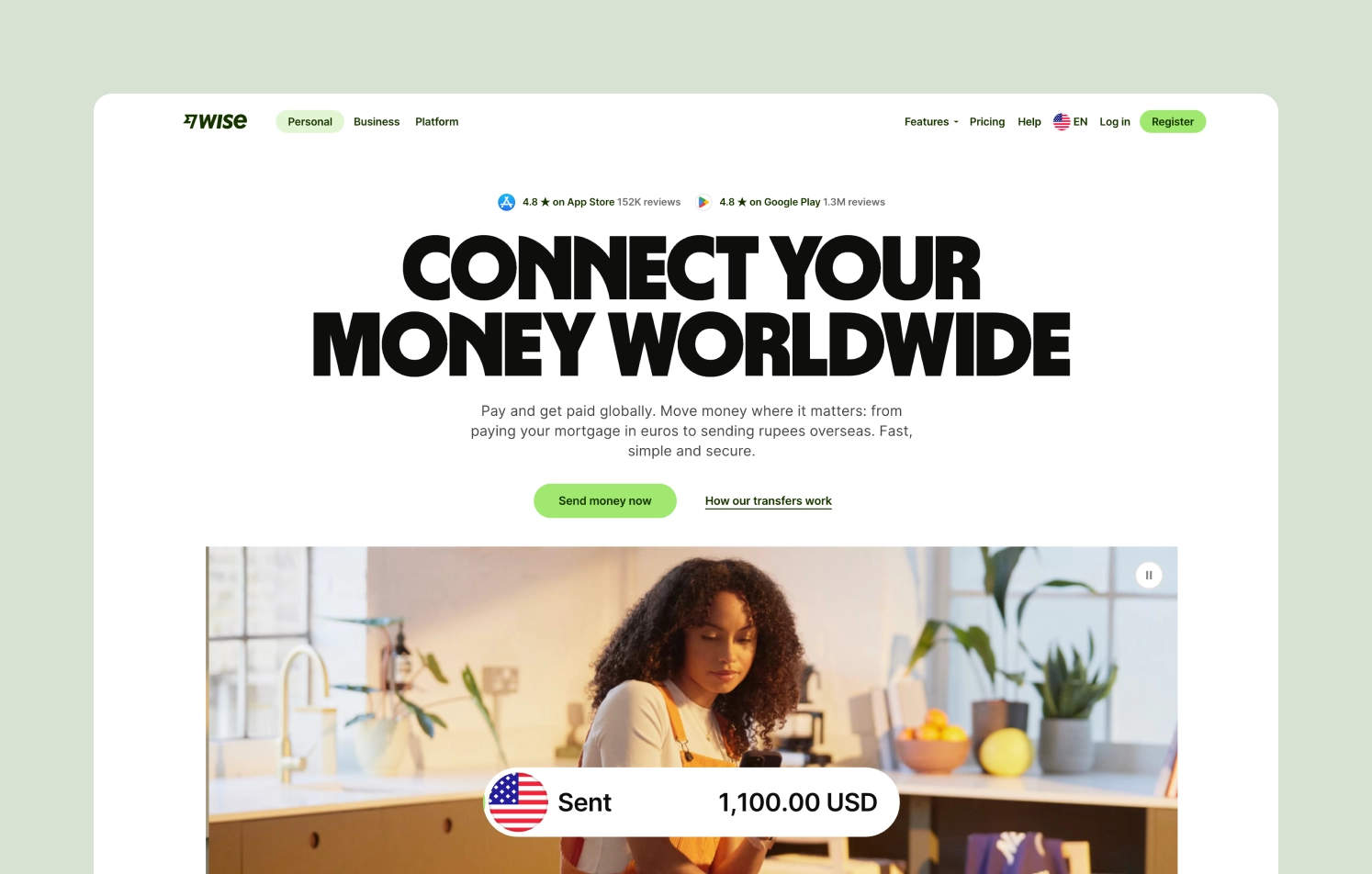
5. Relevance & belonging
Users want to feel that the product and brand get them — their needs, values, and challenges. When your design speaks their language and mirrors their identity, users feel seen and included.
Design considerations:
- Visual language and tone that match the user’s life stage or mental model
- Inclusivity in visuals, use cases, and accessibility
- Show scenarios that reflect users real-world goals, not just features
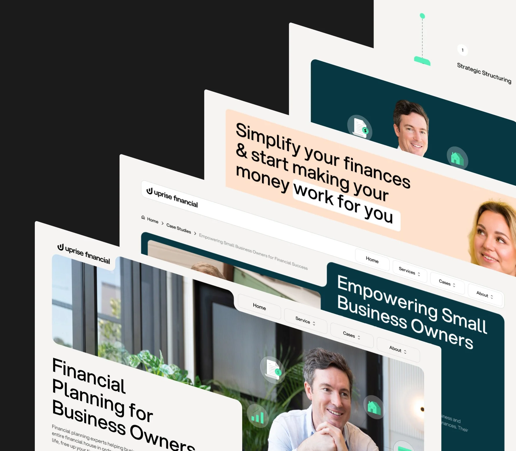
Our case: Uprise Financial
For fintech companies, especially those dealing with personal finance and advisory, the way a product looks and feels can be the difference between “maybe later” and “let’s talk.”
That was exactly the challenge Uprise brought to our agency.
They were reimagining what financial advisory could look like — tech-enabled, human-centered, and genuinely helpful. But their digital presence didn’t match the boldness of their mission. Their site felt outdated, fragmented, and lacked the emotional clarity needed to build trust with users facing complex life decisions.
Our challenge? To built a product experience that mirrors the heart of their brand: smart, calm, and quietly confident.
How we approached it:
- Strategic brand elevation. We didn’t start with colors and shapes — we started with positioning. We refined how Uprise talks about its offering, making sure every piece of content contributes to a sense of guidance and clarity.
- Intentional hierarchy and minimalist design. Every screen was designed to prioritize clarity: clean layouts, ample whitespace, and a visual structure that lets key messages stand out without visual overload.
- Clear, intuitive navigation. We built pathways that feel natural — helping users find what they need quickly, without friction. The experience feels light, purposeful, and built around how people actually explore financial products.
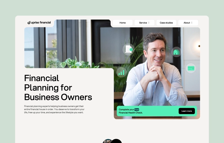
The result is a product that speaks directly to the user’s need to feel seen, supported, and in control.
Wrapping up
What users see, feel, and interact with on your website sets the tone for everything that follows. Strong design choices create confidence and clarity. Weak ones introduce doubt — and doubt kills conversions.
Across all the examples we explored — from Revolut’s emotional clarity to Stripe’s effortless navigation — one truth holds: design isn’t decoration. It’s communication. And in fintech, what your design communicates can either build a relationship or break it before it starts.
So whether you’re building a digital bank, a payment platform, or a financial advisory tool, ask yourself:
Does our design show users they’re in the right place? Or does it make them hesitate?
Because in fintech, that hesitation isn’t just a UX flaw — it’s a lost opportunity for trust.
At Valmax, we’re delivering financial website design and development built for trust — let’s talk if you share our approach.
Design a fintech website that earns user trust
We create clean, modern, and strategic experiences tailored to financial products
FREQUENTLY ASKED QUESTIONS
What makes financial web design different from other industries?
Financial websites must balance clarity, compliance, and emotion. Users need to understand complex information quickly, feel confident in your platform, and ideally, connect with your brand on a human level.
We already have a working product, do we really need a redesign?
If your site feels outdated, inconsistent, or hard to navigate, then yes. Even if your backend works perfectly, poor design can kill user trust and engagement. A strategic redesign can help improve signups, retention, and even investor perception.
What are the common design mistakes financial companies make?
Overloaded interfaces, inconsistent visuals, weak onboarding, and unclear hierarchy. These issues confuse users, slow decision-making, and reduce confidence.
What if we need more than just design, like development or branding?
That’s exactly what we do. VALMAX offers a full-cycle approach: from market positioning and brand identity to UI/UX design, website development, and launch support.
Contact us to discuss end-to-end services for your project.
How long does a typical financial website project take?
It depends on scope — but generally, 4 to 8 weeks for design, and 8 to 12 weeks for full design + development. We always start with a discovery phase to align on goals, users, and business needs.
Contact us for a free consultation — we’ll help you map out the timeline and approach that fits your product.
rate this article
5 / 5.0

based on 6 reviews

