Scroll, Swipe, Subscribe: The Future of Reading
Discover how we transformed FutureTypes into a dynamic online magazine with unique subscription features, ecommerce for physical and digital issues, and a powerful editor’s toolkit. Dive into the future of digital publishing.
Services we provide
Headquarters
Toronto, Canada
Industry
Media
Website
Timelines
5 months
Inside the Magazine
Human Futures Studio
HFS is a forward-thinking consultancy that helps organizations navigate change through human-centered research and strategic foresight. Combining anthropology, behavioral economics, and design research, they empower businesses to better understand their customers and the world around them. Their clients range from large multinational corporations on the Fortune 50/500 lists to small startups and agencies.
Business | Culture | Environment
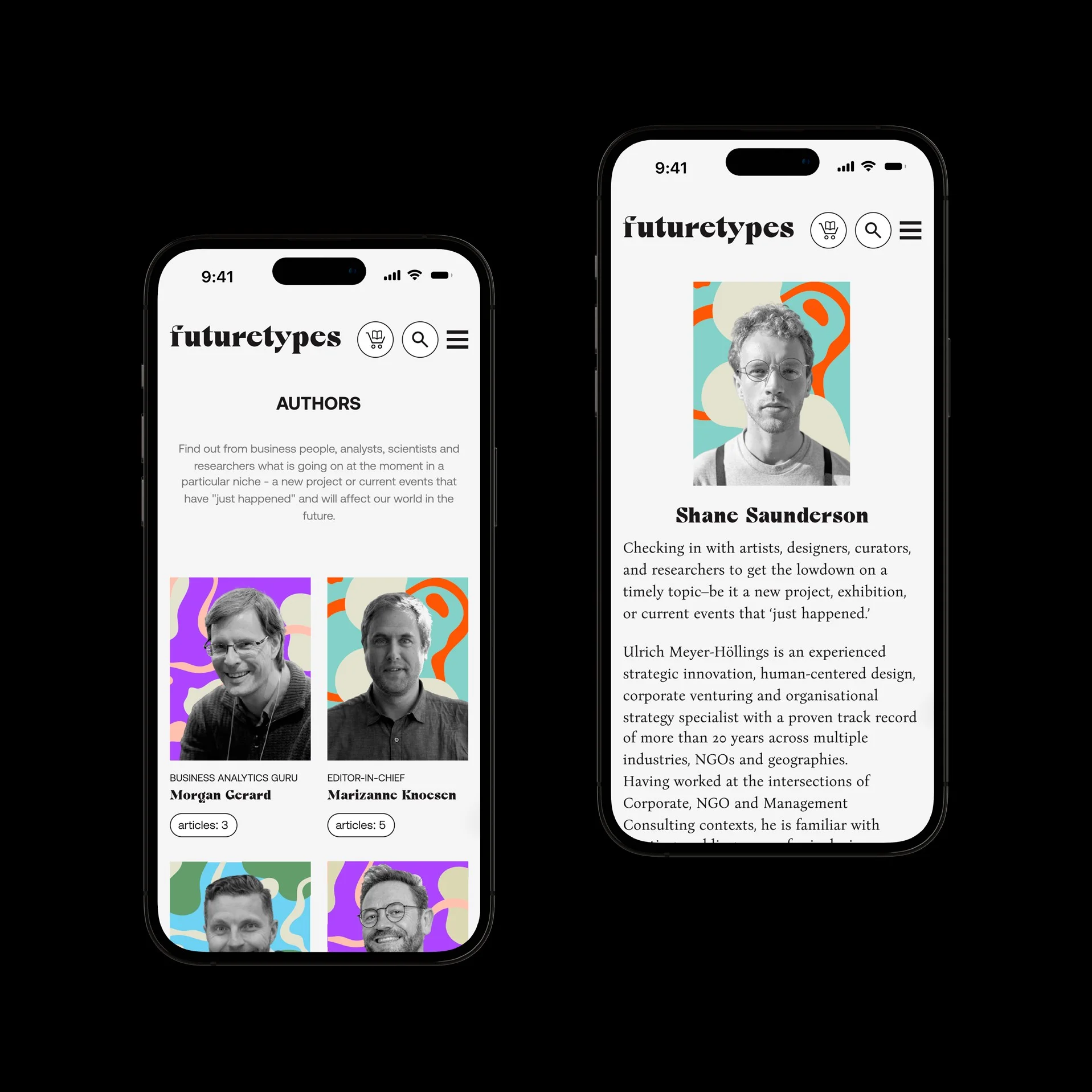
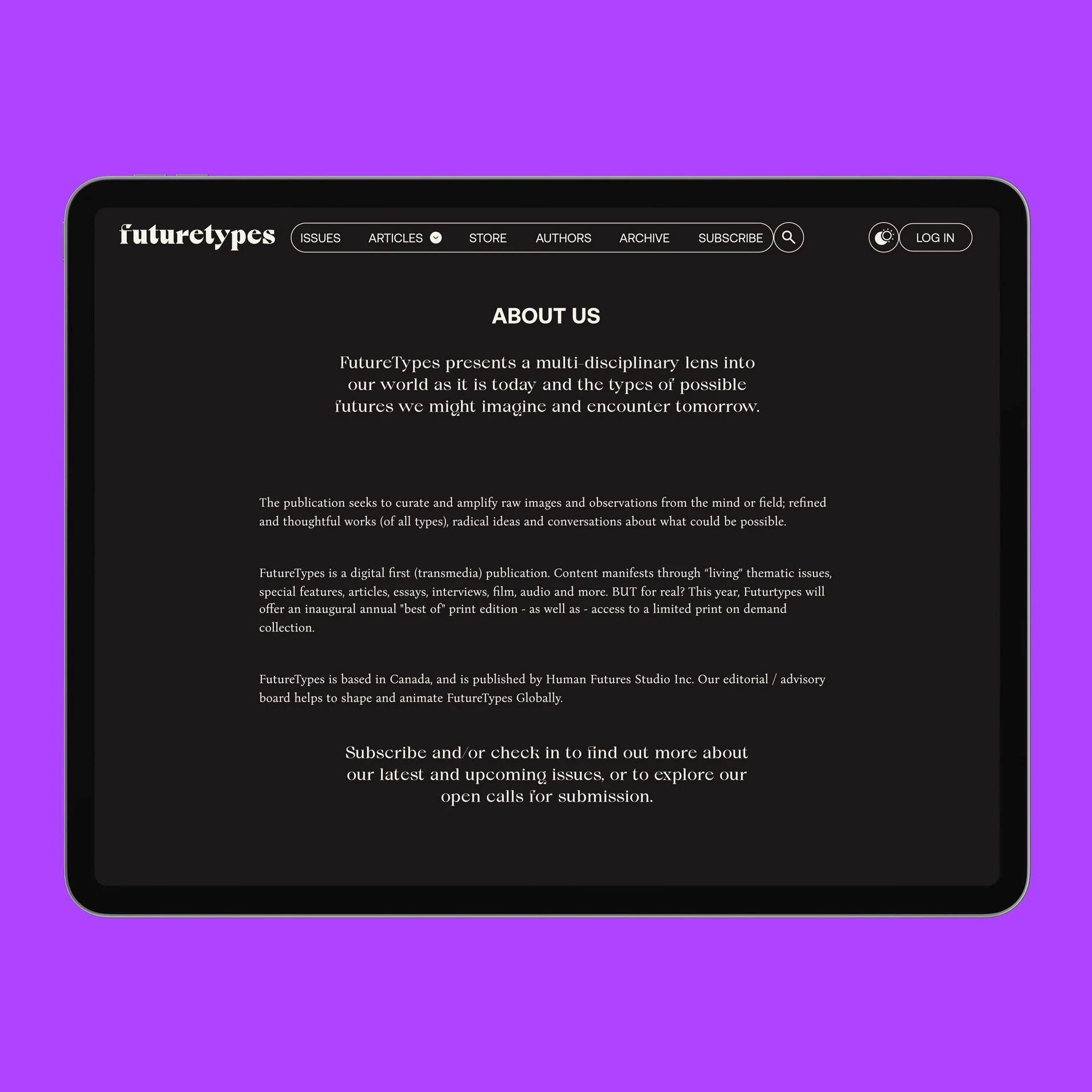
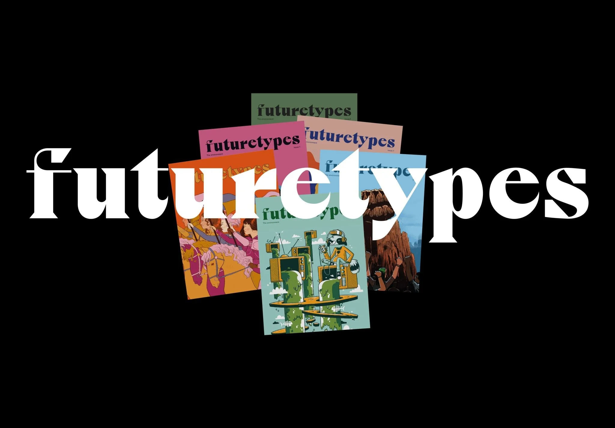
FutureTypes is an online magazine that explores global challenges through the lens of strategic foresight and speculative anthropology. Targeted at leaders and innovators, it provides fresh perspectives on business, culture, and the environment. For HFS, it’s a platform to reach new audiences and demonstrate their expertise in addressing complex global shifts.
Expectations vs Reality
The Challenge
FutureTypes wasn’t your typical website project — it was a complex media platform. The client needed to divide content into free and paid tiers, which meant implementing a subscription model, payment gateway, user account management, and a paywall system. On top of that, the editorial team required a flexible interface to create various article formats by mixing design templates and sections.
The design brief was equally challenging. FutureTypes aimed to blend “Raw,” “Refined,” and “Radical” aesthetics, leaning toward Swiss-style grids with bold creative deviations.
Designing the User Experience
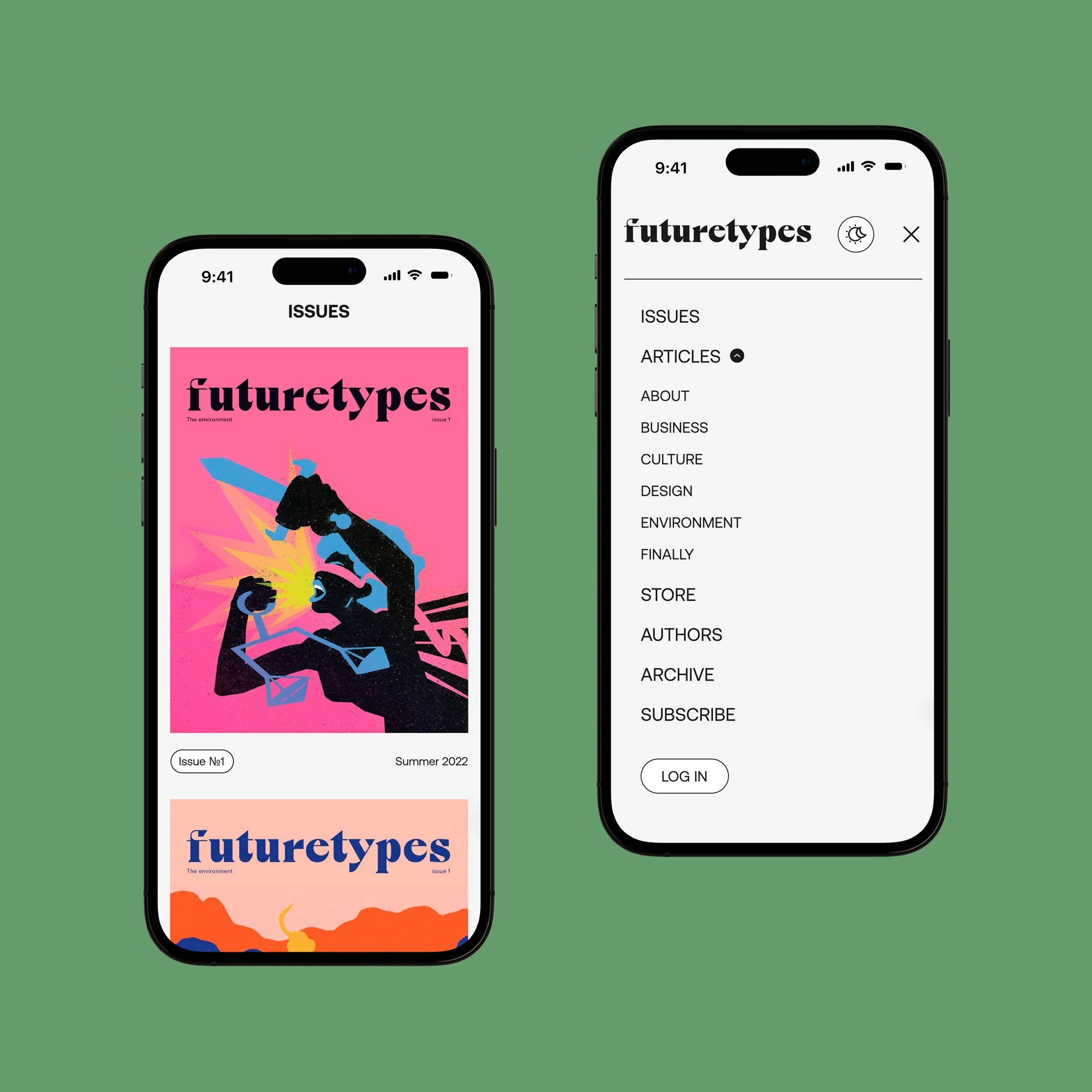
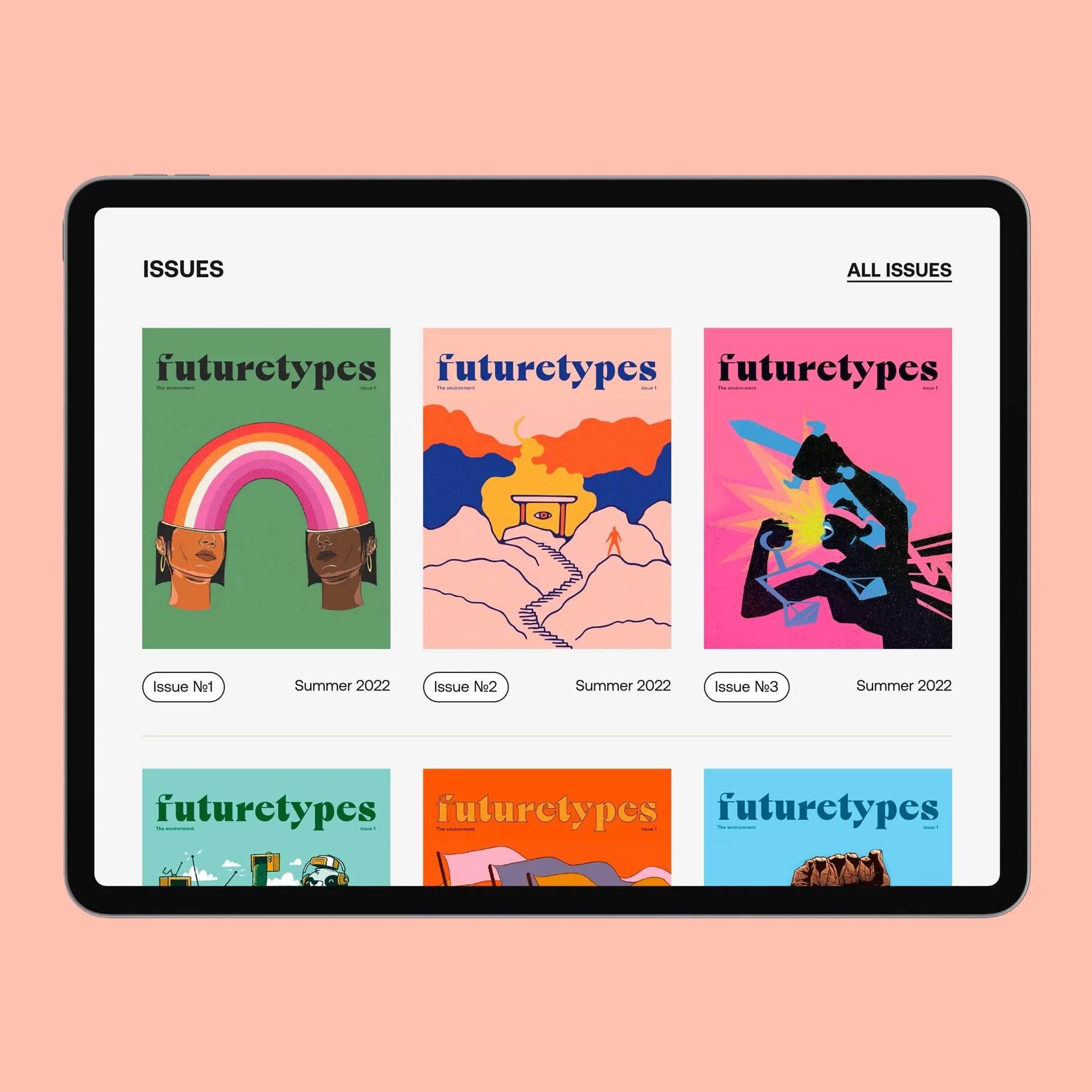
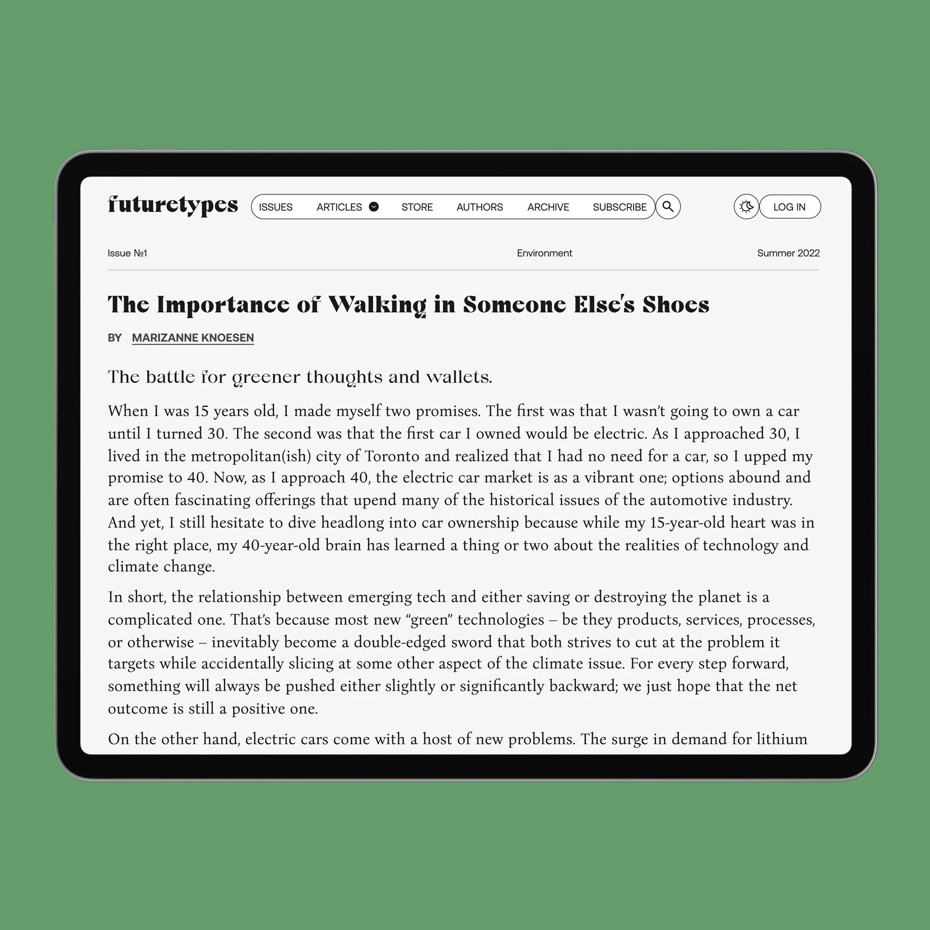
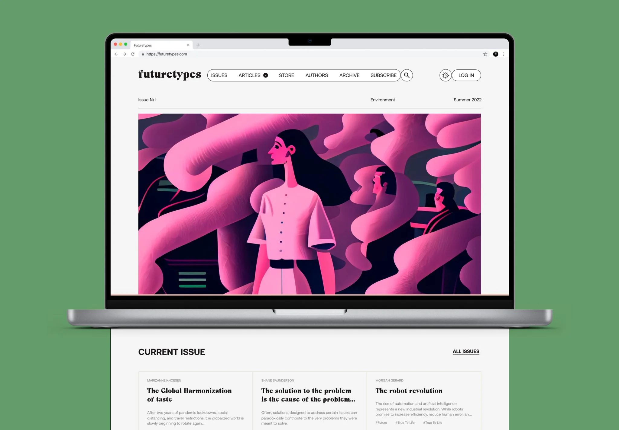
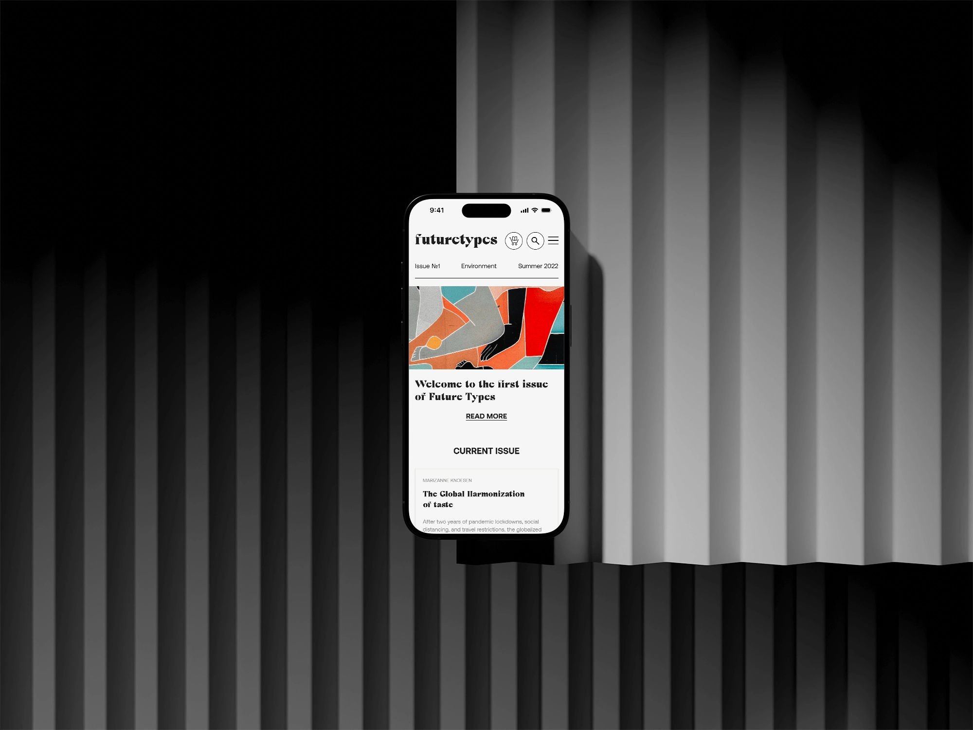
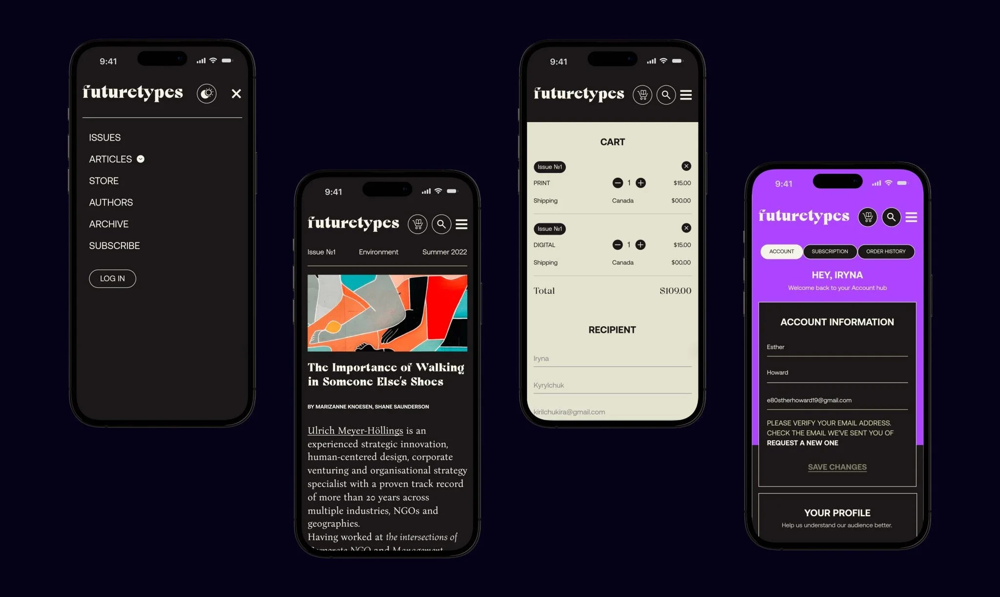
Inspired by Richard Turley’s experimental design at Bloomberg Businessweek, we aimed to bring the same energy to FutureTypes. We focused on making the site feel like paper—easy on the eyes, familiar, and perfect for long reads. Bold, abstract covers added a touch of “wow” to each issue, while clean typography made content effortless to absorb. Navigation was intuitive, guiding readers seamlessly through the magazine.
A design that hits the perfect balance between “Raw,” “Refined,” and “Radical.”!
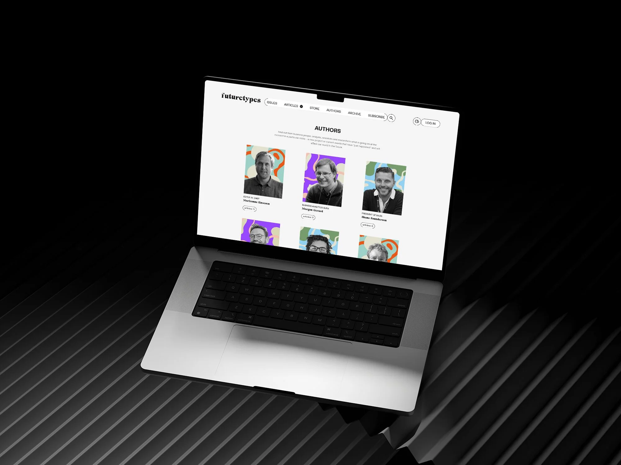
We developed a back-end tool for editors, giving them full creative control to design unique articles. With various templates (full-width, narrow) and a library of 40+ elements — titles, images, videos, sliders, quotes, polls, audio, CTAs, and more — editors can craft dynamic, engaging content, ensuring every issue feels fresh and exciting.
Unlock with Stripe: Subscription & Paywall
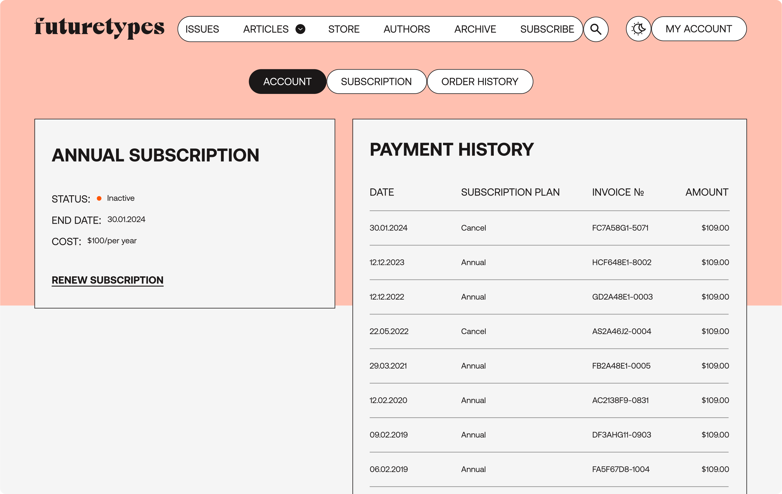
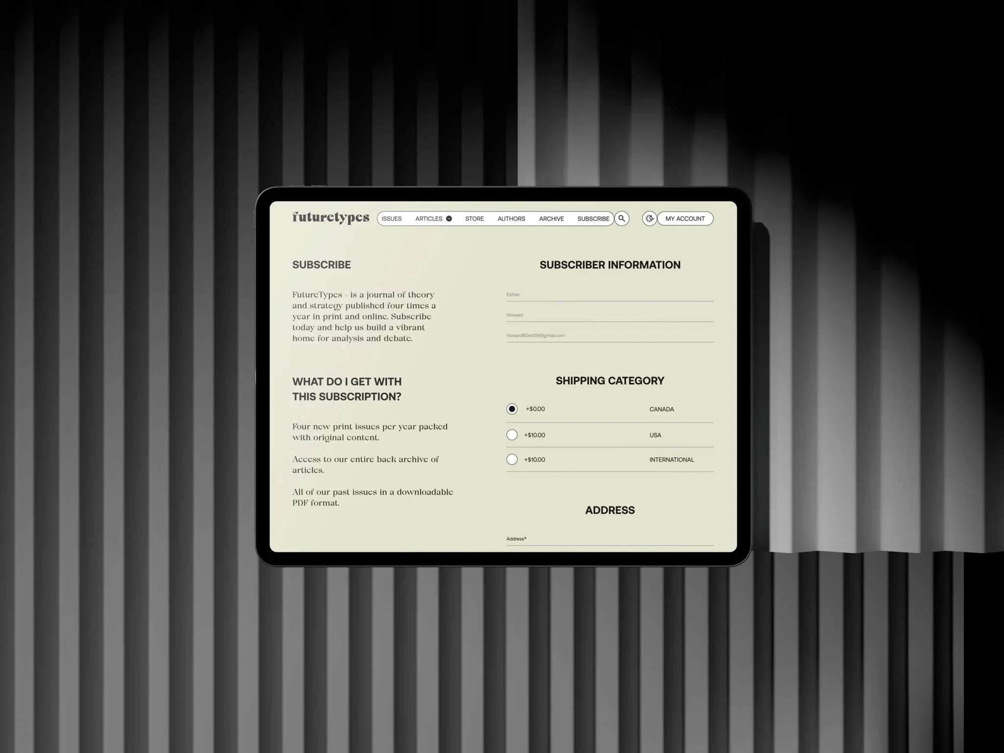
To manage paid content, we implemented a paywall and subscription system. Stripe Billing securely handled payments, subscriptions, and auto-billing, while we developed a custom user account for seamless subscription management and paywall.
Online Magazine Kiosk
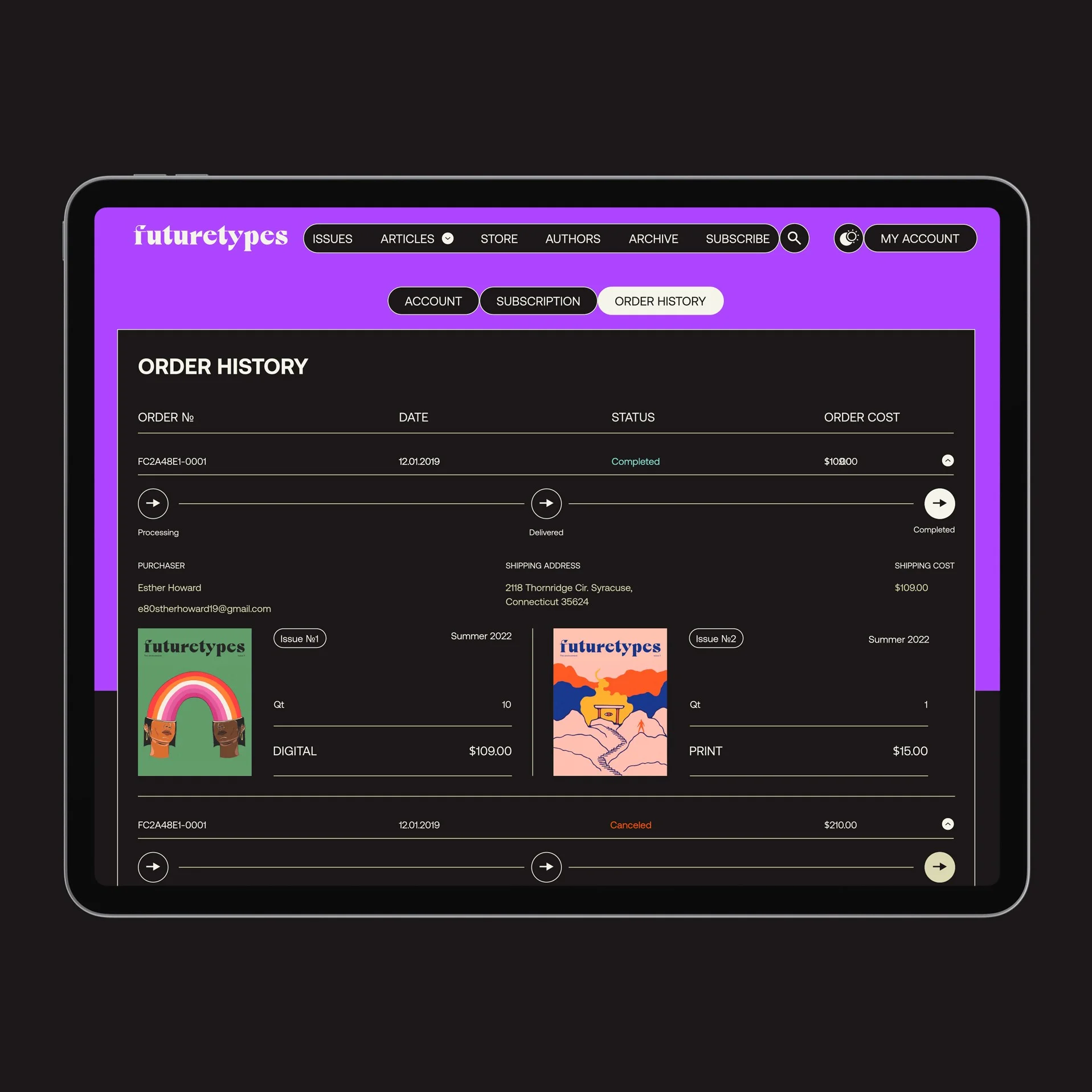
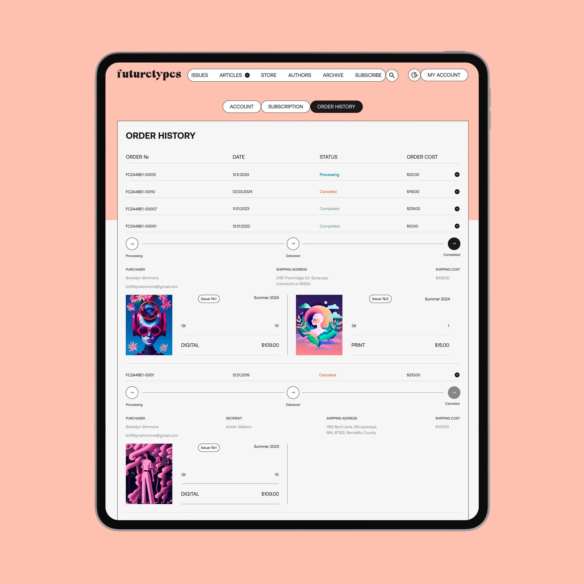
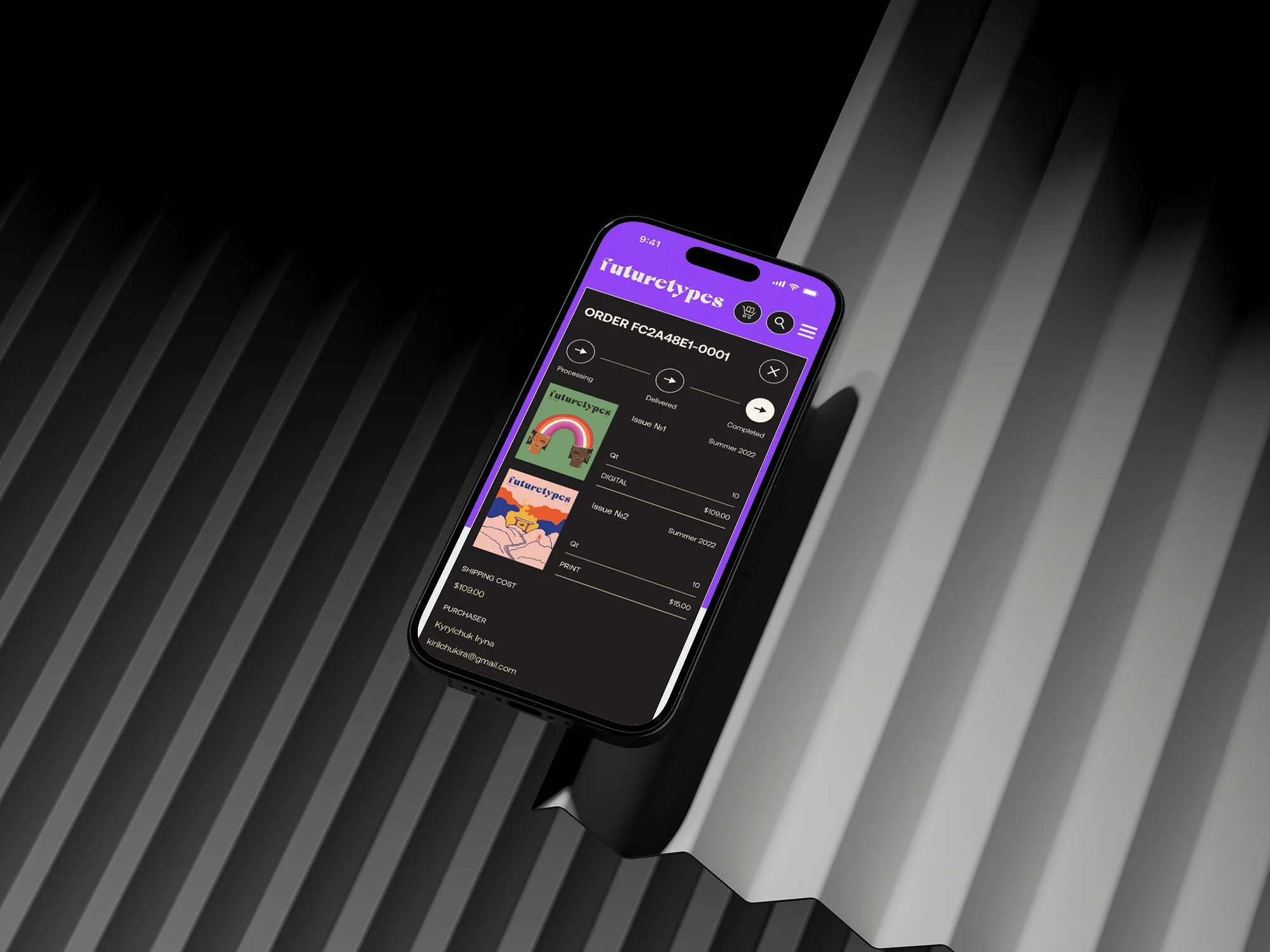
One of the key features of this project is an e-commerce function, allowing users to purchase either a physical copy of each issue with home delivery or a digital version sent as a PDF via email. Integrated with the user account, it lets customers track their order history, delivery status, and manage their addresses and purchases in one place.
Dark mode
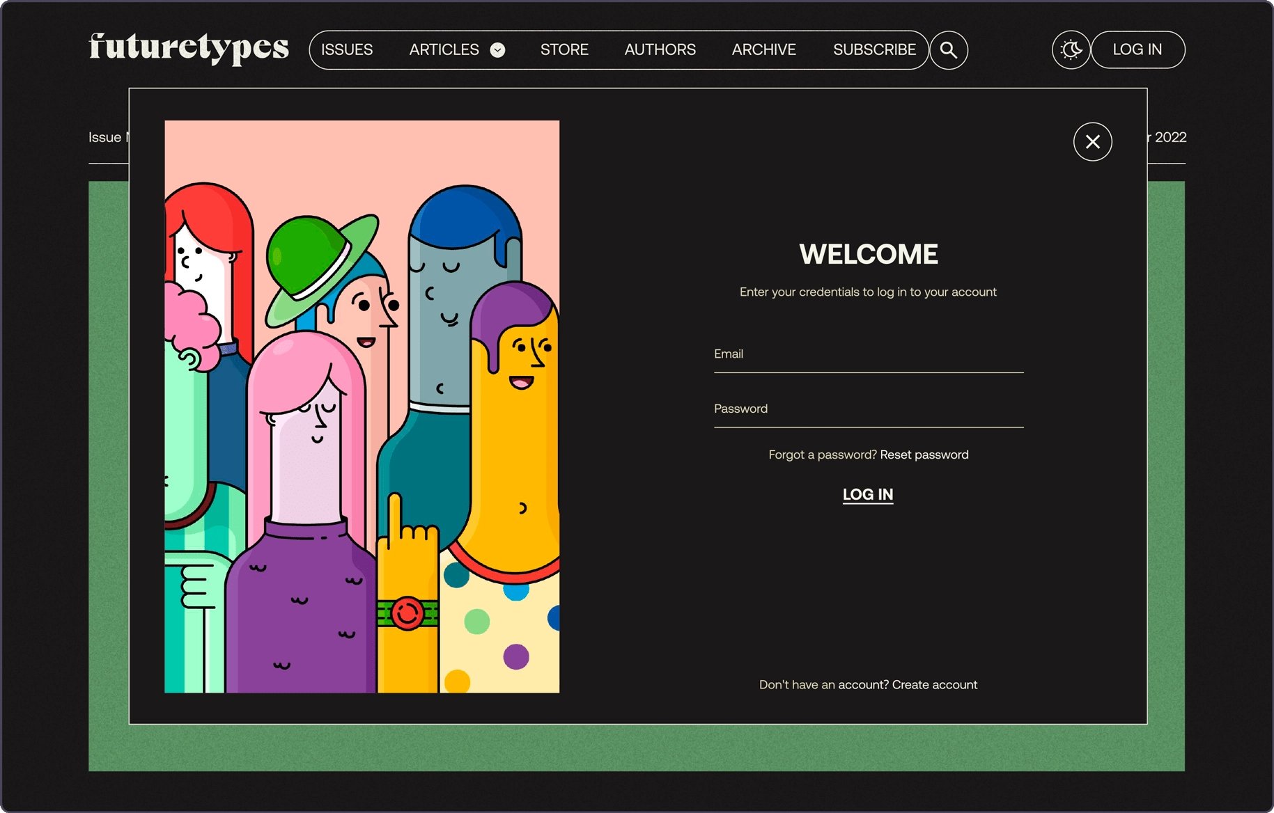
We implemented Dark Mode, a key user request. Though it seems simple, adjusting the color scheme to prevent unreadable black-on-black or white-on-white text was complex. Designers and front-end developers worked closely to ensure a smooth, bug-free experience.
Сlient’s feedback
They were very good at reading between the lines and delivering what we wanted.

Paul Hartley
Ph.D, Founder of Human Futures Studio
