From desert to download: Branding for a mobile game publisher
Two brothers, one vision — build a gaming brand as sharp and immersive as the games they create. Explore how we helped Digital Dunes to shape the visual identity and design a bilingual website built for the world.
Services we provide
Headquarters
Qatar
Industry
Gaming
Website
Timelines
3 months
MEET DIGITAL DUNES
A MENA-based publisher powering the next wave of mobile games.
This story starts with two brothers — MJ and AJ — walking away from high-powered executive roles to build something of their own. They founded Digital Dunes in Qatar as a game publishing and development startup with big energy and even bigger plans. Their focus lies on midcore to hardcore mobile games — think first-person shooters, 4X strategy, and simulation titles.
FROM VISION TO PLAYABLE BRAND
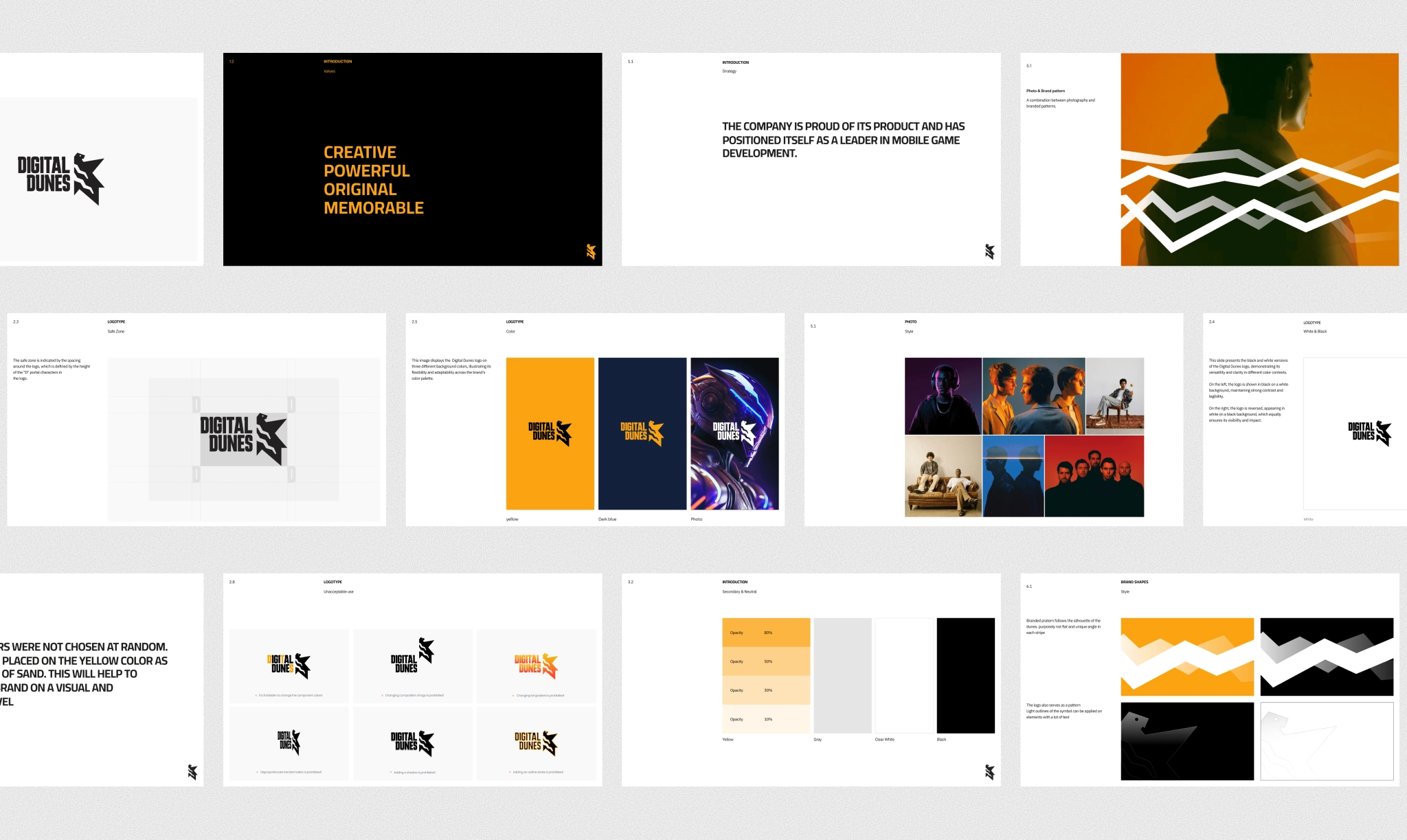
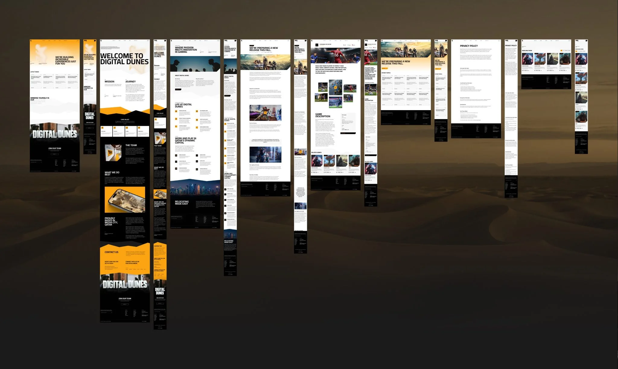
Our role was end-to-end: from strategy and brand foundations to visual storytelling and website experience. We helped design the logo, build a brand book from scratch, and craft an interface that lives and breathes the Digital Dunes mission: high-quality games with global appeal.
BUILDING THE BRAND BEHIND THE GAMES
The name that sets the stage
“Dunes” speaks to their Arabic roots: a landscape that’s both calm and brutal, precise and untamed. It’s a metaphor for resilience, structure, and originality — and the perfect foundation for a bold gaming brand. “Digital” reflects the nature of their work — online-first, game-focused.
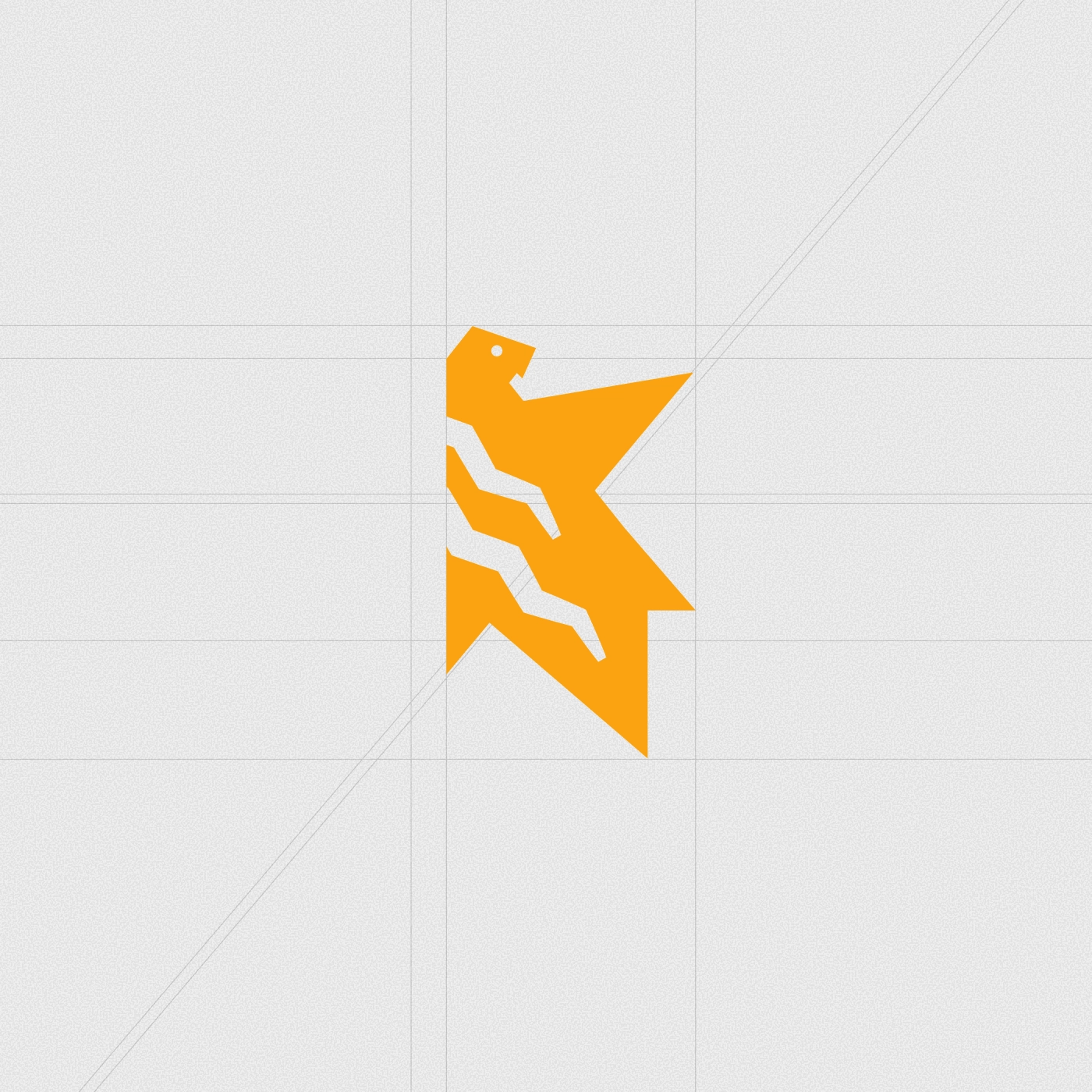
The falcon takes flight
Before we drew a single line, we explored meaning. Through questions, moodboards, and workshops, we surfaced symbols that felt true to the founders. One idea took flight — the desert falcon. Native to their homeland and shaped by the dunes, it’s fast, fierce, and built for a wild landscape, much like their games and plans. That became our core metaphor, guiding everything from sketches to style.
BRINGING IT
ALL TO LIFE
A brand built to play
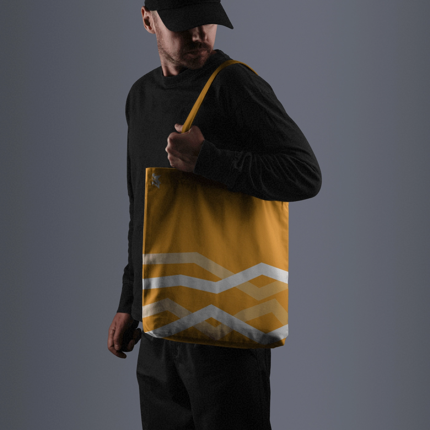
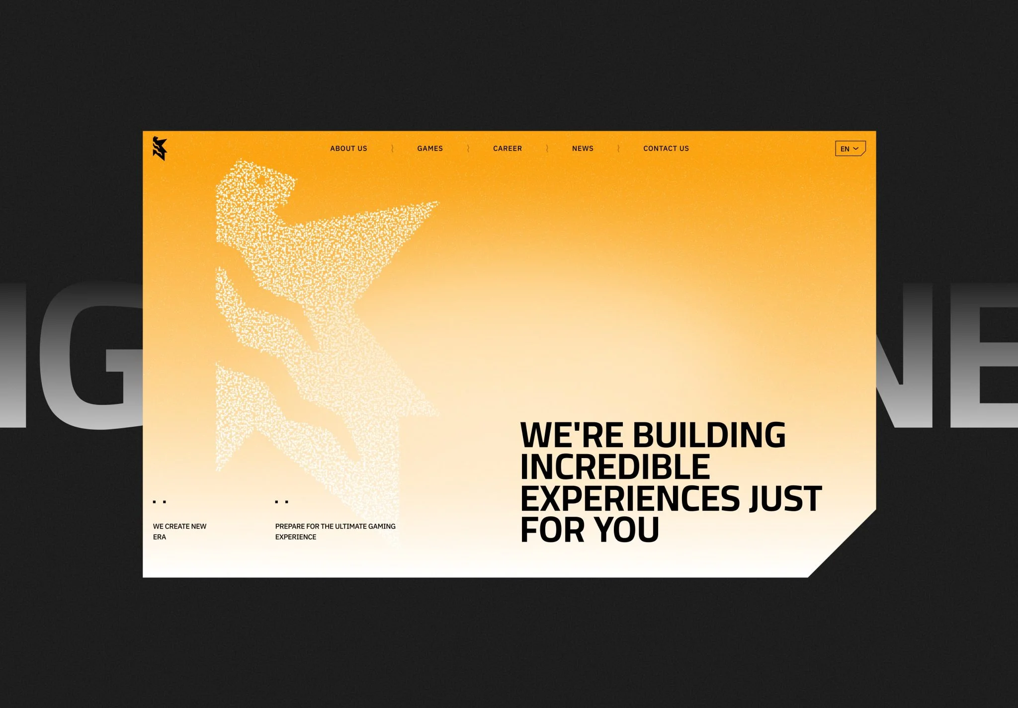
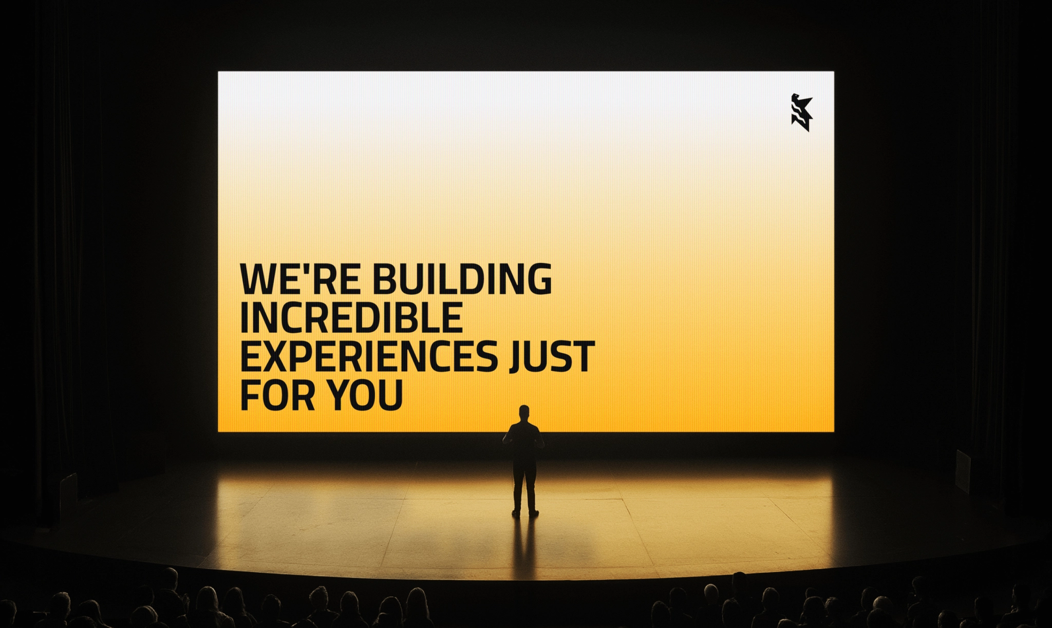
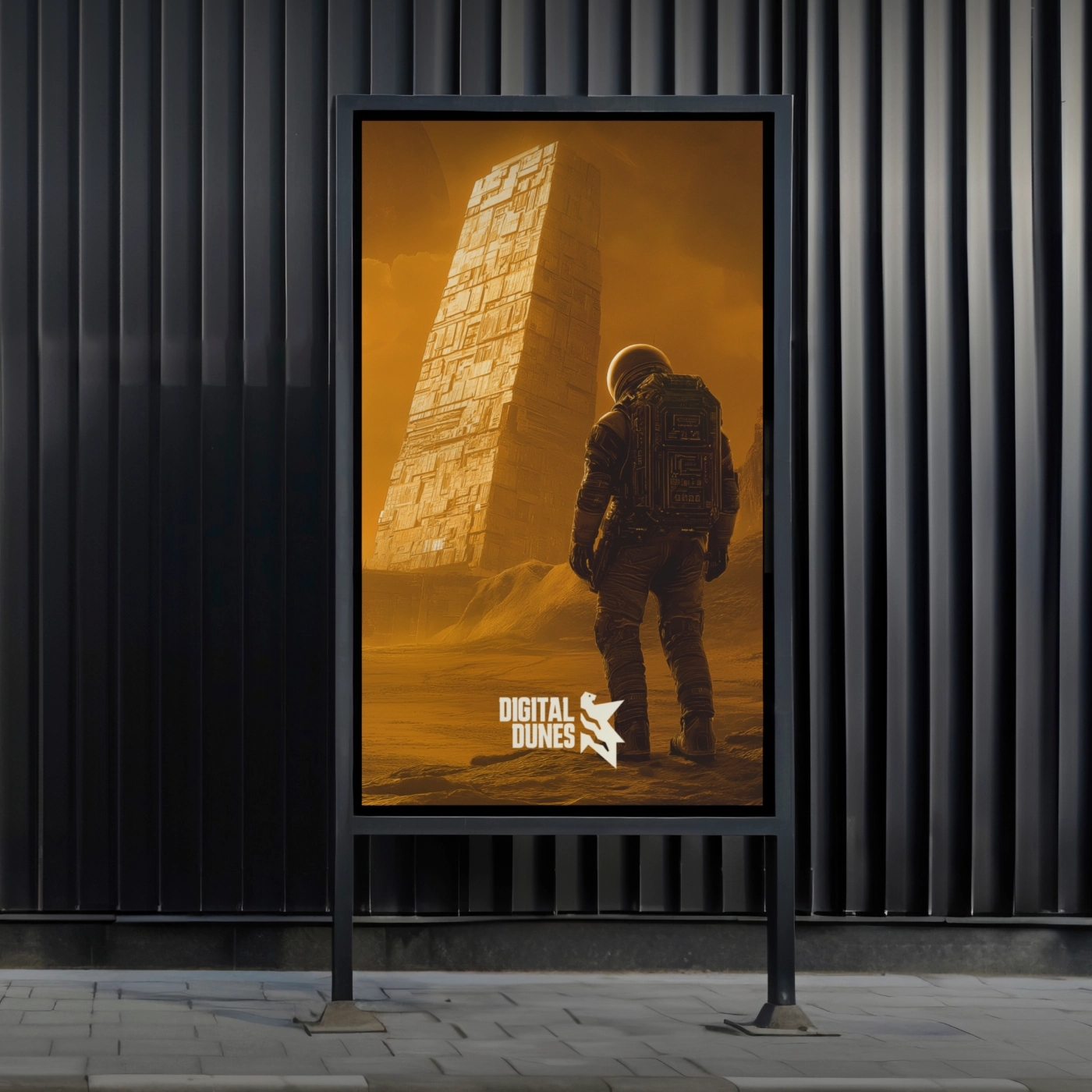
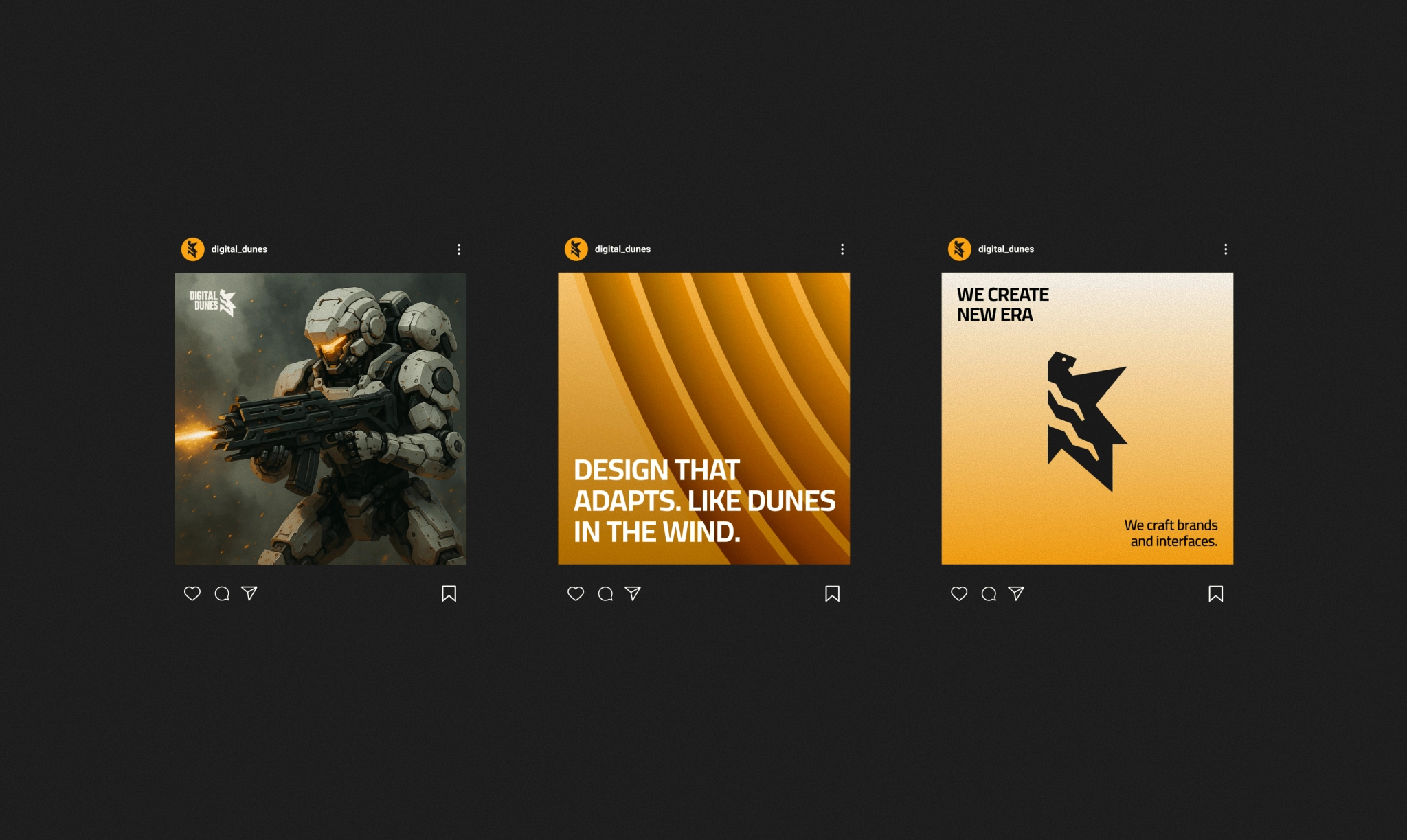
We translated the core metaphor into color and form: dune yellow meets midnight blue — calm by day, brutal by night. Sharp angles in the game company logo design echoed the genre; contrast echoed the setting. The brand guide pulled it all together — colors, type, logo use — ready for a brand experience that feels alive and ready to play.
Design in motion
Open the site and you’ll see a desert falcon ripping across the hero, bursting into gold dust, then snapping back together around the headline. A slow curtain of sand keeps drifting over the screen, so nothing ever feels frozen. One quick animation, two big jobs: hook the player and land the metaphor in a single beat.
READY TO PLAY?
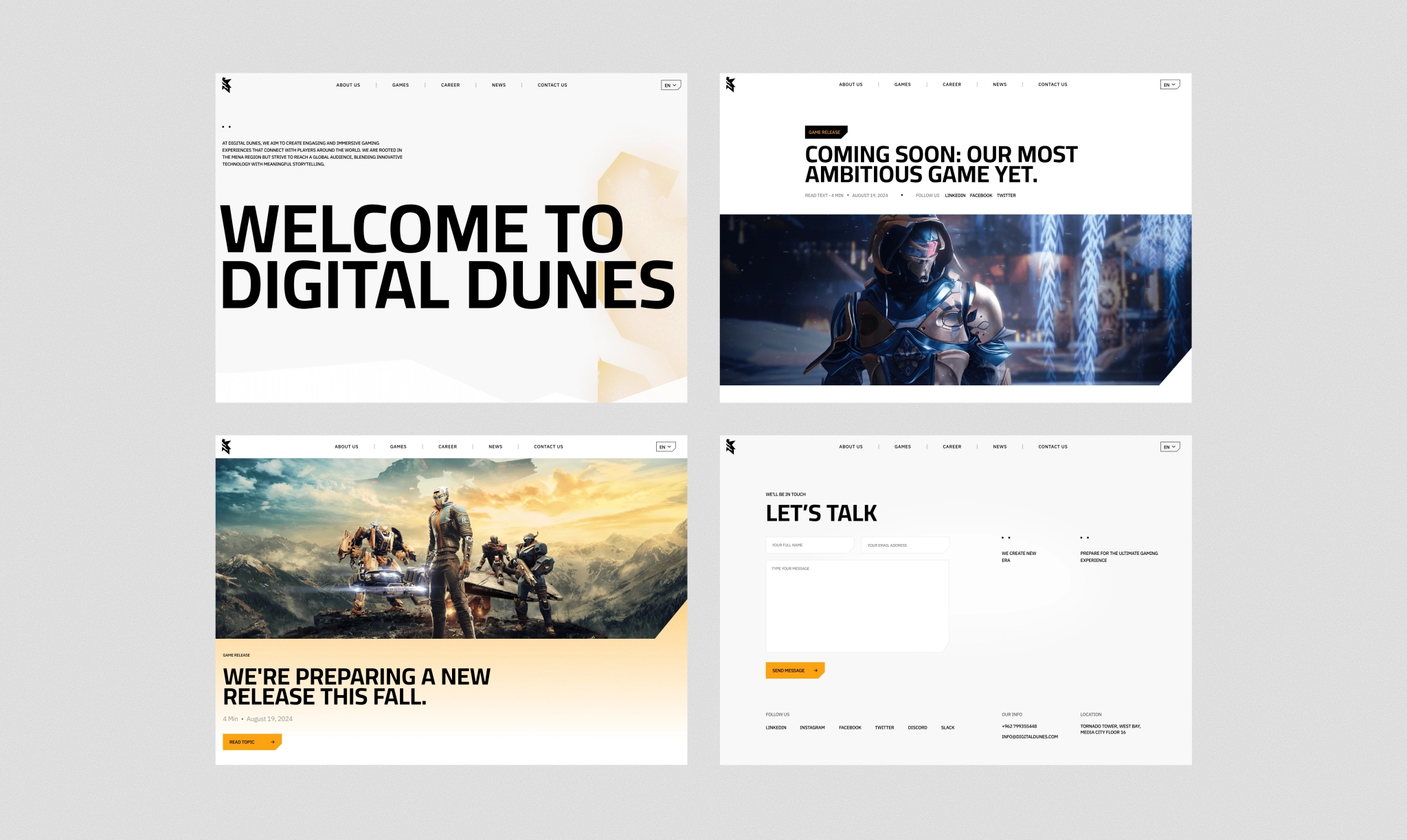
From the moment the game-style loading screen appears, visitors are dropped into play mode. The game development company website is packed with gaming cues — from falcon-inspired angles on dividers and buttons to hover-triggered micro-interactions that reveal art, motion, and depth. Smooth GSAP animations and parallax sand effects keep the experience feeling dynamic, polished, and unmistakably built by gamers, for gamers.
FLIP THE MAP
Left-to-right, right-to-left
The site was built in both English and Arabic, and the Arabic version was far from a simple mirror. Supporting right-to-left layouts meant rebuilding the frontend from scratch and reworking parts of the design to match Arabic reading flow: every animation, transition, and interaction had to be rethought.
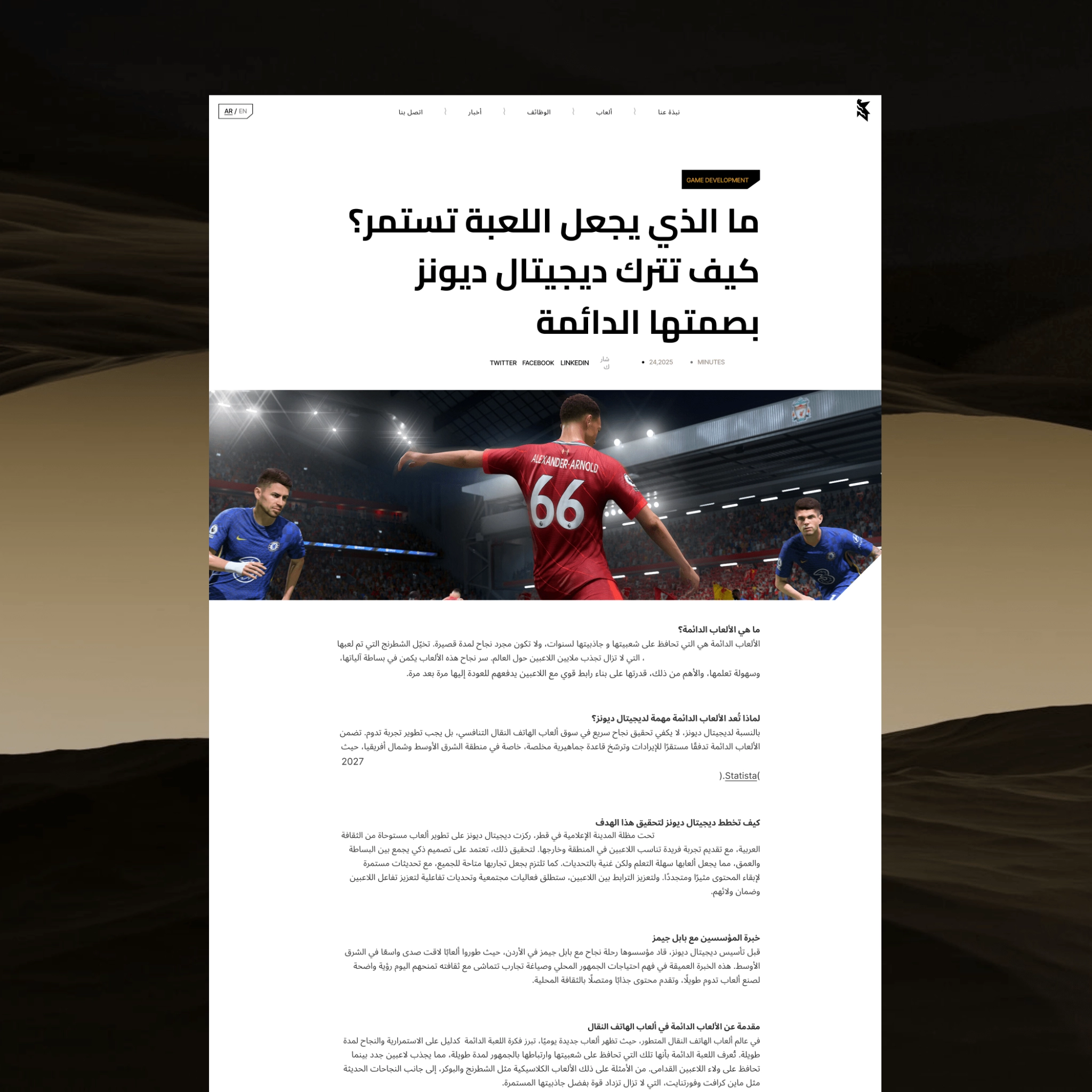
Functional first
Landing top talent was one of Digital Dunes’ core business goals, so a dusty “Careers” page just wouldn’t cut it. We wired the site to their HR platform (Kayana HR) via API, letting every new job post flow straight onto the website in real time.
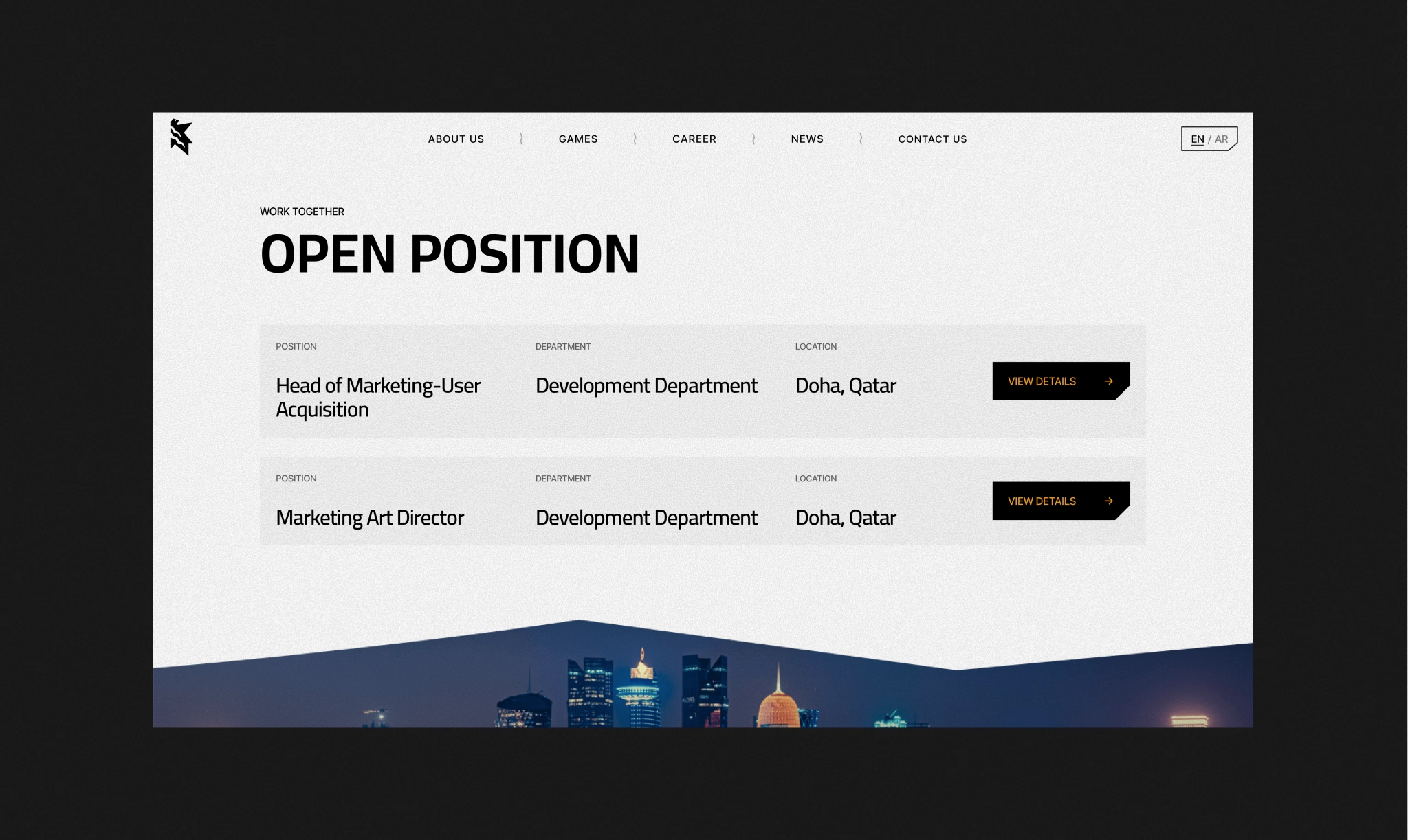
A WIN THAT FELT RIGHT
Client’s story, their ambition, their place in the industry — it all came through. And for us, that’s the metric that matters most: a client who sees their vision fully reflected.
client’s feedback
VALMAX captured what was in our heads, which isn’t easy to do.

MJ Fahmi
CEO
