Many founders learn the hard way, pouring money into a website that ends up doing little for their business. On the surface, the site looks polished (and if you’re unlucky, not even polished). But under the hood, it’s missing the one thing that matters: strategy. Without that, a corporate website won’t generate leads, won’t win trust, and won’t justify the investment.
In this article, we’ll unpack the top 10 website mistakes that sink corporate websites, share real lessons from projects we’ve worked on, and give you practical fixes.
Mistake #1: Starting without a strategy
Here’s the trap we see all the time: a company gets excited about design, skips the hard thinking, and jumps straight into colors, layouts, and “making it look modern.” That can be the recipe for the site that looks good but doesn’t perform. No leads, no sales bump, no ROI. It’s like buying a shiny car with no engine.
But first, what do we actually mean by “strategy”? For a corporate website, strategy means answering a few non-negotiable questions before anyone touches layouts or color palettes:
- What business goals should the site support? (Lead generation, hiring, brand trust, market entry, shorter sales cycles)
- Who is the audience? (Decision-makers, buyers, partners — and what matters most to each group)
- What’s the positioning? (How the company stands out from competitors, and the proof points that back it up)
- What’s the buyer journey? (The path visitors take from discovery to action, and what they need at each step)
Strip away strategy, and even the best-looking corporate sites collapse into decoration.
What to do differently
The real difference comes from alignment. A strategy-first website starts by locking in measurable business goals: generating qualified leads, shortening sales cycles, supporting hiring, or building trust in new markets. Clear objectives at the start ensure that every design and content choice is tied to outcomes; without them, even the most polished site will miss the mark. Here’s what makes a strategy-first website different:
| Design-first website | Talent consistency |
| Driven by aesthetics: “make it modern and clean” | Driven by business priorities: generate leads, hire talent, build trust |
| Pages mirror internal structure (“About us,” “Our services”) | Pages structured around buyer journeys and growth goals |
| Messaging is generic and company-centric | Messaging rooted in positioning, proof points, and differentiation |
| Navigation follows internal preferences | Navigation mapped to how prospects search and decide |
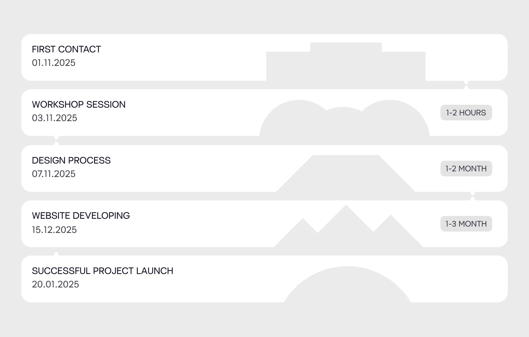
At VALMAX, we make this non-negotiable. Every project starts with a workshop session where we sit down with the client and dig into their goals, audience, and challenges. Only after we know exactly what the site needs to achieve do we move into moodboards, wireframes, and creative concepts. That way, the design has a strategy at its core from the beginning. A strategy-first approach ensures every page, feature, and button is working for your business.
If your last site looked great but didn’t move the needle, chances are it was designed without a clear business goal in mind. So, the missing piece may not have been a design at all — it was strategy.
💡 Insight
Strategy is what turns a website from an expense into an asset. When goals drive design, the site starts working for the business.
Mistake #2: Breaking the critical path (features, pricing, signup)
In web design, the critical path is the route a potential client takes from landing on your homepage to doing what matters most — booking a demo, viewing pricing, or getting in touch. The smoother this path, the more likely visitors are to convert.
A corporate website loses its value if visitors can’t complete the actions that drive business outcomes. For a consulting firm, for instance, it could be accessing services, case studies, or getting in touch with a specialist.
What to do instead
- Define your critical journeys first. Start by asking yourself, “What are the three actions that actually drive revenue?” Then, build your navigation and layout around those actions. For example, for a consulting firm, it might look like: Services → Proof (case studies, clients, results) → Contact Us.
- Place key actions in the top navigation, make options transparent, and reduce cognitive load with clear comparisons and FAQs.
- Test the flow: ask someone to “Find the price of X plan” or “Book a demo in two clicks” and see where they stumble.
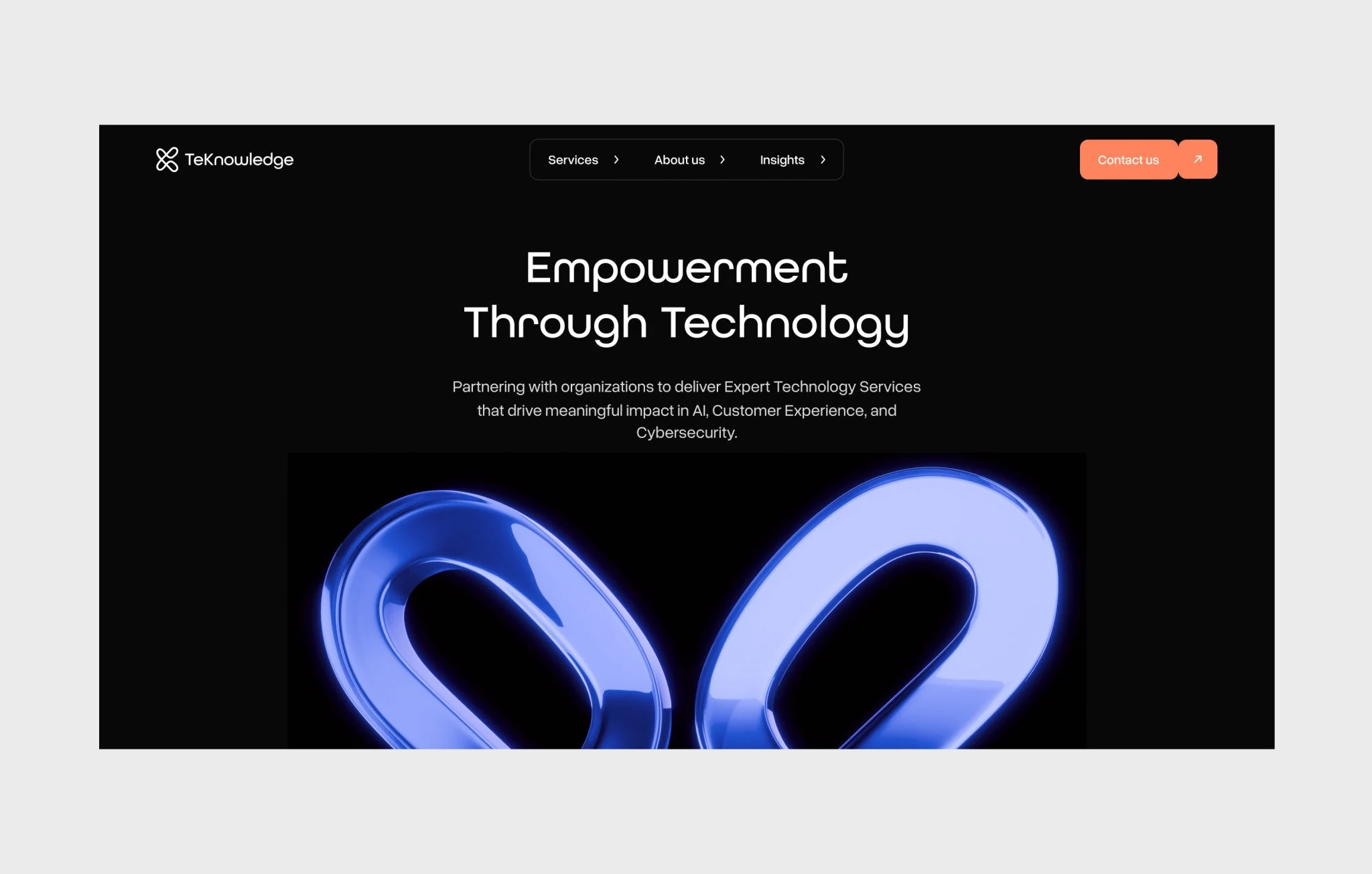
For one of our clients, Teknowledge, the key action was to get people to reach out. So we made sure the “Contact Us” button became their loyal shadow, following visitors across the site and popping with just enough accent color to catch the eye without shouting for attention.
💡 Insight
Even the most polished corporate website fails if it blocks users from reaching pricing, service details, or signup. Fix these paths first, and design everything else to support them.
Mistake #3: Overcomplicated navigation
Imagine walking into a giant library where none of the books are labeled, the aisles twist like a labyrinth, and the exit signs are hidden behind stacks of encyclopedias. That’s what bad website navigation feels like — and one of the common web design mistakes. Messy menus, no clear hierarchy, and too many options send users straight to the digital door.
When prospects land on a corporate website, they are evaluating complex products, comparing vendors, and reporting back to their teams. Confusing menus stop decision-makers and potential partners from finding the critical information they need to trust you.
What to do instead
- Build your information architecture for your specific target audience: Who are the people browsing your website? What are they here for?
- Group content logically, keep menus lean, and give users an intuitive way forward at every step.
- Structure navigation by the way B2B buyers actually search (e.g., “Industries,” “Solutions,” “Case Studies,”)
- Use plain, descriptive labels (“Services,” “Pricing,” “Contact”) instead of jargon or clever wordplay that confuses.
- Aim for 5–7 top-level items max; push secondary content into logical submenus.
- Use heatmaps and behavioral data to spot drop-offs, then simplify navigation accordingly.
💡 Insight
Treat your navigation like a sales pitch. If a prospect can’t reach your most valuable pages in two clicks or less, it’s time to fix it. Every extra click is a missed opportunity.
Mistake #4: Pretty pages, empty words
Not all website design mistakes jumps out at you — design might draw people in, but it’s the content that convinces them to stay. And too many corporate websites waste that opportunity with vague messaging, filler copy, and empty promises: users don’t understand what you offer, why it matters, or what to do next. Weak content undermines even the most polished design. Prospects leave unclear on your value, sales cycles drag on, and marketing spend is wasted driving traffic to a site that doesn’t convert.
What to do instead
This time, let’s learn from the best. We’ll take a look at Apple’s messaging magic and unpack how each example can elevate corporate content.

“Unlimited access to over 200 incredibly fun games, with no ads and no in-app purchases.” — Apple Arcade
Why it works:
Apple leads with the benefit you care about (“unlimited access”), makes it concrete with numbers (“over 200 games”), and then removes the friction with a clear promise (“no ads, no in-app purchases”). You instantly know what you’re getting and why it’s valuable.
Takeaway:
That same formula works for B2B. Instead of vague claims like “best-in-class support,” spell out the outcomes. For example: “24/7 support across time zones, with SLA-backed response times and zero-ticket backlog.” It’s specific, measurable, and makes a promise prospects can trust.
Or, let’s take their official website:
“Brighter display, now with ProMotion up to 120Hz. Durable Ceramic Shield 2 front with 3x better scratch resistance.”

Why it works:
Apple condenses two value points (brighter visuals + durability) into one short line. Each benefit is quantified or branded for memorability: “up to 120Hz” gives a measurable performance improvement, while “3x better scratch resistance” makes durability tangible. The phrasing is simple, active, and concrete.
And here’s the subtle genius: not everyone will fully understand every detail — and that’s the point. Apple deliberately fills its site with dozens of similar, concrete claims. If you care about scratch resistance, that line will stick. If refresh rates matter to you, you’ll notice the 120Hz. Each audience segment zeroes in on what’s personally relevant, while the overall impression is that the product feels packed with real, measurable improvements.
Takeaway for corporate websites:
Corporate messaging should do the same: highlight specific, measurable improvements instead of vague claims. Not every detail needs to resonate with everyone, but the right proof points will land with the right audience. For example, instead of “robust infrastructure,” say “99.99% uptime with 3-layer redundancy and real-time monitoring.” Instead of “great customer service,” try “average 2-minute response time with 92% first-call resolution.”
Mistake #5: Non-converting CTAs
A corporate website can have flawless design and compelling content, but if the calls to action (CTAs) are weak, the whole funnel may break. Too many companies bury CTAs at the bottom of the page, label buttons with vague text, or use designs that blend into the background. Think of CTAs as conversion infrastructure. Without them, interest leaks out of the funnel. With them, curiosity becomes demos, leads, and deals you can actually attribute back to the site.
What to do instead
High-performing CTAs share a few key traits:
- Make the language actionable and personal. Buttons like “Get My Free Quote” or “Start My Trial” create ownership and have been shown to boost conversions by up to 90%.
- Ensure visual contrast. A CTA should stand out through color, spacing, and sizing (especially on mobile) — so users can’t miss it.
- Communicate clear value. Instead of “Submit,” say “Join Free for a Month” or “Start Learning Today.” The benefit is obvious and reduces hesitation.
- Use personalization where possible. CTAs tailored to user behavior or segment can convert up to 202% better than generic ones.
- Test continuously. Small tweaks — copy, color, size, placement — often lead to big improvements. Sticky CTAs or multistep CTAs can lift conversions by 27–30%.
💡 Insight
Businesses see the biggest impact when CTAs are designed as mini-value propositions: clear, visible, and personalized to the user’s context.
Mistake #6: No marketing or sales involvement
Too often, corporate websites are designed in a silo: led by designers and executives, with little input from the people closest to customers. But founders who skip marketing and sales in the design process miss out on the very insights that connect a website to revenue. The impact of this gap shows up quickly. Without alignment, the site risks becoming a brand vanity project: attractive, but disconnected from how customers actually buy. Messaging may sound generic, calls to action may not address objections, and campaign landing pages often feel bolted on instead of integrated. Sales teams then complain about poor-quality leads, while marketing struggles to tie campaigns to measurable ROI.
What to do instead?
The answer is collaboration. Marketing and sales bring the customer’s voice into the design process — their knowledge of pain points, objections, and behaviors turns the website from a static brochure into a dynamic sales funnel. With their input, the site can:
- Define clear business goals that link design choices directly to lead generation, nurturing, and conversions.
- Map the customer journey so navigation, content, and CTAs align with how buyers actually move from discovery to decision.
Beyond that, their involvement ensures messaging is tailored to real audience segments, CTAs feel relevant, and campaigns are integrated instead of patched on. Feedback loops also matter: when sales reports back on lead quality and customer objections, marketing and design can adjust content and flows with data-backed precision. And collaboration has efficiency benefits too: no more duplicated work or conflicting messages that erode trust. In some companies, cross-team workshops even build empathy between departments, making execution smoother all around.
When design, marketing, and sales work together, the website becomes a living asset: strategically aligned with business goals, responsive to customer needs, and continually optimized for conversions.
💡 Insight
Businesses benefit most from involving marketing and sales early in the website process — during strategy and content planning — because that’s when customer insights, revenue goals, and design decisions can be aligned into a single, conversion-focused system.
Mistake #7: Ignoring mobile
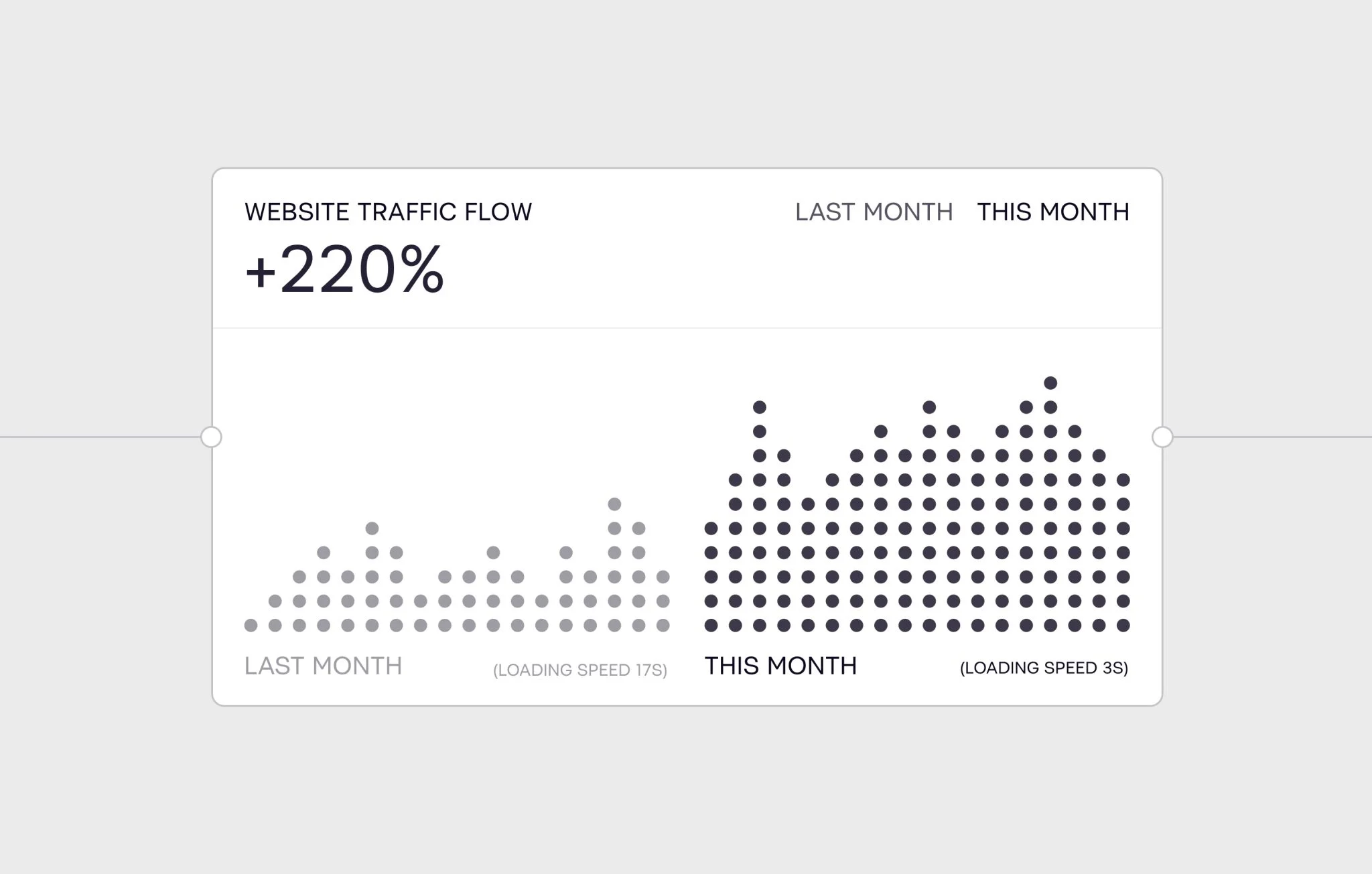
If your site takes more than three seconds to load, users bounce, and they rarely come back. Beyond traffic loss, Google now factors speed into rankings, so ignoring it hurts both user experience and discoverability. In practice, this means wasted ad spend, fewer inbound leads, and weaker brand credibility.
- Google reports 53% of mobile users abandon a site if it takes more than 3 seconds to load.
- Every extra second between 1–5s costs an average 4.24% drop in conversions.
What to do instead
Improving speed starts with tackling the biggest culprit: heavy files. Images, videos, and even fonts can weigh a site down if they’re not optimized. By compressing and converting assets into modern formats, you can cut load times dramatically without sacrificing quality.
Once the files are lean, caching and content delivery networks (CDNs) make a huge difference. Caching ensures repeat visitors don’t need to reload the same resources every time, while CDNs distribute your content across global servers so users in Berlin or Buenos Aires experience the same fast response as someone in New York.
The next technique is lazy loading. Instead of forcing the browser to load every video, animation, or secondary image upfront, assets appear only when users actually scroll to them. This keeps the initial page load light and makes the site feel snappy from the first click.
💡 Insight
Speed is invisible when it’s good and painfully obvious when it’s bad. A fast site signals competence, respect for users’ time, and technical maturity.
Mistake #8: Outdated or nonexistent SEO
Too many corporate websites launch with glossy visuals but no real search strategy — one of the most common web design issues that undermines performance. Without SEO in place from day one, your site becomes a digital ghost: live, but practically invisible. Founders often assume traffic will “just come” after launch, only to discover that without search visibility, the site attracts no one except people they already know.
If search engines can’t properly crawl and index your pages, you won’t appear for the queries your buyers are typing in. That means little to no organic traffic, pushing you into the expensive cycle of paid ads and outbound campaigns.
What to do instead?
Start with the basics. A clear semantic structure (H1, H2, H3) helps both Google and your readers follow the logic of your content. Content itself should be optimized for intent — meaning it uses the right keywords naturally, answers the real questions buyers are asking, and includes meta titles and descriptions that make people want to click.
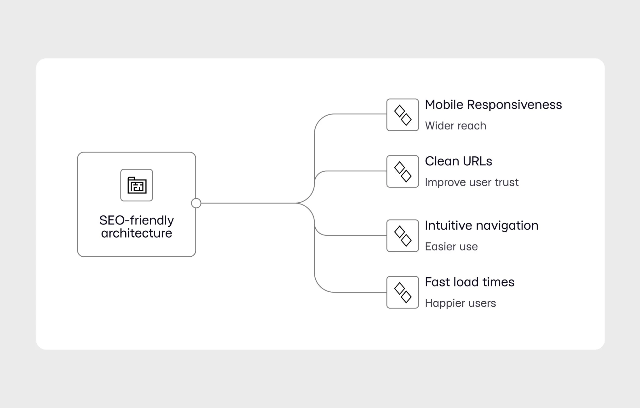
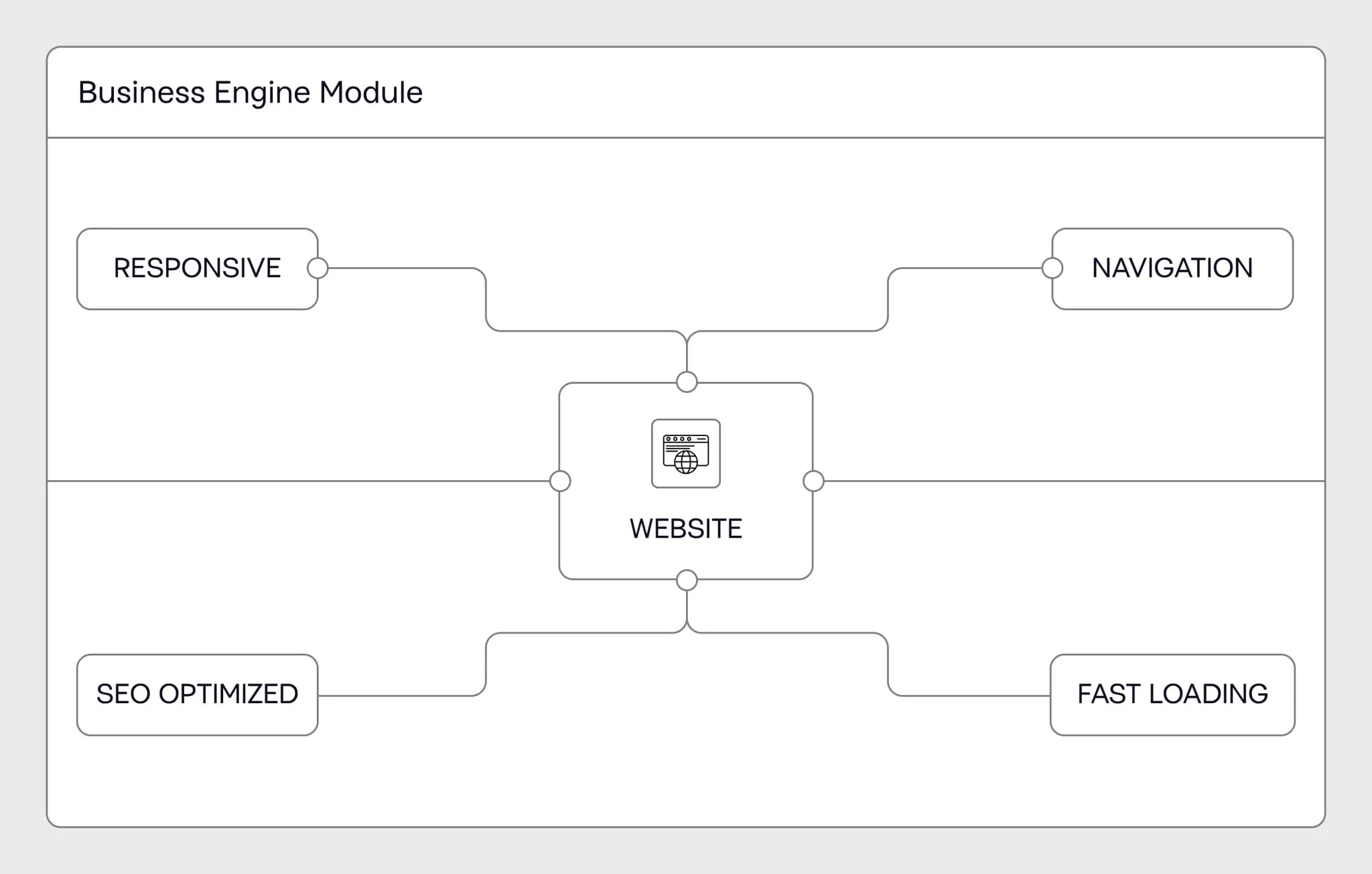
Underneath it all, your site needs SEO-friendly architecture: clean URLs, intuitive navigation, fast load times, and mobile responsiveness. And then there’s the technical layer: fixing broken links, adding structured data where relevant, ensuring proper indexing, and hitting Google’s Core Web Vitals benchmarks.
💡 Insight
Google now prioritizes mobile-first design and site speed as ranking factors. That means SEO is inseparable from good design and performance. When you ignore it, you don’t just miss out on traffic, you miss out on credibility, leads, and long-term growth.
Mistake #9: Flying blind without analytics
Imagine pouring money into a sales team without ever checking their results. That’s exactly what happens when a corporate website launches without analytics. The site might look polished, the messaging might feel sharp — but if you’re not tracking what visitors do, you have no idea if it’s actually working. Founders who skip analytics end up making decisions on gut feel, not data, and that’s a dangerous way to run digital strategy.
The impact is easy to underestimate until it hurts. Without data, you can’t tell if traffic is coming from the right channels, or if paid ads are just burning budget. You don’t know why leads are dropping off or which pages keep users engaged. A high bounce rate might quietly bleed opportunities for months before anyone notices. And when investors or stakeholders ask the hard question — “What’s the ROI on the website?” — you’ll be left shrugging.
What to do instead?
Here are the metrics we suggest tracking, depending on your business goals:
- Traffic (sessions, users): Shows how many visitors arrive, when, and from where — critical for evaluating marketing reach.
- Conversion rates: Measure whether the site is turning visits into leads, signups, or sales — the ultimate indicator of business impact.
- Bounce rates: Spot landing pages that fail to engage so you can fix messaging, design, or targeting.
- Average session duration & pages per session: Reveal if your content resonates or if users are skimming and leaving.
- Click-through rates (CTRs) on CTAs: Highlight whether calls to action inspire action or need refining.
- Exit pages: Pinpoint where users tend to drop off in the journey, often exposing UX or content gaps.
- Page load time & Core Web Vitals: Ensure technical performance doesn’t sabotage user experience or SEO.
- User behavior & demographics: Help tailor messaging and campaigns to the right audience profiles.
Tools like Hotjar or Microsoft Clarity let you go deeper with heatmaps, scroll tracking, and even session recordings, so you can literally watch how visitors interact with your site.
💡 Insight
Analytics is about running your website like a living product — one that gets tested, refined, and improved based on evidence. Founders who embrace analytics turn their websites into engines for growth. Founders who ignore them stay in the dark. If you’re not measuring what happens on your site, you’re not managing it — you’re just guessing, and guesses don’t scale.
Mistake #10: Outdated design & tech
Some corporate websites feel dated the moment they launch. It often happens when companies rely on cookie-cutter templates or patchwork tech that looks passable on day one but already lags behind competitors. For a founder, that’s a signal to prospects, partners, and even investors that your company is behind the curve, and it’s designed to grow, adapt, and stay fresh in a competitive market. Falling back on outdated templates might feel like a shortcut, but in practice it costs credibility, flexibility, and long-term growth.
What to do instead?
- Invest in up-to-date CMS platforms, frameworks, and modular architectures that make scaling easier and prevent legacy tech debt from piling up.
- Treat your website as a living asset, not a one-off project. Refresh content and design quarterly or biannually, guided by analytics and user feedback, to keep pace with evolving standards and customer expectations.
- Partner with specialized web design agencies or experts who bring data-driven strategies and current best practices. They’ll ensure your site isn’t just visually modern, but also technically future-proof. VALMAX does exactly that for their clients — fill out the form if you’re ready to start a conversation.
💡 Insight
Your website’s design and tech are part of the story. If they feel outdated, so does your business.
Wrapping up
When corporate website is built without strategy, user focus, or business alignment, it quickly becomes a cost center. But when you avoid these common web design errors, from poor navigation and weak CTAs to ignoring SEO, analytics, and mobile performance, your site transforms into a scalable growth asset. When your website aligns with business goals, every click moves you closer to revenue.
Ready to make your corporate website work? Reach out — we’ll be happy to show you what a well-built corporate site can do.
GET A TEAM THAT’S ALWAYS ON YOUR SIDE
Retainer Contract gives you reliable support whenever you need it
Your questions, answered
What are the most common corporate website mistakes founders make?
Most founders skip strategy and rush into design, ending up with a beautiful site that doesn’t convert. The top issues include missing strategy, poor navigation, weak CTAs, no SEO plan, and ignoring analytics or mobile performance.
Why is having a website strategy more important than just good design?
As a corporate web design agency, we make sure websites we build support real business outcomes, like lead generation, sales, or hiring. That’s what makes strategy-led websites different.
How do I know if my website has poor UX?
If visitors struggle to find information, bounce quickly, or your sales team constantly explains what the site should’ve made clear, UX is the culprit.
What’s the ideal approach to website navigation?
Keep it simple: 5–7 top-level items, clear labels, and structure based on how buyers search, not your internal org chart.
How often should a corporate website be updated?
Treat it as a living asset: refresh content and design at least quarterly or biannually, guided by analytics and user feedback.
How does mobile optimization impact SEO and conversions?
Over half of visitors leave if a site loads in more than 3 seconds. Mobile speed and usability directly affect Google rankings and conversion rates — slow sites lose traffic and credibility.
rate this article
5 / 5.0

based on 3 reviews


