Have you ever stopped to really think about what a website is? It might sound like a strange question, but stay with us. Most companies know they need a website — fewer truly understand the value it can bring when it’s built to do more than just exist. In the B2B world, decisions are never impulsive. Buyers research, analyze, and compare.
In fact, nearly 90% of B2B buyers review multiple vendor sites before ever reaching out.
Your website is often the first (and sometimes only) chance to show you understand their challenges and can deliver the results they’re after. If it doesn’t demonstrate expertise, answer objections, and make the next step obvious, your lead generation is suffering. But with the right architecture, design, content, and integrations, a website becomes a 24/7 sales engine. This article shows how to turn your corporate B2B website into a sales engine that works around the clock.
B2B vs. B2C websites: why the rules are different
Not all websites play by the same rules. A business selling to other businesses has a very different job to do than one selling directly to consumers, and the difference shows in everything from the content to the checkout.
Audience and preferences
B2B websites speak to decision-makers — people tasked with justifying every purchase, often to a group. They need detail, evidence, and a clear business case. B2C websites speak to individuals, appealing to personal wants and emotions. The former is about business outcomes; the latter is about lifestyle, enjoyment, or instant need.
Content and messaging
In B2B, content is the sales conversation. It’s detailed, often technical, and built to support a long, research-heavy buying process — think case studies, whitepapers, and deep product pages. In B2C, content is lighter, more emotional, designed for quick engagement and an equally quick decision.
Sales cycles and buyer journeys
A B2B sale can take months, with multiple approvals and budget sign-offs. The website has to support repeated visits, comparisons, and ongoing learning. B2C journeys are usually short, sometimes minutes from discovery to purchase — so the focus is on a fast, frictionless path to “Buy Now.”
Design priorities
B2B sites favor clarity and trust: structured navigation, easy access to sales reps, comparison tools, and detailed product data. B2C sites lead with aesthetics, speed, and instant gratification: bold visuals, emotional storytelling, and 3Ds.
Conversion goals
For B2B, a “conversion” is often a qualified lead — someone requesting a demo, downloading a guide, or booking a consultation. For B2C, it’s usually a completed purchase.
Relationships and transactions
B2B is built on long-term partnerships, recurring orders, and personalized service. B2C focuses on brand loyalty, repeat buyers, and community engagement, but transactions are typically smaller, fixed-price, and one-off.
B2B corporate website best practices: design that sells
In B2B, nobody wakes up wanting to “buy a service” or “implement a platform.” They want to solve a costly problem, hit a strategic target, or find a new opportunity. Your corporate website should reflect that, starting from the first headline. Below are the core principles that will help you do that.
Define your positioning
As April Dunford puts it, positioning is “how your product is a leader at delivering something your target customer cares a lot about.” And it’s the foundation that informs your copy and design decisions. A high-performing B2B site uses positioning as a strategic core, influencing everything from structure to copy.
Positioning is the lens through which buyers understand your website and your entire offer. It frames your category, setting the stage for how they compare you to competitors and even how search engines rank you. Are you a CRM or a revenue intelligence tool? The answer shapes not just perception, but the expectations visitors bring with them. Strong positioning also sharpens your value proposition, speaking directly to the right audience and making it clear why you’re the better choice. Without it, your site risks blending into a sea of “we do everything” promises, instead of standing out as the obvious fit.
How to implement it on your site
- Communicate your core value through homepage copy, case studies, and ROI-driven claims.
- Reflect your ideal customer segment through navigation, tailored landing pages, and targeted messaging.
- Address competitor context with “Why us” pages, clear comparison tables, and objection-handling content.
From feature-led to value-led: sell the outcome, not the offering
Once you’ve defined your positioning, the next challenge is avoiding a trap that catches many B2B companies: leading with what you do instead of why it matters. A common mistake is to say, “We provide automation solutions for retail” when you could be saying, “We help retail chains cut operational costs by 30% in 90 days.”
The first headline is feature-led — it talks about what you do.
“We provide cloud-based logistics software.”
The second one is value-led — it tells the buyer why it matters to them and positions you as a solution to a specific pain point.
“We help manufacturers reduce delivery times by 40% without adding fleet capacity.”
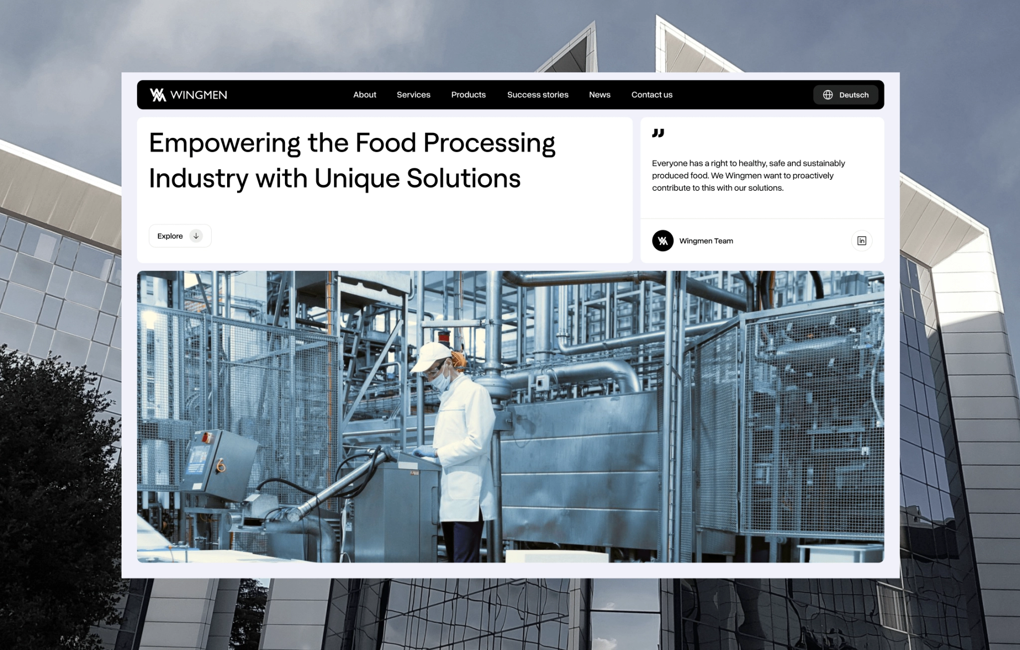
So, value-led positioning means your website leads with the business outcomes you create for your clients, not just the products or services you sell. In a corporate B2B context, this is about making the visitor immediately see:
- Who is this for? (industry, role, company size)
- What problem do they solve for me? (framed in my language, not internal jargon)
- Why should I choose them over competitors? (clear differentiators, not generic promises)
💡 Why it works in B2B sales
Decision-makers aren’t impressed by long lists of technical capabilities without context. They’re driven by ROI, risk reduction, and competitive advantage. When your site’s messaging is built around measurable business impact, it creates an instant connection between their objectives and your offer.
How to implement it on your site
- Write outcome-driven headlines above the fold on every key page.
- Support those outcomes with quantifiable results, not vague promises.
- Align messaging across the entire site so the same core value proposition is reinforced, no matter where the visitor lands.
Proof as a sales accelerator
In B2B, the gap between interest and a signed deal is often filled with doubt. Decision-makers want to know not just what you offer, but whether it works for businesses like theirs — and by “works,” they mean delivers measurable results. That’s why real-life proof is more than a supporting detail.
The numbers prove it: websites that showcase real customer success and measurable impact can lead to conversion optimization, like Flos USA’s 125% checkout lift and Oracle NetSuite’s 30% increase in demo requests.
When done well, real-life proof becomes part of the buyer’s journey itself. Early on, it sparks the thought, “They’ve solved problems like mine.” In the consideration stage, it answers, “How well do they solve them?” And at the point of decision, it seals the deal with, “Yes, I can trust them to deliver.” A corporate website without this layer is missing one of the strongest levers for closing B2B sales.
This is where sales-driven website acts as your evidence library:
- Case studies with concrete results
- Before-and-after metrics that quantify impact
- Client logos for instant recognition
- Testimonials from decision-makers, not just end users
- Awards, certifications, and partnerships as authority signals
The key is to make this proof specific and relevant. A generic testimonial or vague “success story” won’t move the needle — buyers want to see themselves in your wins.
💡 Why it matters for B2B
When buyers see clear metrics and real success stories, they can picture your results solving their own challenges. It builds trust, lowers perceived risk, and makes saying “yes” feel like a safe, informed choice.
How to implement it on a corporate site
- Link proof directly to the claim it supports. If you say you “cut delivery times by 40%,” show the client and context.
- Mix formats: written case studies, short video testimonials, even data visualizations.
- Put proof near decision points (e.g., after service descriptions or before CTAs).
Conversion-first UX: make the next step effortless
Even the most persuasive website fails if visitors don’t know what to do next or if taking that step feels like work. In B2B, your job is to remove friction from every interaction. Conversion-first UX means building action into the flow of the site, not burying it at the end. That’s why forms, CTAs, live chat, and scheduling tools should appear at the right moment, in the right context.
Elements that work hard for conversions:
- Contextual CTAs, like “Book a strategy call” after a case study, “See a live demo” on a product page.
- Short, smart forms that ask only what’s necessary to qualify the lead.
- Live chat or chatbots for quick answers without forcing visitors into an email thread.
- Instant scheduling that lets prospects book a call directly into a sales rep’s calendar.
💡 Why it matters
In B2B, interest can cool quickly if the next step feels too big (e.g., “Contact us” with a generic form). The easier it is to act, the less likely you lose a lead.
How to implement it on your site
- Place CTAs above the fold and inline within content, not just in the footer.
- Match CTA type to the visitor’s likely stage (learn more vs. request a proposal).
- Test different CTA formats (buttons, banners, sticky bars) to see what works best.
- Track which touchpoints drive the highest-quality leads rather than clicks.
Sales–marketing integration
A high-performing B2B website arms your sales team with context, timing, and conversation starters. That’s the role of sales–marketing integration. When your site is connected to a CRM, marketing automation, and analytics stack, every form submission, content download, or chat interaction becomes part of a lead’s profile. Sales reps can see which pages a lead visited, what content they engaged with, how recently they interacted, and which campaigns or sources brought them in — all clear signals of interest and intent. This level of visibility lets sales teams prioritize outreach, personalize conversations, and follow up at the moment of peak interest.
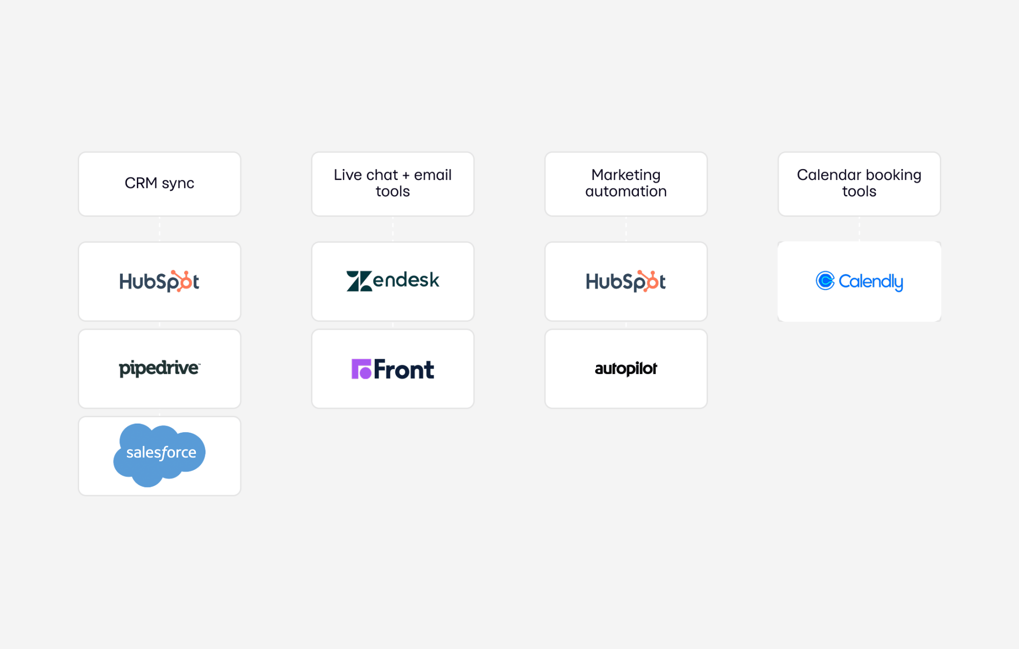
Key integrations to consider:
- CRM sync (HubSpot, Salesforce, Pipedrive) for lead tracking and segmentation
- Marketing automation (Hubspot, Autopilot) for nurturing sequences and lead scoring
- Live chat + email tools (Zendesk, Front) to keep records of early conversations
- Calendar booking tools (Calendly) synced to sales schedules
💡 Why it matters
Without integration, leads often fall into a black hole, lost between marketing and sales handoffs. With it, your website becomes a continuous feedback loop, where sales insights inform content strategy, and marketing delivers warmer, better-qualified leads.
Understand buyer logic, then building around it
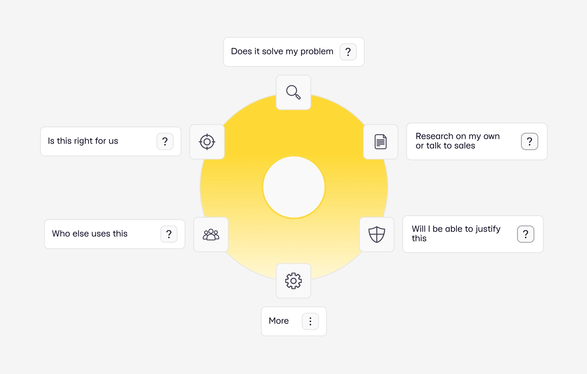
B2B purchases involve multiple stakeholders, long sales cycles, and deliberate comparisons. That means your website has to guide every type of visitor through a clear, logical sequence that mirrors how buying decisions are made.
Stage 1: What exactly is this, and can it solve my problem?
That’s where a clear hero headline, a short explainer, and a concise product or service overview earn their keep.
Stage 2: “Is it right for us?”
Once they understand what you do, the next question is, “Is it right for us?”. Use cases, persona-based pages, and tailored benefits make your offer feel built for their exact situation.
Stage 3: “Who else uses this, and has it worked for them?”
From there, it’s about trust. This is where case studies, testimonials, and recognizable client logos prove the point.
Stage 4: “Can I justify this to my boss, and is it worth the switch?”
Even with trust, buyers still measure risk. Security details, compliance information, pricing transparency, and industry awards all help lower the stakes.
Stage 5: “Can I explore on my own first, or am I ready to talk to sales?”
Finally, they want control over the next step. Some will download resources, watch videos, or use calculators; others will head straight to a CTA, fill out a short form, or request direct access to your team.
When your site answers these questions in the order buyers ask them, you’re you’re leading a sales conversation that works 24/7, with a structure built for B2B decision-making.
Key pages that drive B2B sales
Once you move to web design and web development services, it’s essential to ensure every page has a clear role in the buyer journey, and that design choices actively support that role.
Homepage — set the direction immediately
This is your front line. Within seconds, a visitor should understand what you do, who you serve, and why it matters.
Design tips:
- Keep the hero section minimal but powerful: a headline, subheadline, and a primary CTA.
- Use a visual that reinforces your value proposition.
- Include clear entry points for different audiences or needs.
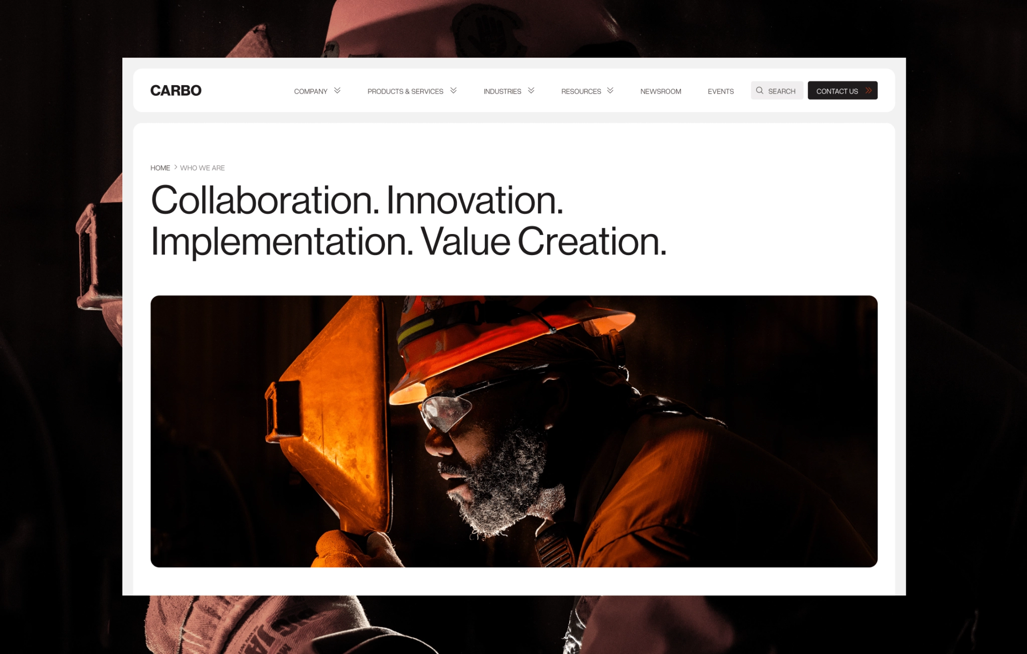
Example: On Carbo’s homepage, a single rotating ceramic bead conveys precision and durability instantly, supported by direct links to product and industry pages.

About/company page — build trust and authority
Buyers want to see the people and track record behind the product.
Design tips:
- Lead with a concise mission statement, then expand into your story.
- Use real team photos, not stock imagery.
- Add timelines, milestones, or numbers that signal scale and stability.
- Highlight certifications, awards, and partnerships in a visually distinct block.
Industry or solution pages — speak directly to segments
Tailor messaging to the challenges of each buyer segment.
Design tips:
- Break content into scannable sections: “The Challenge,” “Our Solution,” “Results.”
- Include a related case study or testimonial for credibility.
- End each page with a relevant CTA (“See similar projects,” “Book a consultation”).
Case studies & resources — prove and educate
That’s where you turn interest into belief.
Design tips:
- Use a consistent layout for all case studies: challenge → approach → results → proof.
- Show data visually — charts, before/after numbers, timelines.
- Organize resources with filters by topic, industry, or product type.
- Offer gated downloads for in-depth materials, but keep introductory resources open.
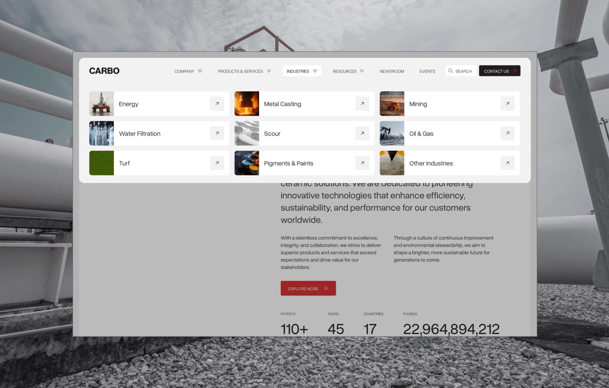
For Carbo, the Knowledge Hub was designed for fast navigation, with product and industry filtering and gated technical specs to qualify leads.
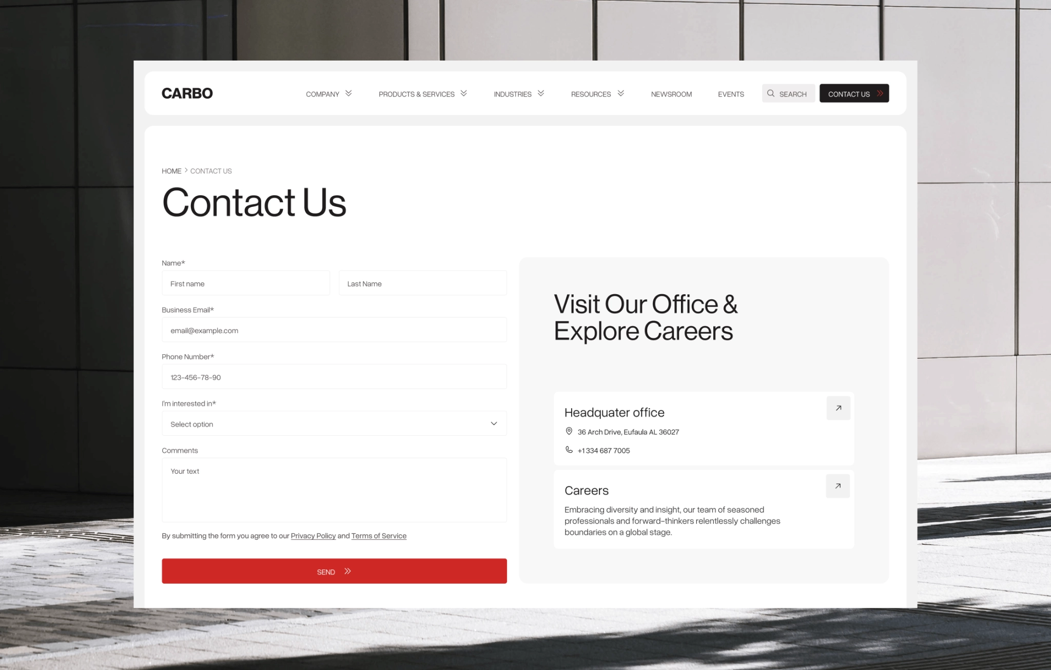
Contact form to remove friction
The point of conversion should feel effortless.
Design tips:
- Use short, clean forms; remove non-essential fields.
- Offer multiple contact methods — form, email, phone, calendar booking.
- Keep the design uncluttered to focus attention on the form or CTA.
- Add a short reassurance line (“We’ll get back to you within 24 hours”) to reduce hesitation.
Conclusion
So, going back to the very first question in this article — what is a website? It’s the first real experience buyers have of your expertise, your way of working, and your ability to deliver. When it’s built around how they think, decide, and act, it stops being a static presence and becomes a working part of your sales process — qualifying, educating, and persuading before you ever speak to a lead.
GET A TEAM THAT’S ALWAYS ON YOUR SIDE
Retainer Contract gives you reliable support whenever you need it
Your questions, answered
How can a B2B website help generate qualified leads?
By clearly positioning your offer, showcasing proof, and guiding visitors through a logical buyer journey with targeted CTAs.
What makes a corporate website “high-performing” in the B2B space?
A high-performing B2B site is designed around buyer logic, leads with value-driven messaging, integrates with sales and marketing tools, and removes friction.
How does automation on a website support B2B sales scalability?
With the right web design and development services, automation tools like CRM and marketing integrations capture, qualify, and nurture leads automatically, letting sales teams focus on the most engaged prospects at the right time.
What are common mistakes B2B companies make with their websites?
Leading with features instead of outcomes, lacking real proof, burying CTAs, and failing to address objections. Our web design and development company helps you avoid these pitfalls from the start.
How often should a B2B company update or optimize its website?
Continuously — it’s best if you have a dedicated team to update content and proof as results come in, review structure and UX. If you’d like to see how our web design and development services in USA can keep your site performing at its best, let’s have a talk.
rate this article
5 / 5.0

based on 6 reviews

